MY GOAL
To develop comprehensive visual language that represented the department and its attendant councils. This visual style will lend individual recognition to each council while uniting them under the umbrella of one visual family.
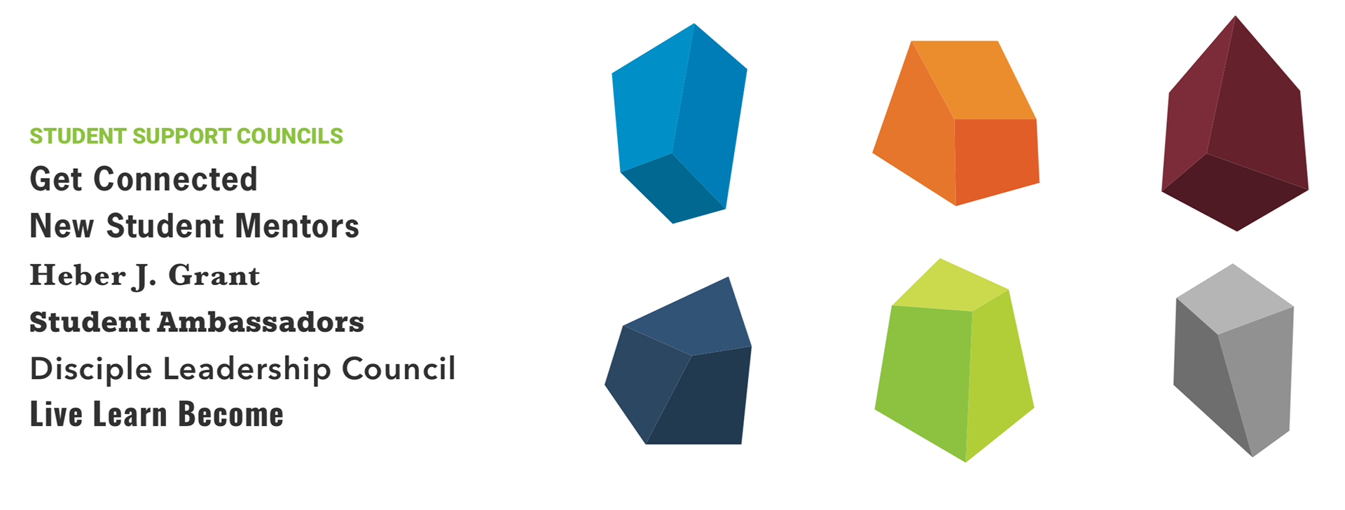
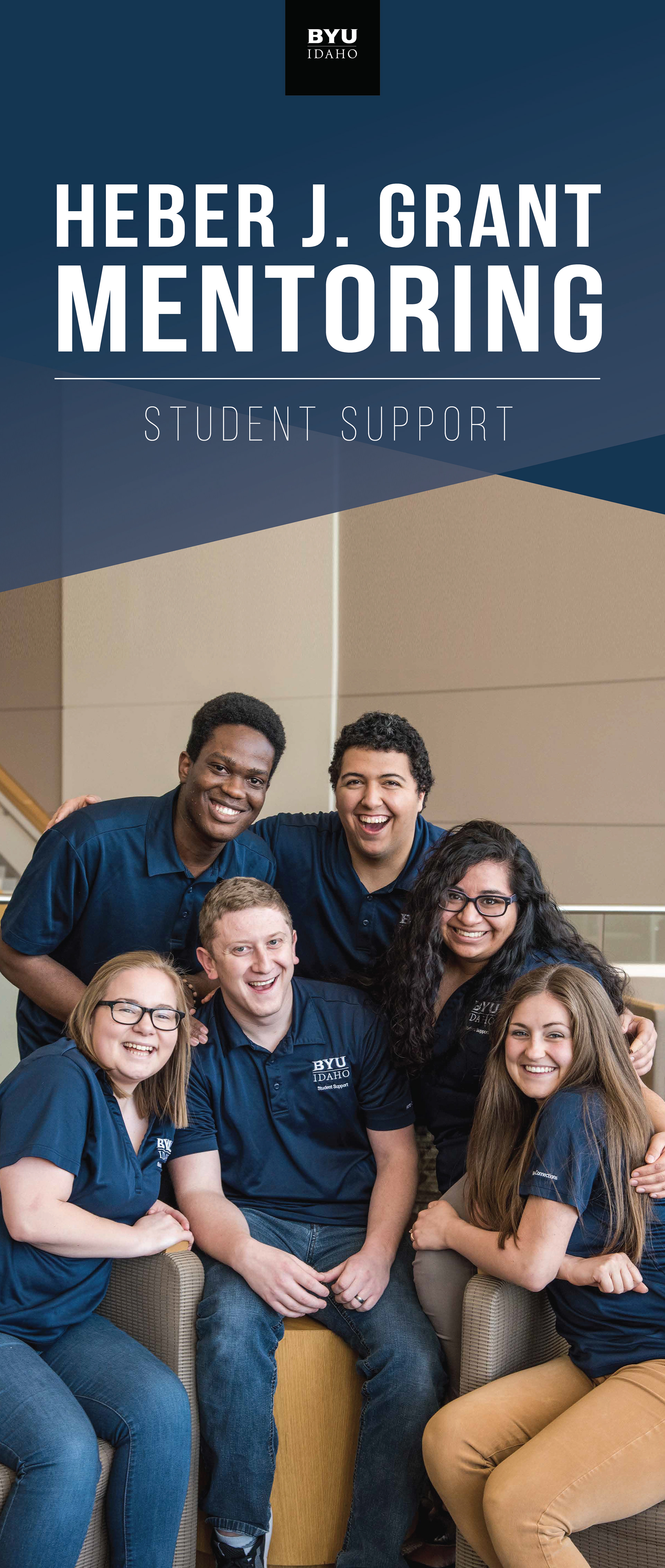
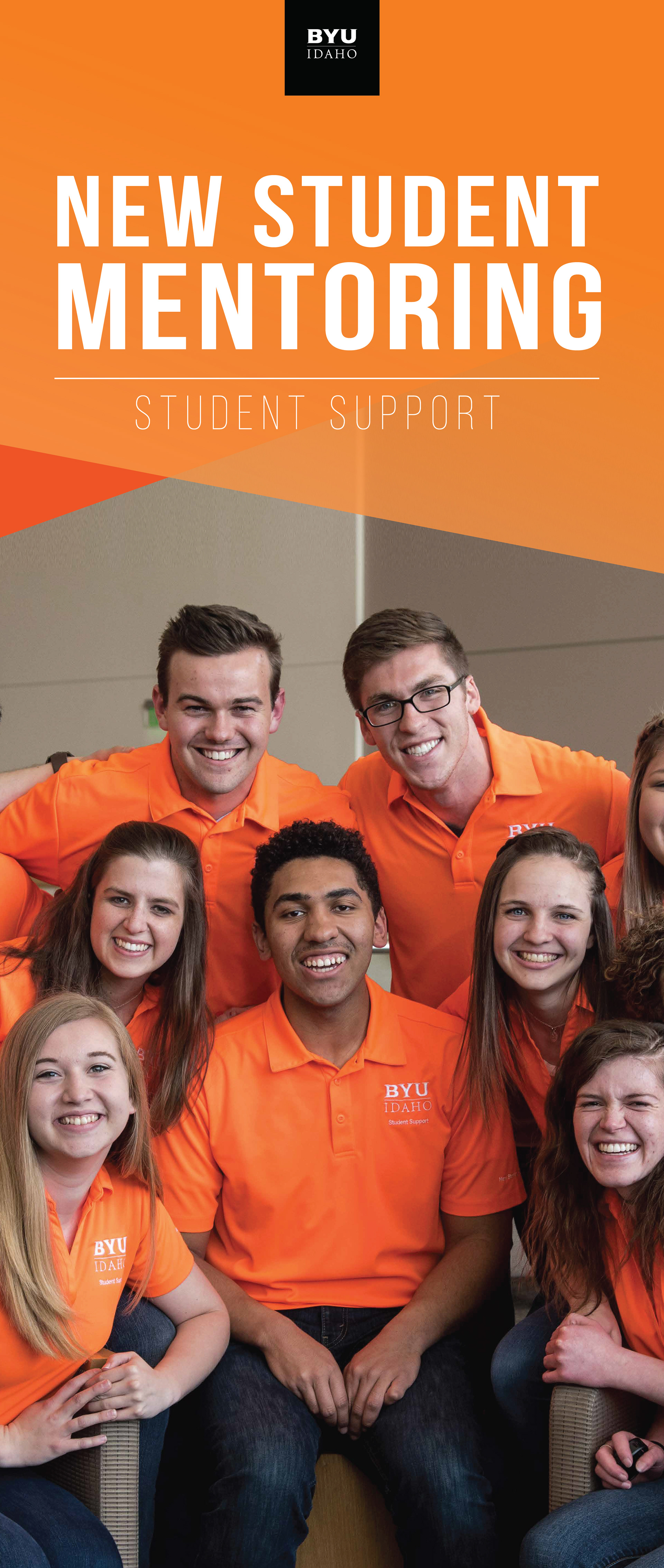
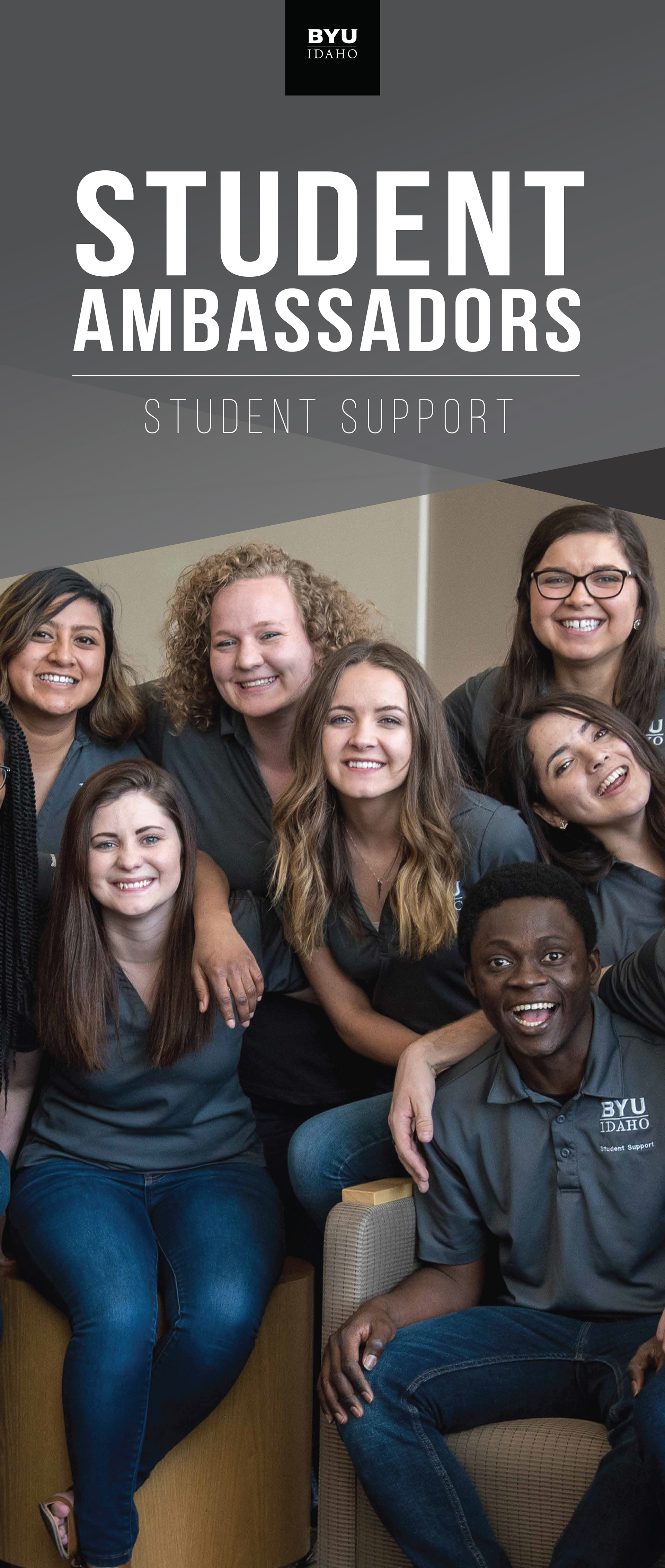
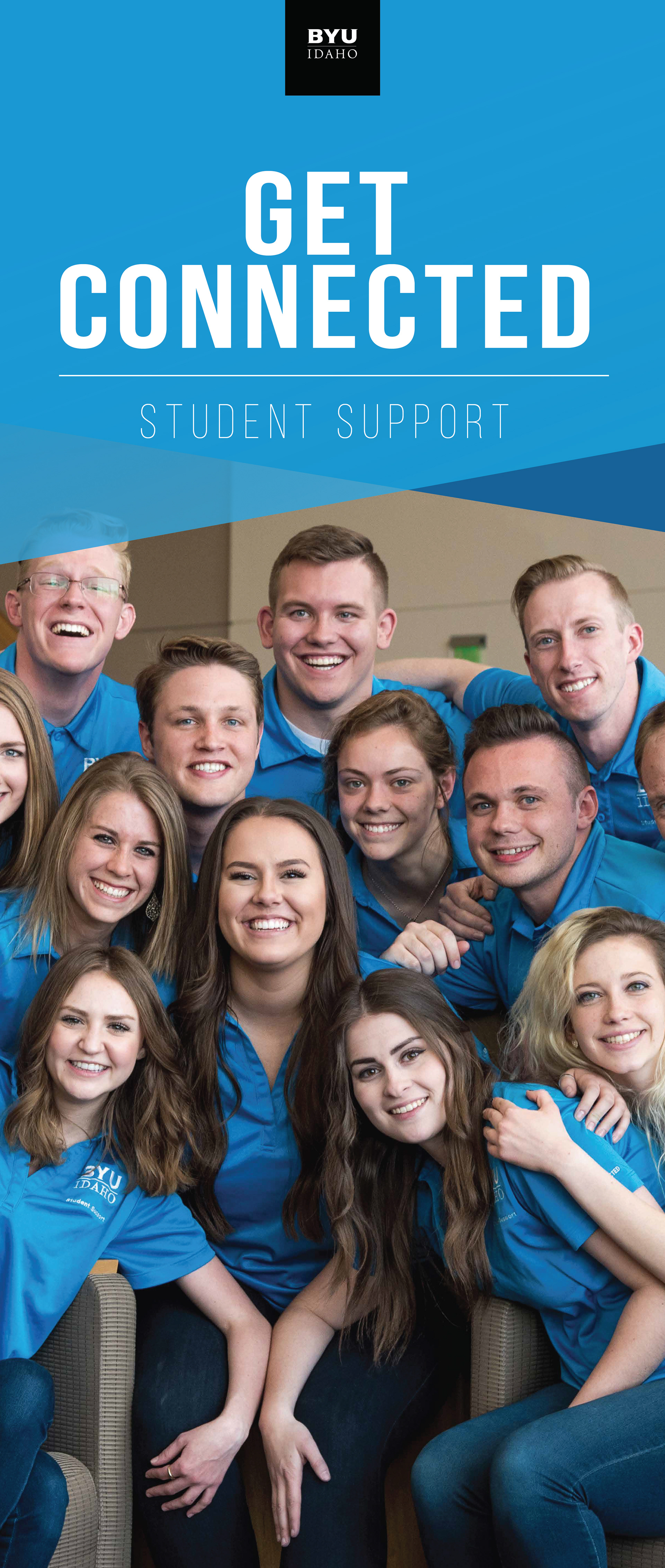
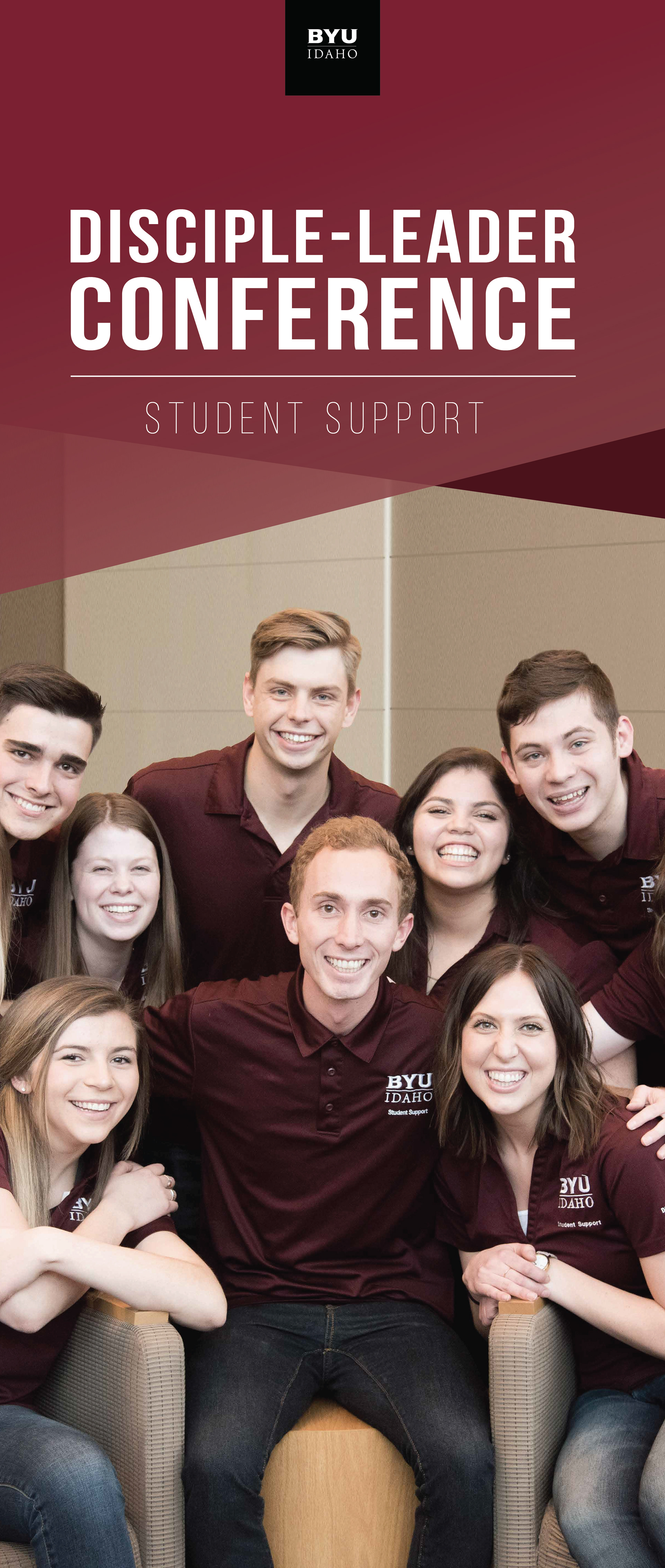
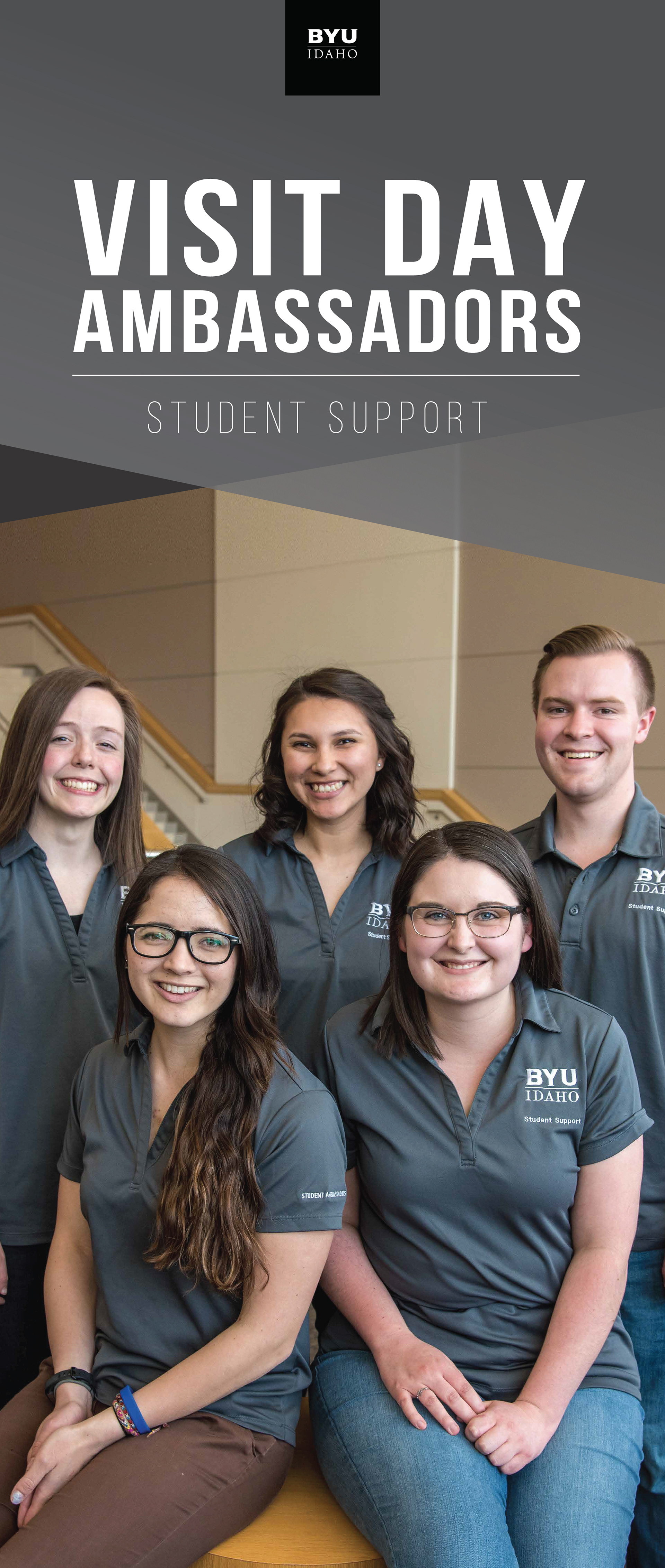
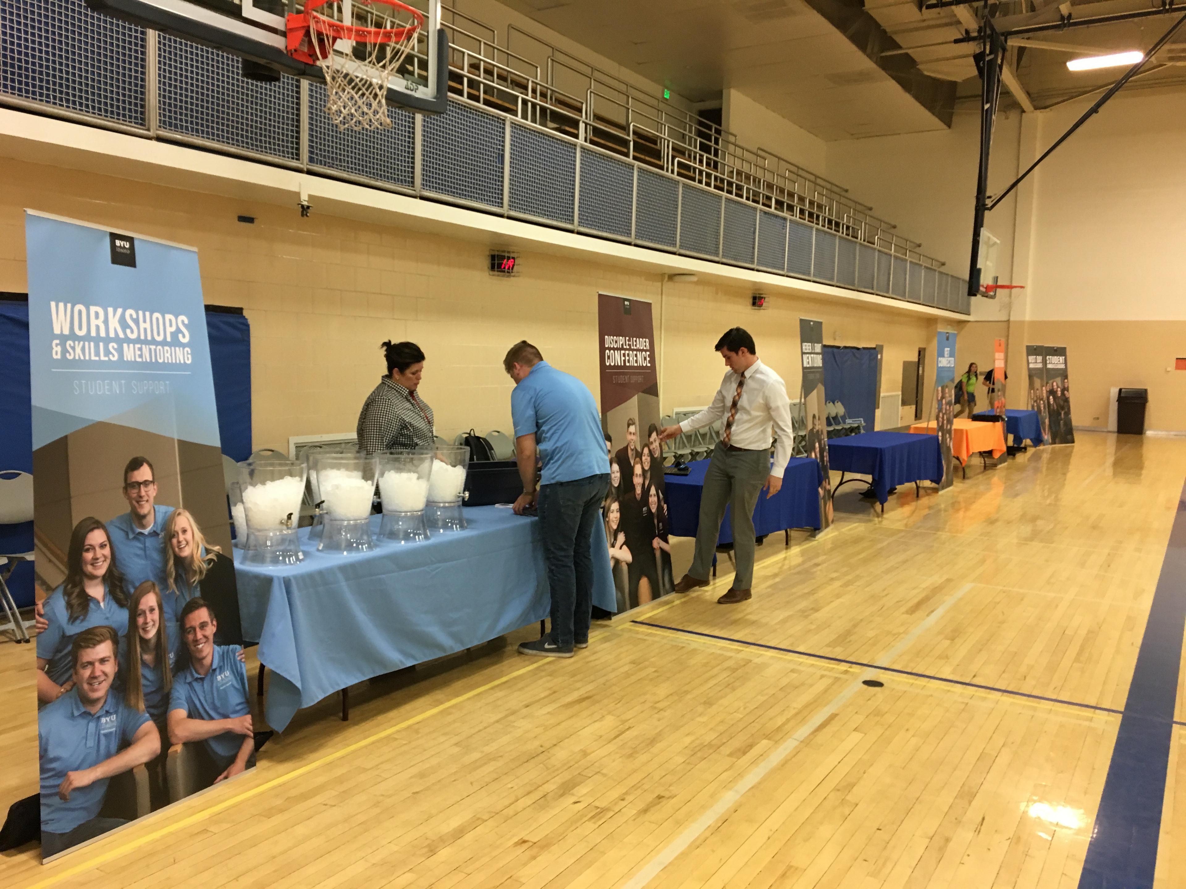
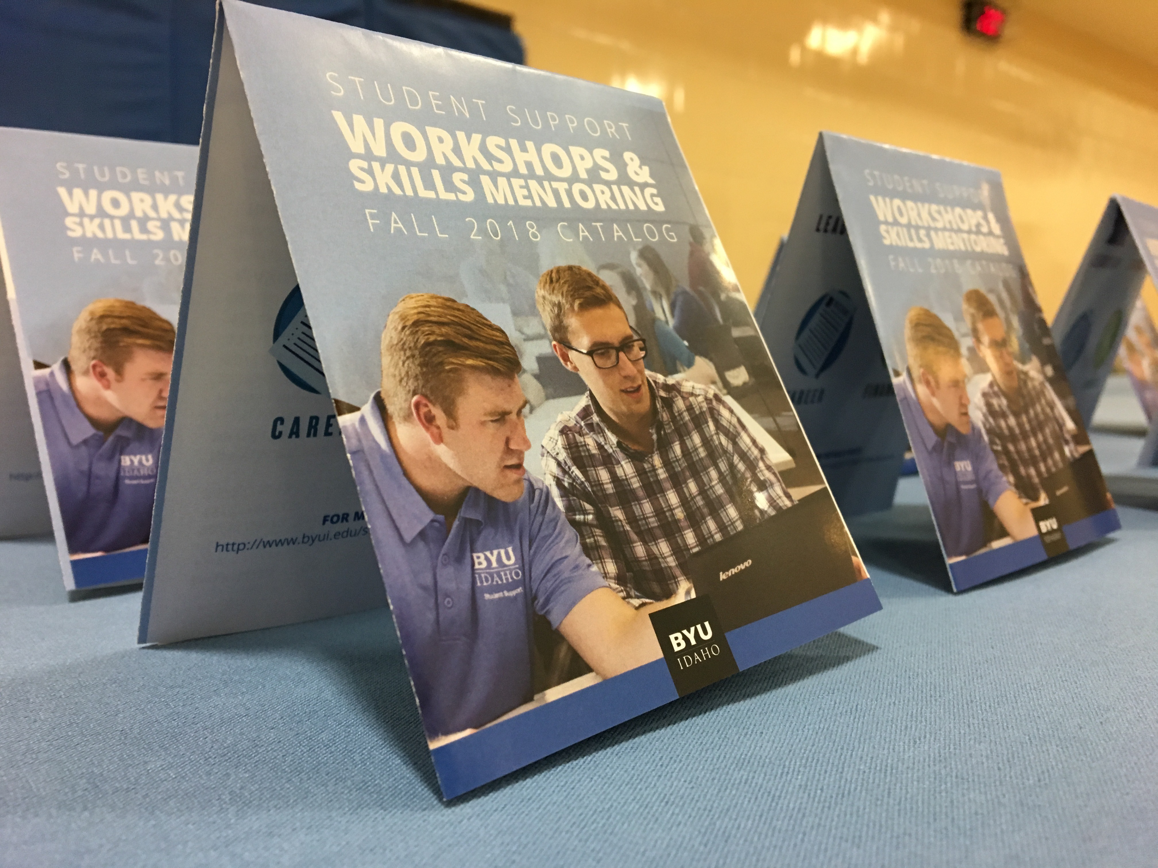
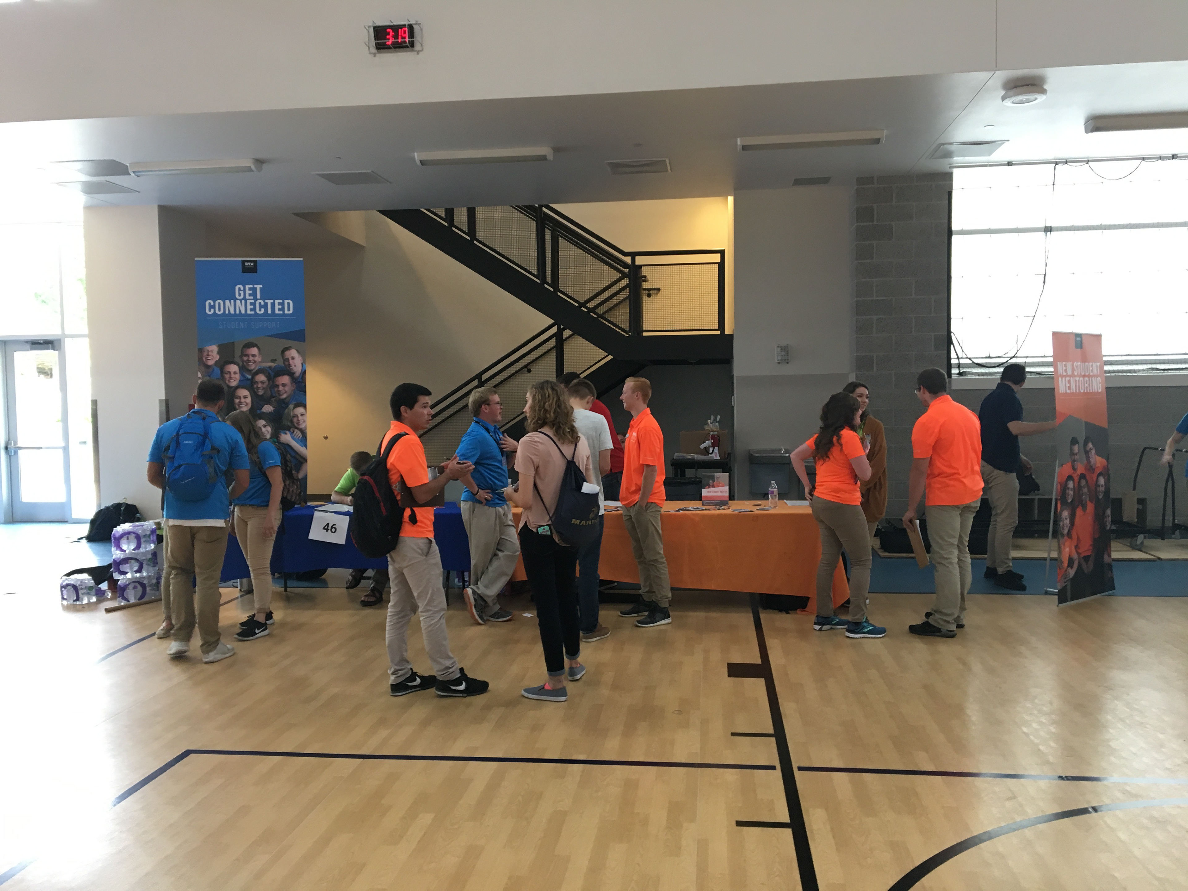
Understanding Student Support was not allowed to have an independent logo, I worked to develop a visual language using a series of shapes and colors in tandem with clear photography to express their messages and unify the department and councils in visual consistency.

THE PLAN
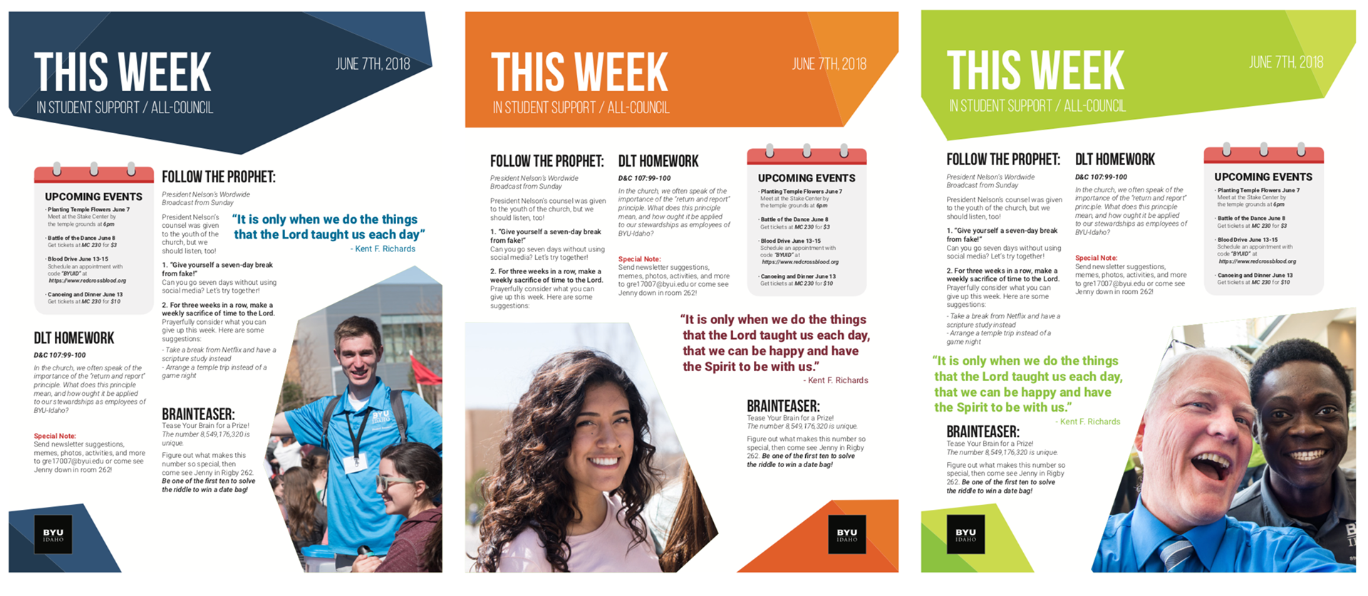
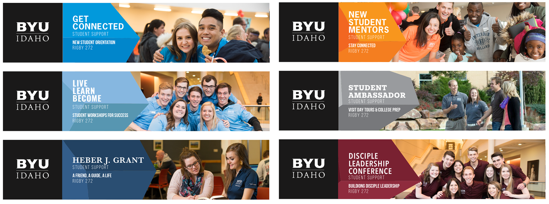
This was accomplished by using a different font for the headline of each department (fonts were chosen from the school-approved selection), while maintaining consistency in the H2 and body copy across the department. These fonts are paired with a shape set in the council color, bled off the page to achieve visual unity and consistency.

Ultimately the proposal was rejected, and no other option was proposed, so the group continues to function without unified branding though many of these concepts and elements can be found within their marketing as shown below


View the Process Book