THE PURPOSE of this project was to challenge us to create a document that was beautiful and worth giving to someone else. The main goal was for the document to be read. This meant we were to focus on readability and legibility in an attempt to actively invite a reader to participate in, and engage with the content.
We were to choose a talk from the most recent LDS General Conference that we would like to share with someone we care about. Using the text of the talk, as content, we were to design a multi-page printed booklet as a gift. Focusing on how typography hierarchy works over a series of spreads to engage and invite a reader to invest time in the content.
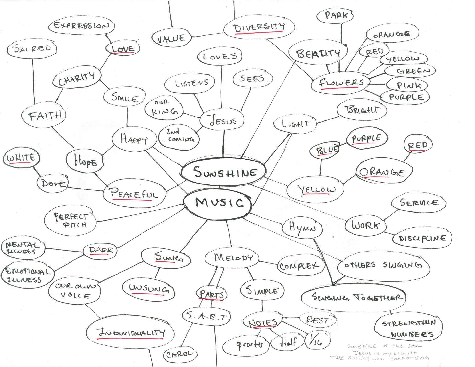
I began with a mind map to explore concepts surrounding the central topics.
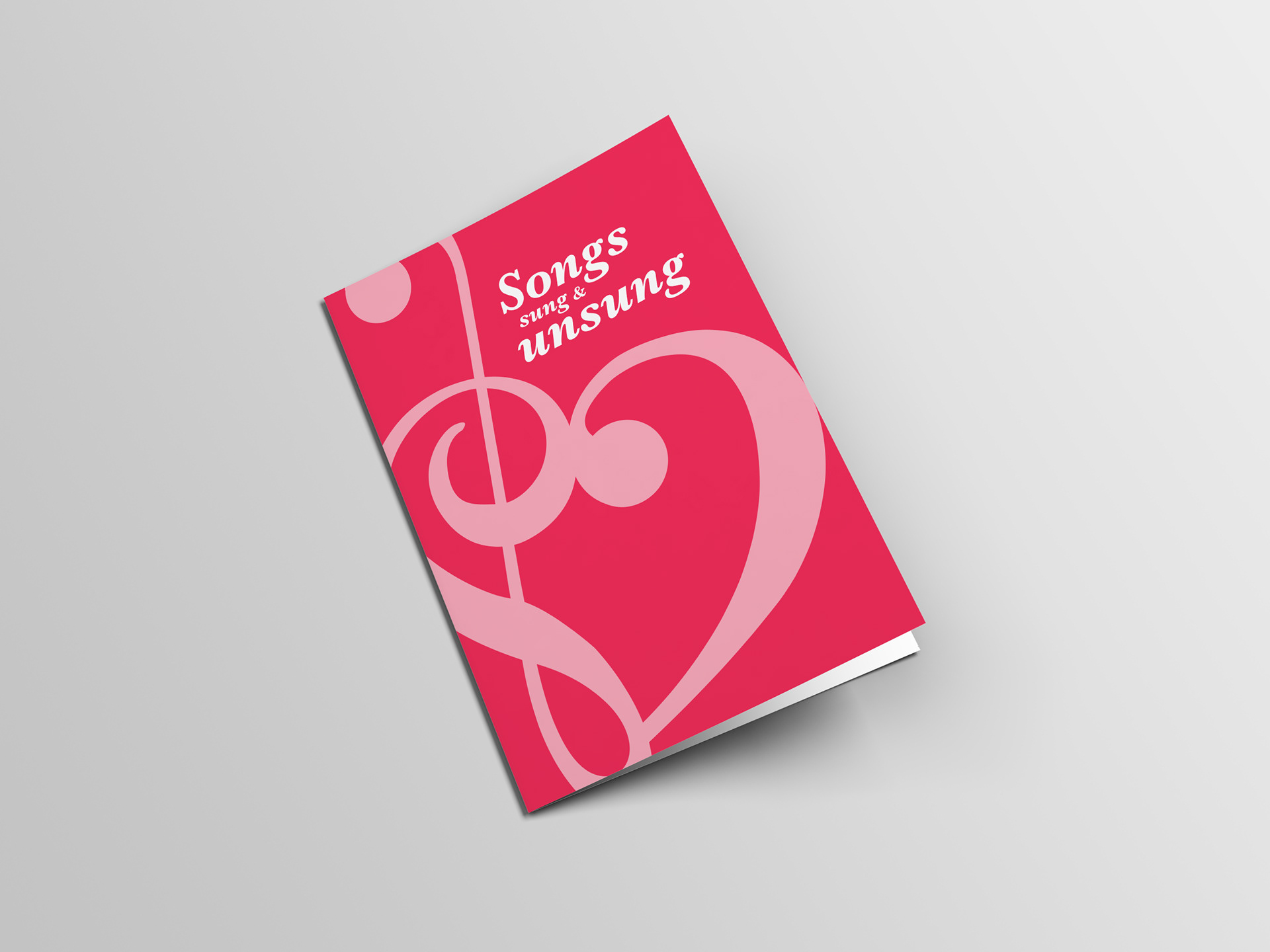
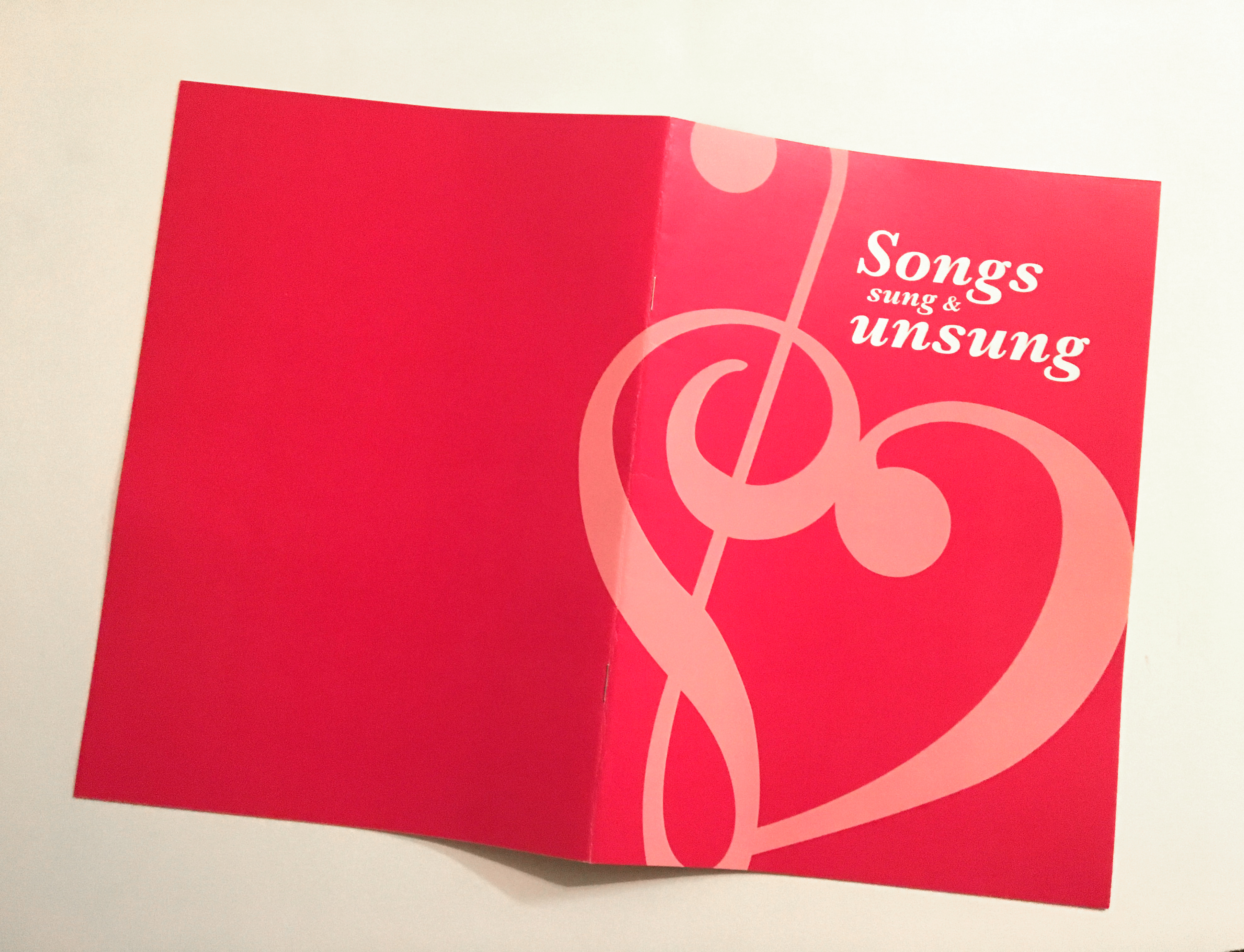
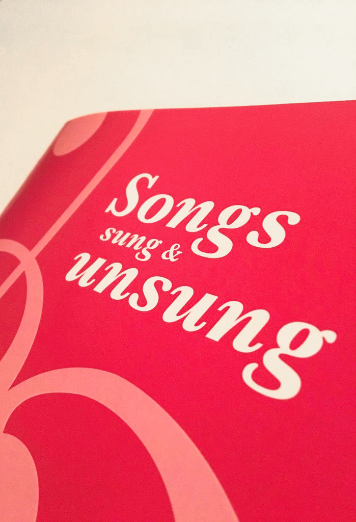
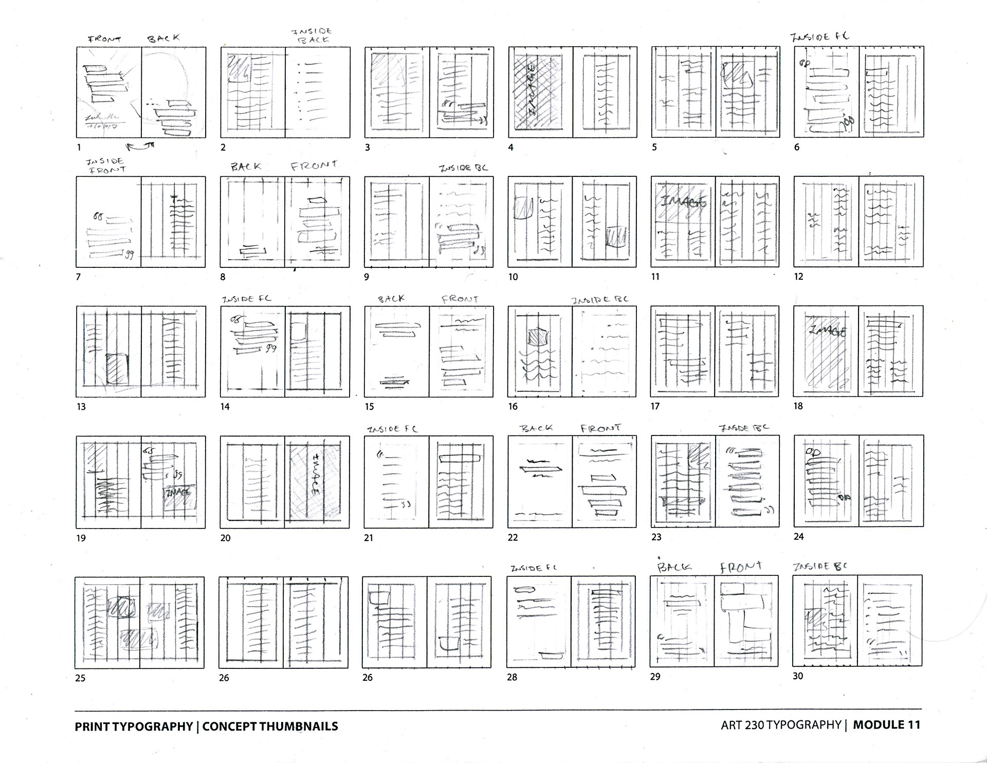
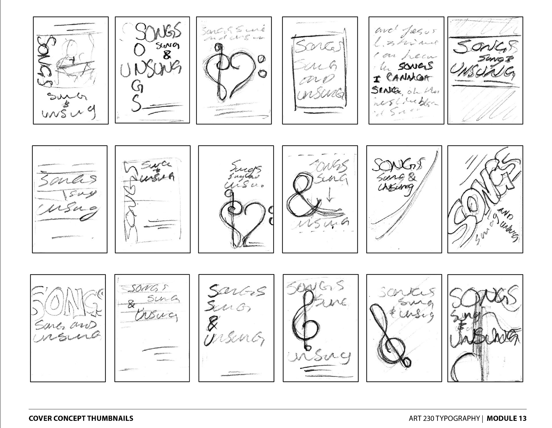
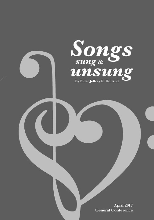
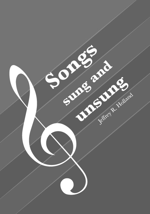
I then considered various layout styles and grid / column options. As well as pursuing different cover & back cover designs.
The fist digital mockup was not very pleasing, and left much to be desired.
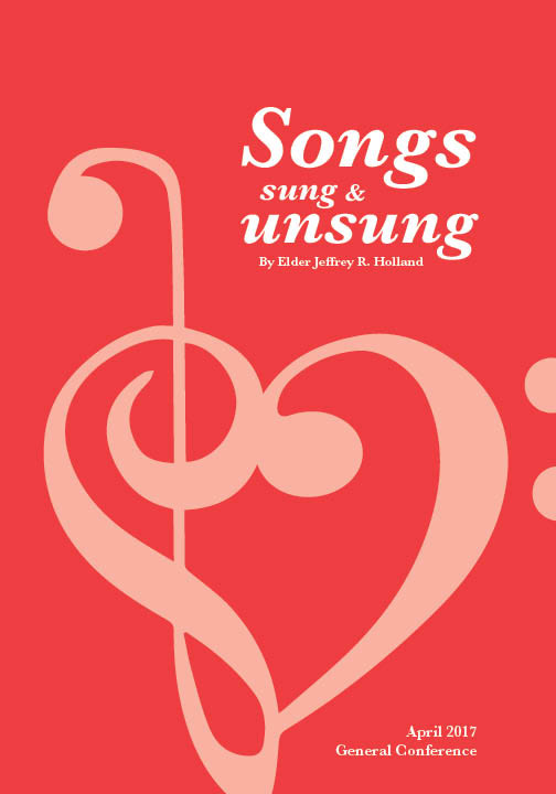
However, the digital sketches of the cover were coming along quite nicely.
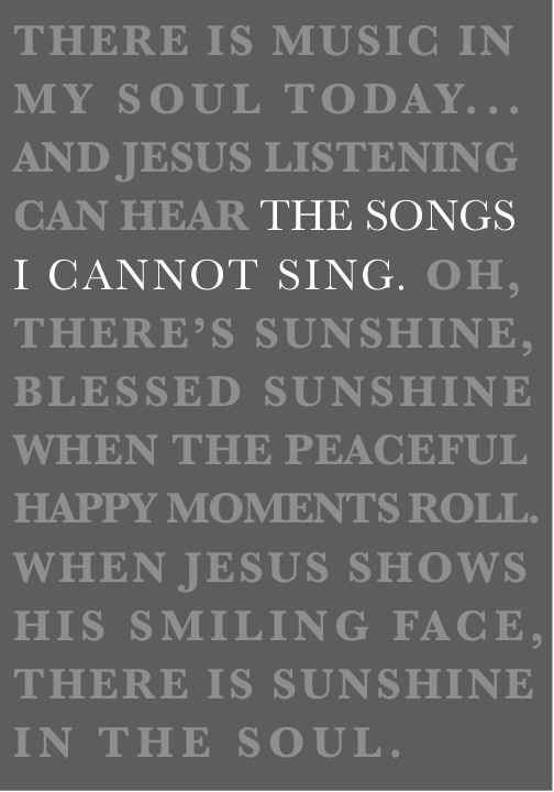
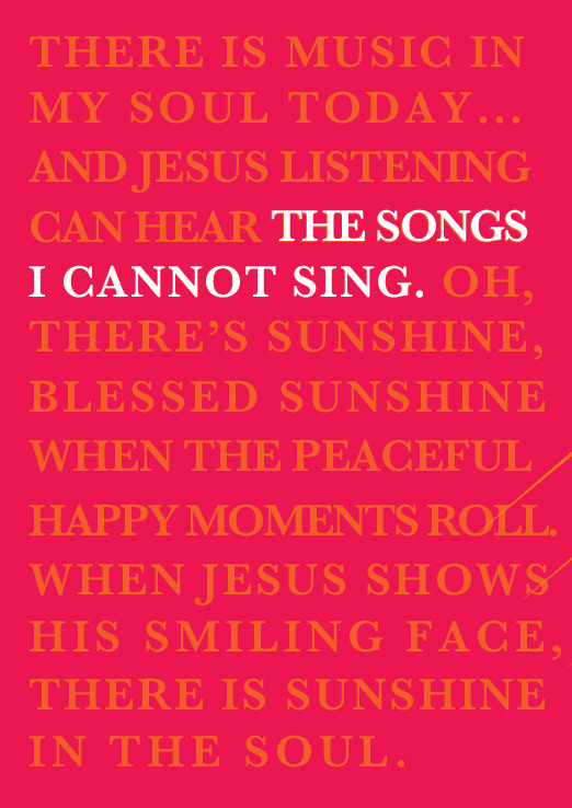
The first full draft came out pretty nice. Yet there were too many stray graphics, and not enough type treatment.

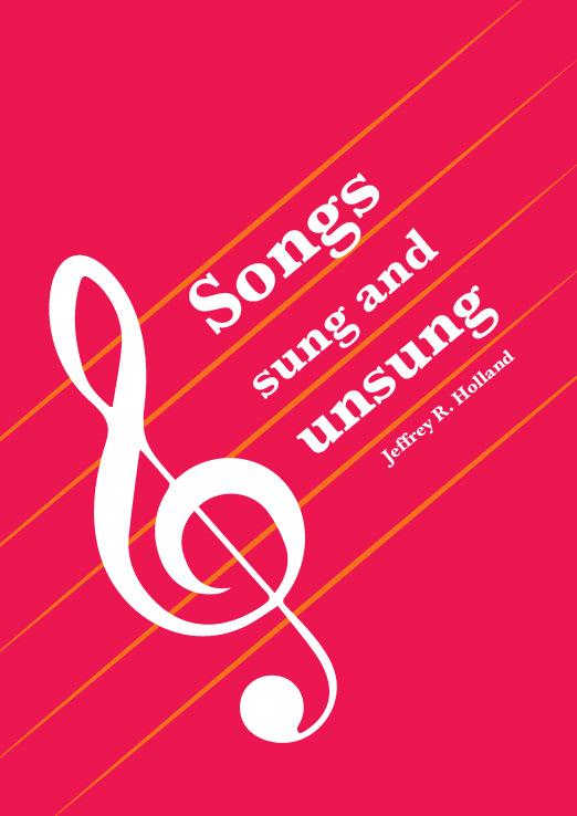
The second draft was better. I had explored more with type treatment, but had lost most of my consistency in the process.
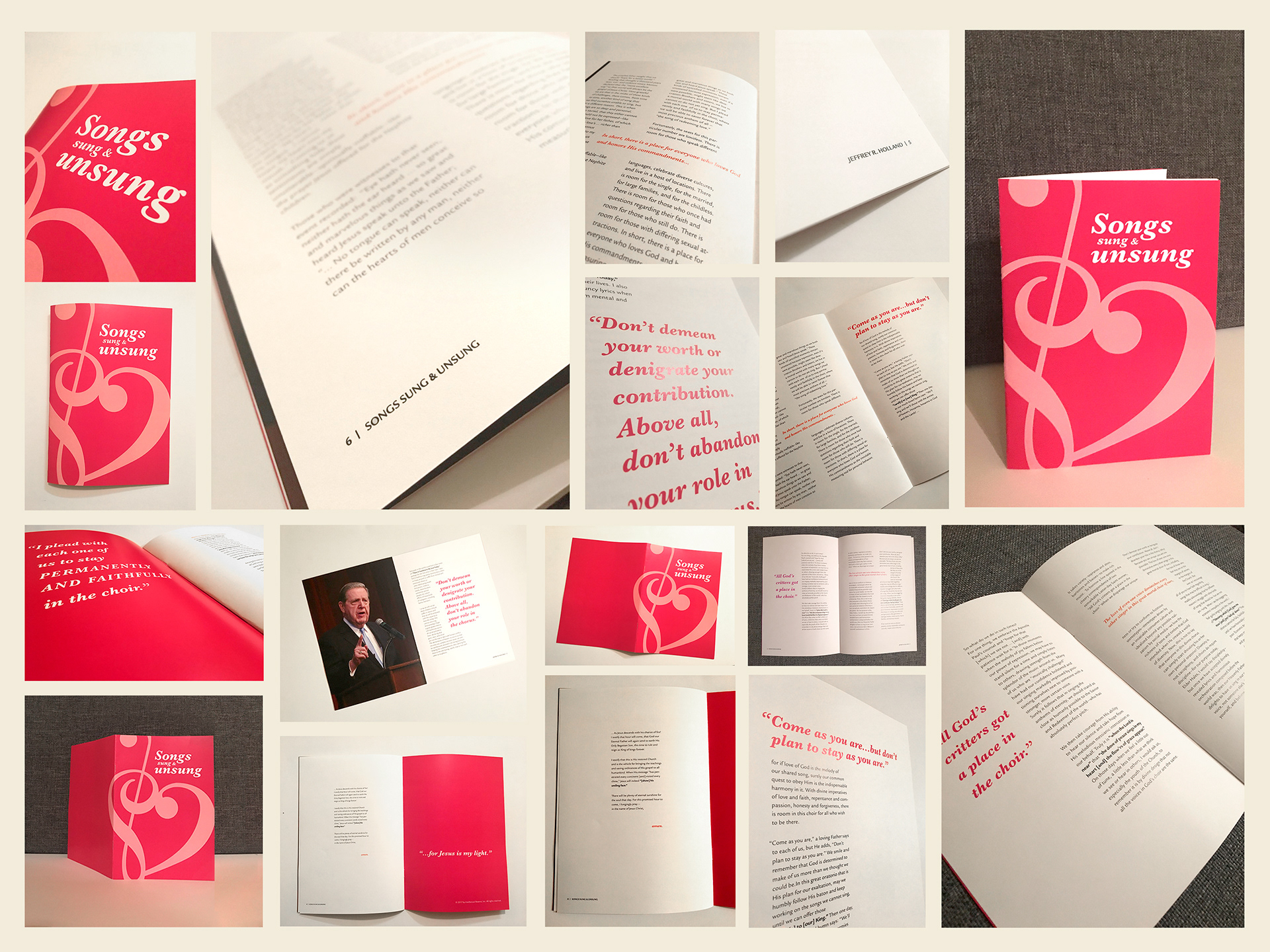
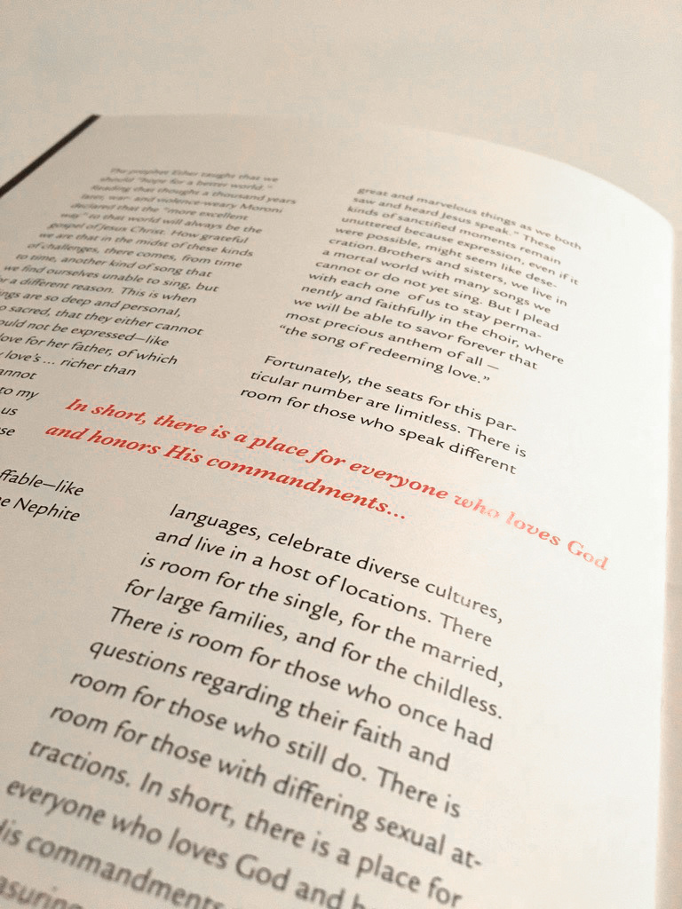
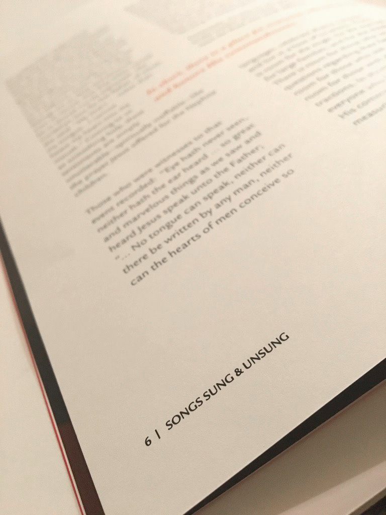
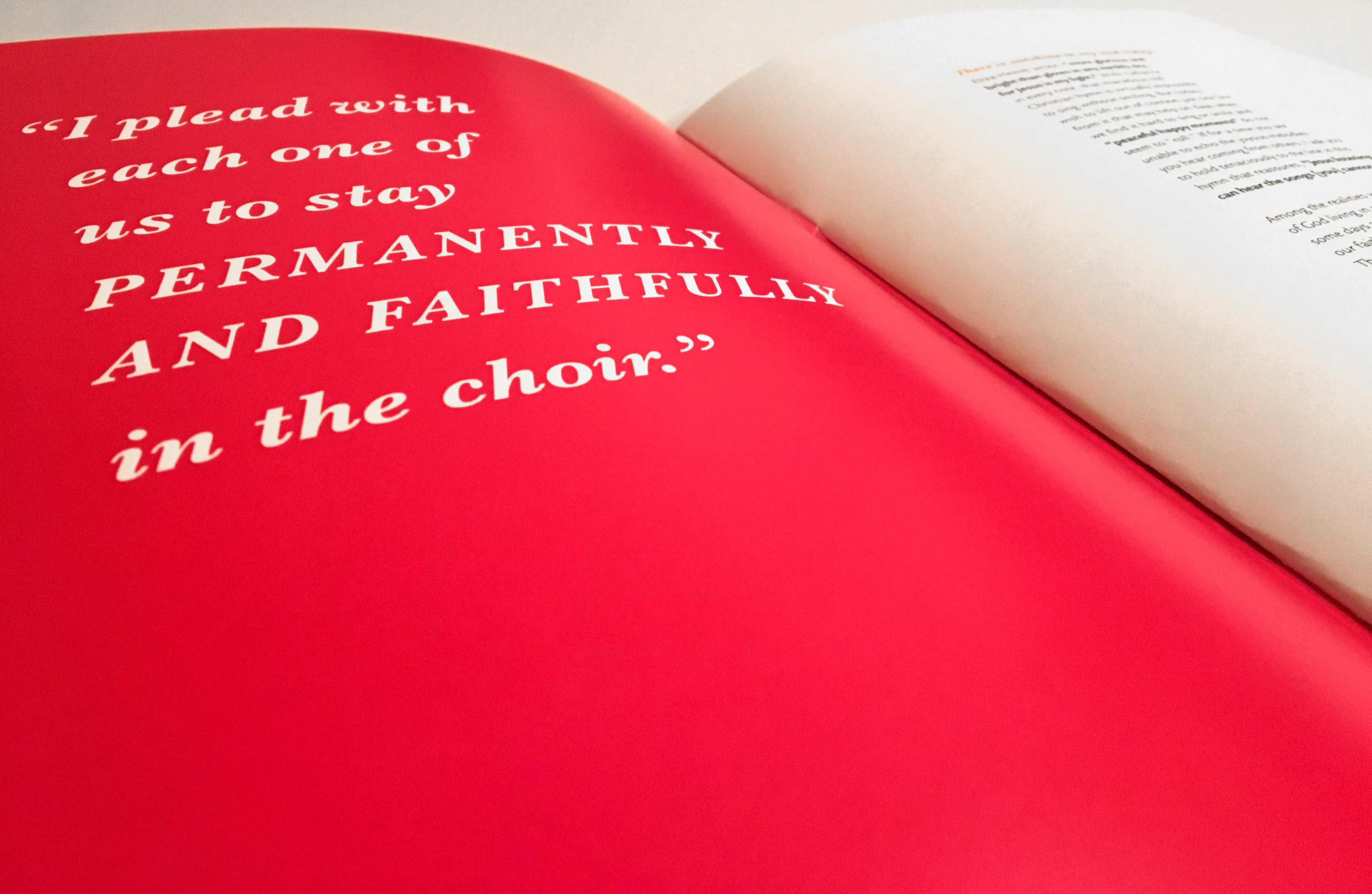
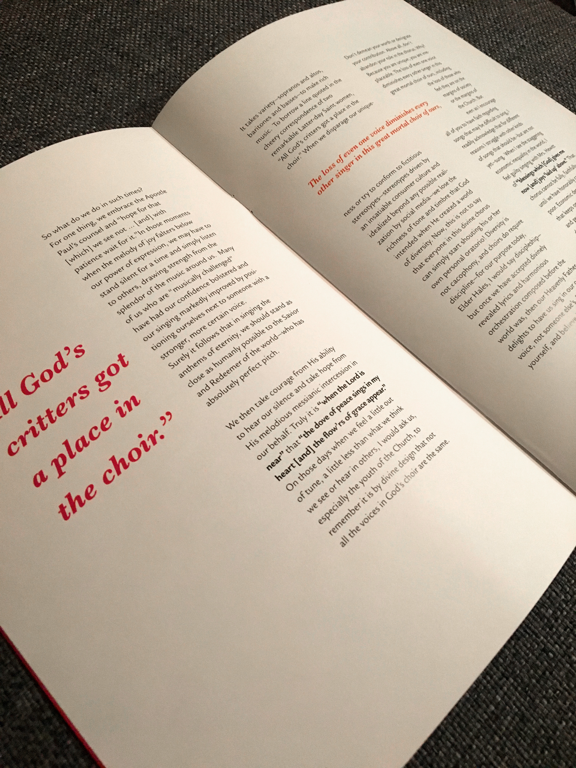
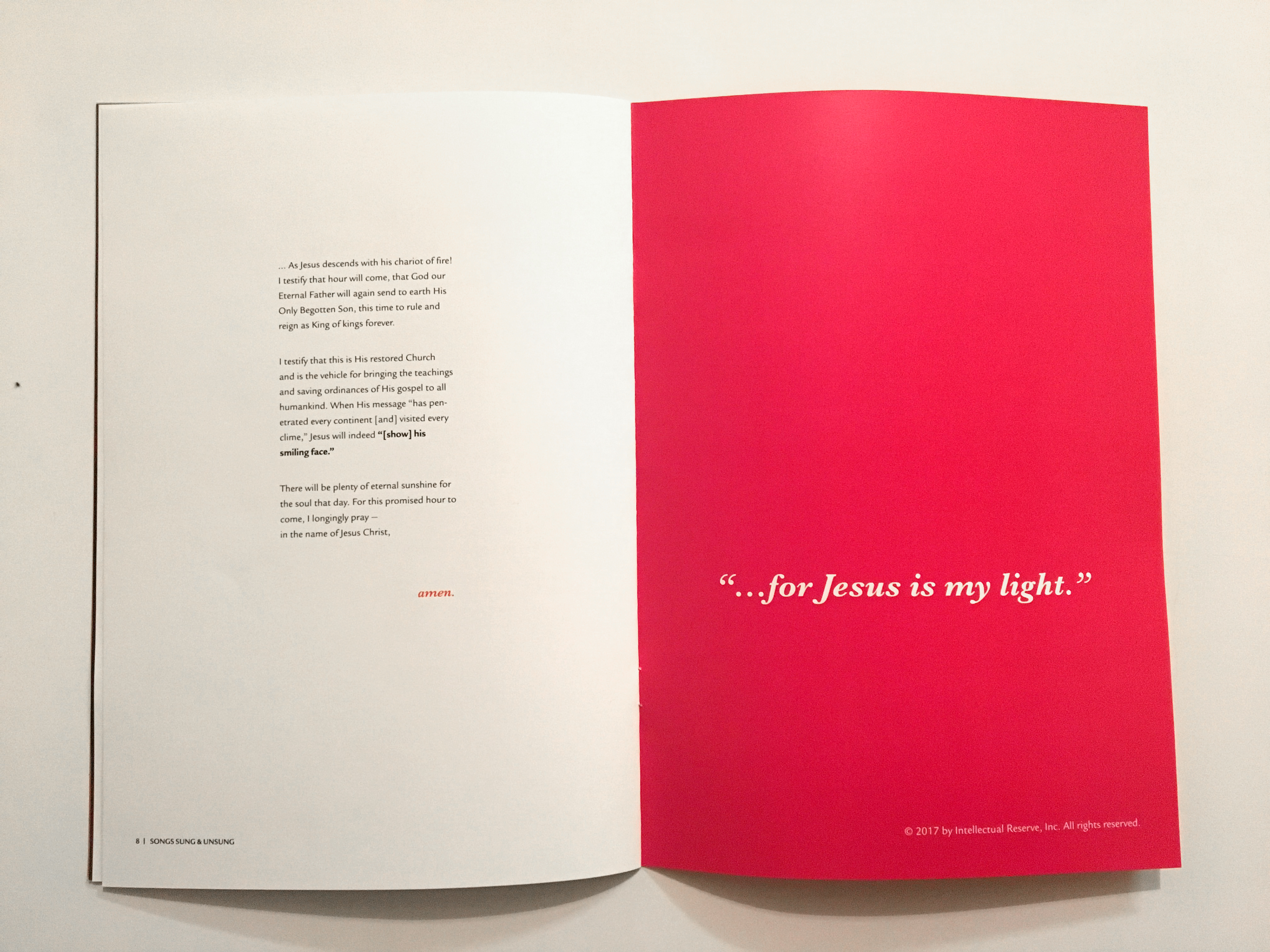
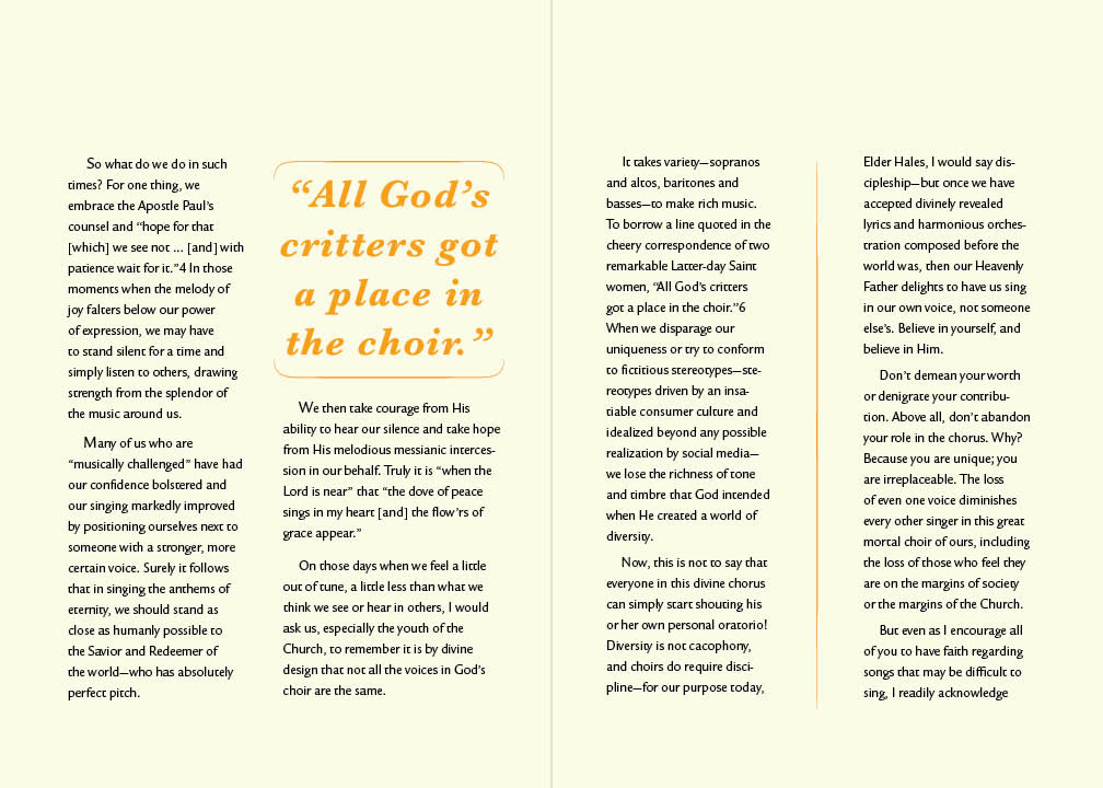
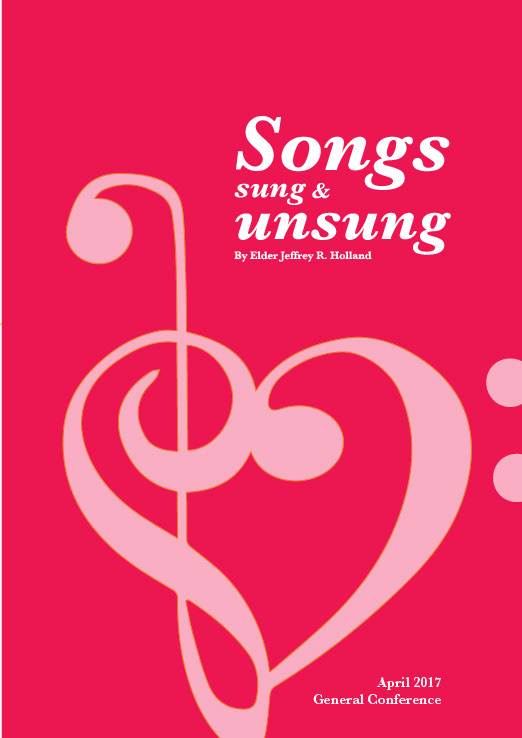
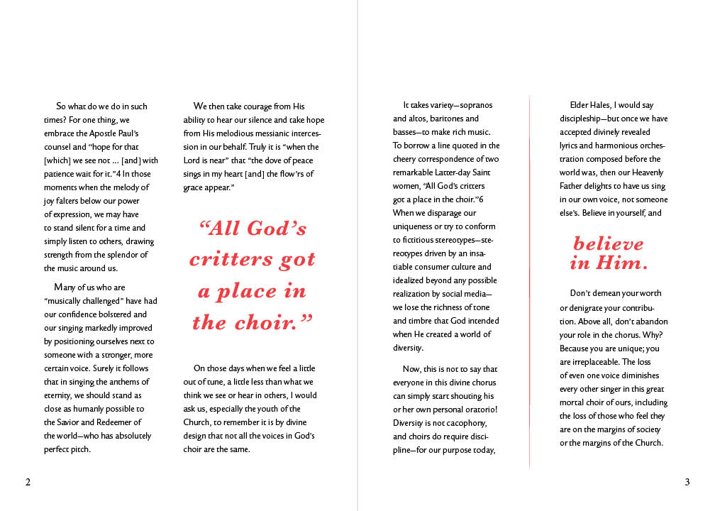
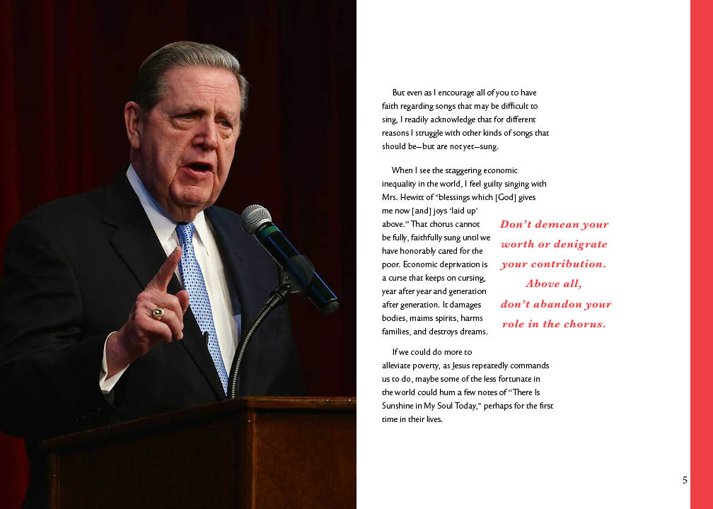
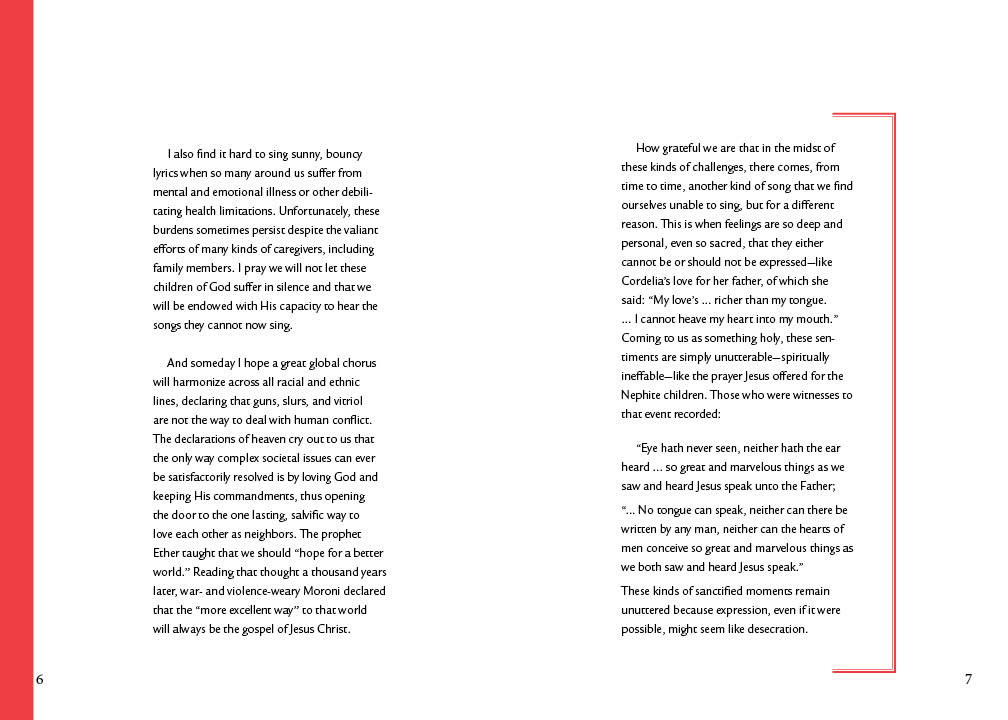
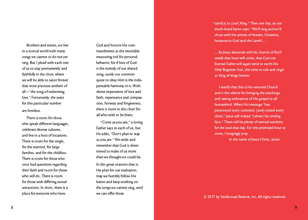
The final composition was much cleaner, and involved very consistent pull-quotes, paragraph leading, and a more professional furniture in the footer.


Overall, this was a really fun project. I feel that I learned a lot about proper layout on a grid though a consistent number of spreads. How to make text interesting within pre-set restrictions, and how to move a reader through engaging content without excessive use of pictures and graphics.