Tasked with building three physical package prototypes for three distinct audiences; Children age 7-10yrs, College Students / Millennials, and Adults age 55+.The goal was to apply good design & typography while telling a visually compelling story.
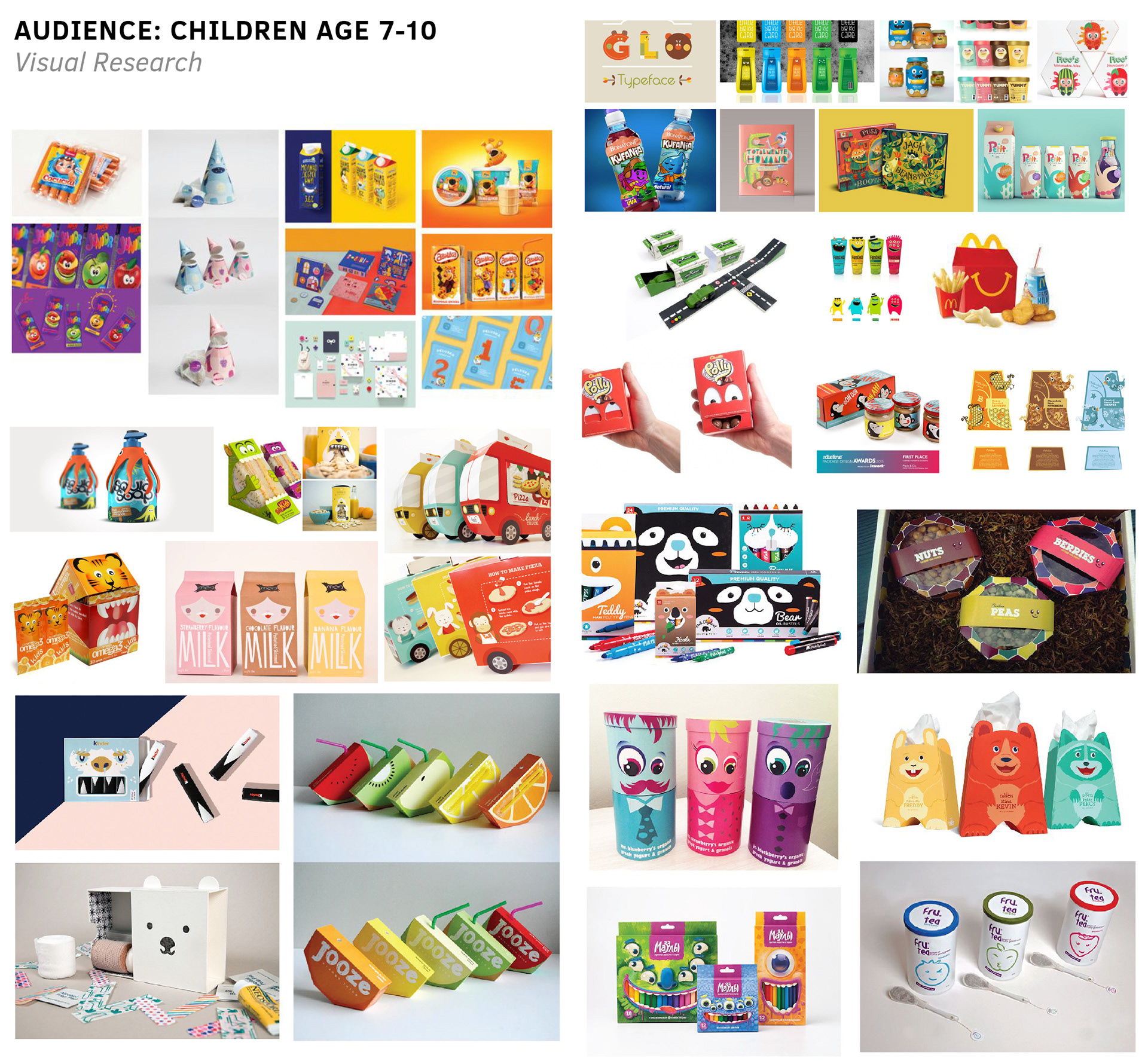
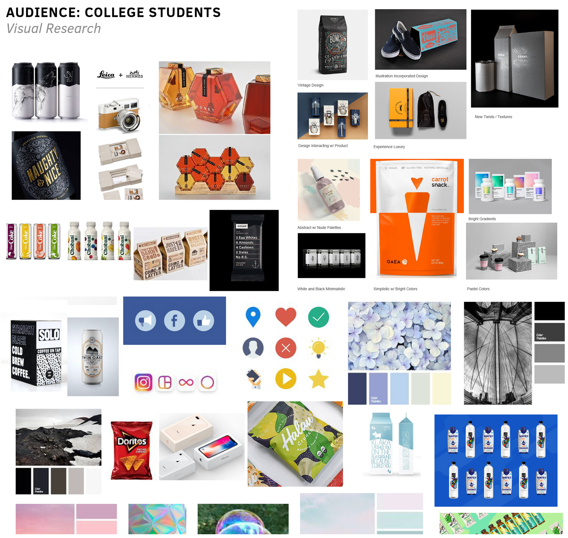
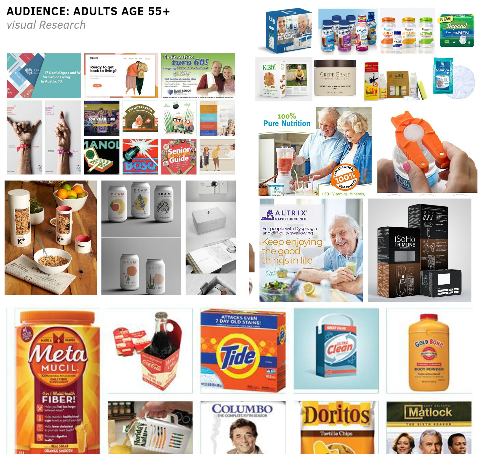
VISUAL RESEARCH
As a group we collaborated on visual research to better understand our audiences according to visual appeal and cultural conventions.
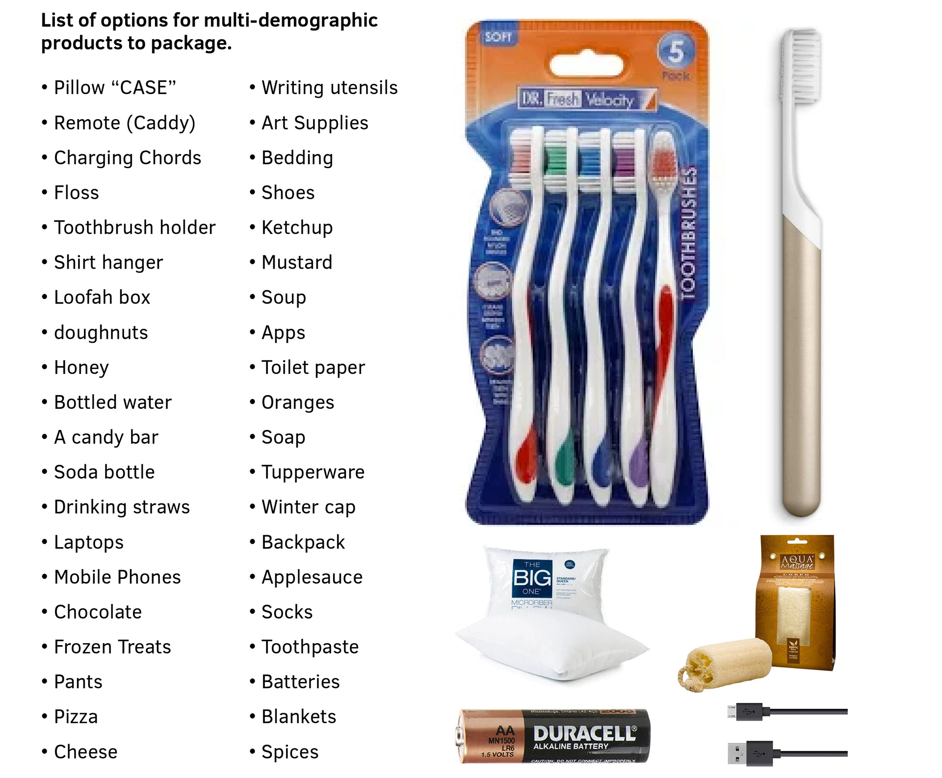
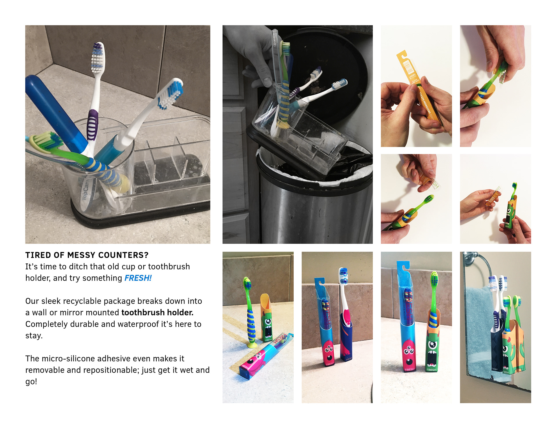
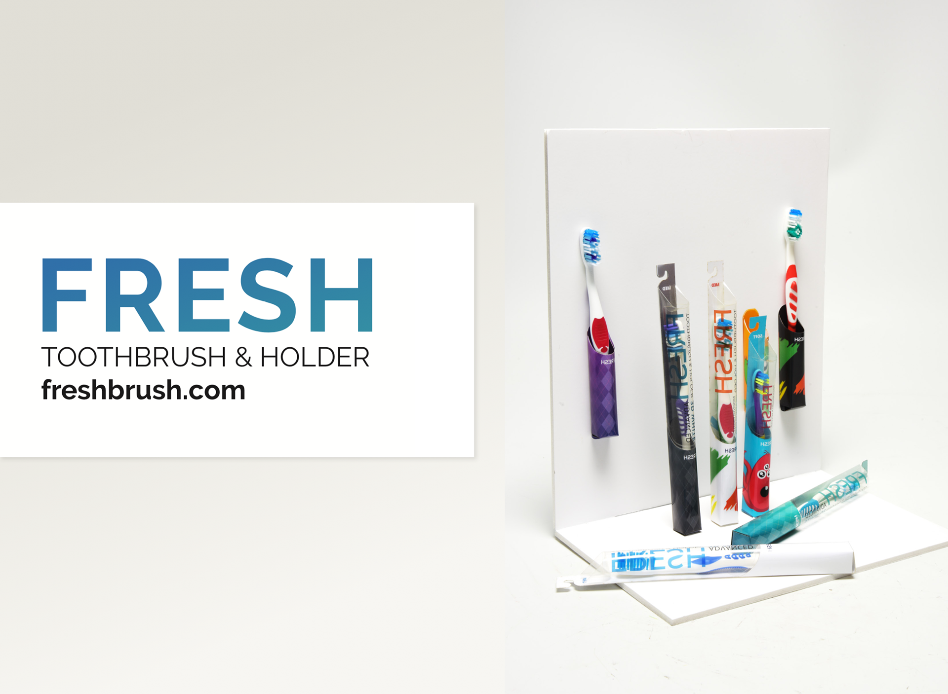
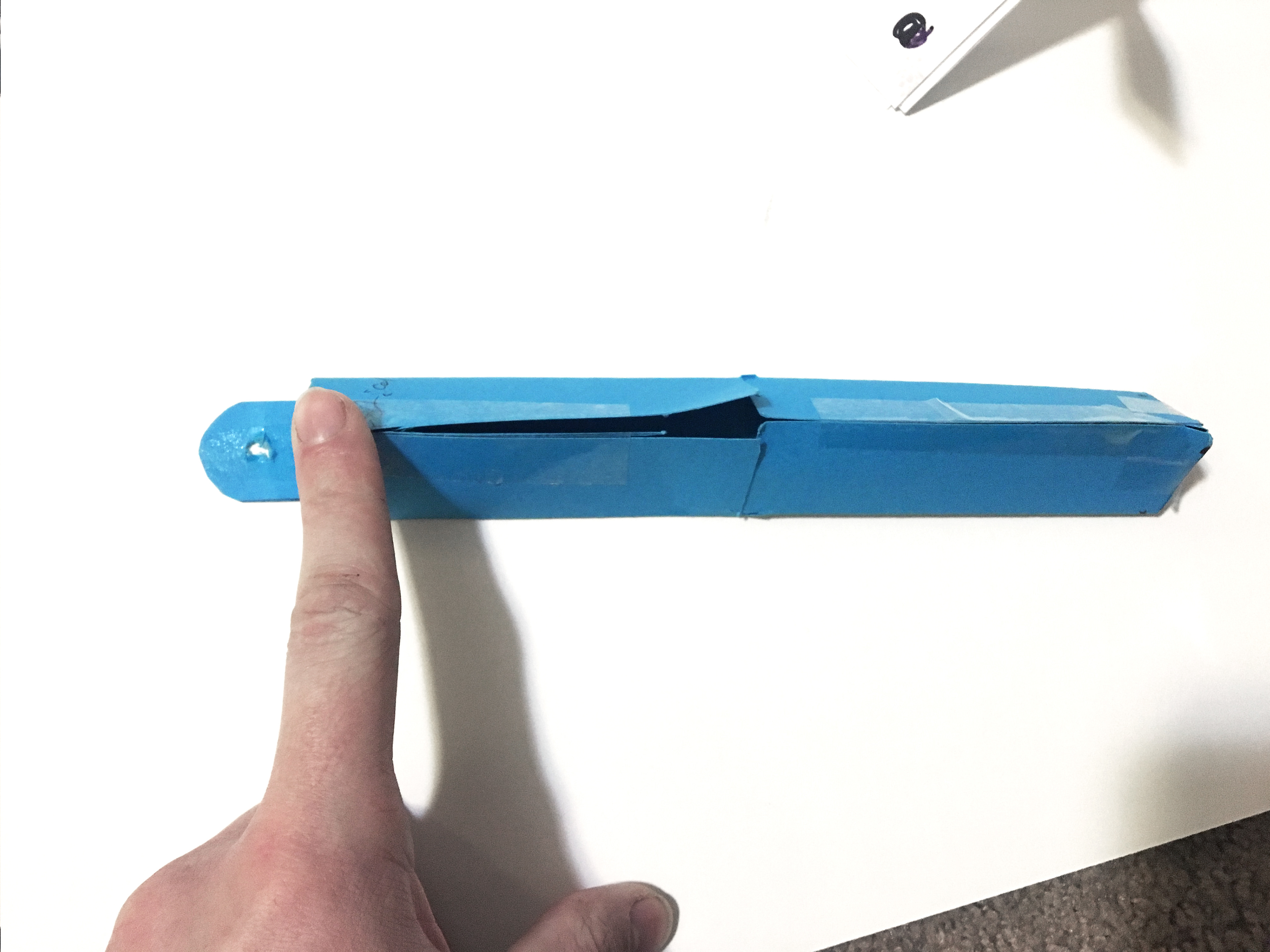
After considering a handful of different options I settled on a toothbrush. I further resolved to design a package that was responsible in that it would be reusable or have some other function outside of simply protecting, transporting and presenting the product.
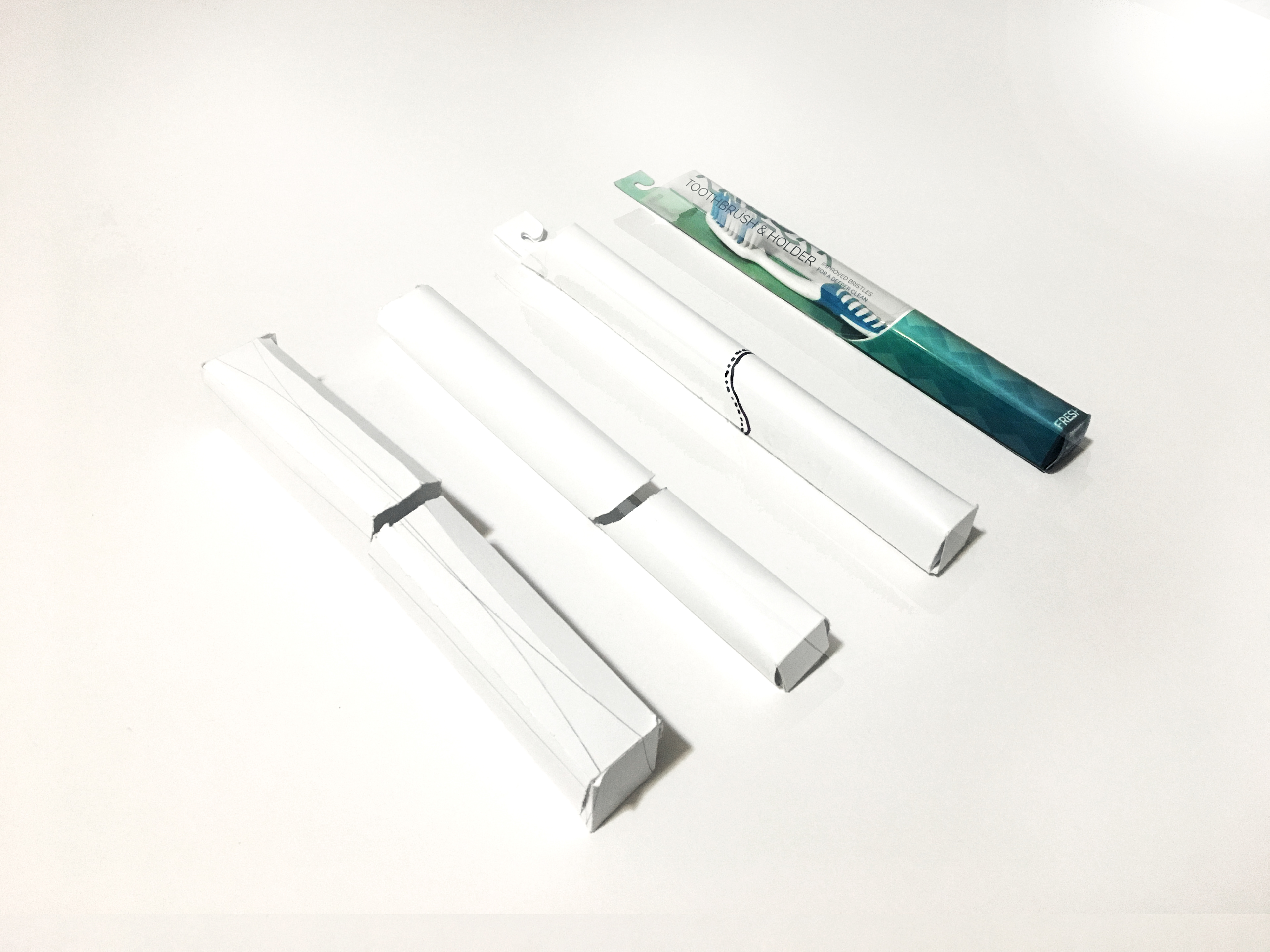
FORM EXPLORATION
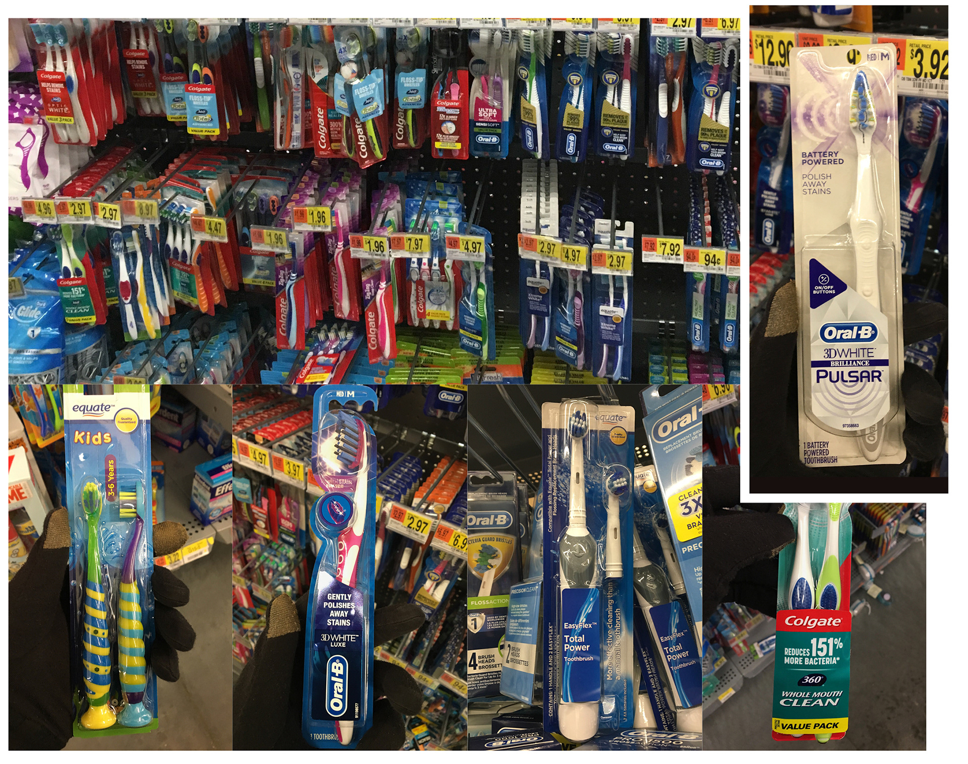
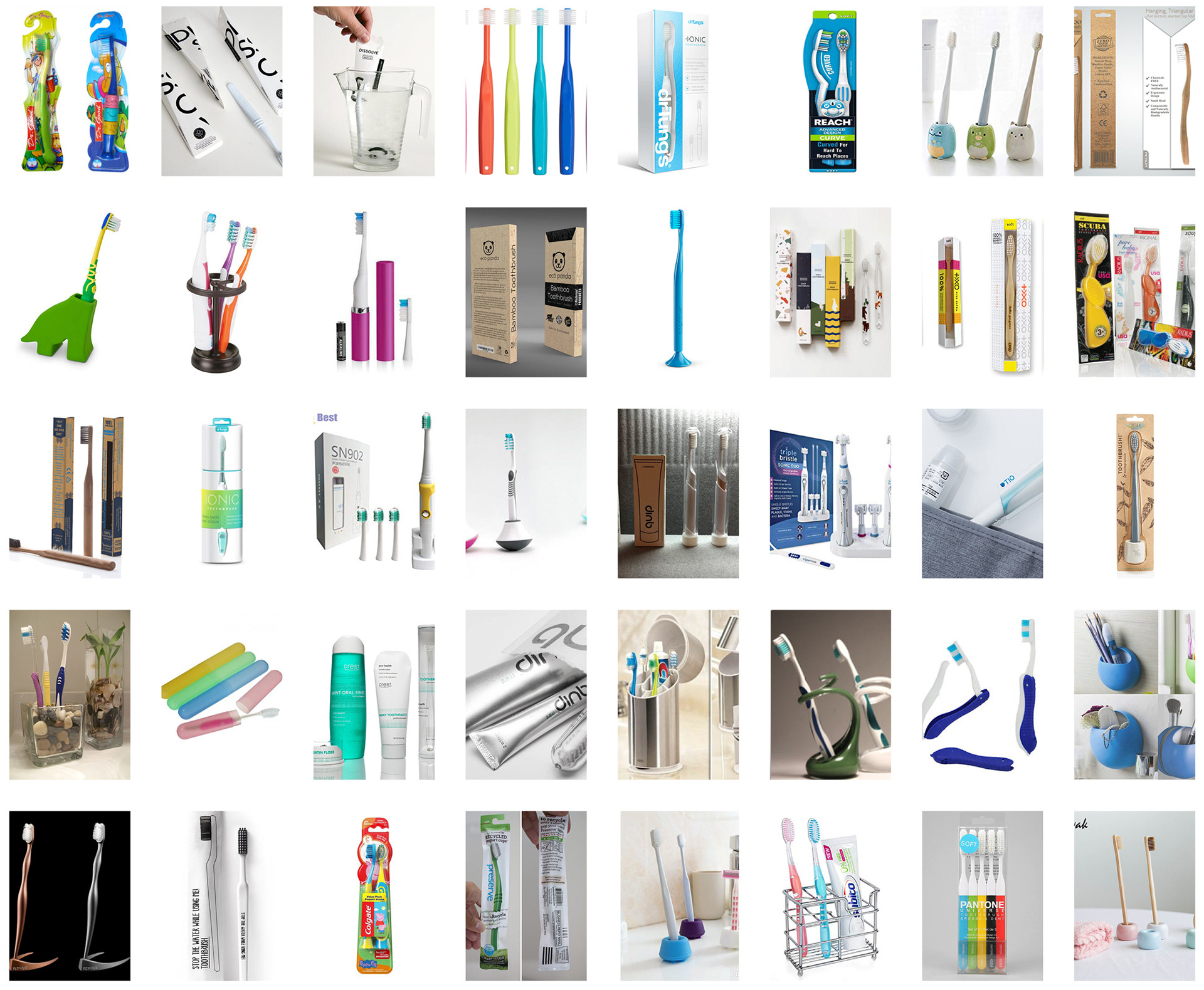
After exploring the current packaging for toothbrushes, I started looking into other ways to present the project, that would be more beneficial for the
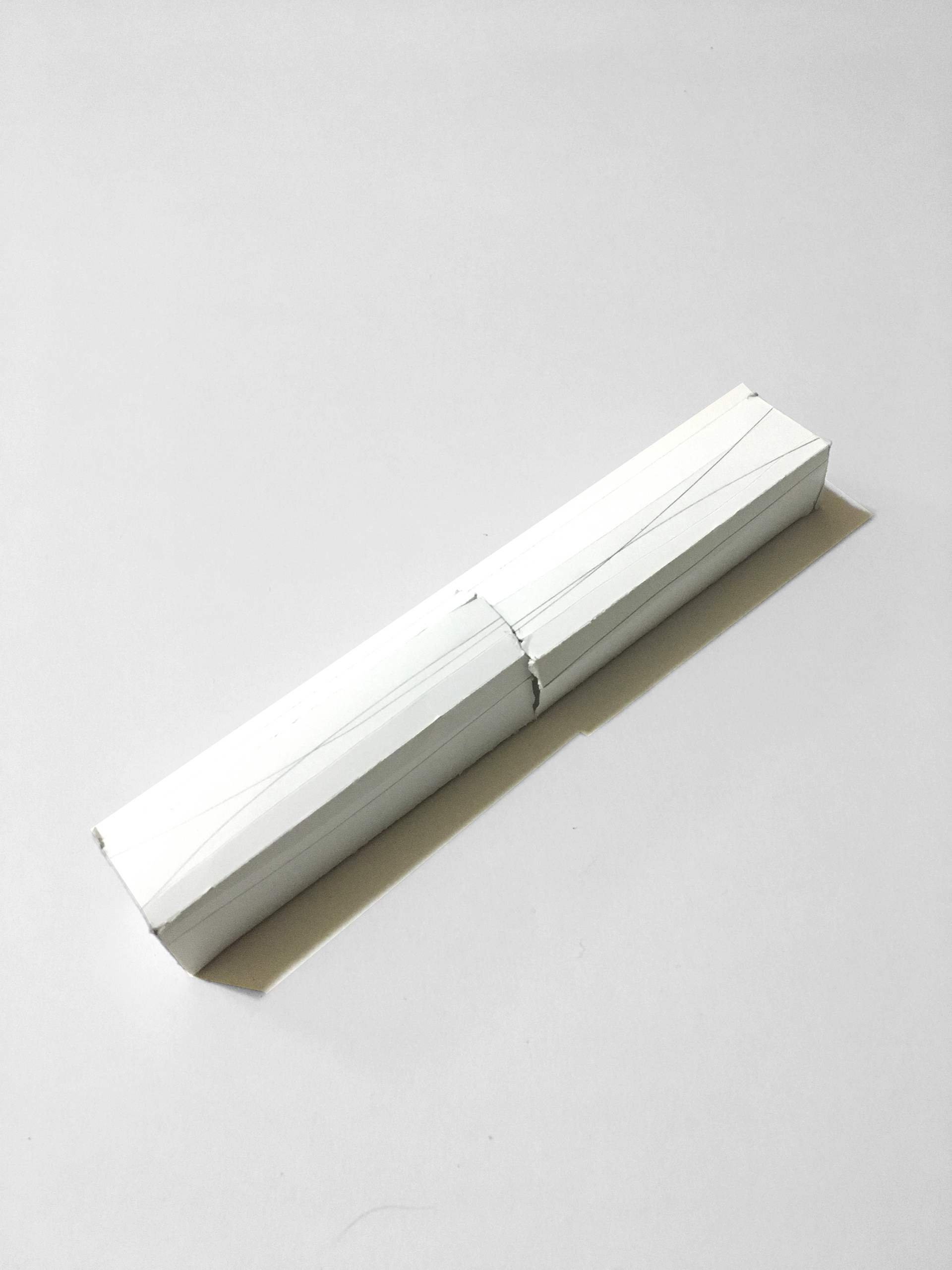
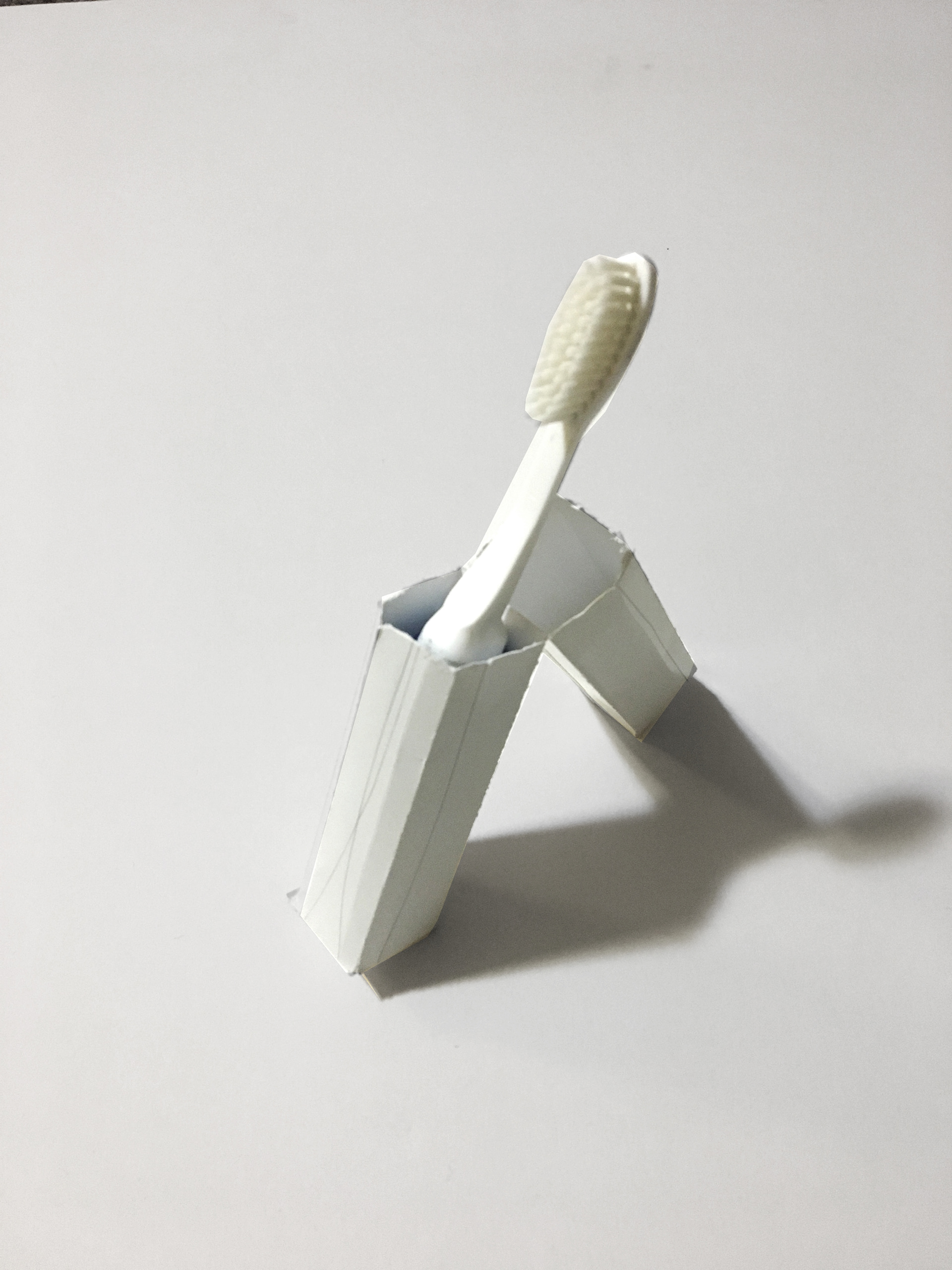
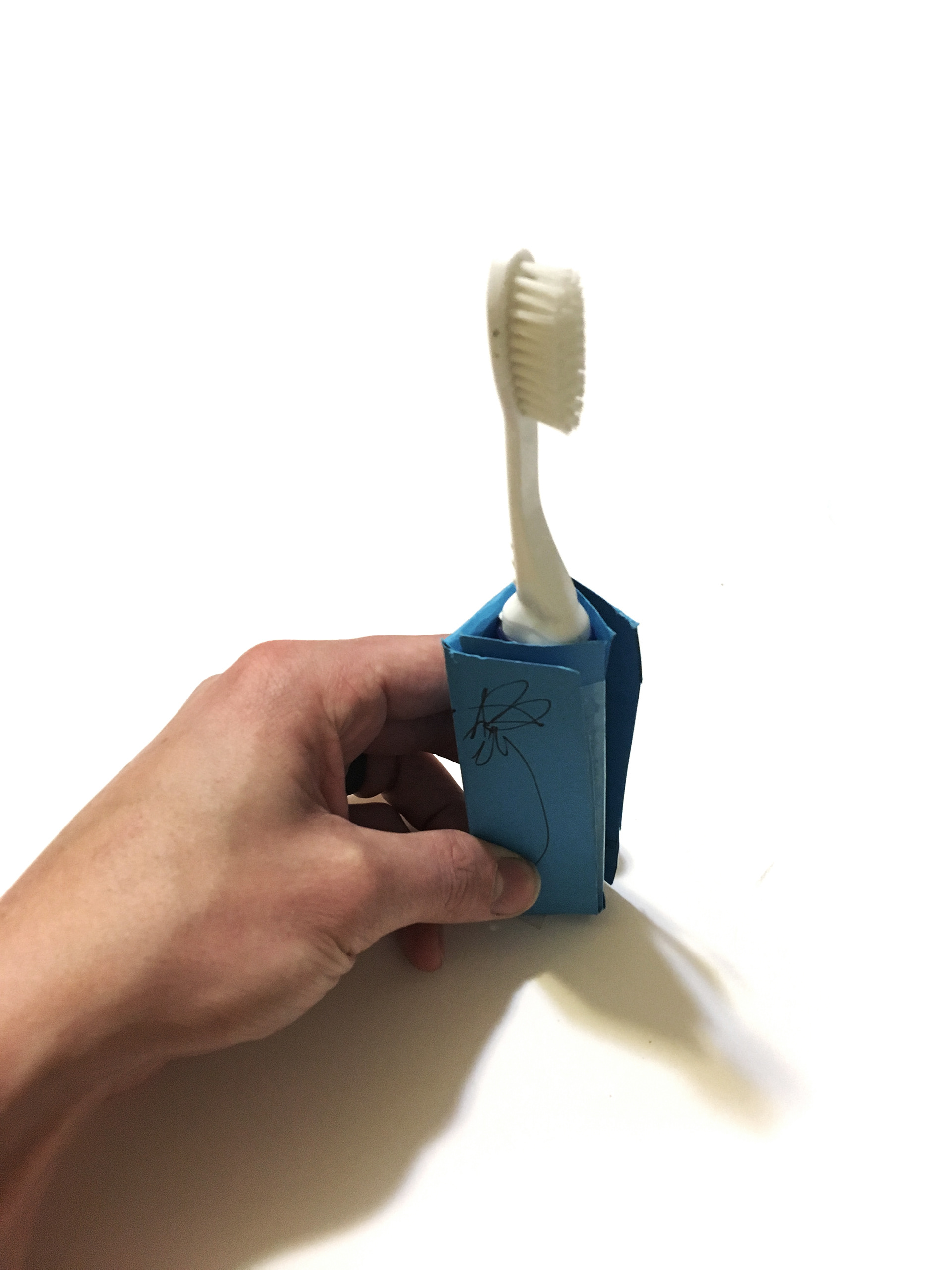
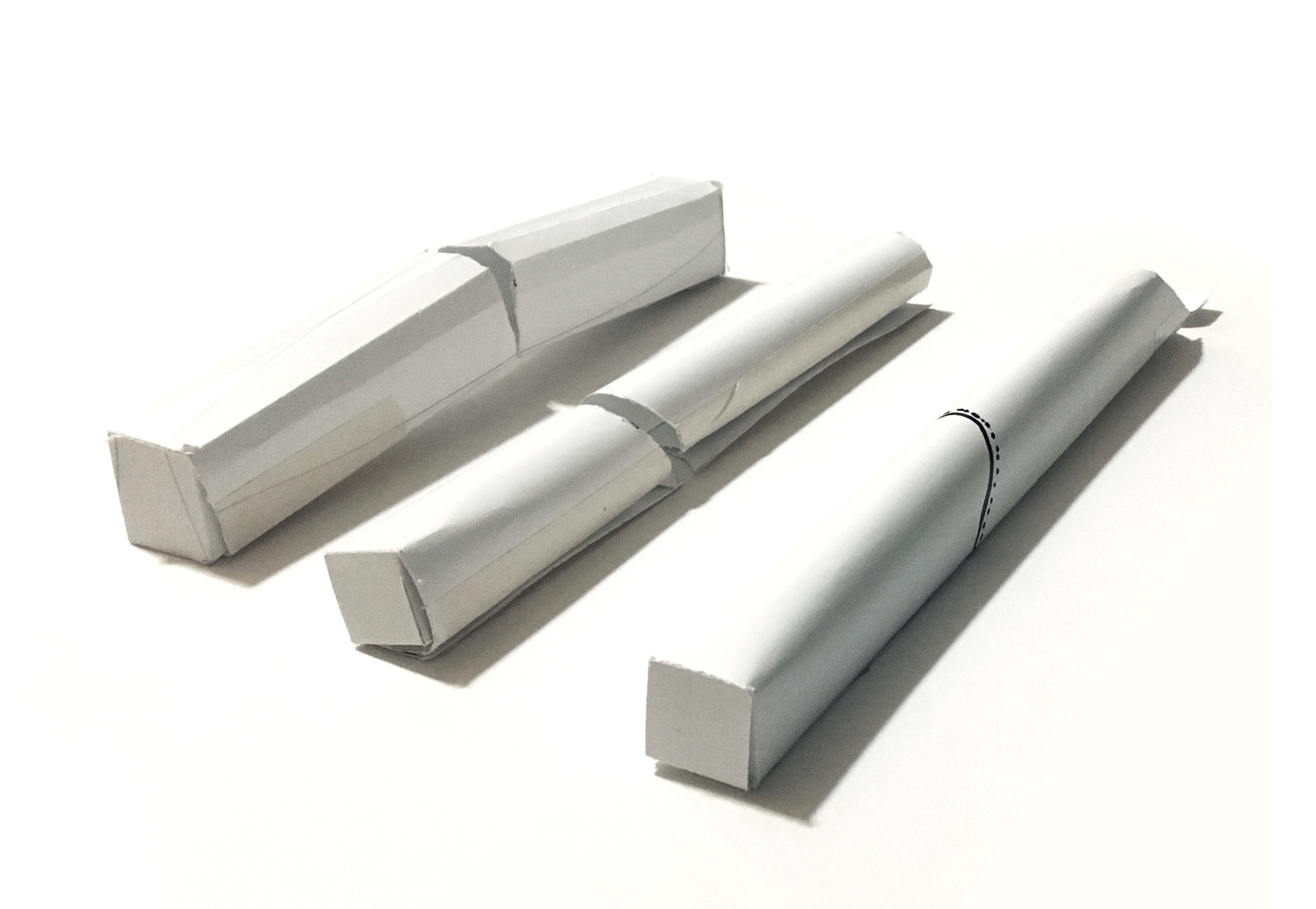
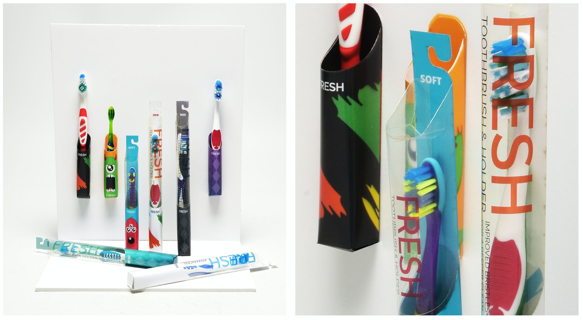
I decided to go with a form that was cylindrical with a flat back to improve shelving and palleting, as well as add durability and the affordance of mirror or wall mounting. The intention was to have a package that could double as a mounted toothbrush holder.
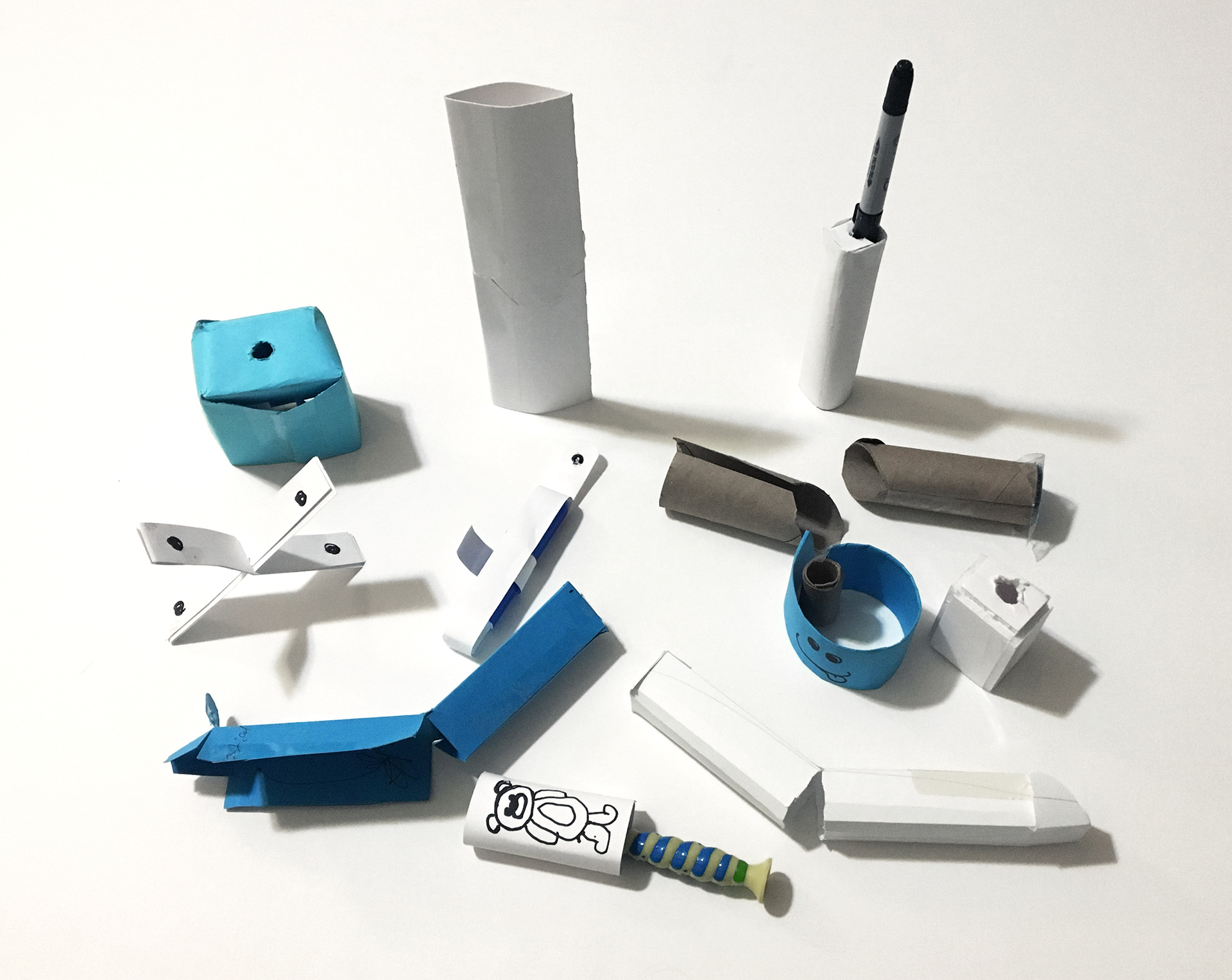
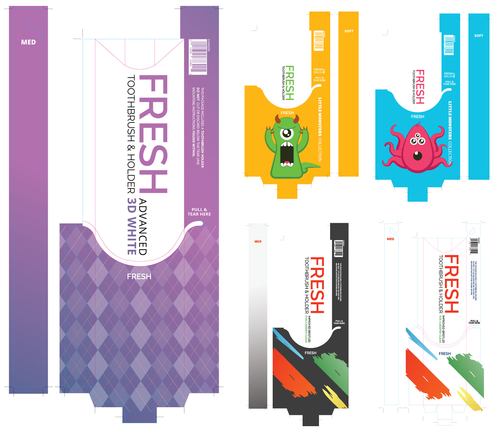
DECORATION DRAFTS
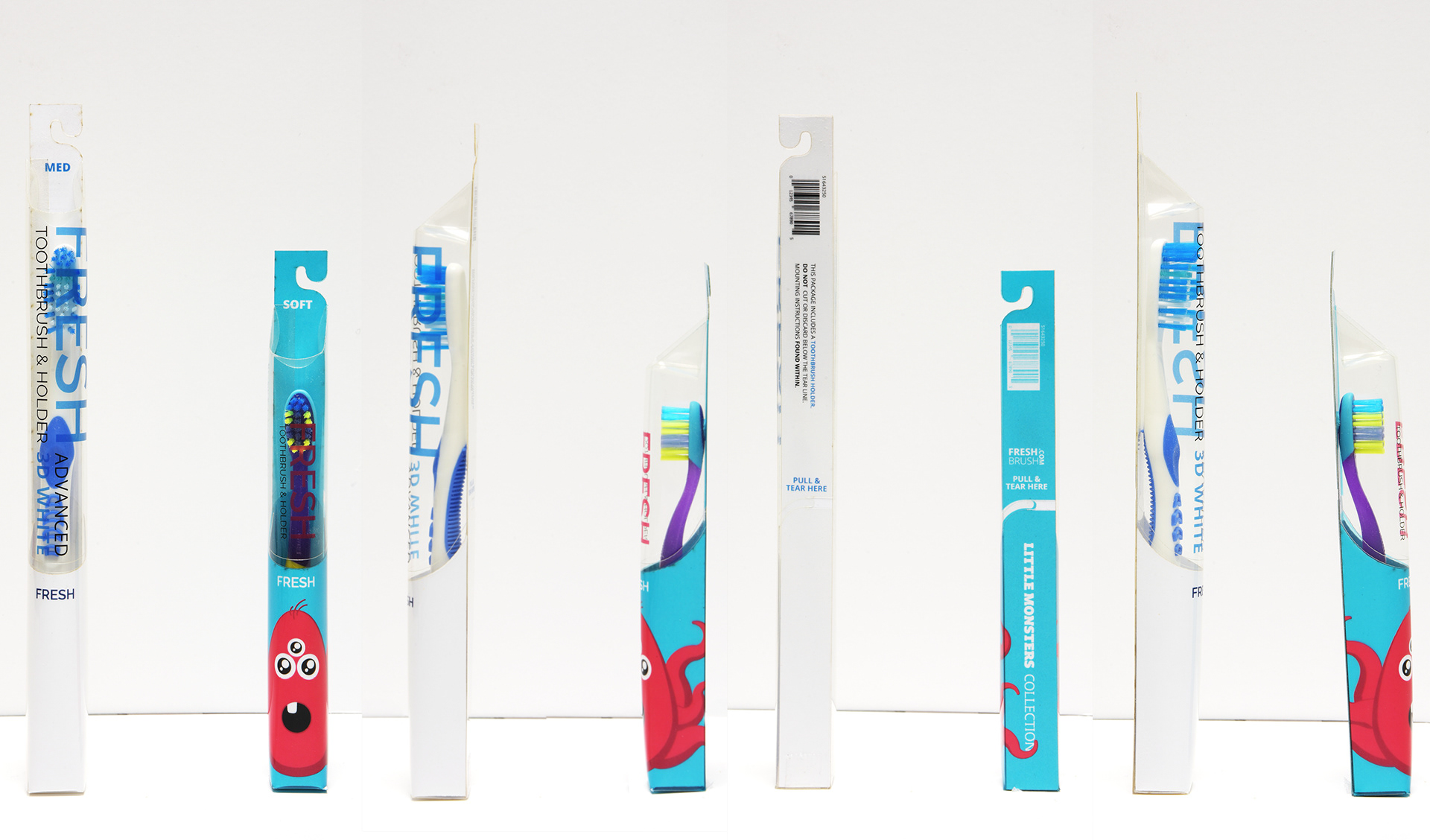
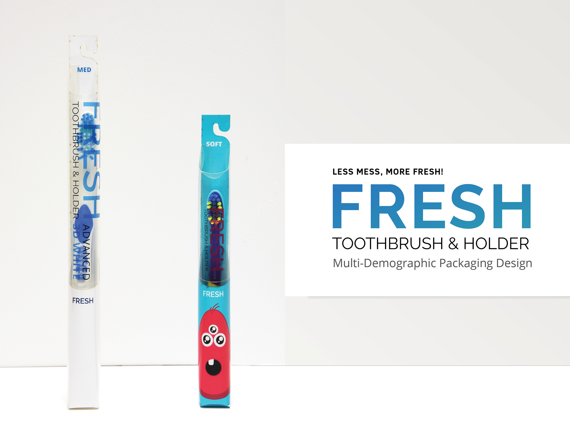
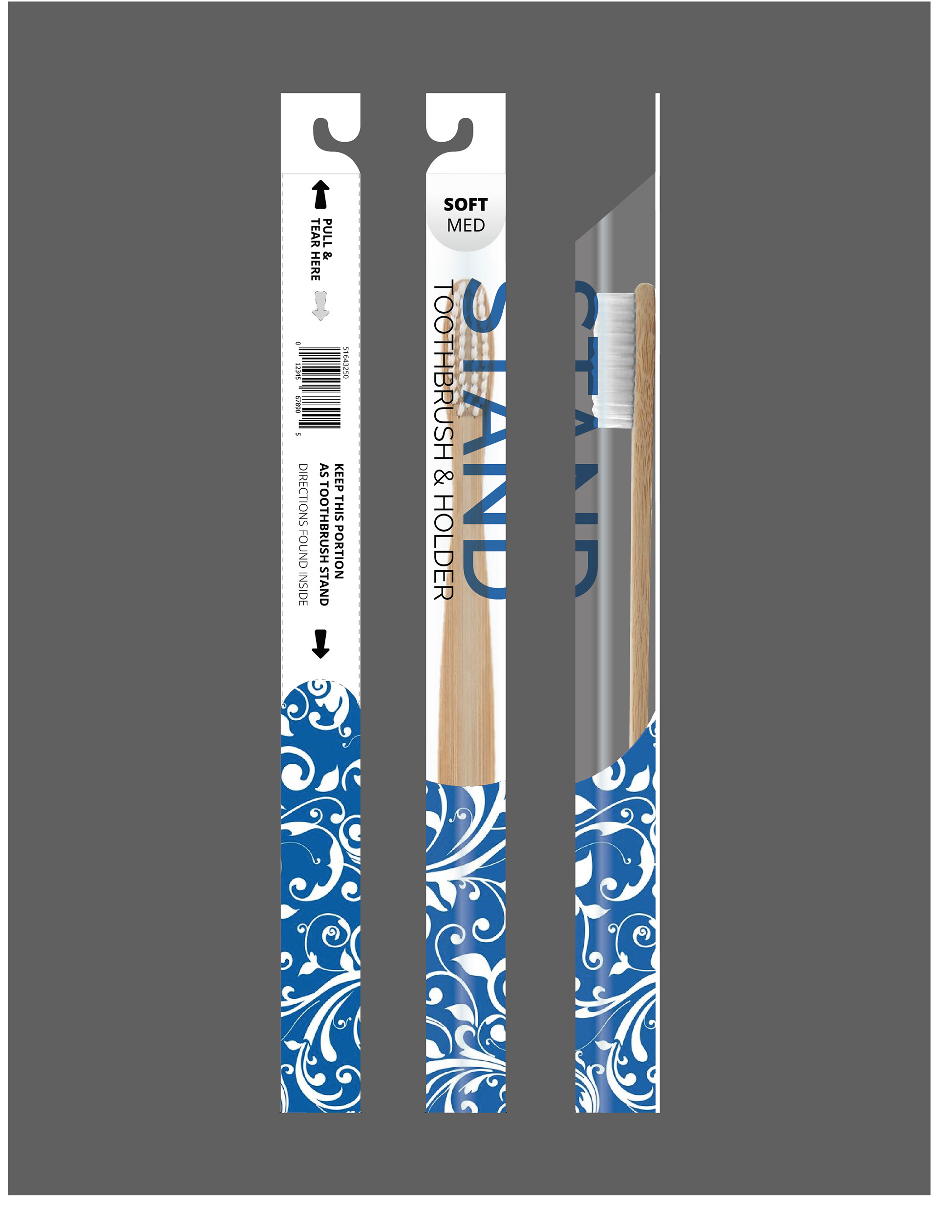
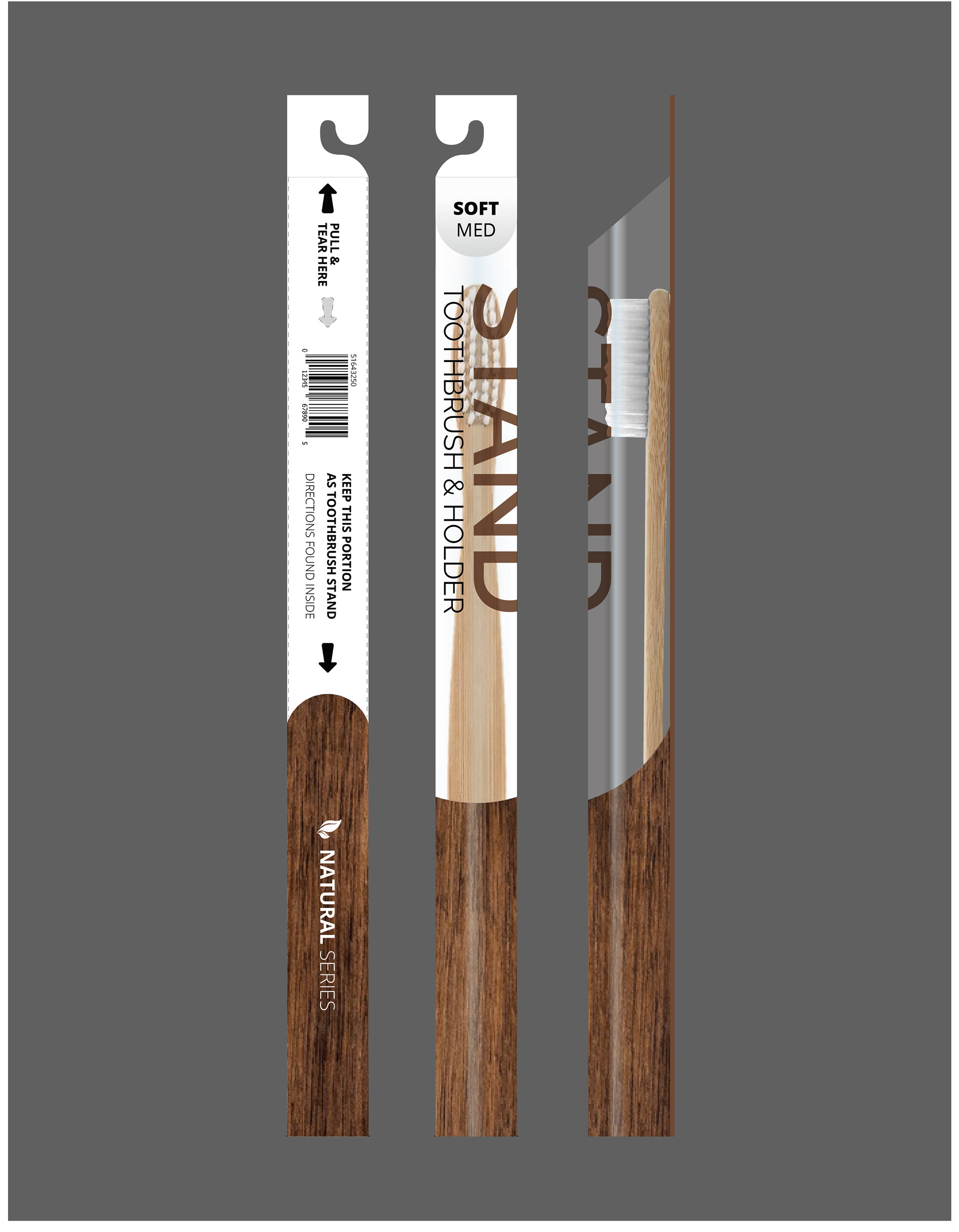
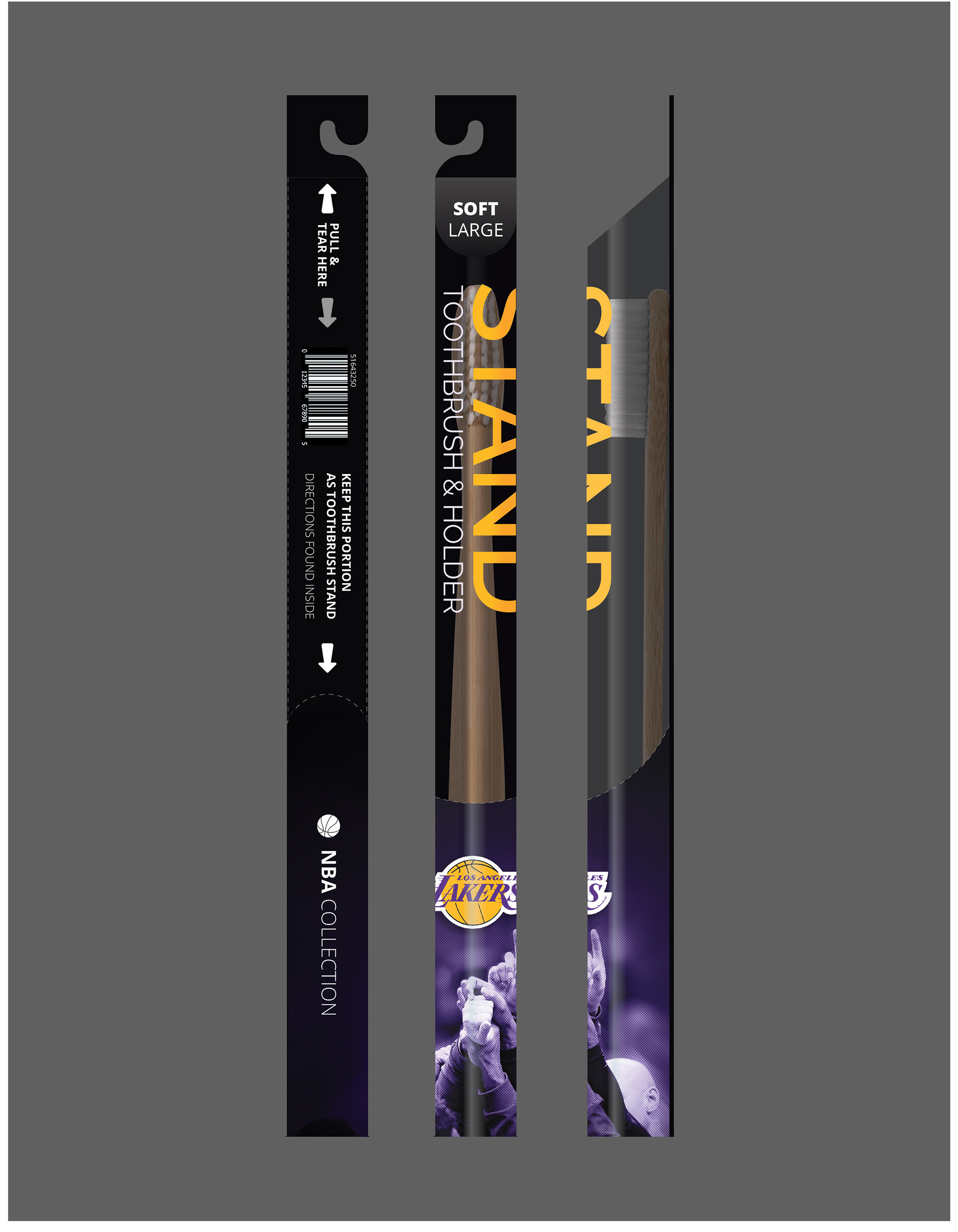
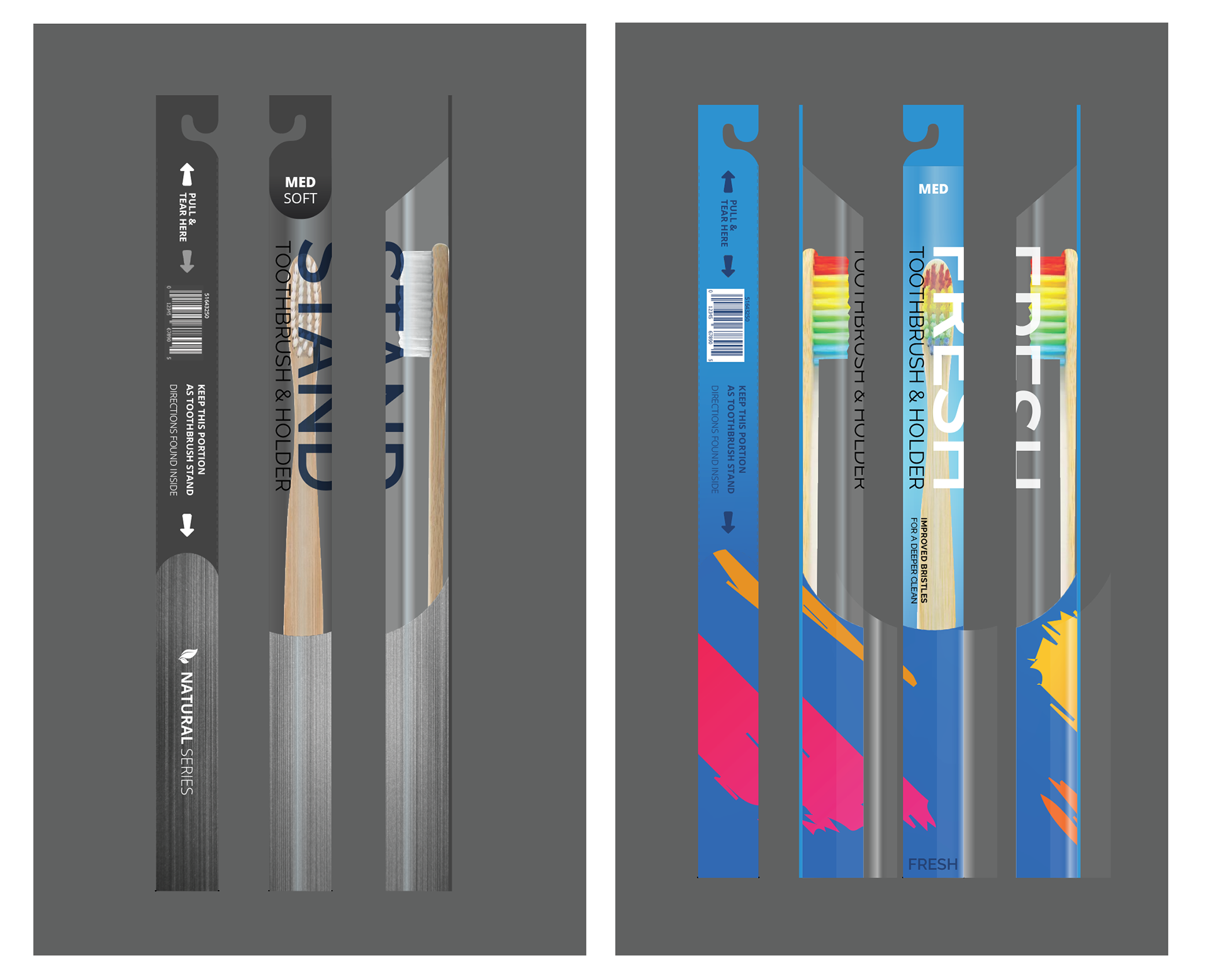
Having considered all the various package designs that I saw I wanted to create something that was visually attractive, but also affordable. The images on the left were targeted to older audiences, while the images on the right are aimed at college students and children.
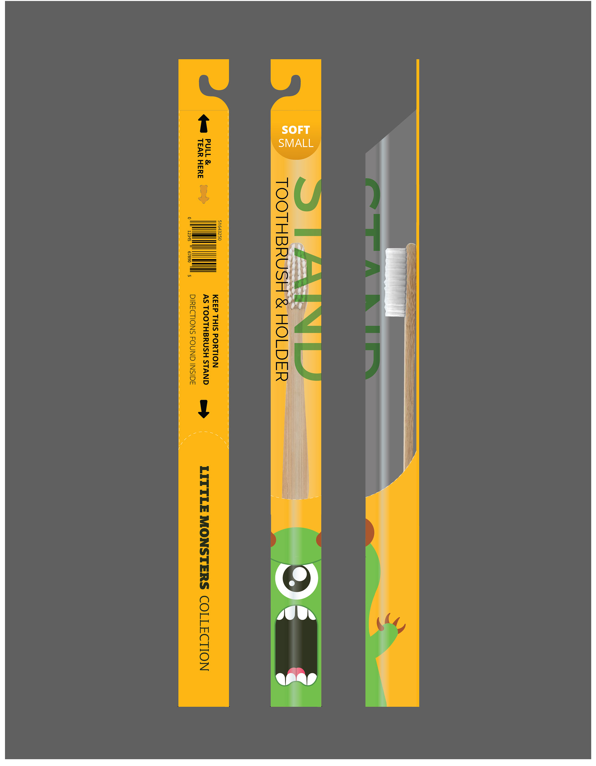
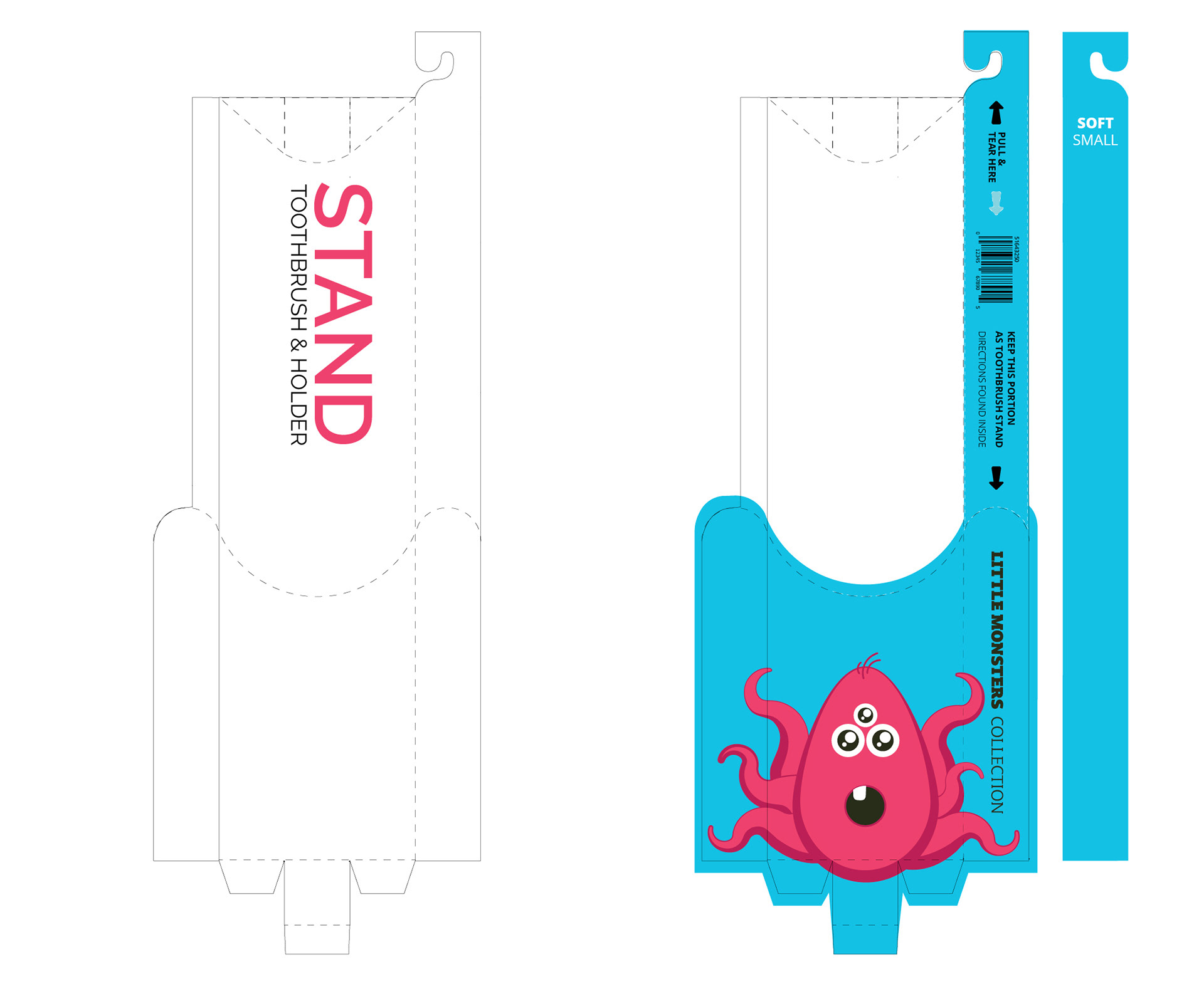
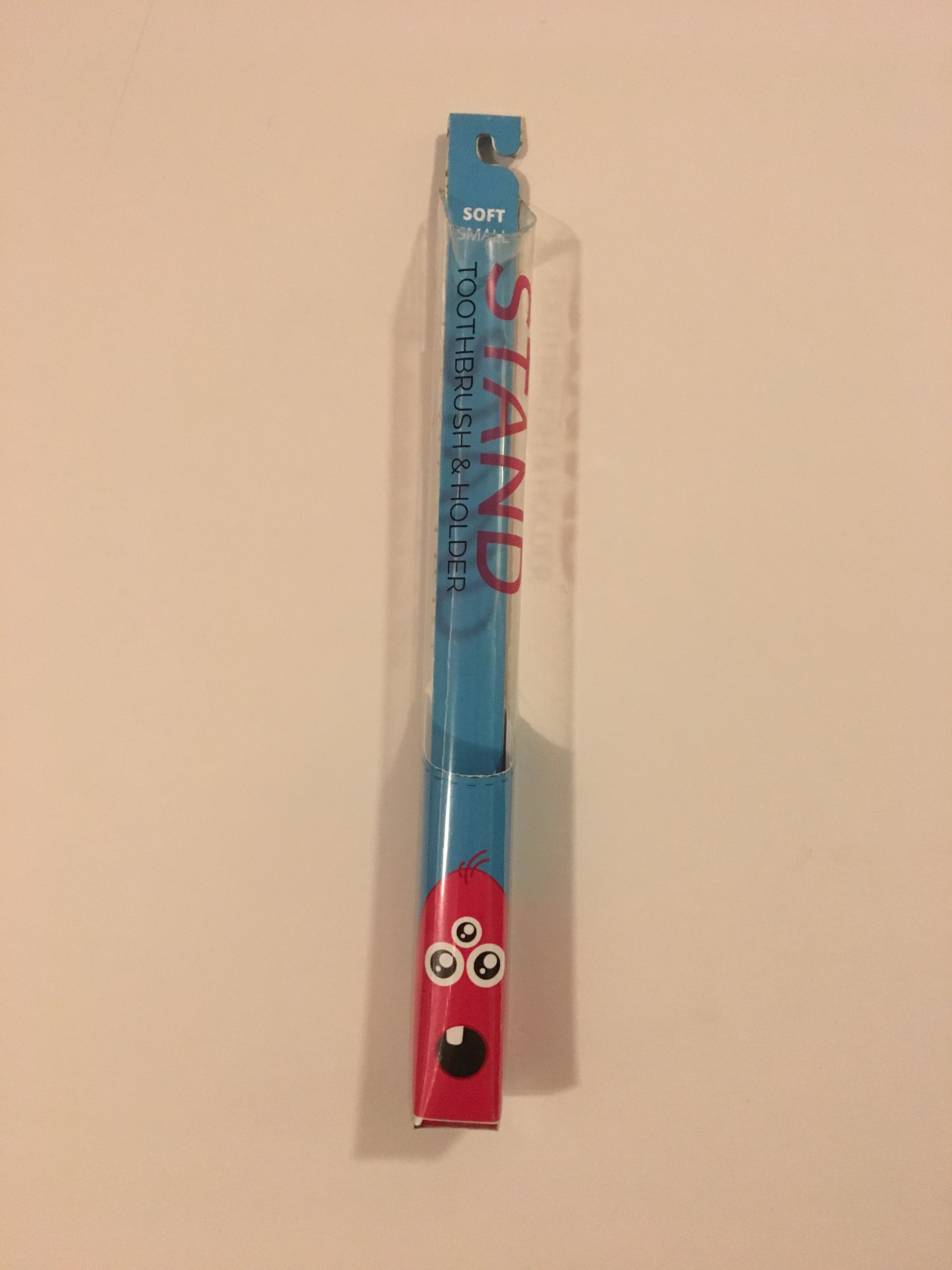
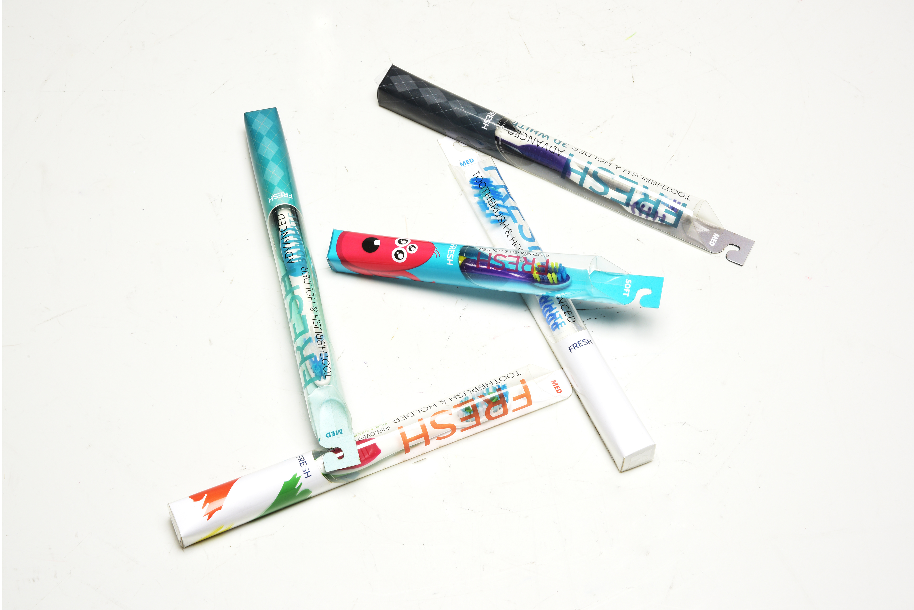
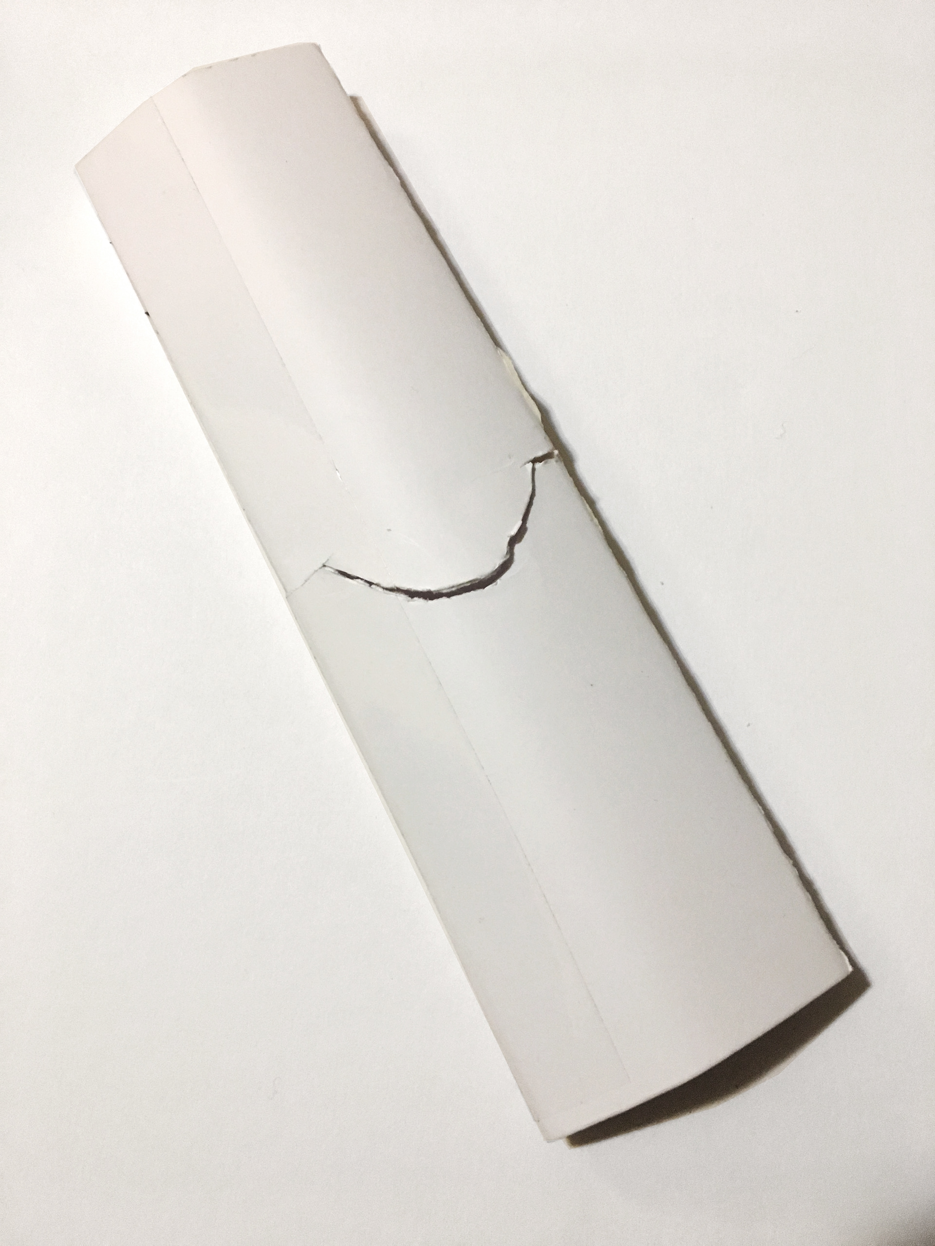
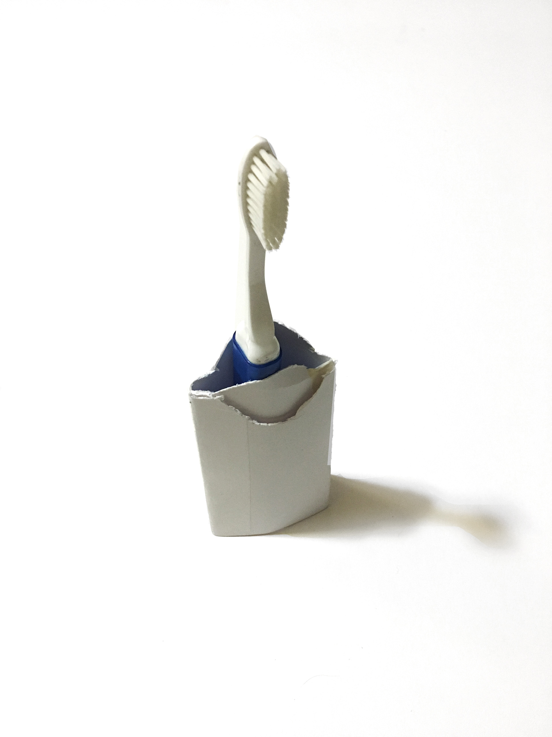
After building the physical prototype I realized a few things. First, I noticed that I needed to make the Kids packages smaller to accommodate a smaller brush. Second, the brand name was not as successful as I thought it would.
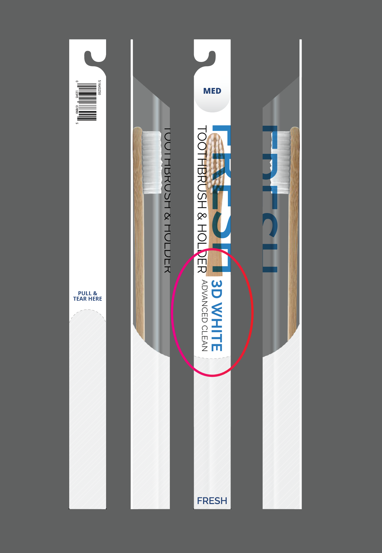
FINAL DECORATION
FINAL PRODUCT
Having considered all the various package designs that I saw I wanted to create something that was visually attractive, but also affordable. The images on the left were targeted to older audiences, while the images on the right are aimed at college students and children.