
Soyini, inspired by her childhood memories in Guyana and her family's love for gardening, channels her passion for art and design into Yinibini Baby, offering handcrafted organic cotton clothing and accessories that tell stories, fostering imagination and play for children. Soyini asked me to improve her home page, about page, and purchasing/payment processing, by providing customers with seasonal recommendations and a more clean and accessible experience.
Taking into consideration the fact that these items would be hand-selected,
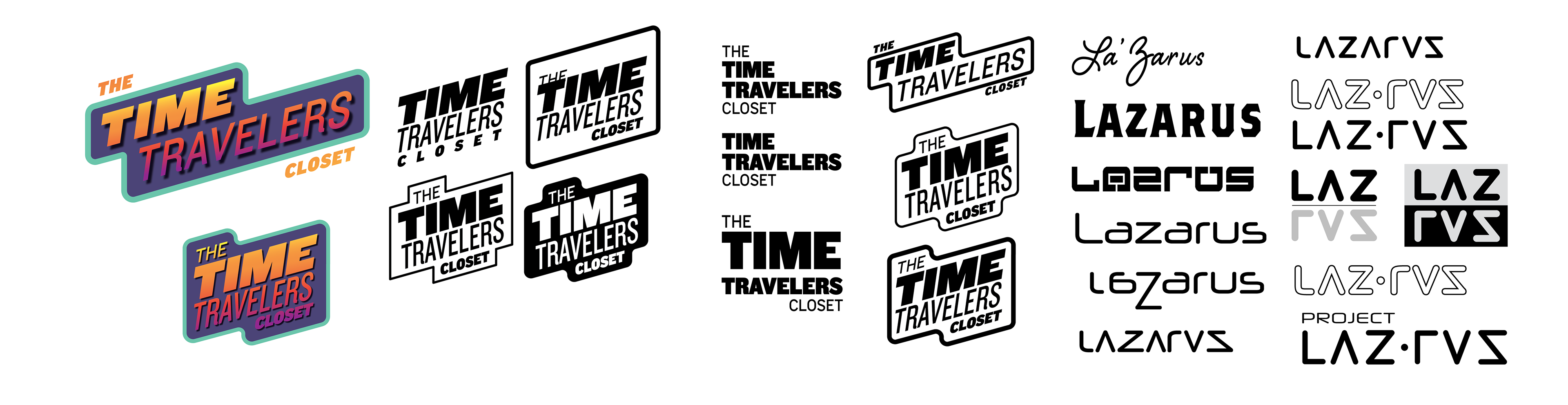
I explored a variety of options that would exhibit the various era's and decades these items might span.
I explored a variety of options that would exhibit the various era's and decades these items might span.
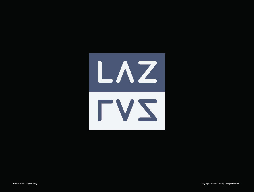
As part of that process I also explored potential names that might better express the nature of a revitalized clothing store.
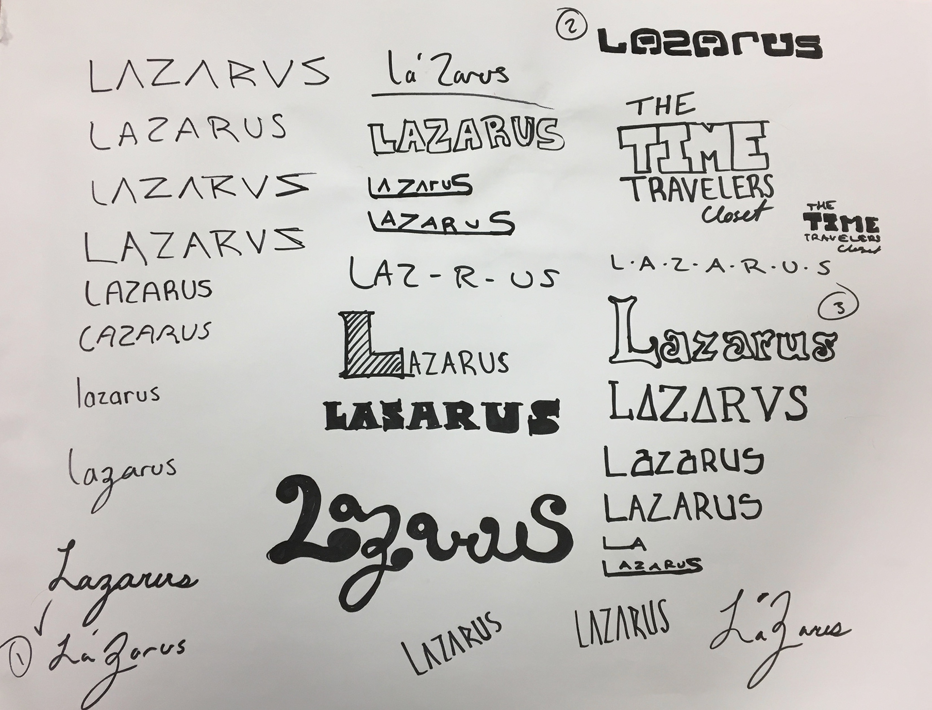
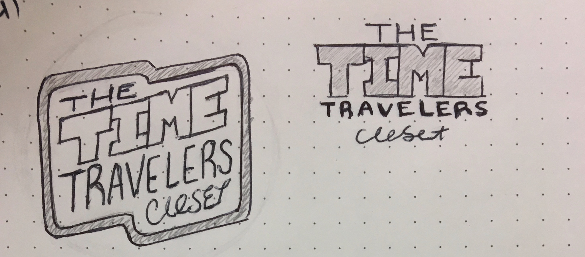
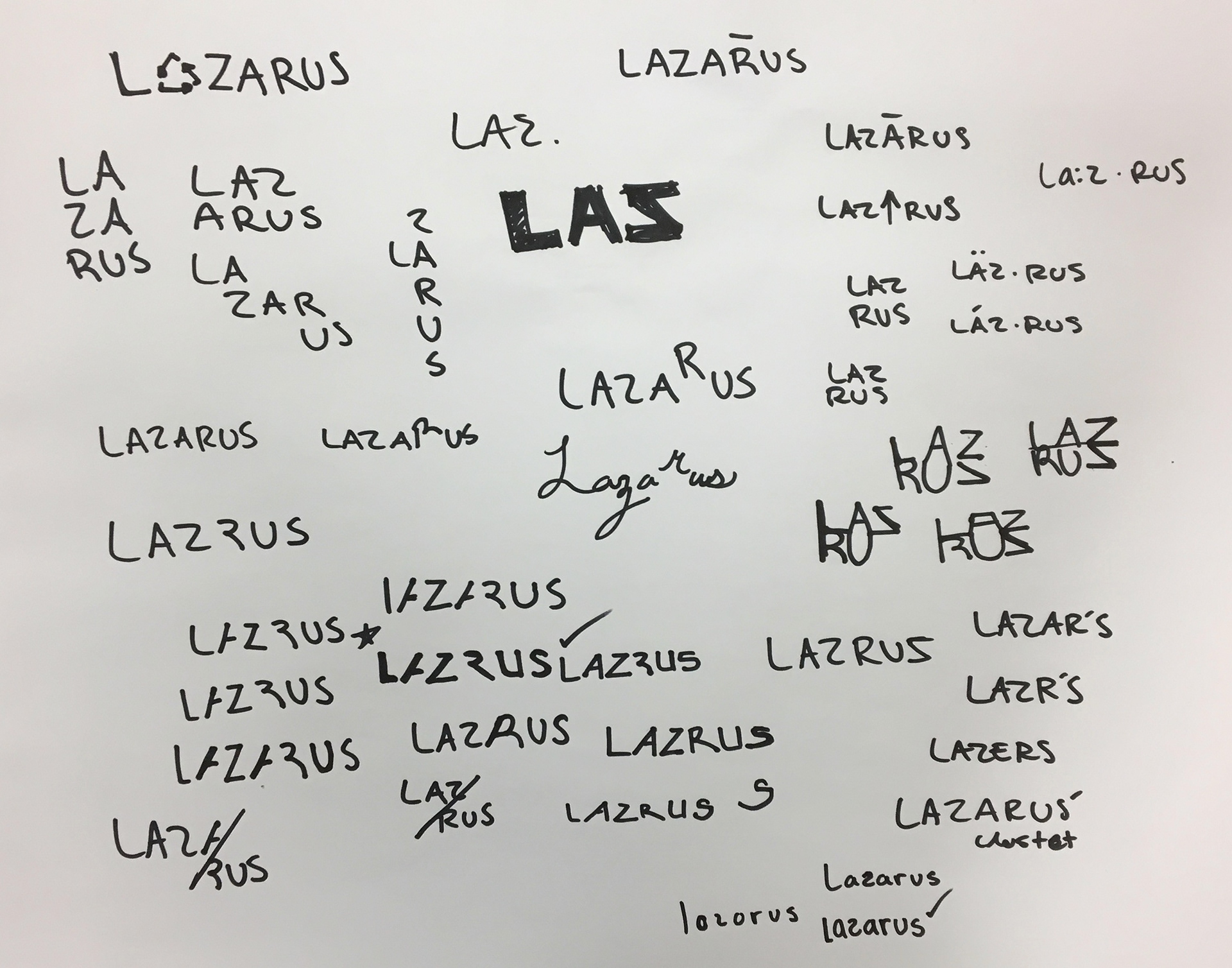
These ideas were distilled into six basic digital compositions. The options below were intended to convey aspects of antiquity, modernity, and futurism.
(The futurism aspect playing off the idea that a time traveler might have gathered the articles for purchase.)
(The futurism aspect playing off the idea that a time traveler might have gathered the articles for purchase.)
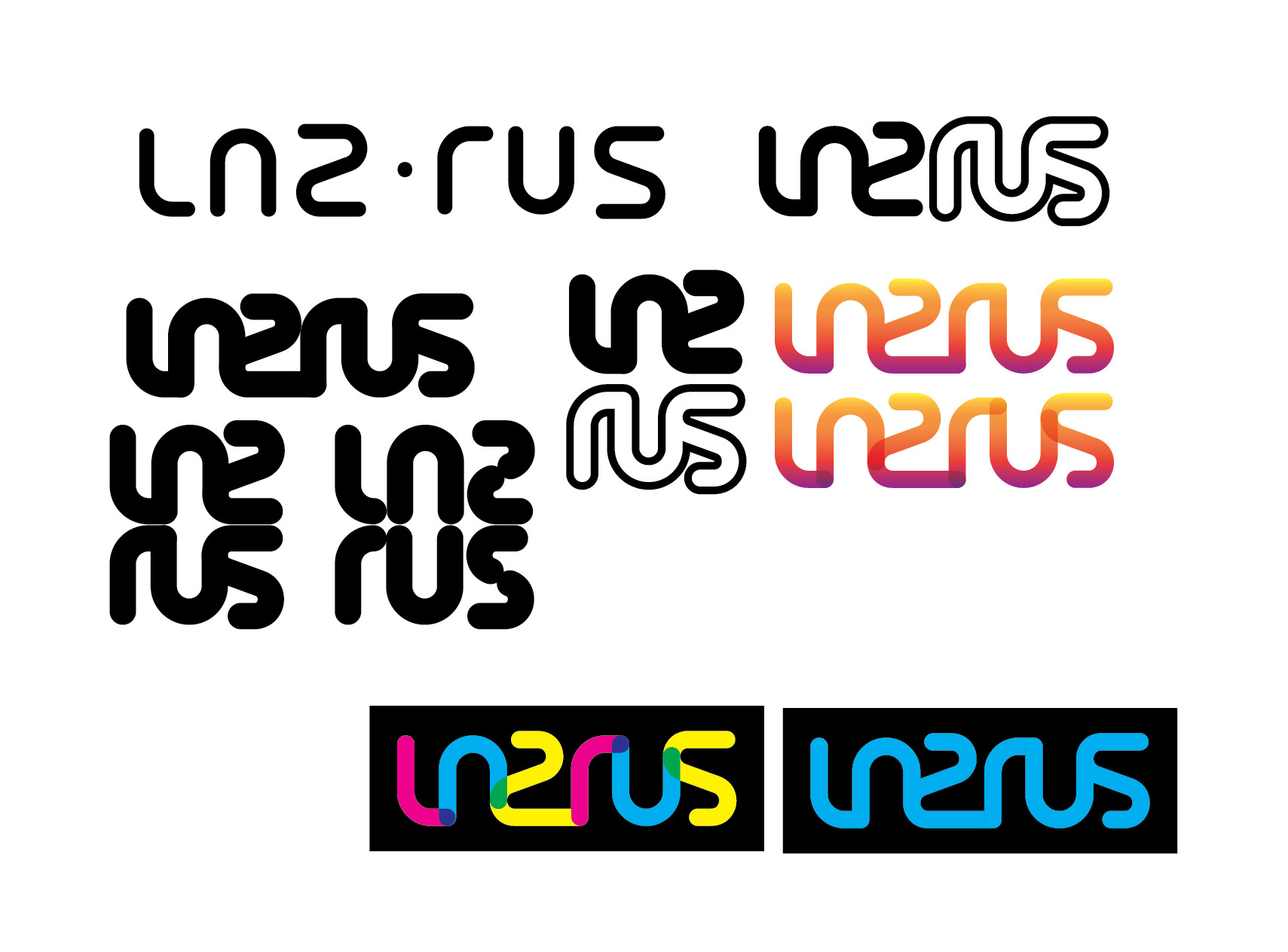
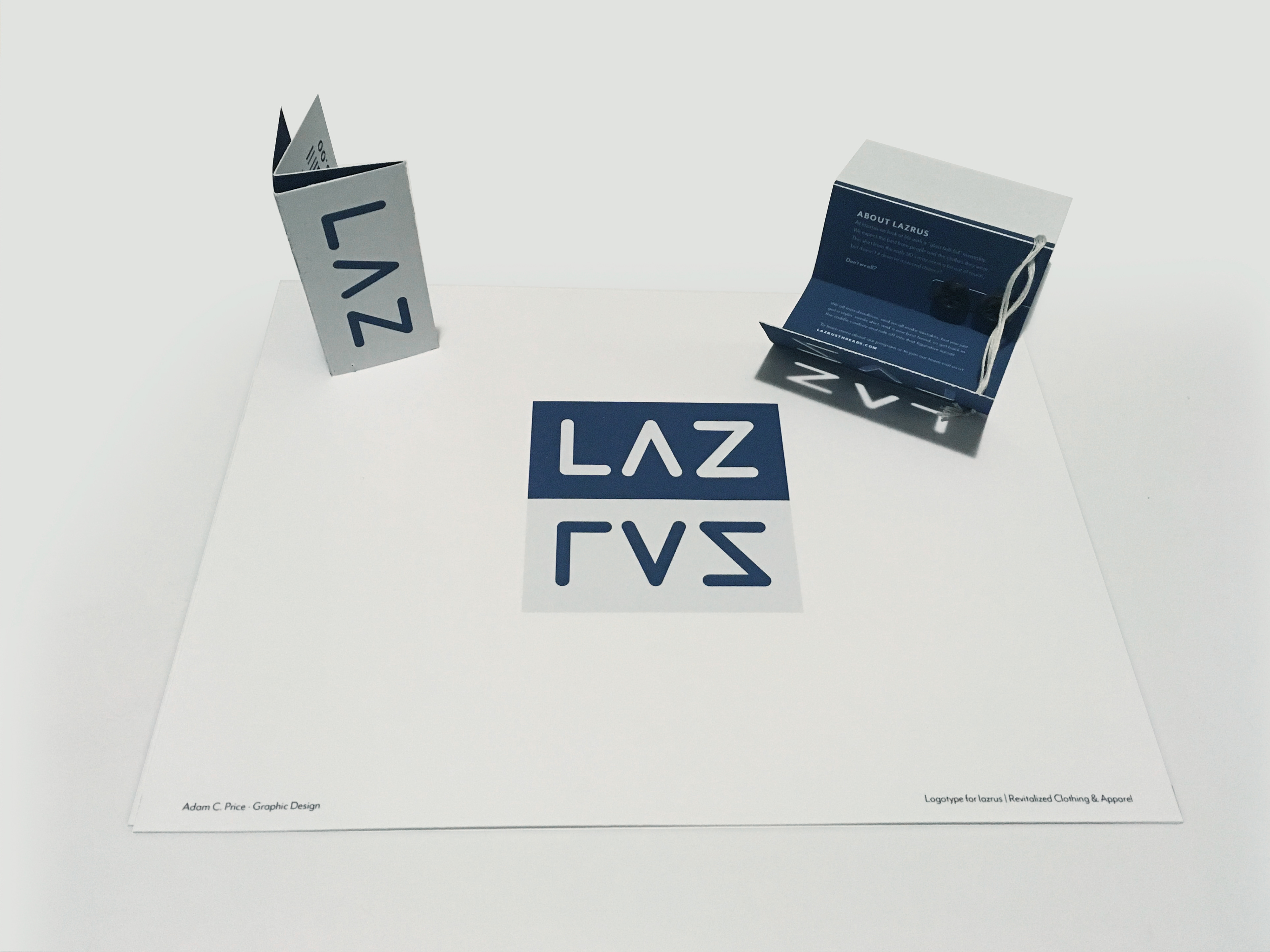
After much consideration I decided to pursue the option in the bottom left corner. I felt that this Idea expressed the must about the brand. The concept of light & dark, life & death, up & down, and not to mention the reflection of the same forms to create the name "LAZRUS", in a simple and clean manner.
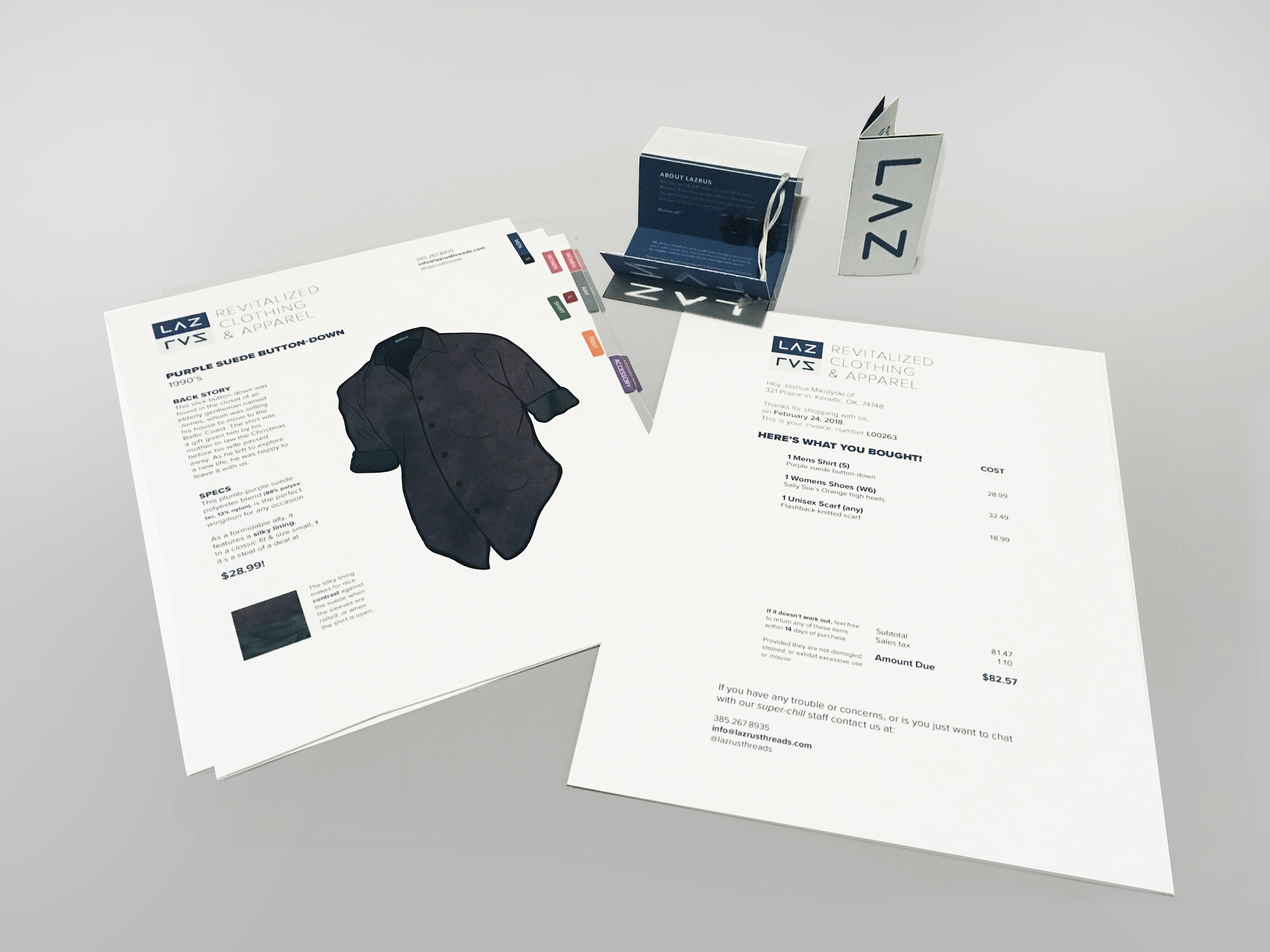
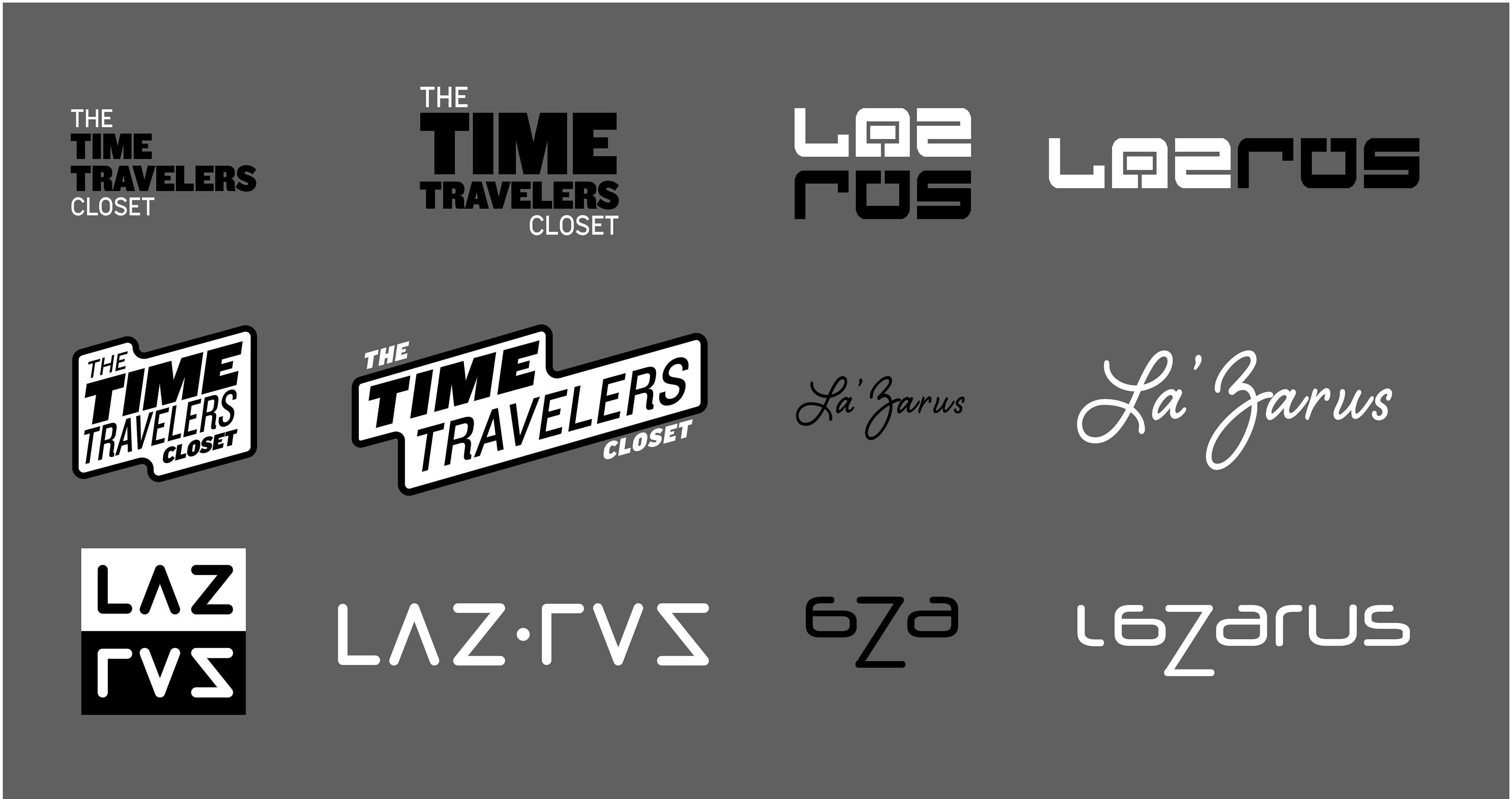
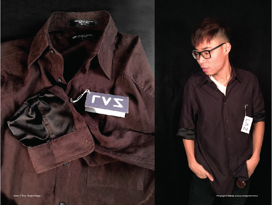
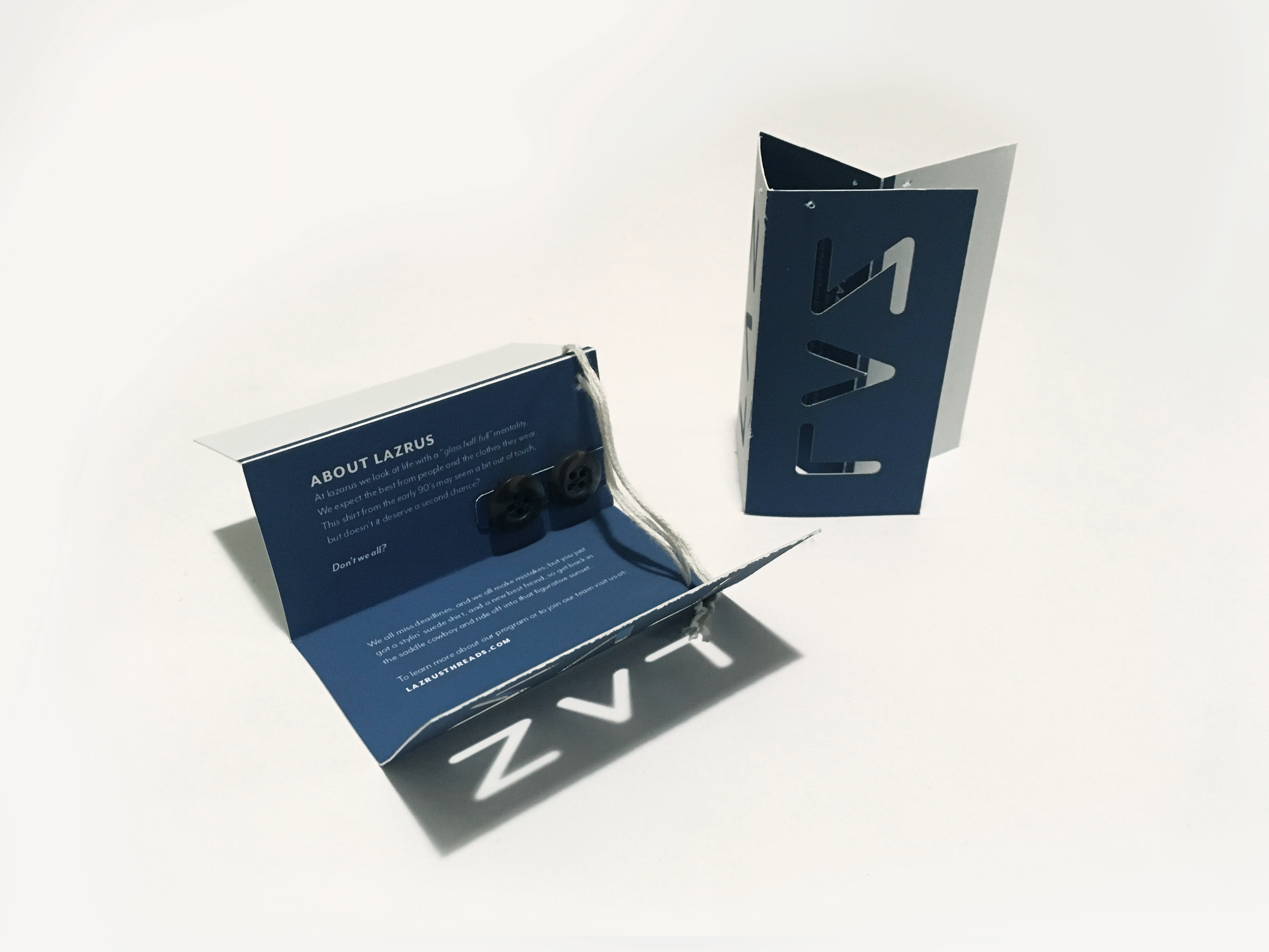
Next we considered the hangtag that might be used on the aforementioned clothing. I considered the following ideas as well as others, but settled on the option to the right.
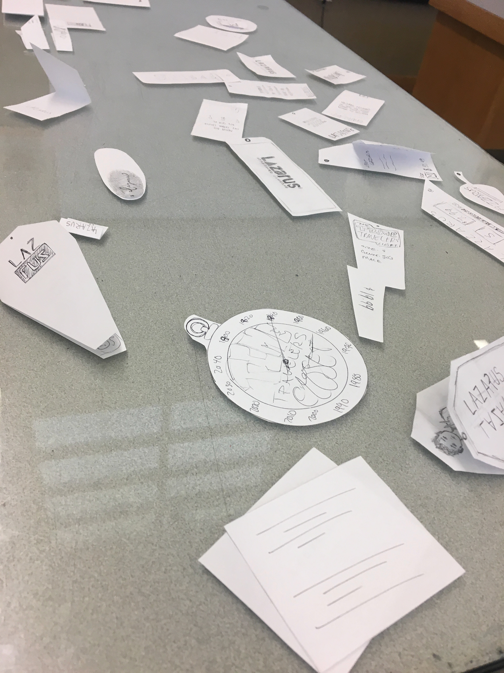

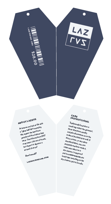
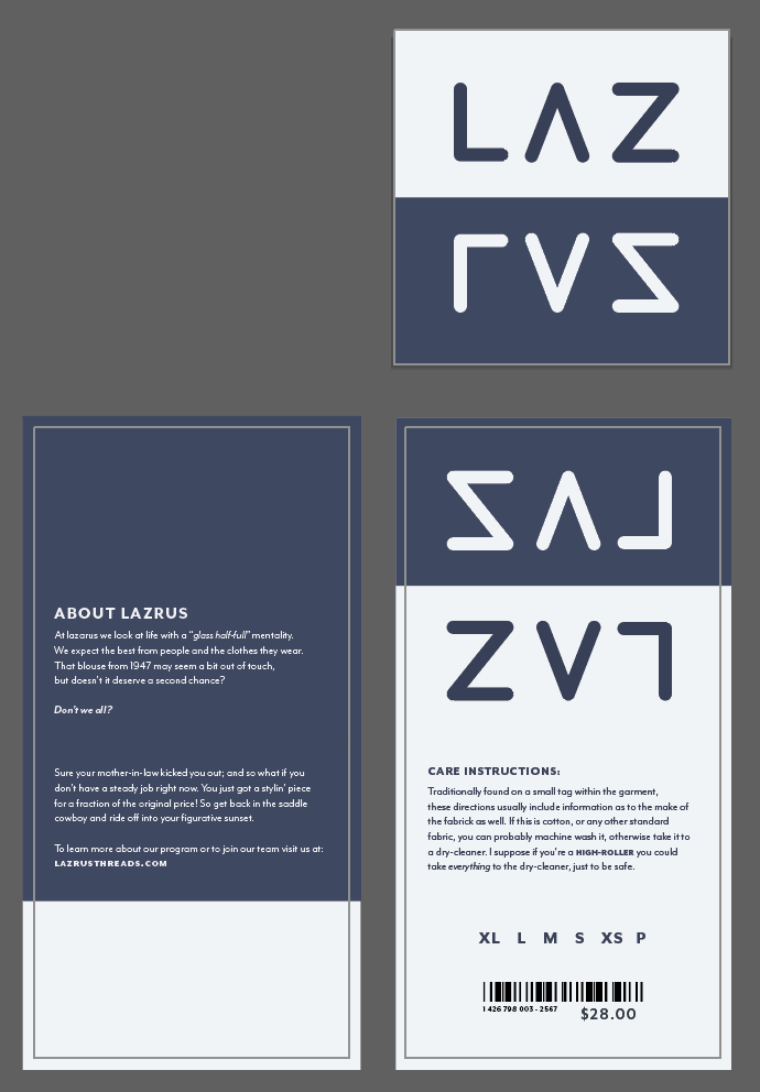
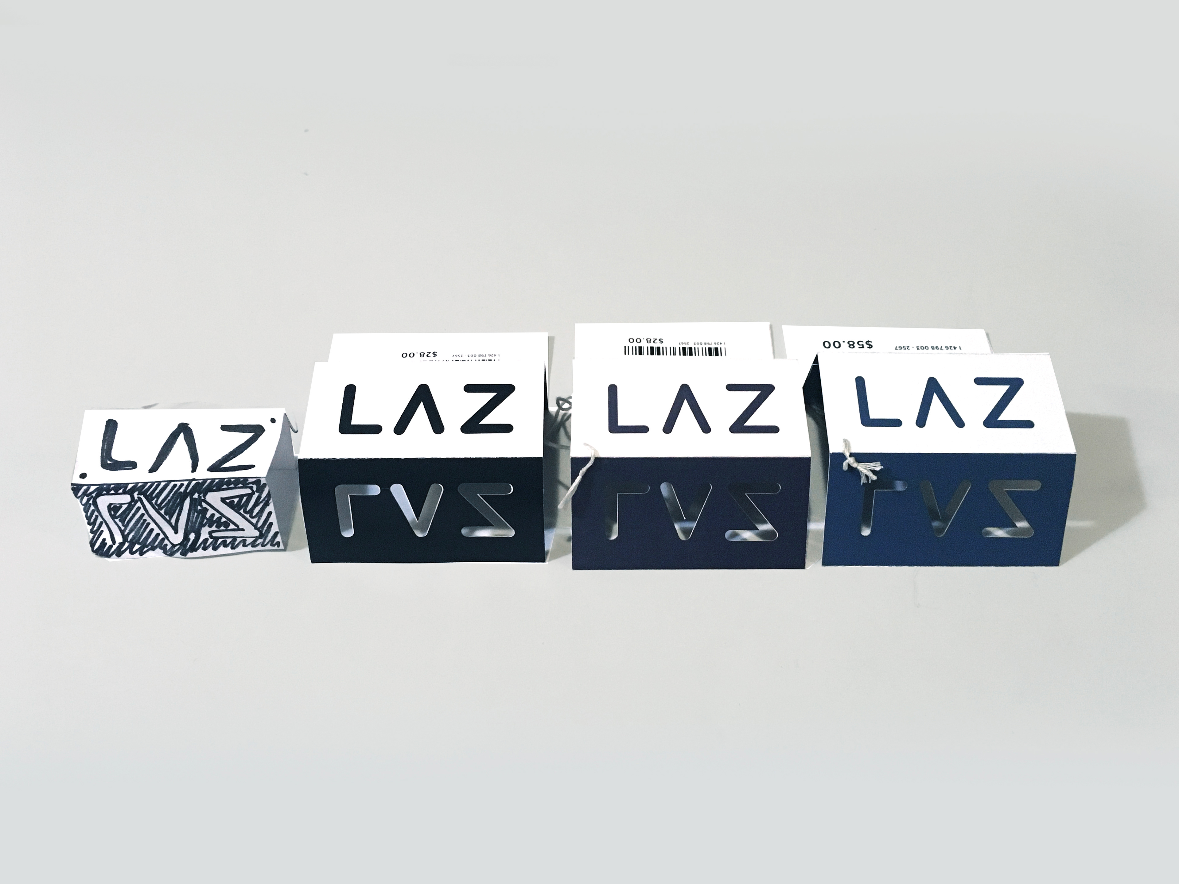
Having considered the color options, I built a tangible model and directed a photoshoot to display the logotype & tag design.
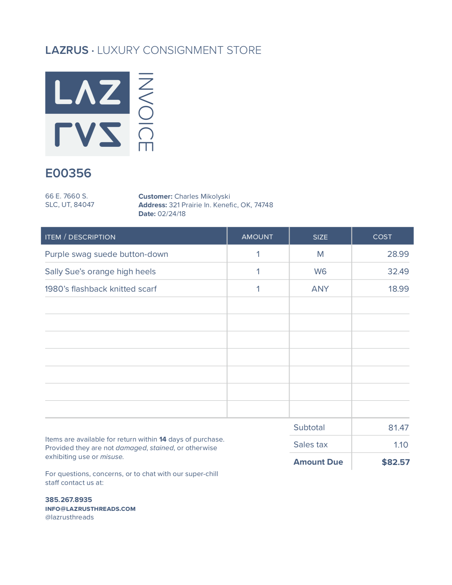
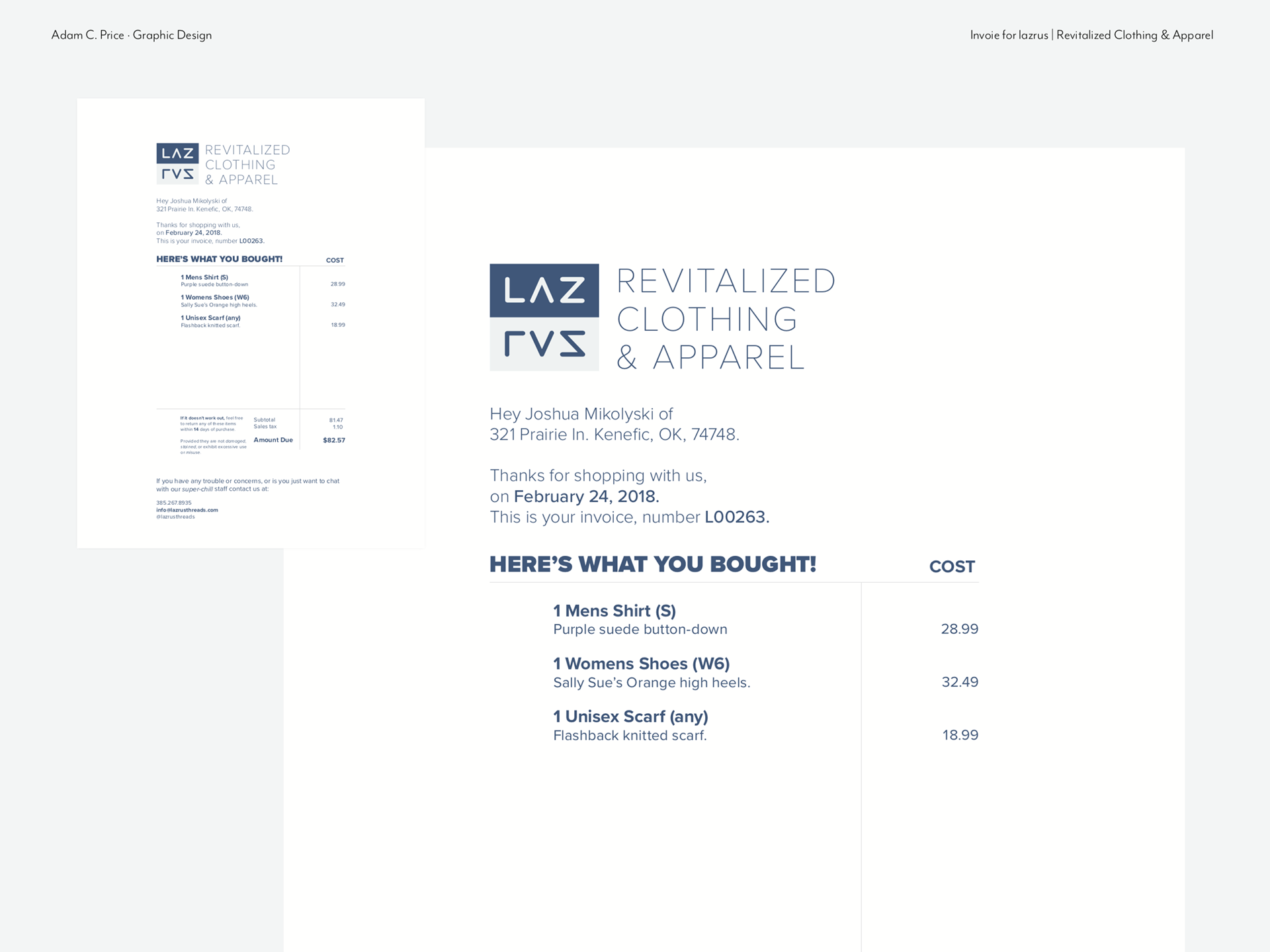
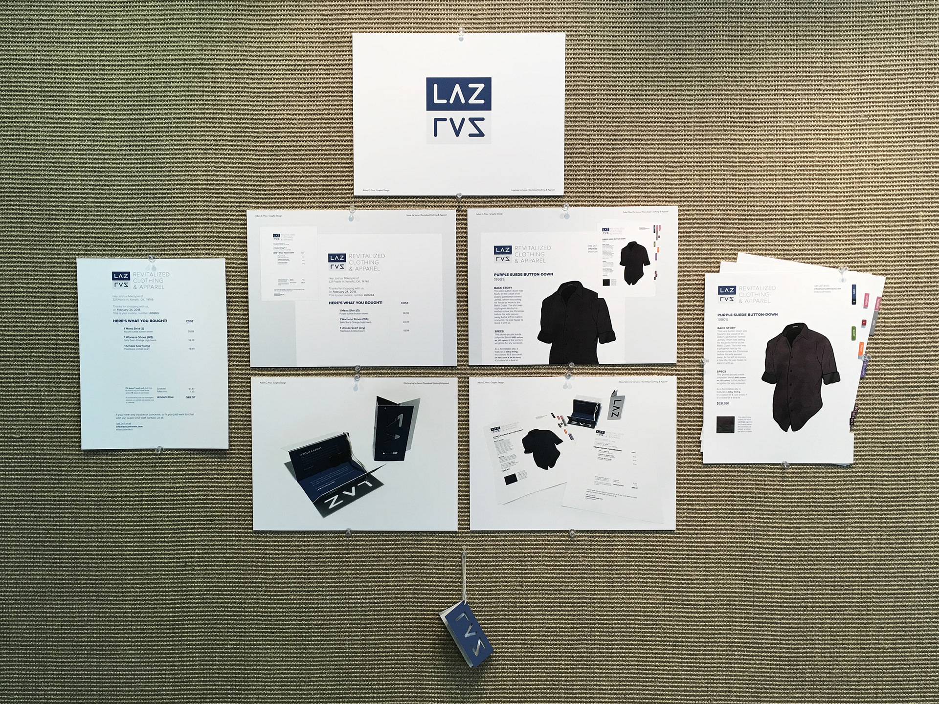
I then moved on to planning how to express the specific brand information on an invoice or a sales sheet, that may be used by sales associates.
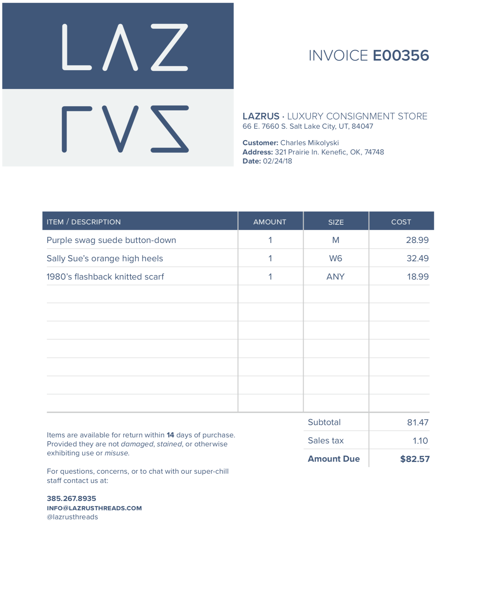
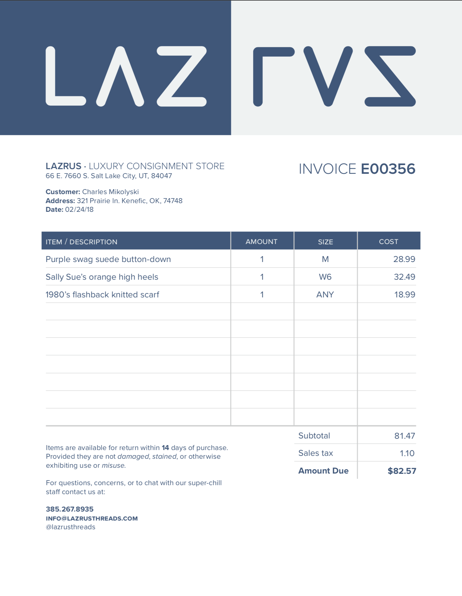
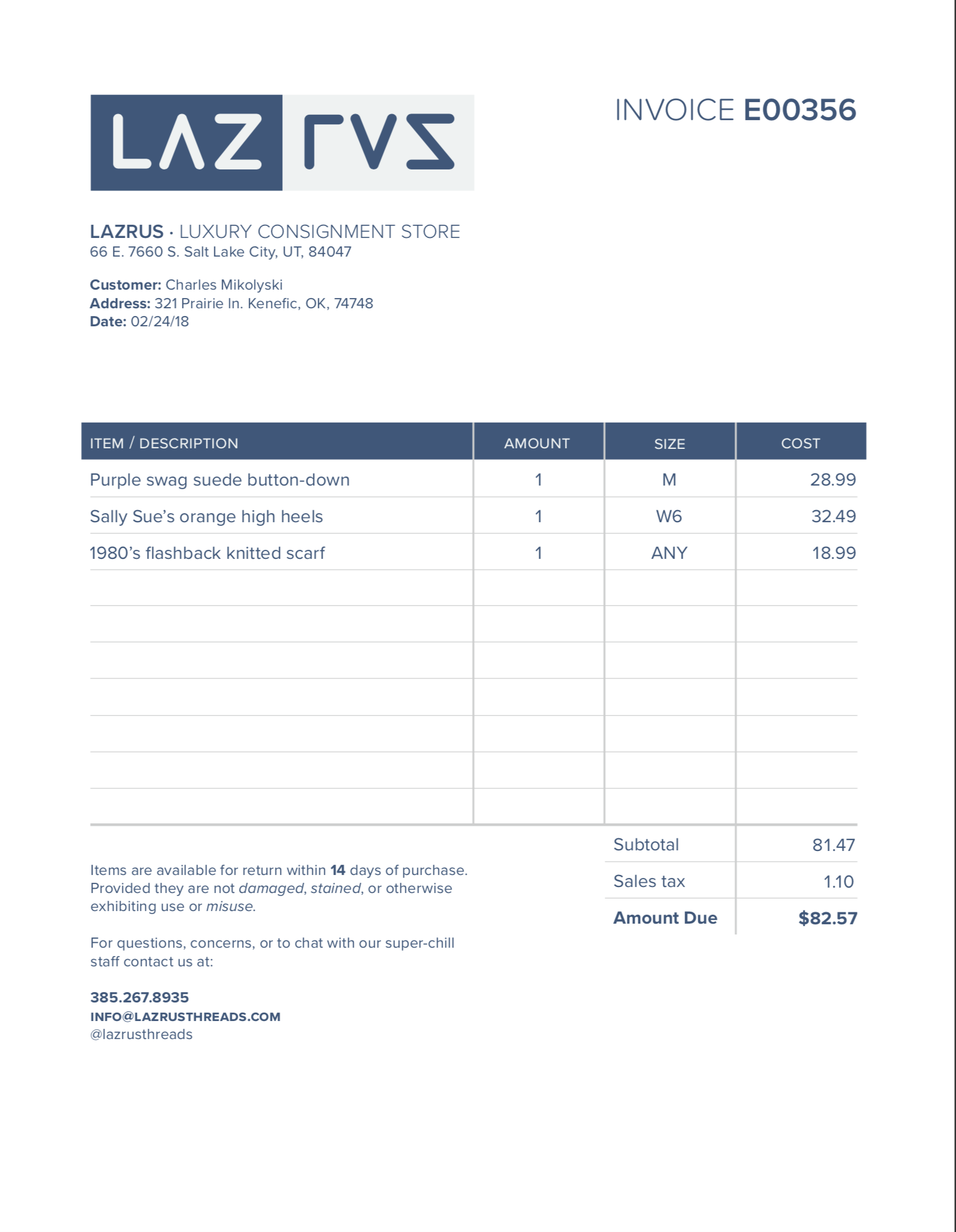
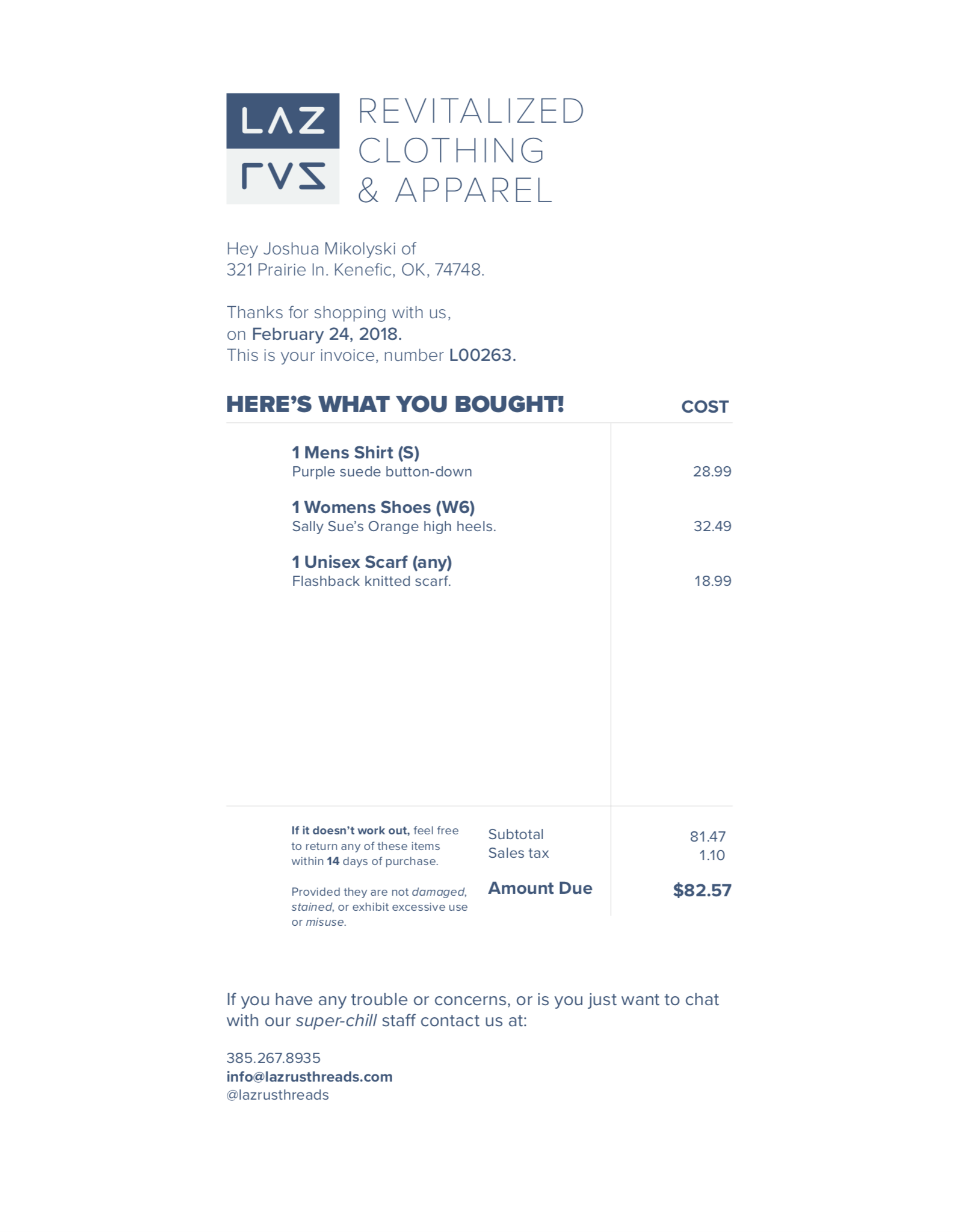
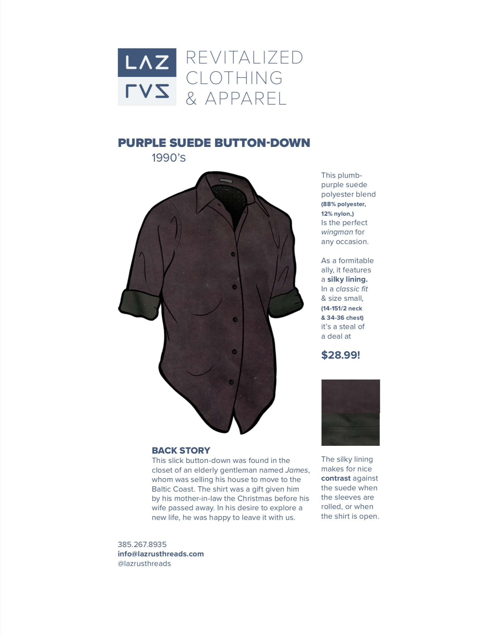
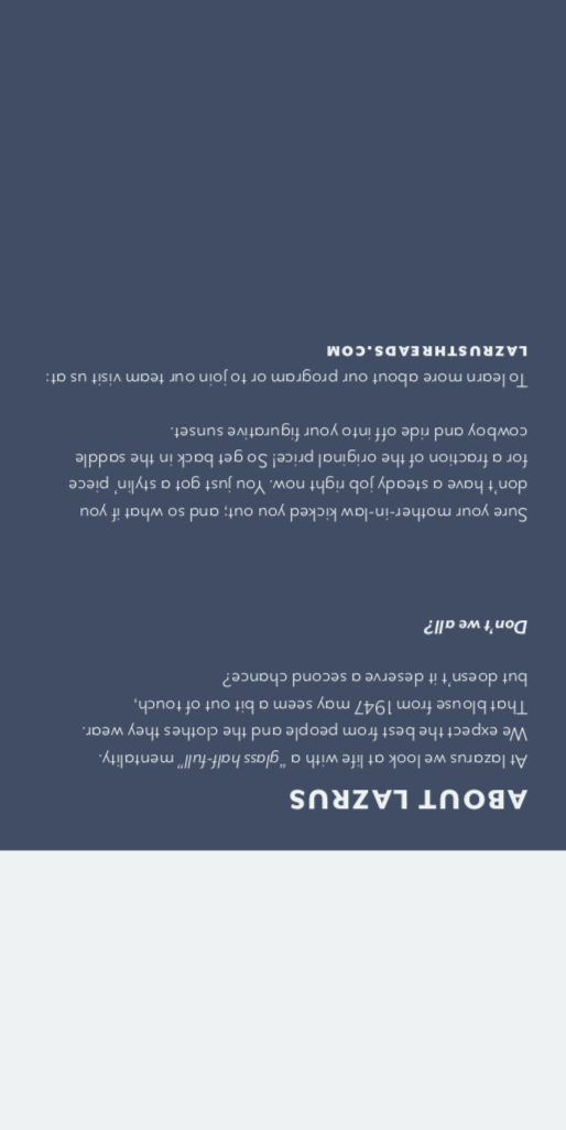
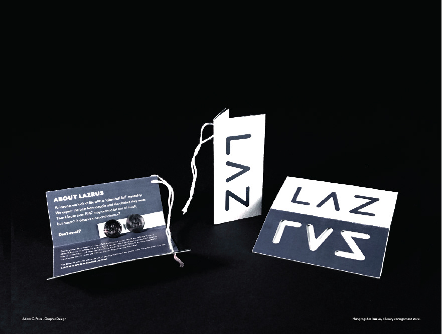
I had made the decision with both the hangtag and the paperwork to give the brand an unapologetic, modern expression. I felt that this might help target a younger audience, while giving the brand a unique spin for the high-end market.
To that end, I used the copy in the invoice and the sales sheet to as an opportunity to be more conversational and personal in an effort to improve customer relations.
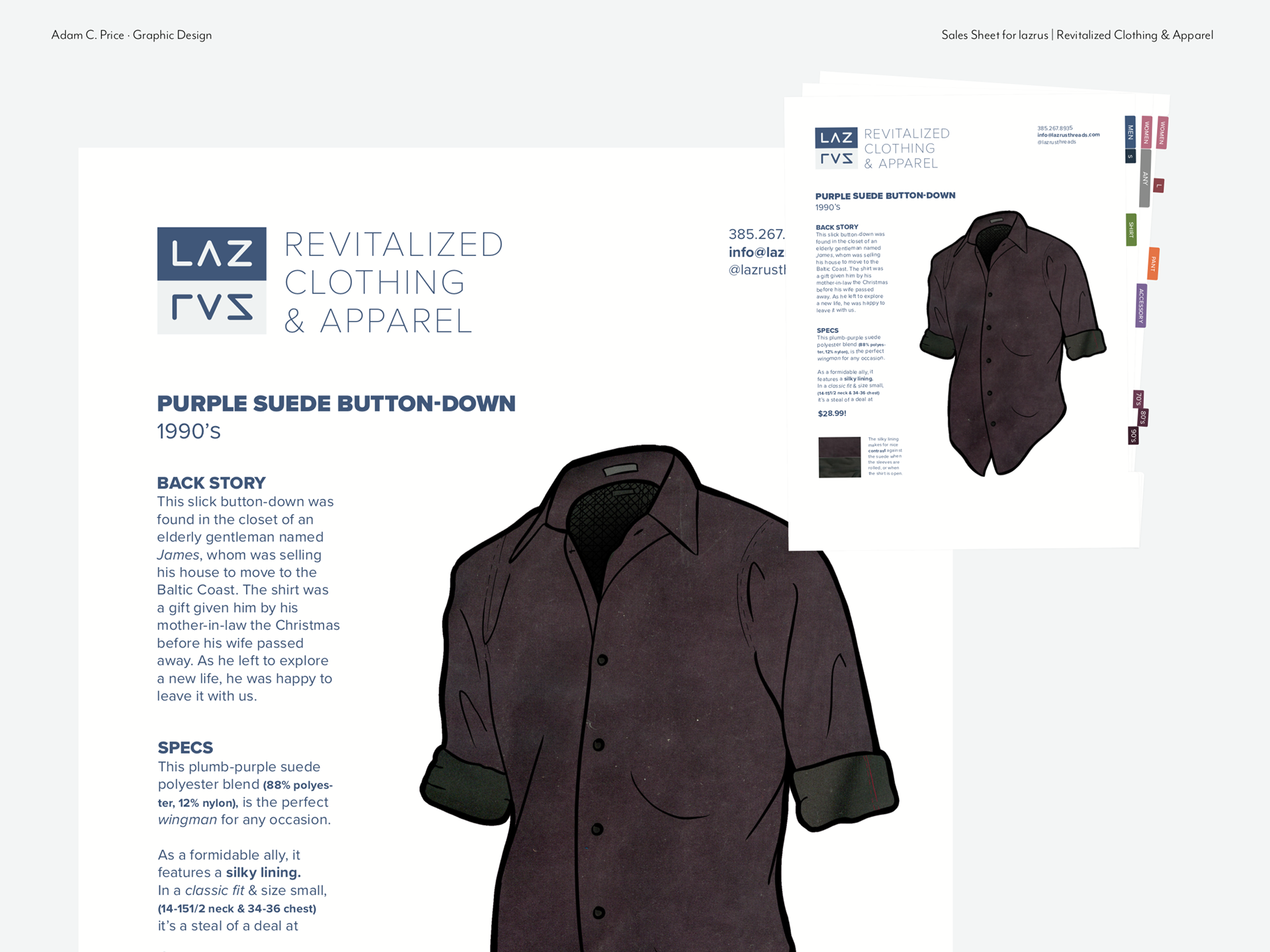
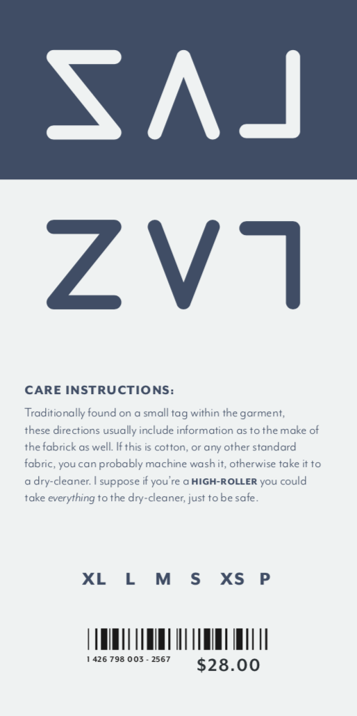
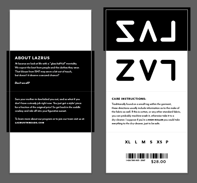
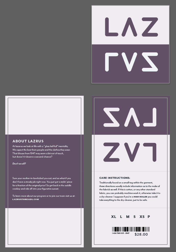
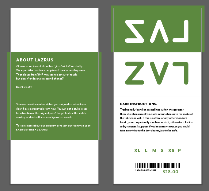
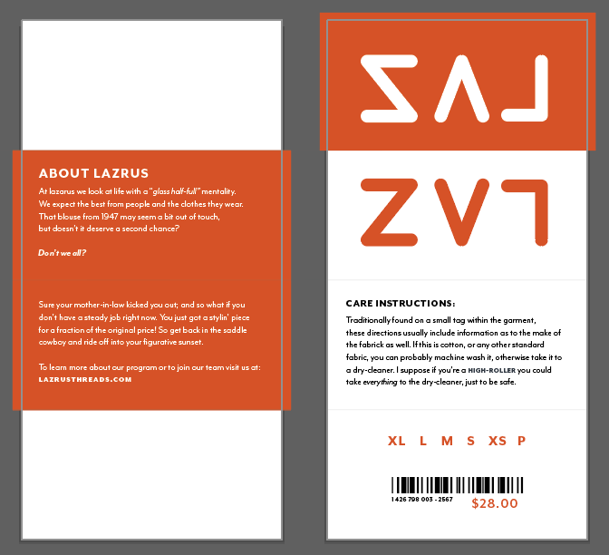
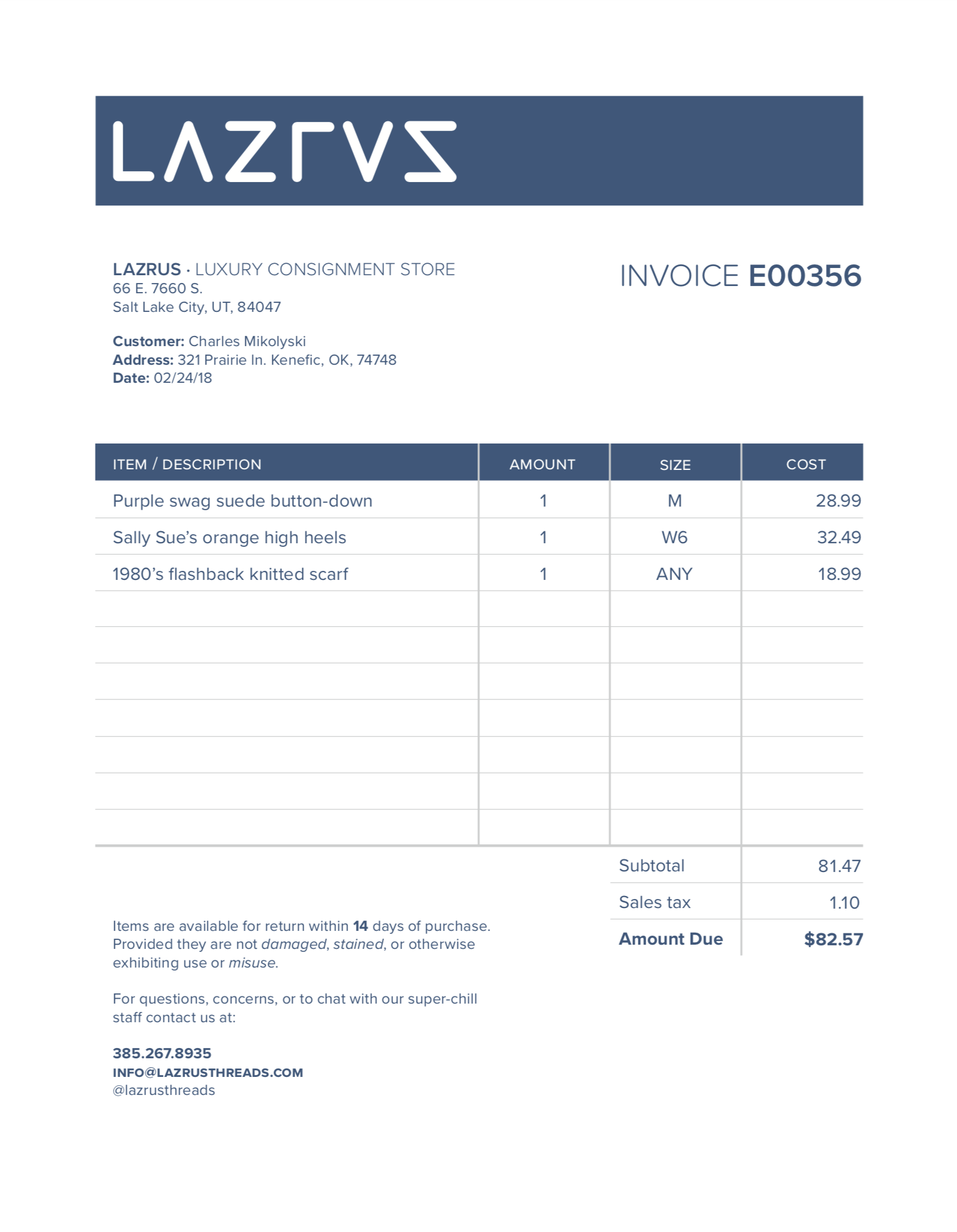
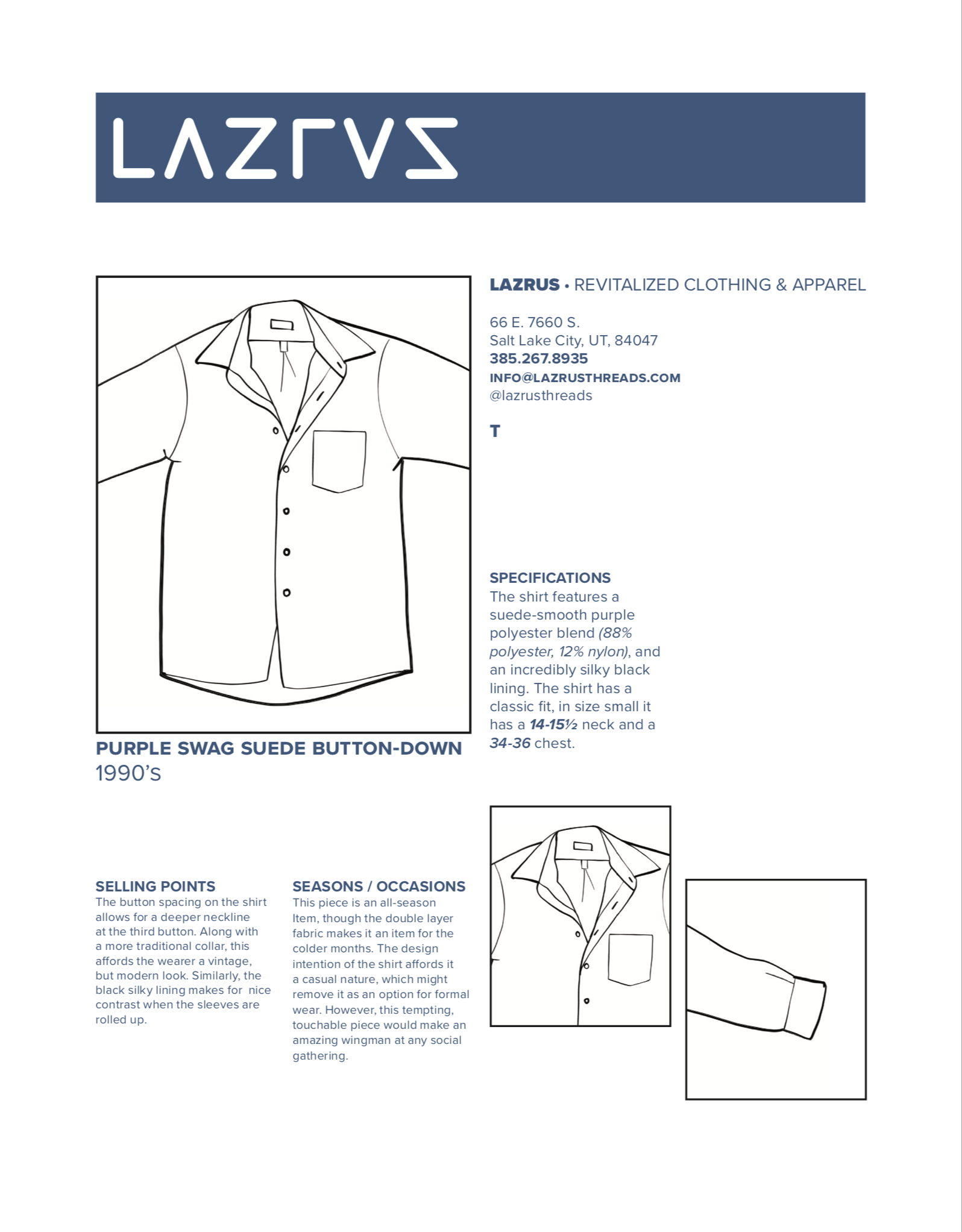
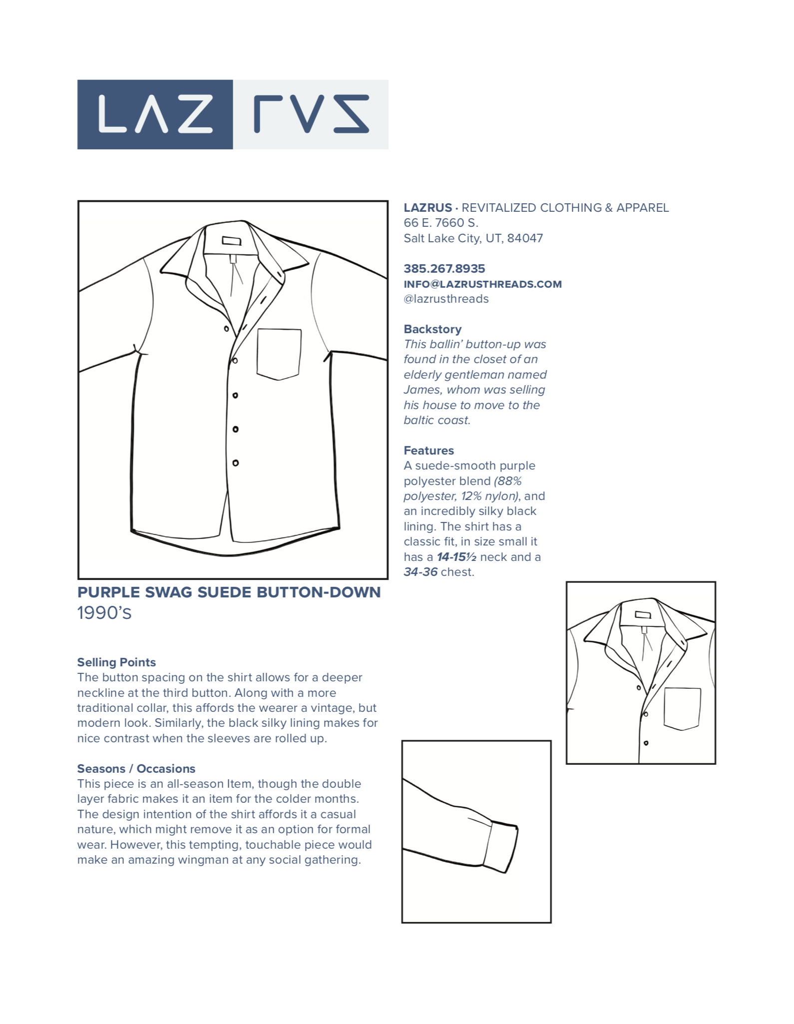
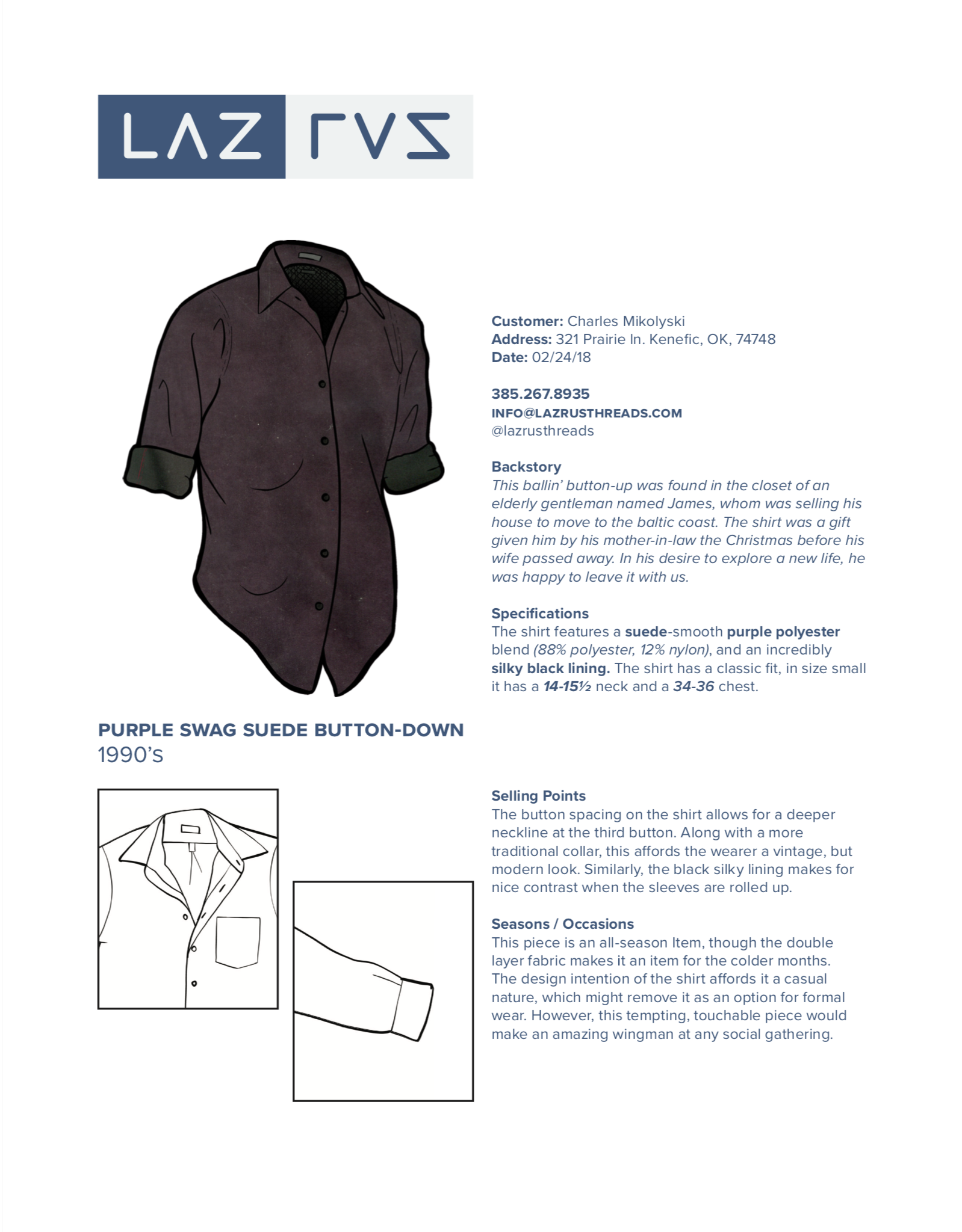
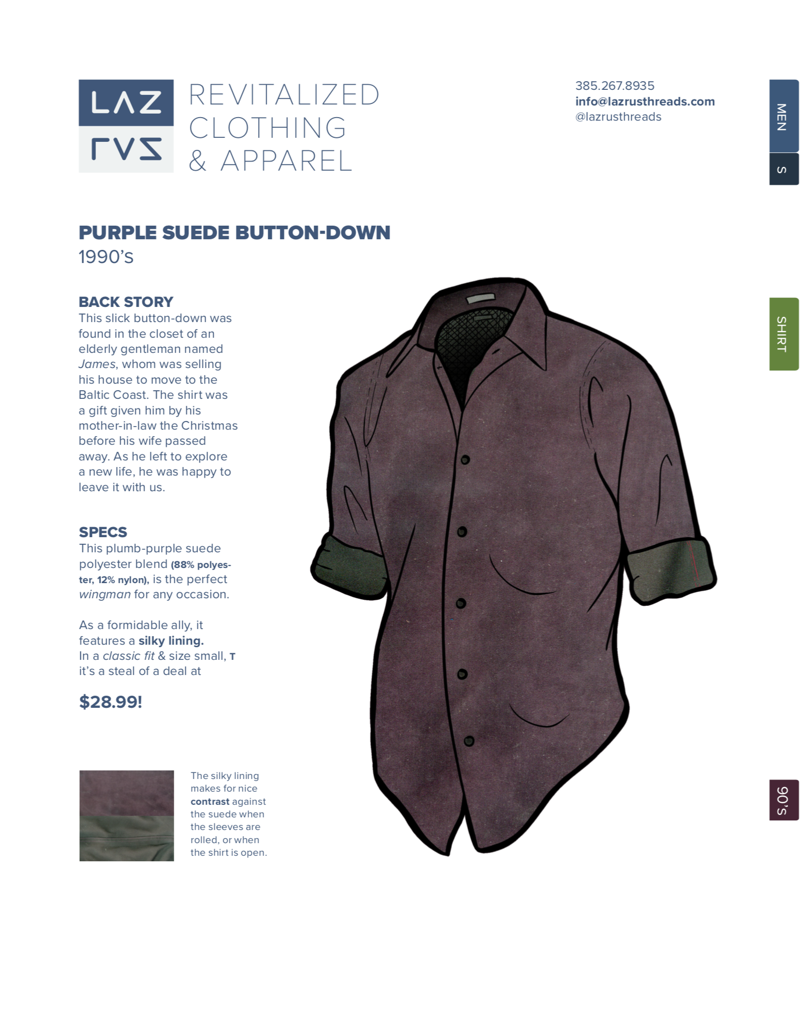
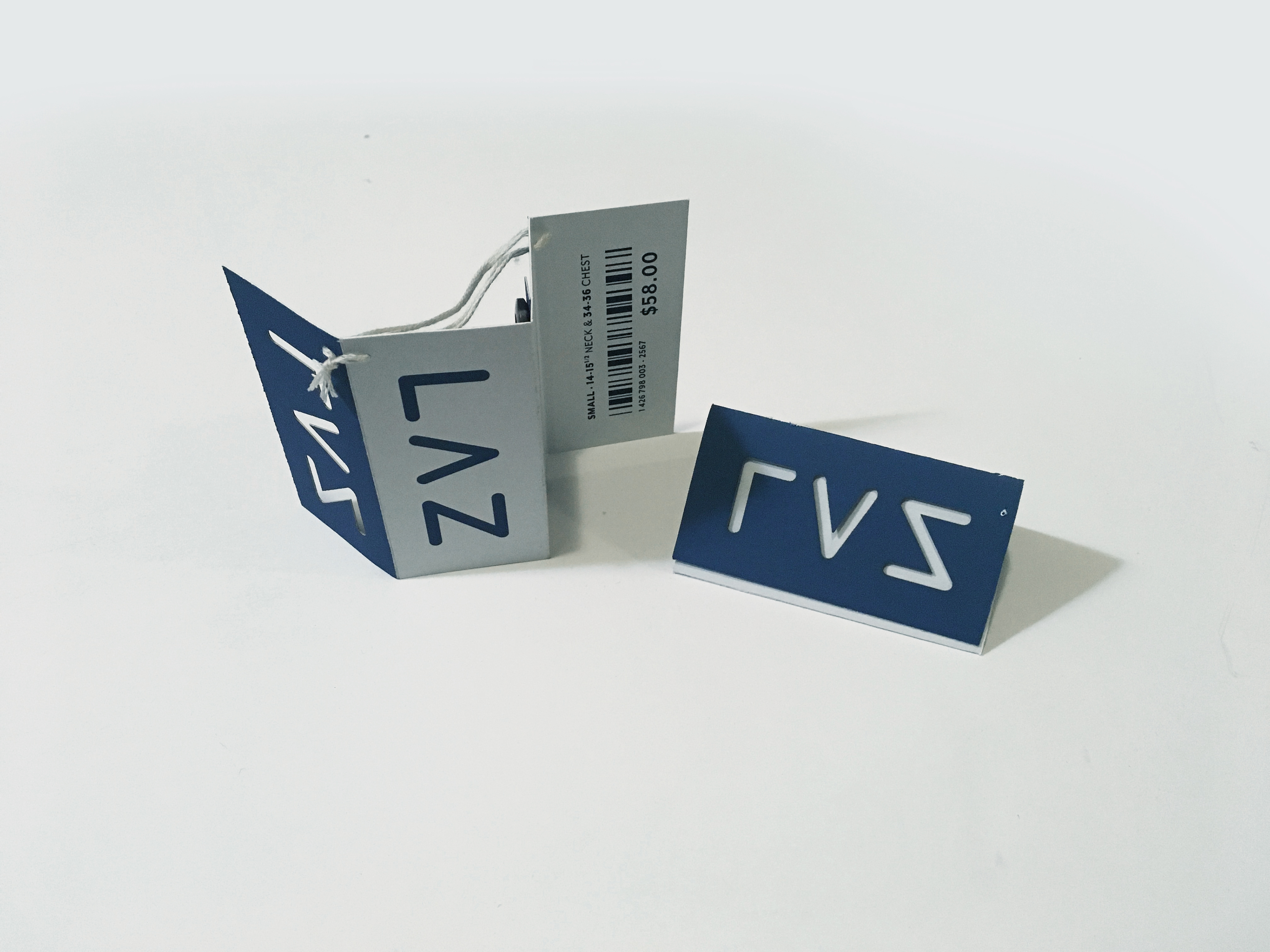
After receiving feedback, I completed the sorting system for the sales sheets
(as shown in the upper right corner of the image above), and updated the hangtags as shown below.
(as shown in the upper right corner of the image above), and updated the hangtags as shown below.
In the end, this was a very enjoyable, and very rewarding project. It was fun focusing mainly on type, and how it can be used to create compelling design.