The city of Rexburg was looking to develop a visual style for the “Kids Discovery Zone” they were building fall of 2018. Several designers designed a style guide and presented it to client for selection.



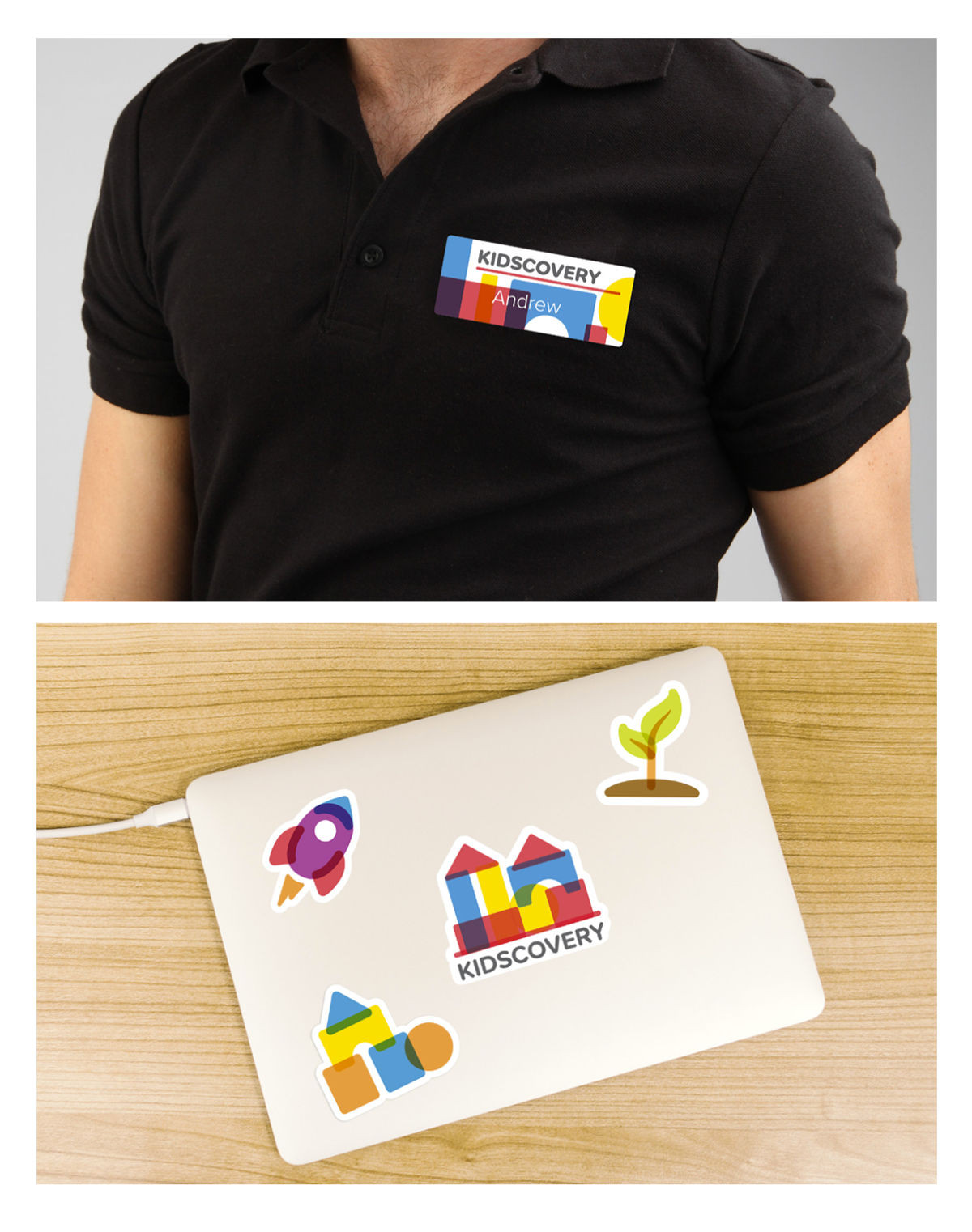
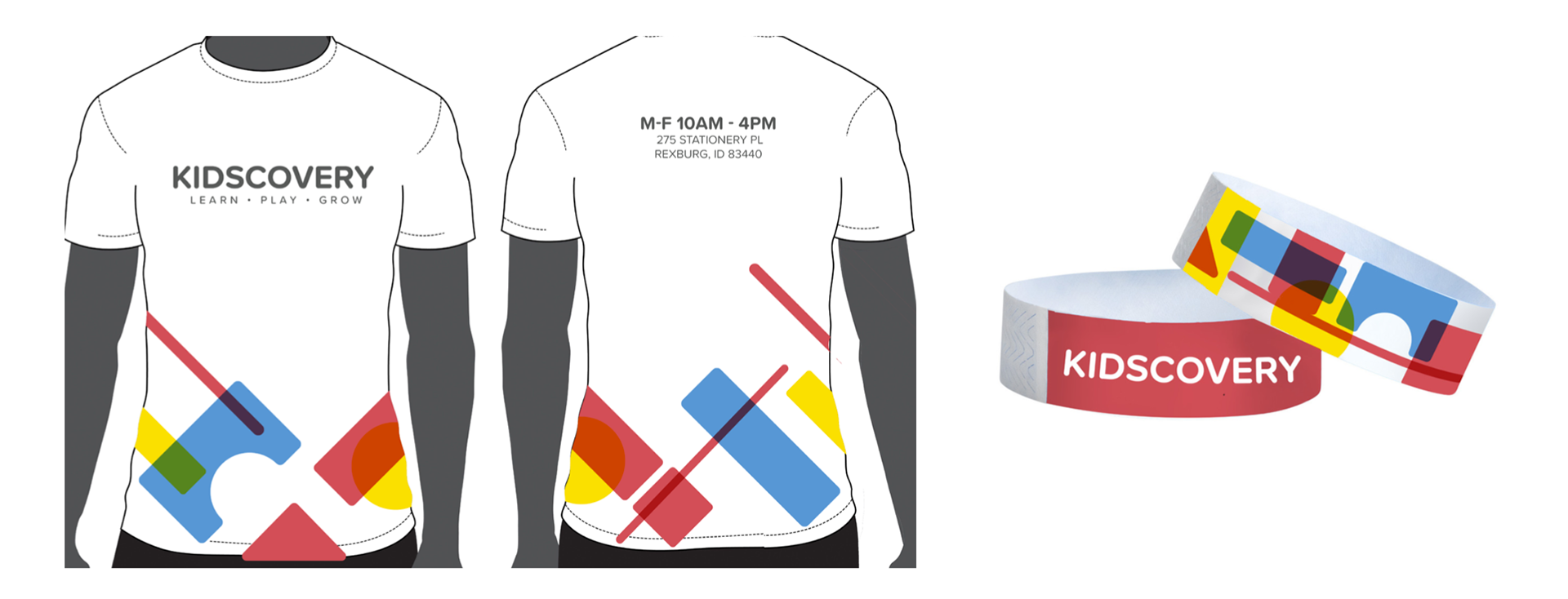
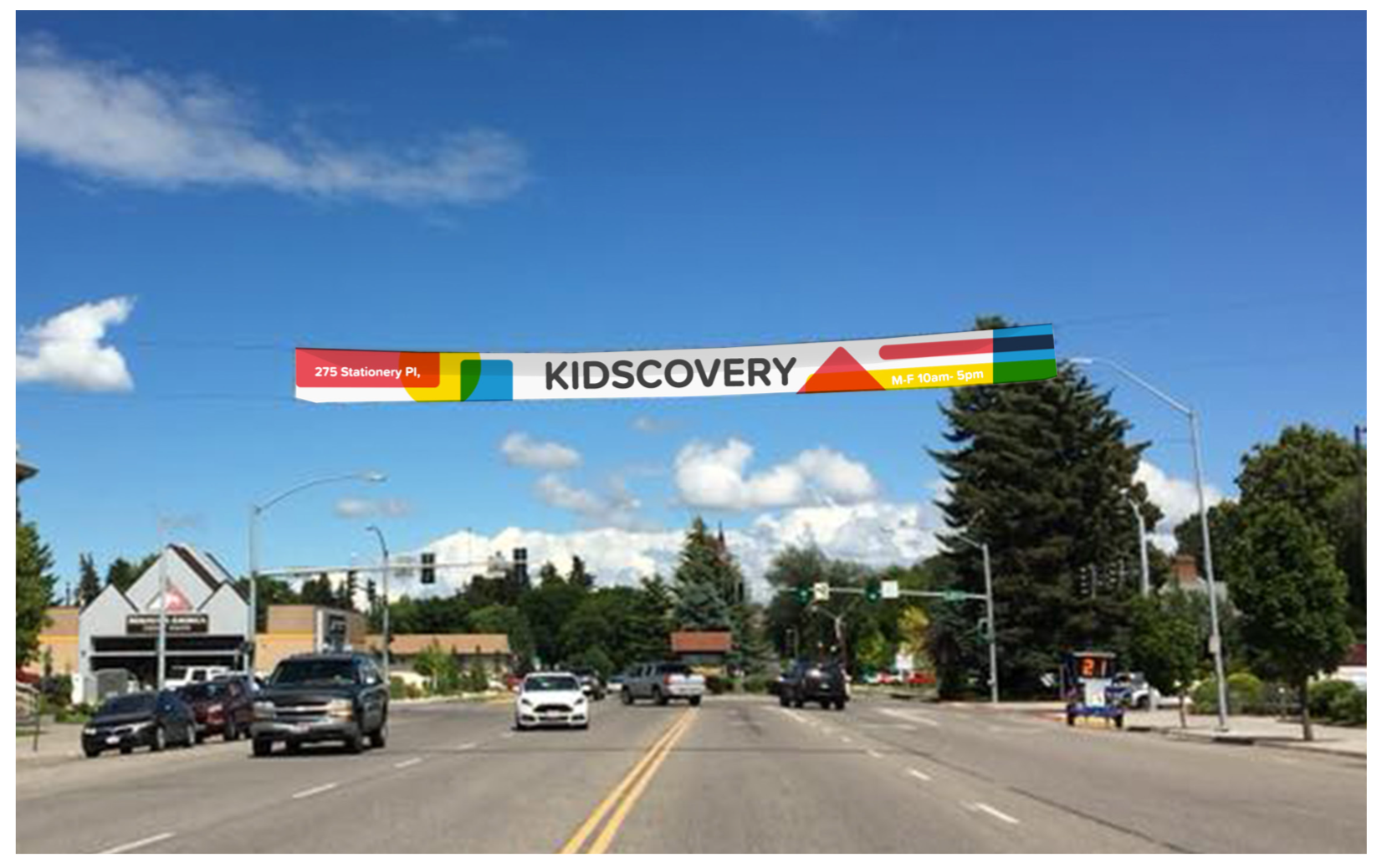
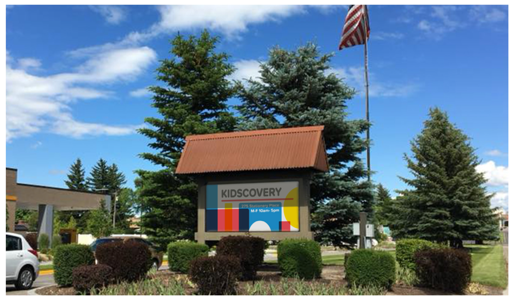
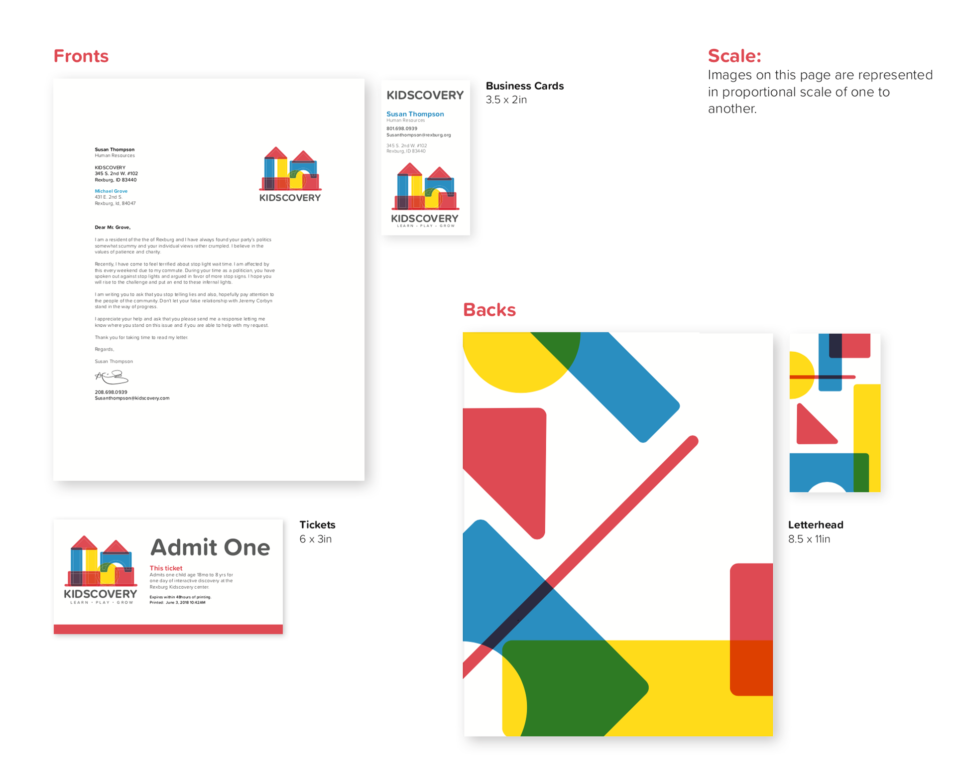
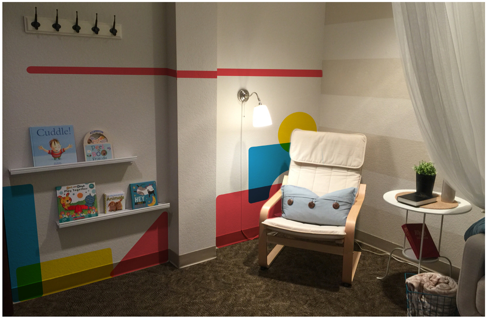
I chose to develop a brand that had a dynamic element. I thought it would be fun to have the logo itself be a source of discovery for the children. So I took familiar building block shapes and used adjusted primary colors on multiply to achieve and over-printed look. This also allowed for modular renditions of the shapes to be used as patters in branding, marketing and other materials.
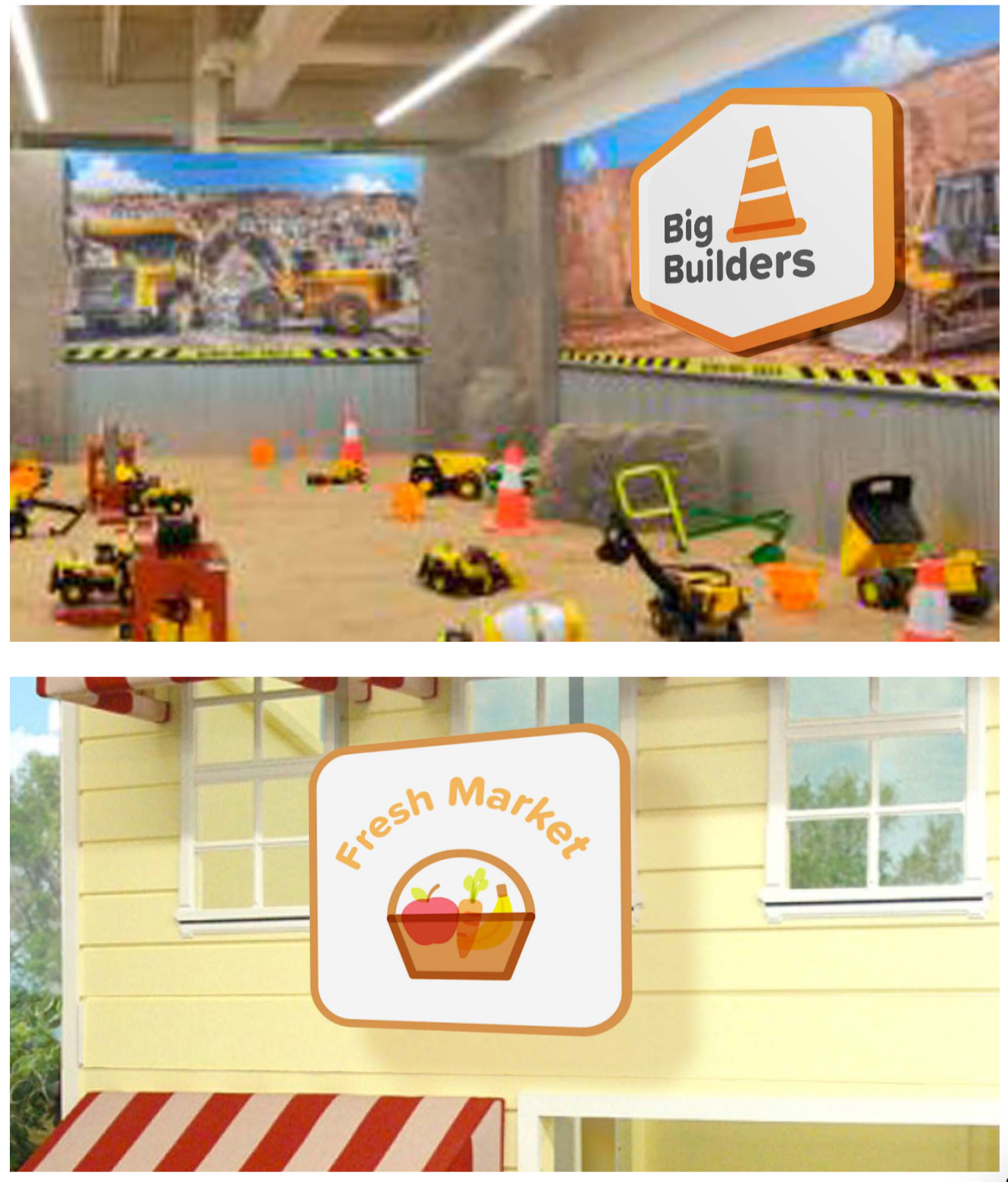
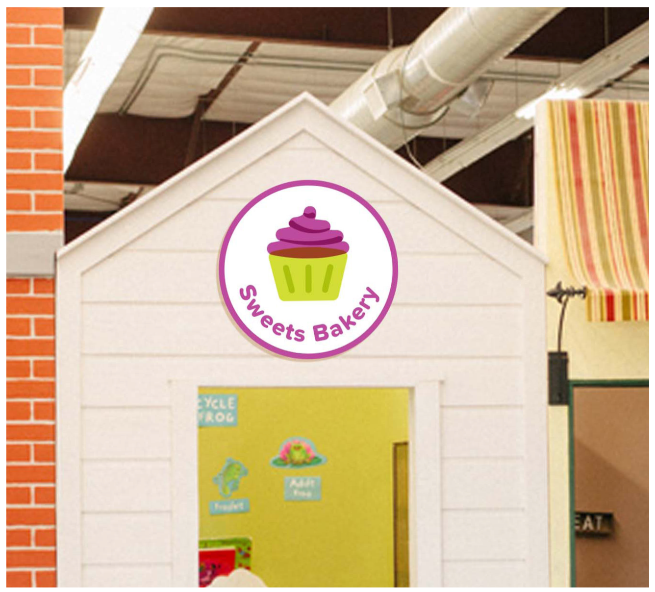
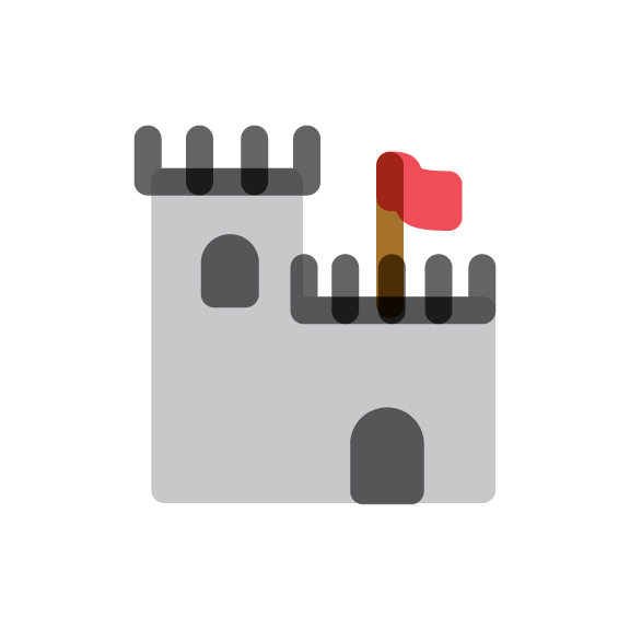
I also worked to developed an illustration style that implemented the same concepts of color overlay and modular discovery.








I carefully selected a style of photography that I thought would convey the concept of a playful education.
In the end, another style was chosen and implemented, but I was grateful for the chance to work on this project and enjoyed everything I learned along the way.
