PROTOTYPE LINK: (not all animations are active in the public review link)
https://xd.adobe.com/view/136719da-f200-4922-7e4f-f064e795382a-6556/
https://xd.adobe.com/view/136719da-f200-4922-7e4f-f064e795382a-6556/
As an Interaction Design exercise, I set out to design the interface for a specialized calculator app. To do so I Identified a profession that would benefit from a specialized calculator app, the functions the calculator would provide, and appropriate interface using the principles of interaction and user testing.
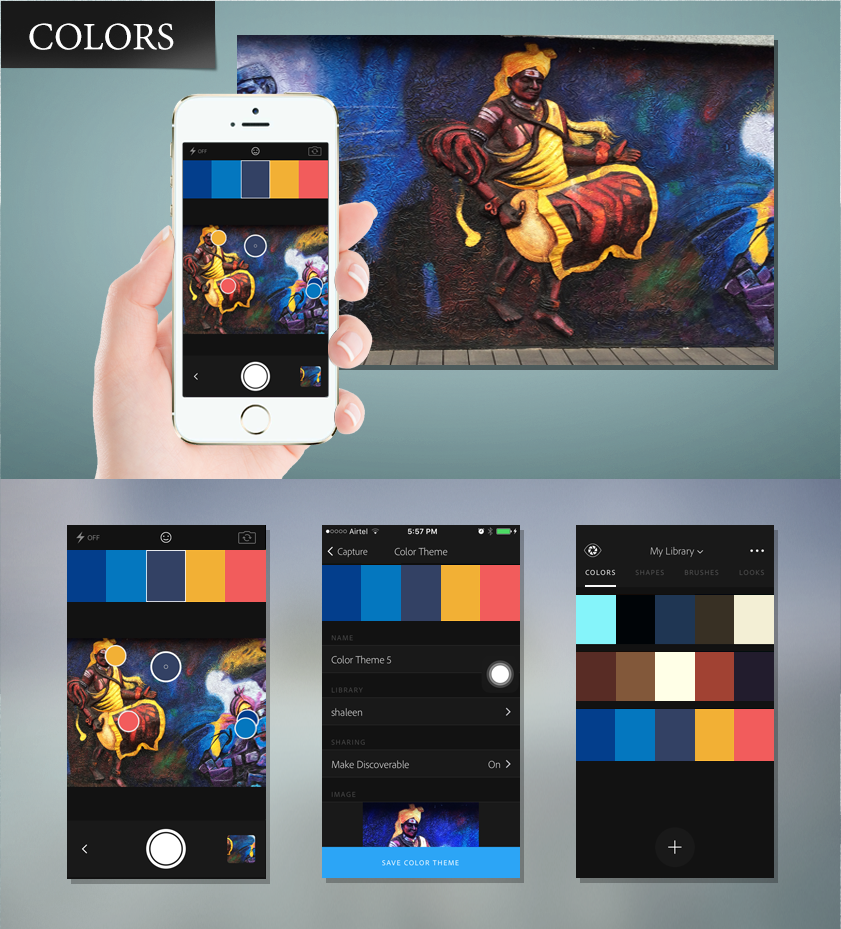
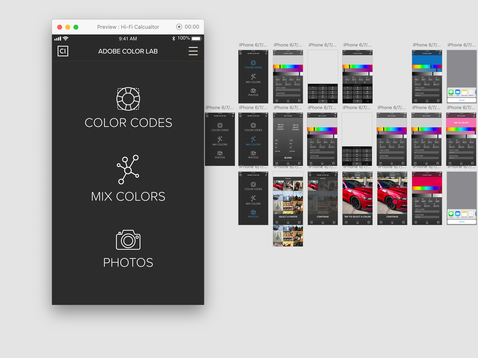
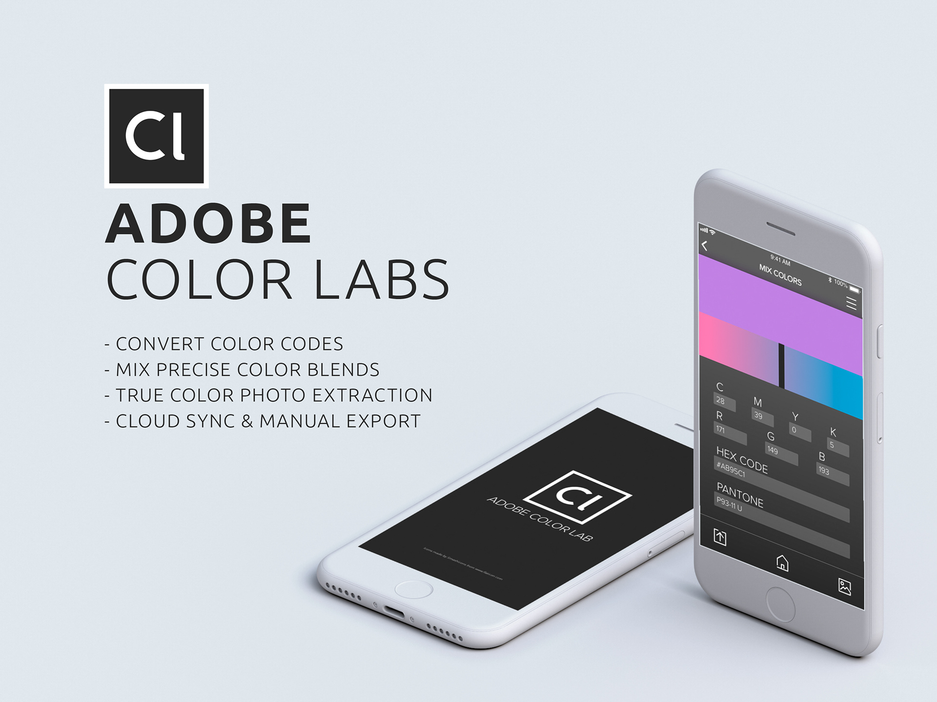
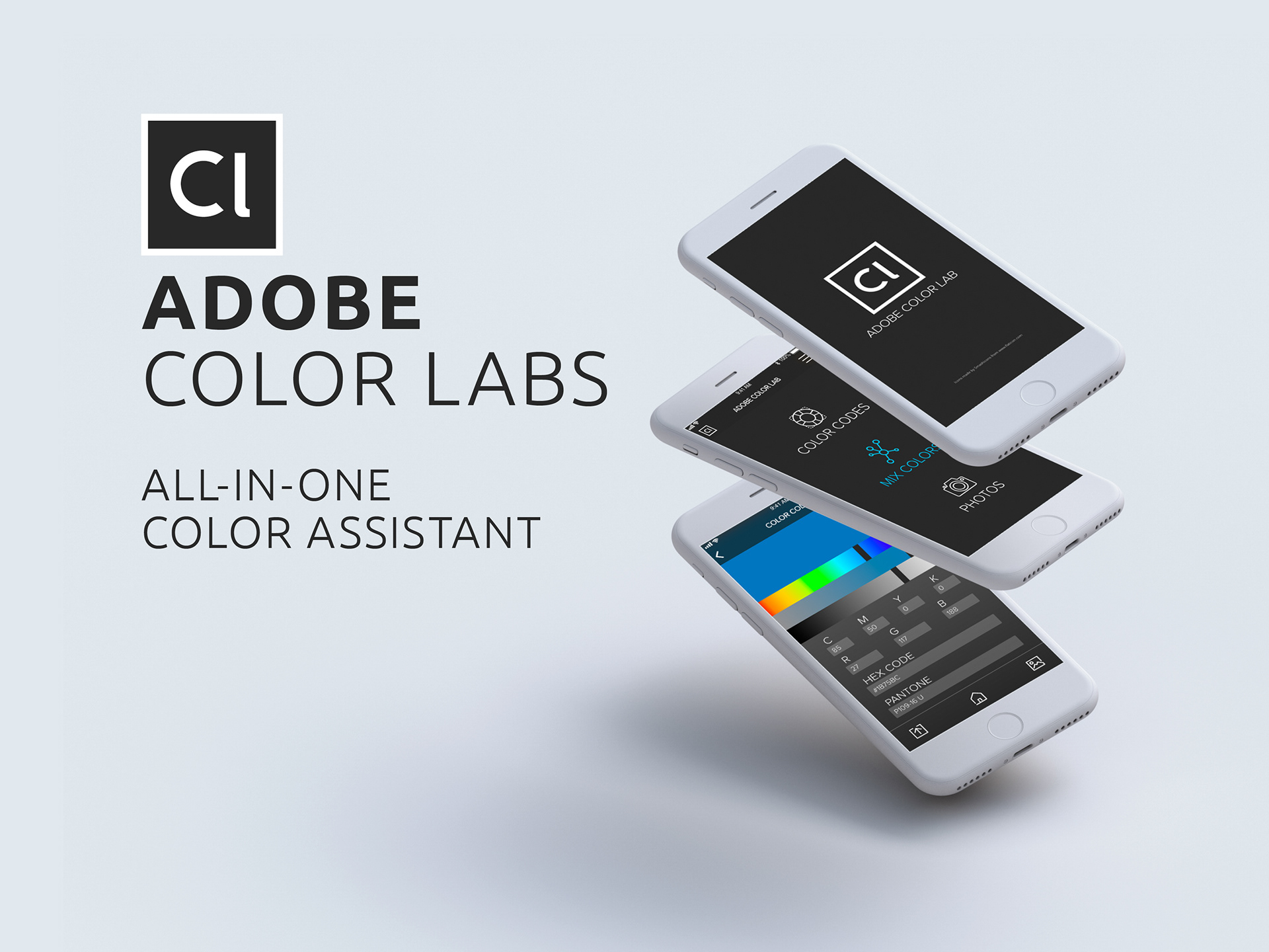
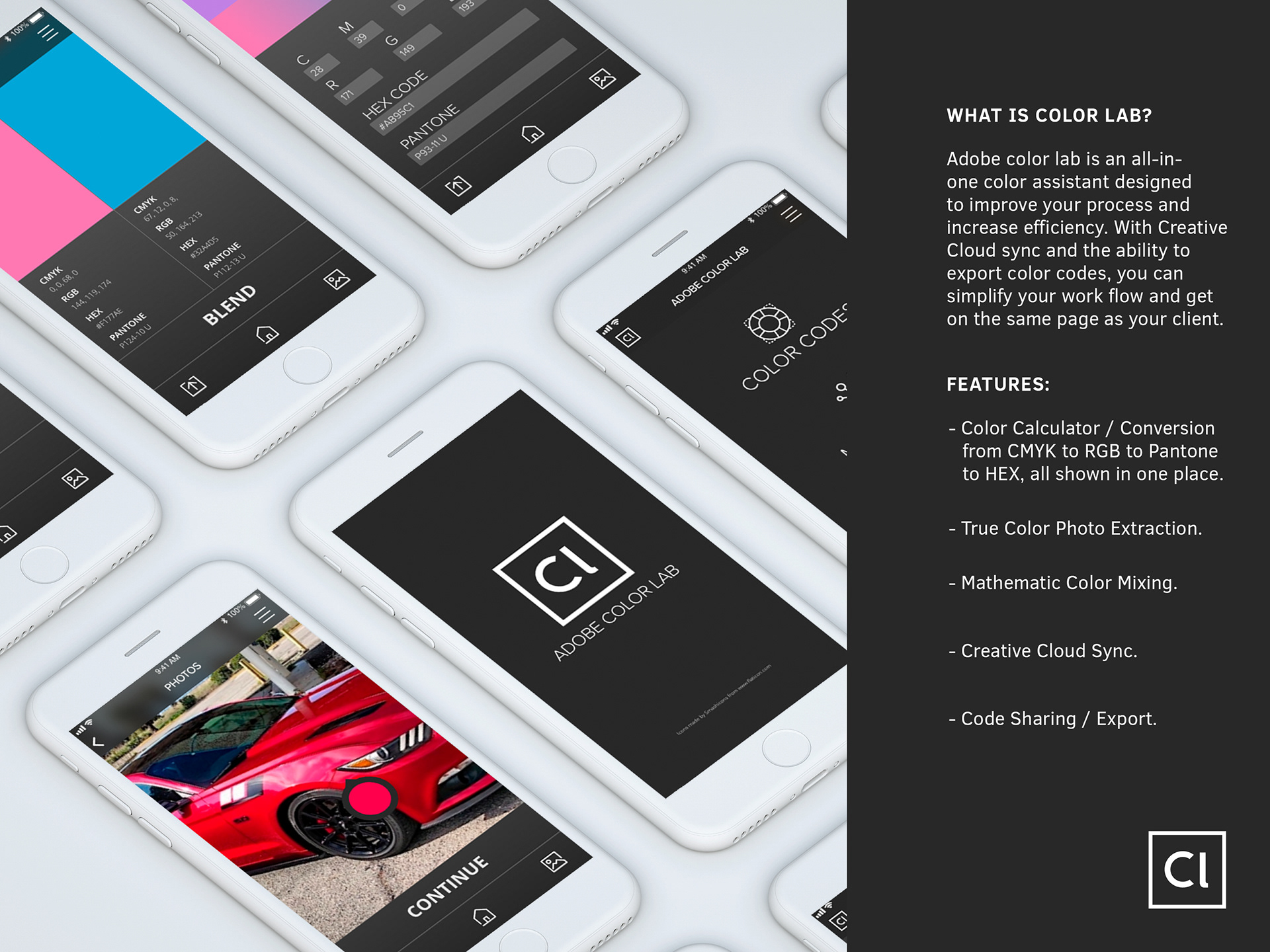
After Researching various calculator options I realized that most of them had be done before, and I considered what calculating functions I had need of that were not met. The result was a color calculator intended for designers. The application would help you quickly convert CMYK to RGB to HEX to Pantone. It would also be able to extract color codes from a photo, or find the mathematic blend of two separate colors.
THE PROBLEM
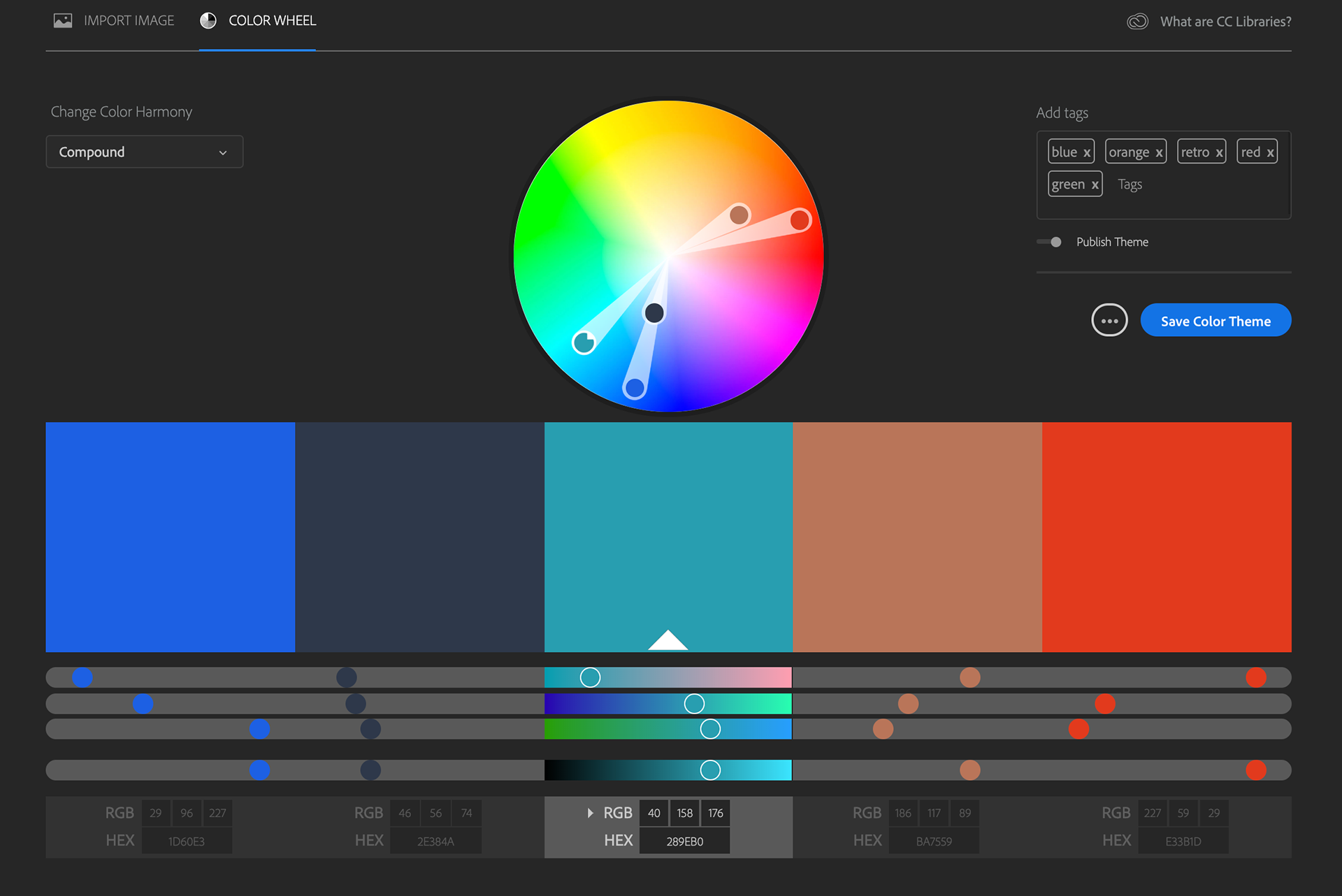
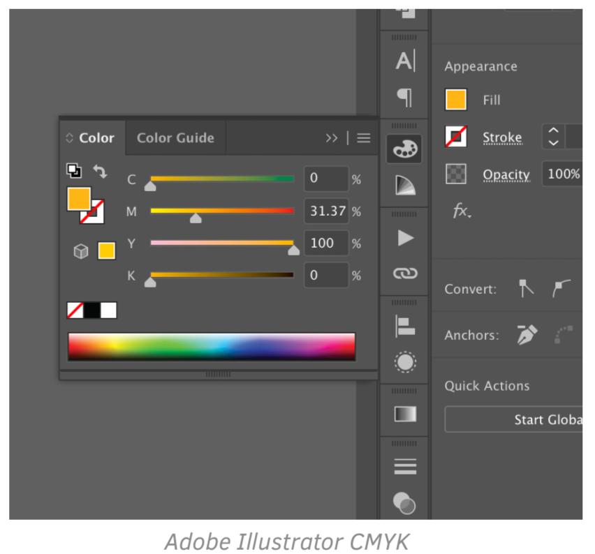
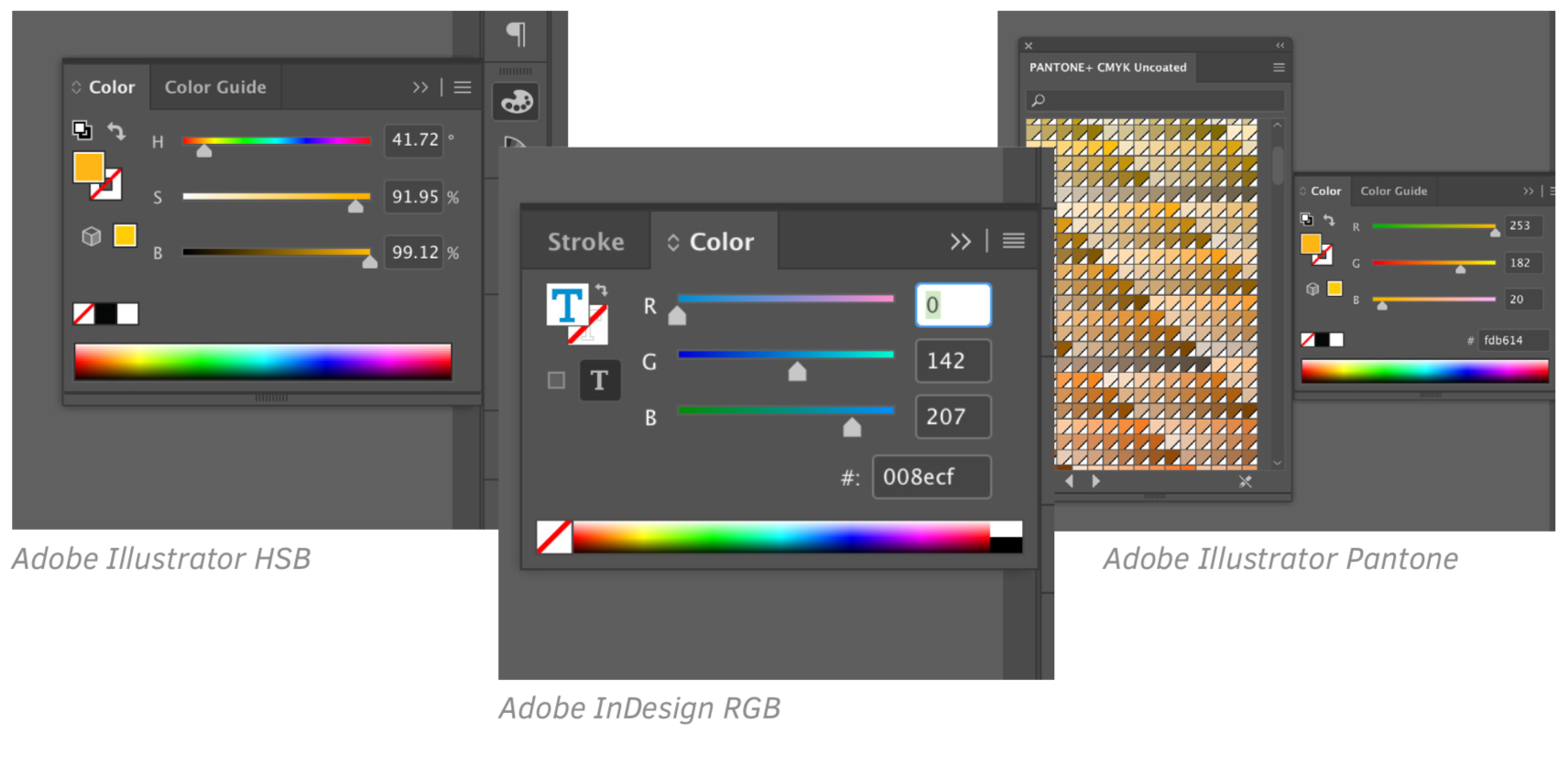
According to my knowledge there is no way to view CMYK, RGB, HEX, HSB, and Pantone color codes all at the same time. Especially when working in the Adobe Creative Suite, it requires either a really good memory, or the taking of notes to collect all four color codes, and then a process of elimination to find a matching Pantone.
THE SOLUTION
I decided It would be fun to build a color calculator that could help designers, and non-designers better understand color codes, and how they can be used. A business owner could find the RGB of his brand color for a designer by simply snapping a photo, or a working mom could find out how to get her home office to match her business cards by imputing a CMYK, and getting a Pantone swatch. Ultimately the goal was to democratize color codes to make them less of a mystery.
SCENARIOS
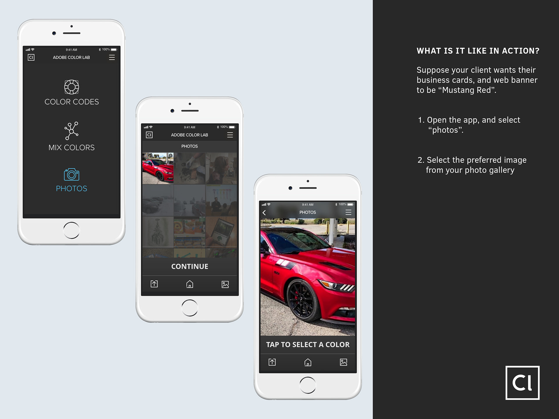
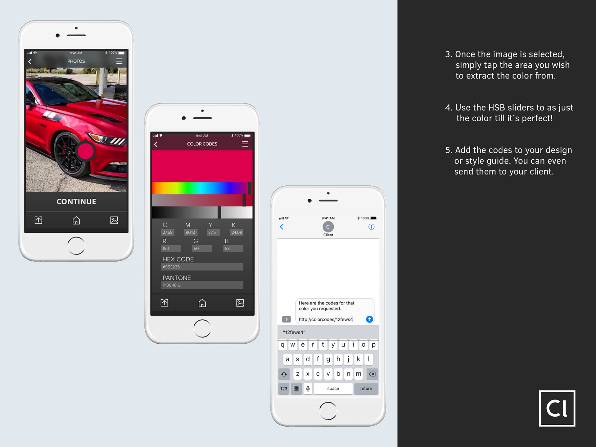
I developed three specific scenarios that outline the main features of the app. Again, the intended audience are designers who need specific colors for their various projects.
Fortunately I spend a lot of time around designers, and therefore I had ample opportunity to test the app on the target audience. I also preformed user-testson various users who were not familiar with the processes of design. About seventy percent of them were able to navigate the sketches, their feedback was most informative.
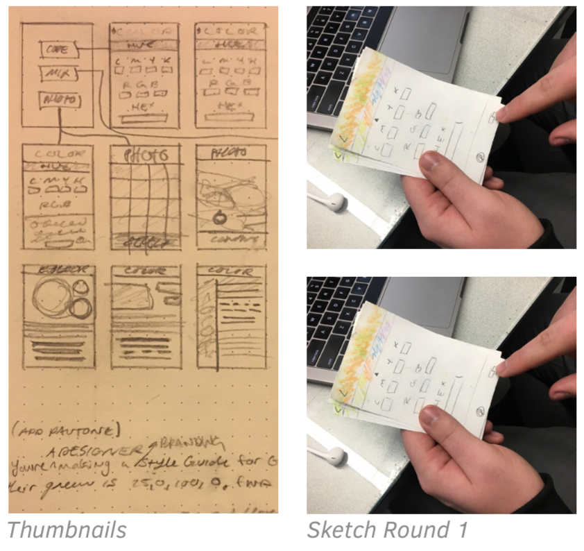
I considered three basic theme options for the app. A contrast, a light, and a dark theme. Since the app was about managing color, I didn’t want to distract the user with saturated bars and menus. This meant the majority of the app would be in black and white.
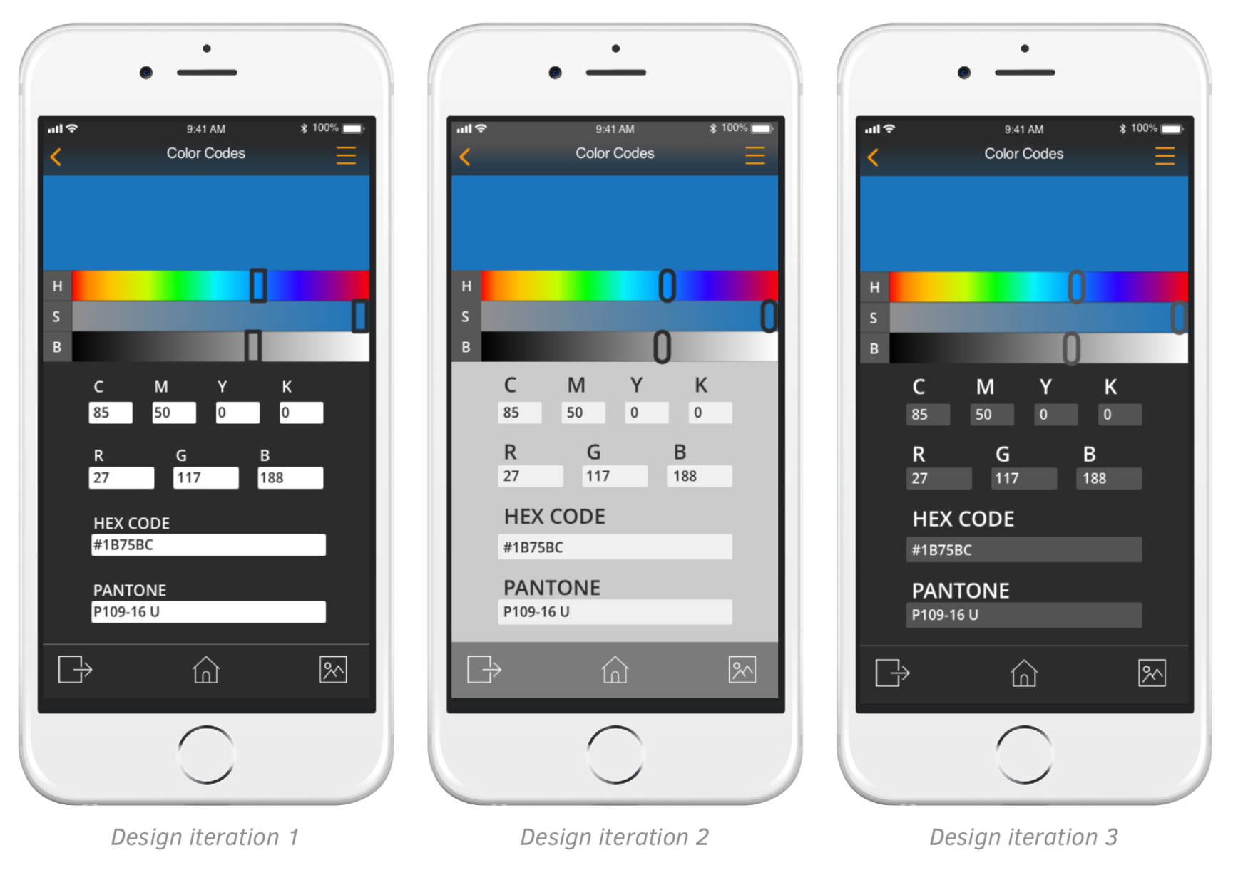
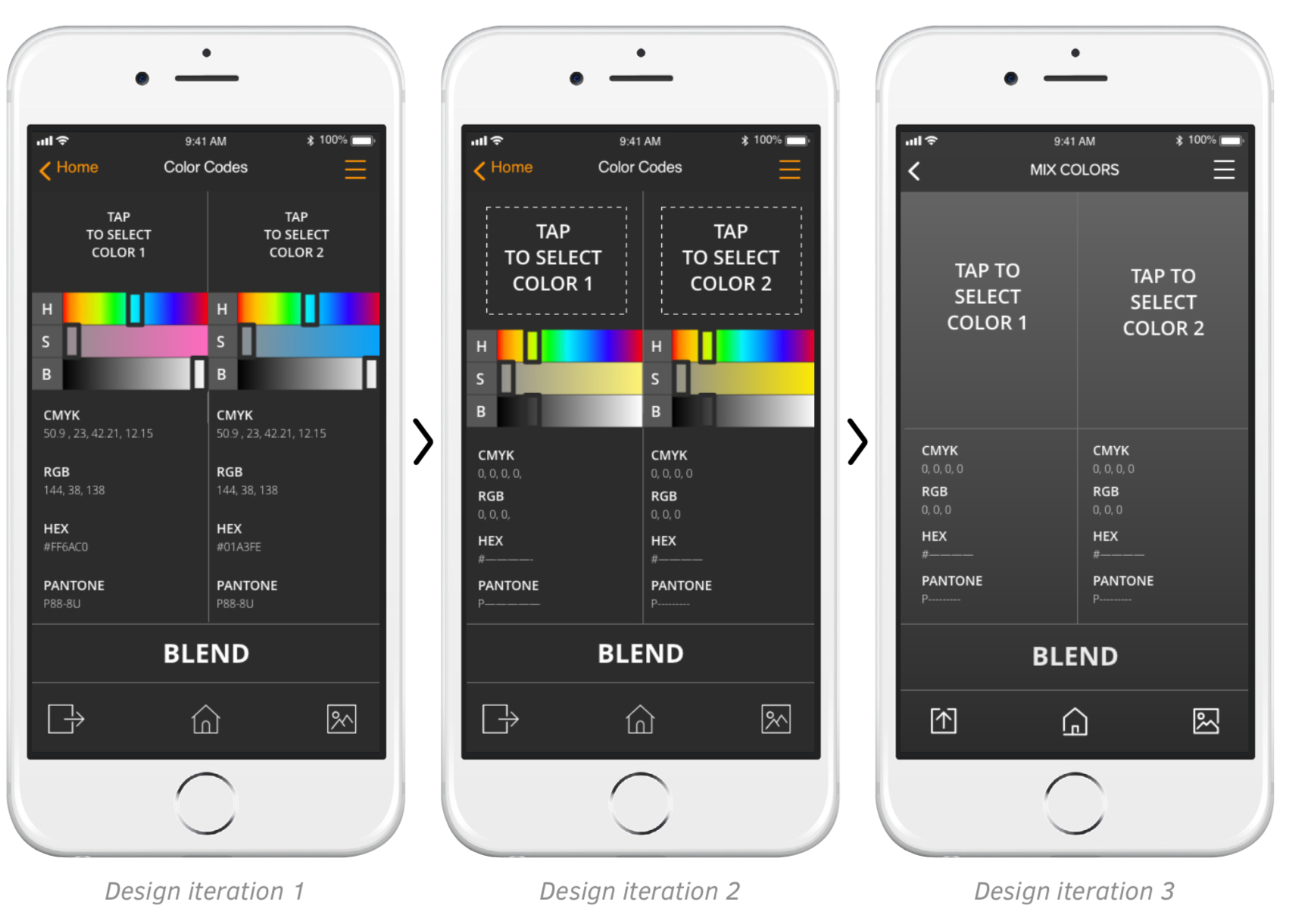
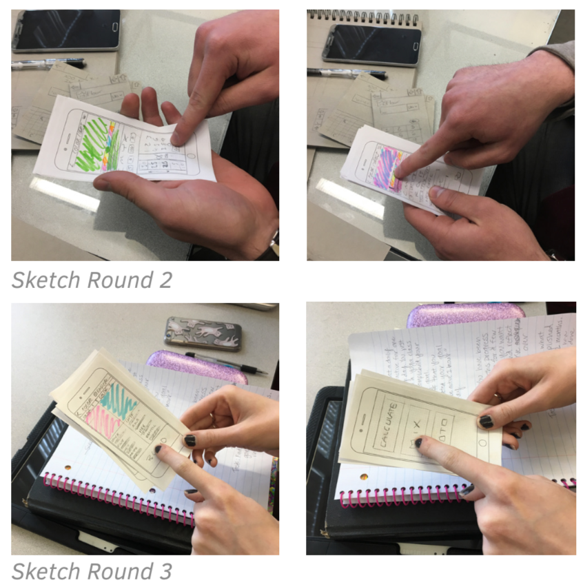
After more usability testing I came to the conclusion that the mixer (three images on the right) wasn’t missing something, but rather had too many details on screen. The HSB sliders gave the user the perception that they should adjust the colors then and there, which in technicality they could, but these signifiers made the screen to cluttered and difficult to understand. By simplifying and clearing up the space, I was able to more clearly communicate the direction I wanted them to take.
Working with Adobe XD was really fun, and I learned a lot. I came to better understand affordances and signifiers. I learned to simplify my content, and number of screens, and I learned how to consider the interaction of each screen, and how to minimize state changes for when they were necessary.