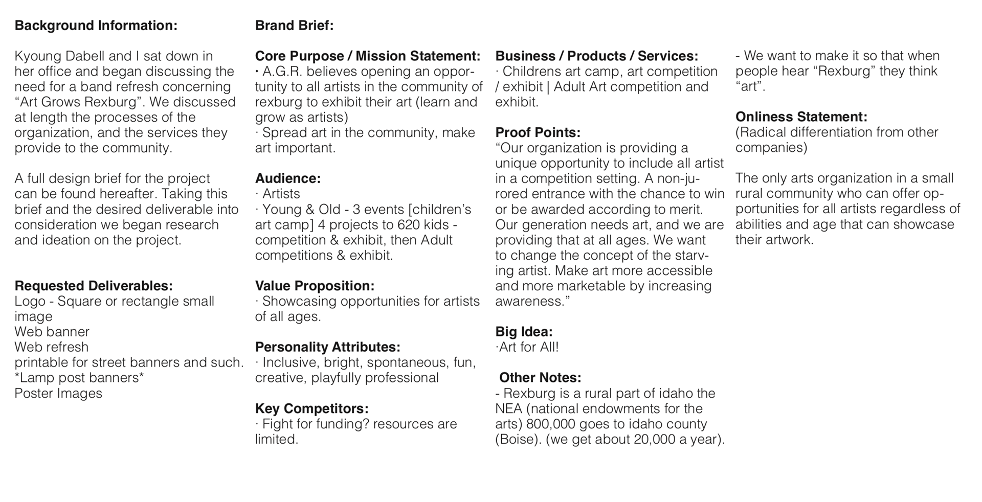
Art Grows Rexburg is a non-profit organization dedicated to helping community member realize their artistic abilities. Their main offering is an annual art show that presents a variety of work from differing ages and skill levels side-by-side. I was contracted to rebrand the organization to better represent their business.
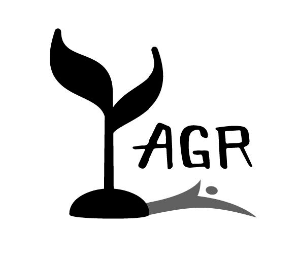
The previous logo was put together by members of the AGR committee. They felt that the color washes represented "Art", and that the sprout expressed the concept of "growth". They asked me to take these ideas into consideration as I worked on the logo. I was also asked to use the primary colors in the logo.
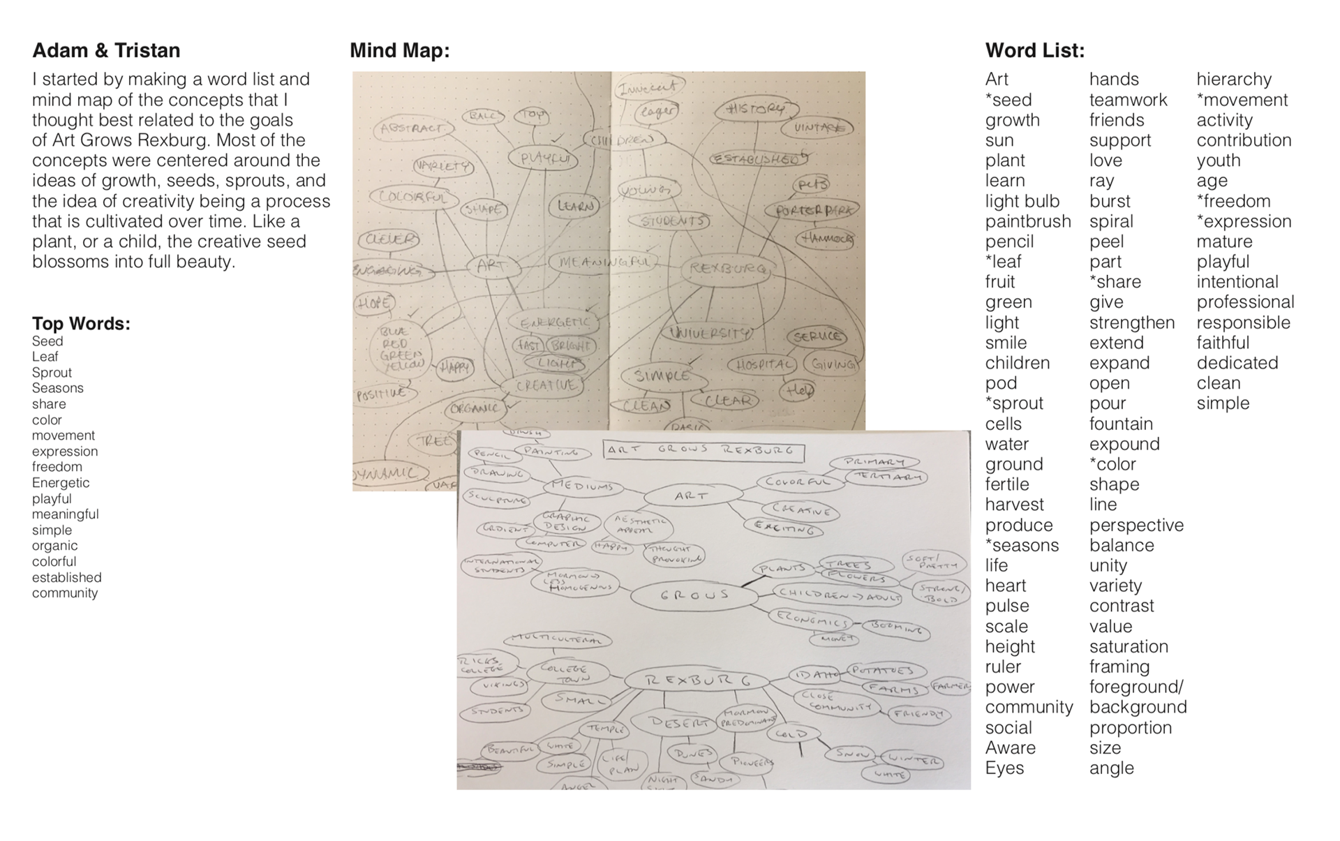
I began by sending a brand brief to the committee, and then started a word list and mind map with the help of a friend. We settled on a few keywords including:
seed, sprout, expression, meaningful, simple.
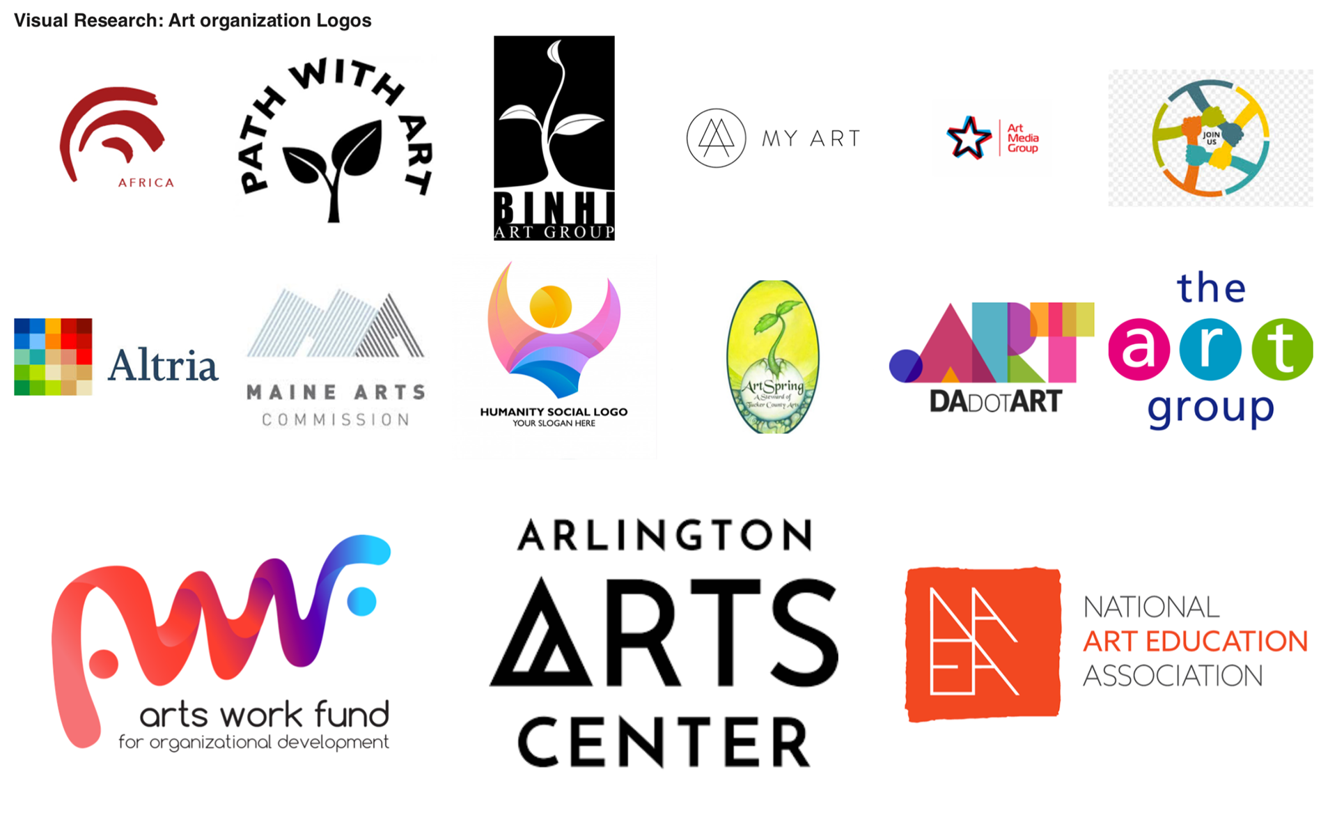
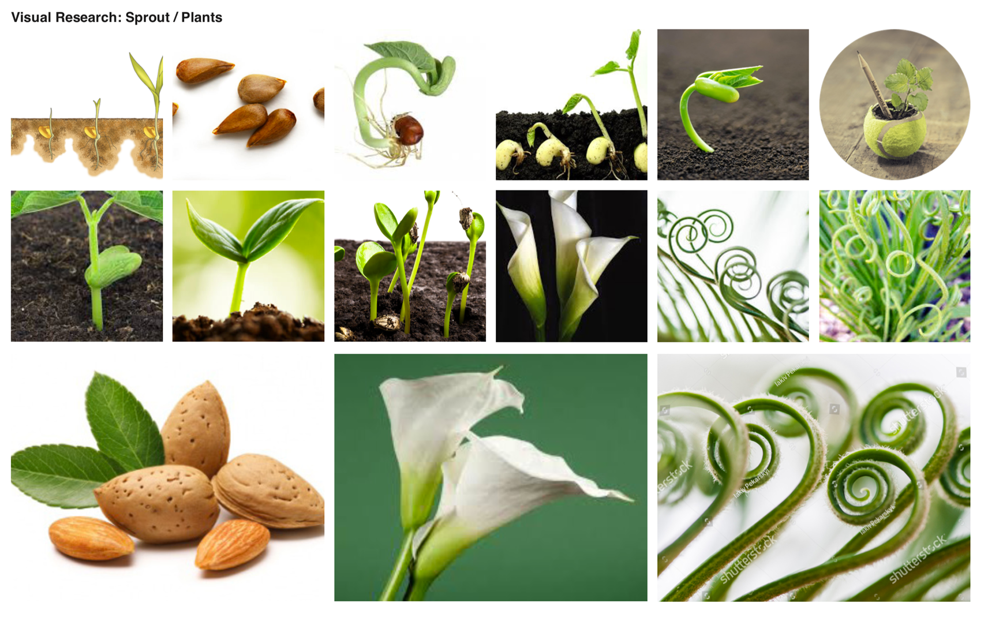
I then launched into visual research for both educational art organization as well as the concepts listed above. These really helped spark a few ideas.
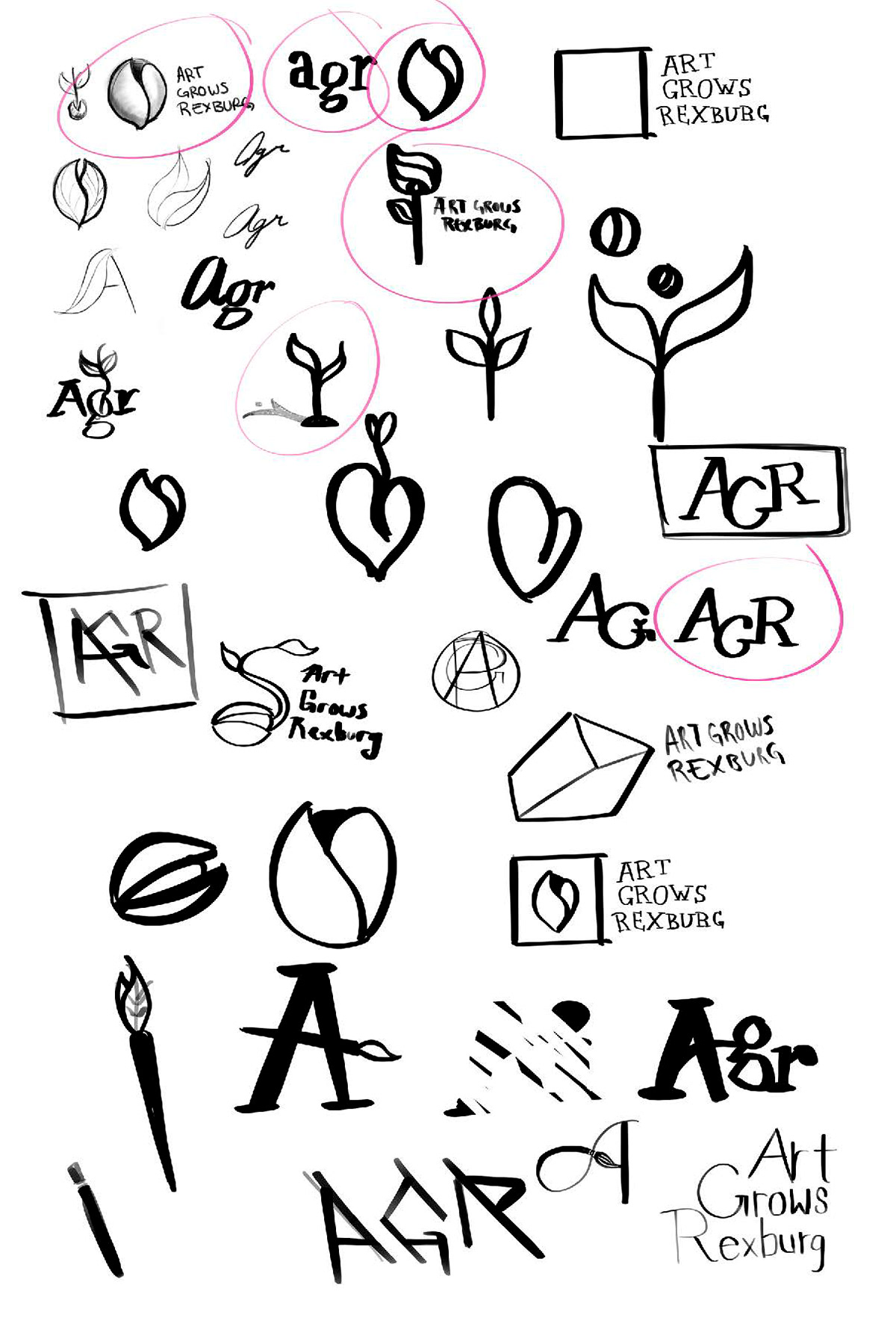

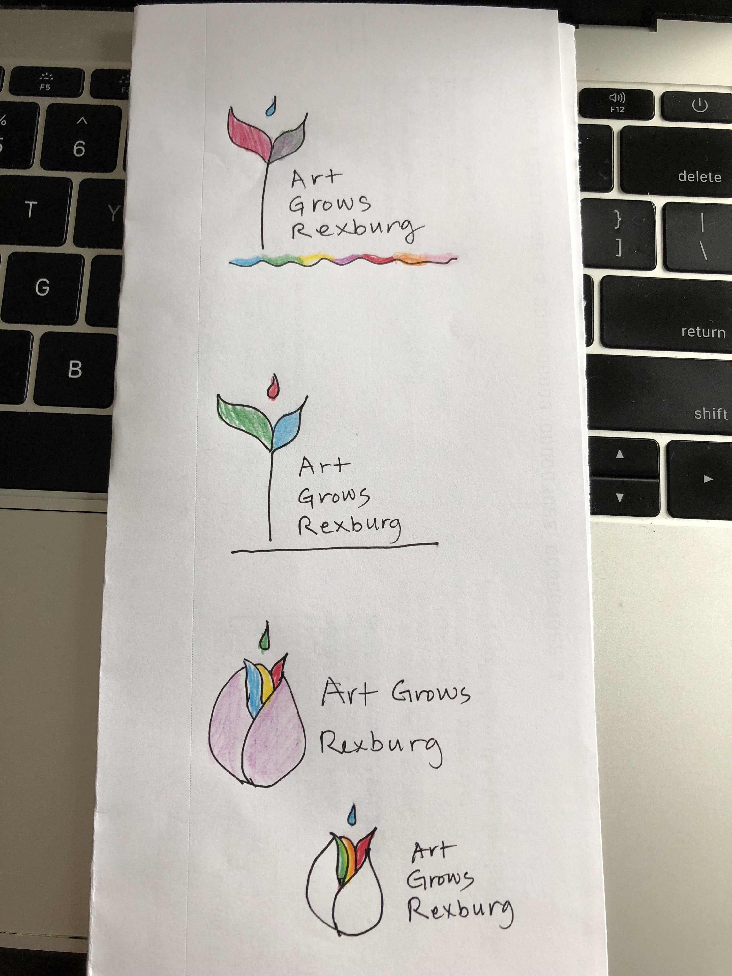
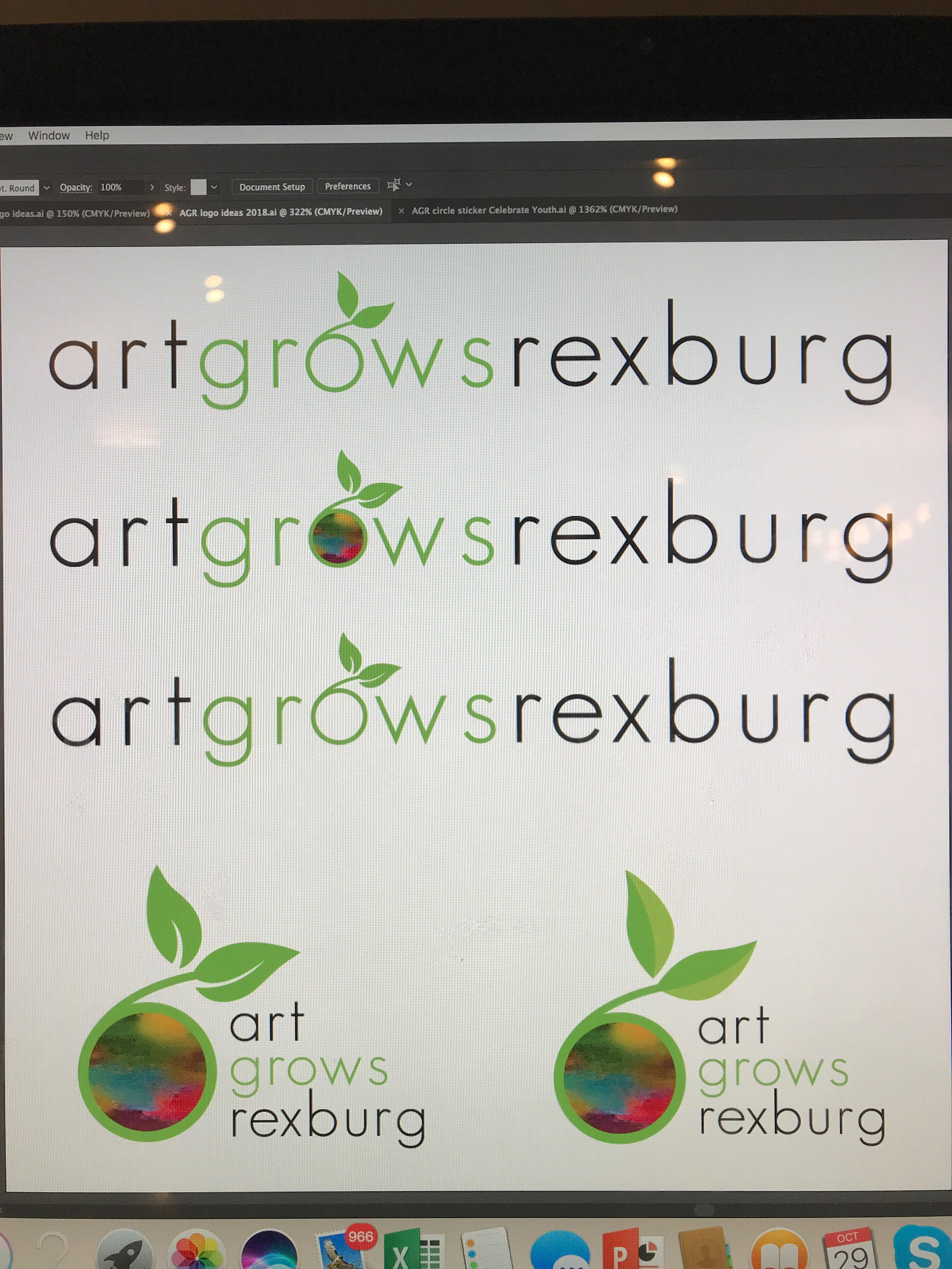
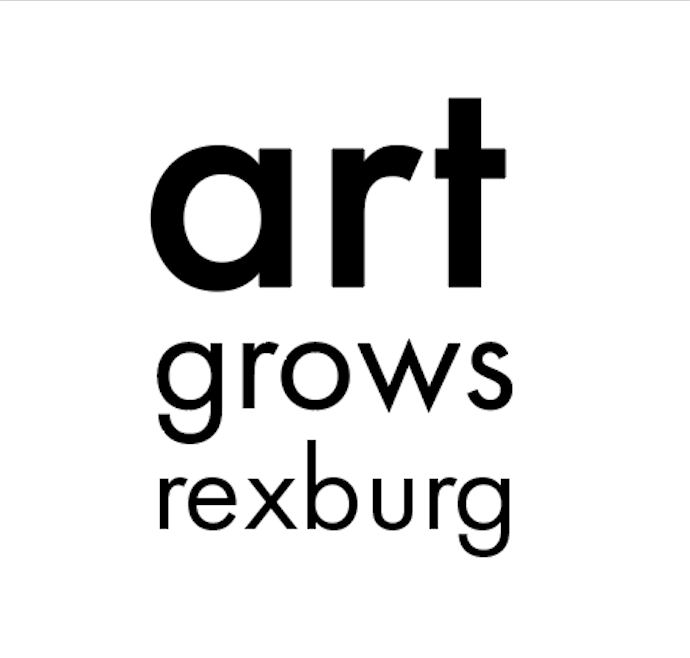
My initial sketches focused a lot on the idea of the sprout, and the seed, but I also gently toyed with the typography, seeking for a way to capture "art" in type. These were reflected in my initial digital compositions shown below.
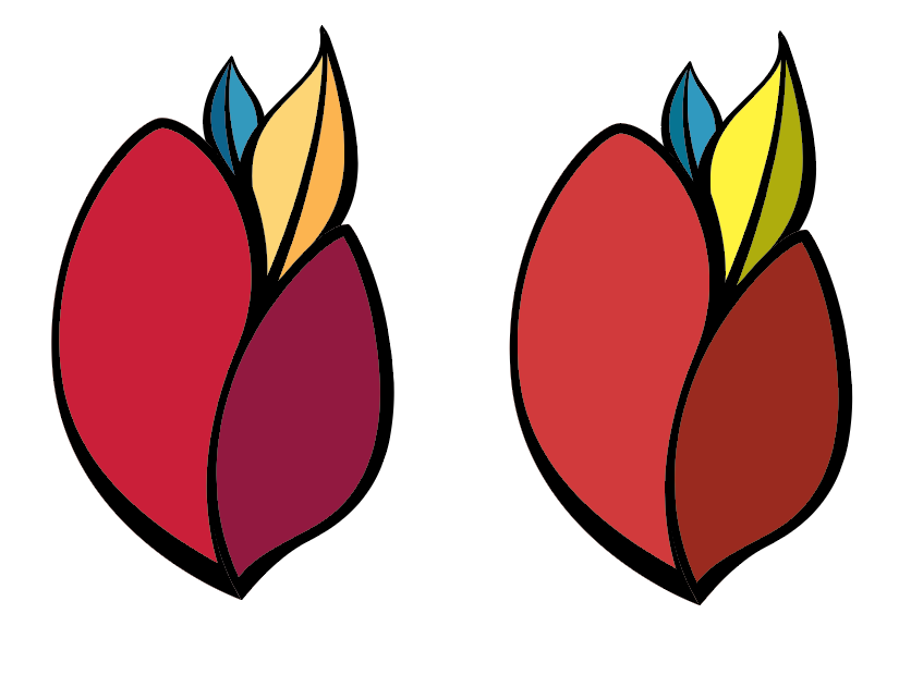
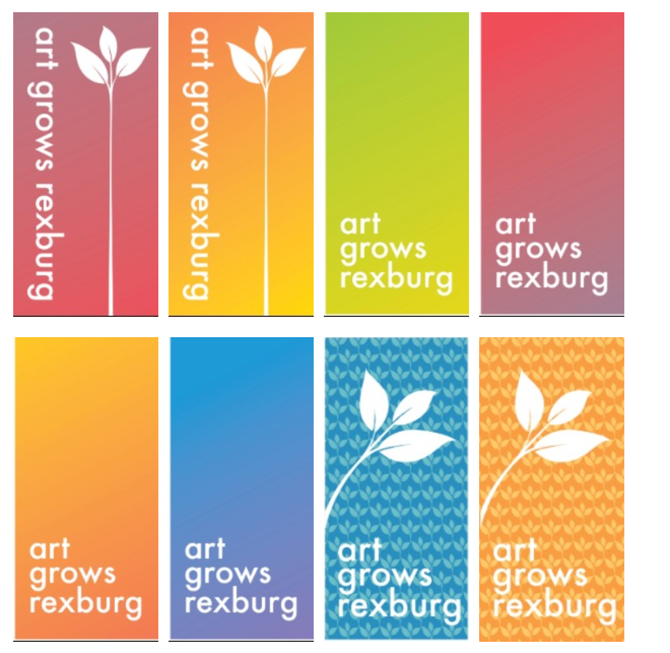
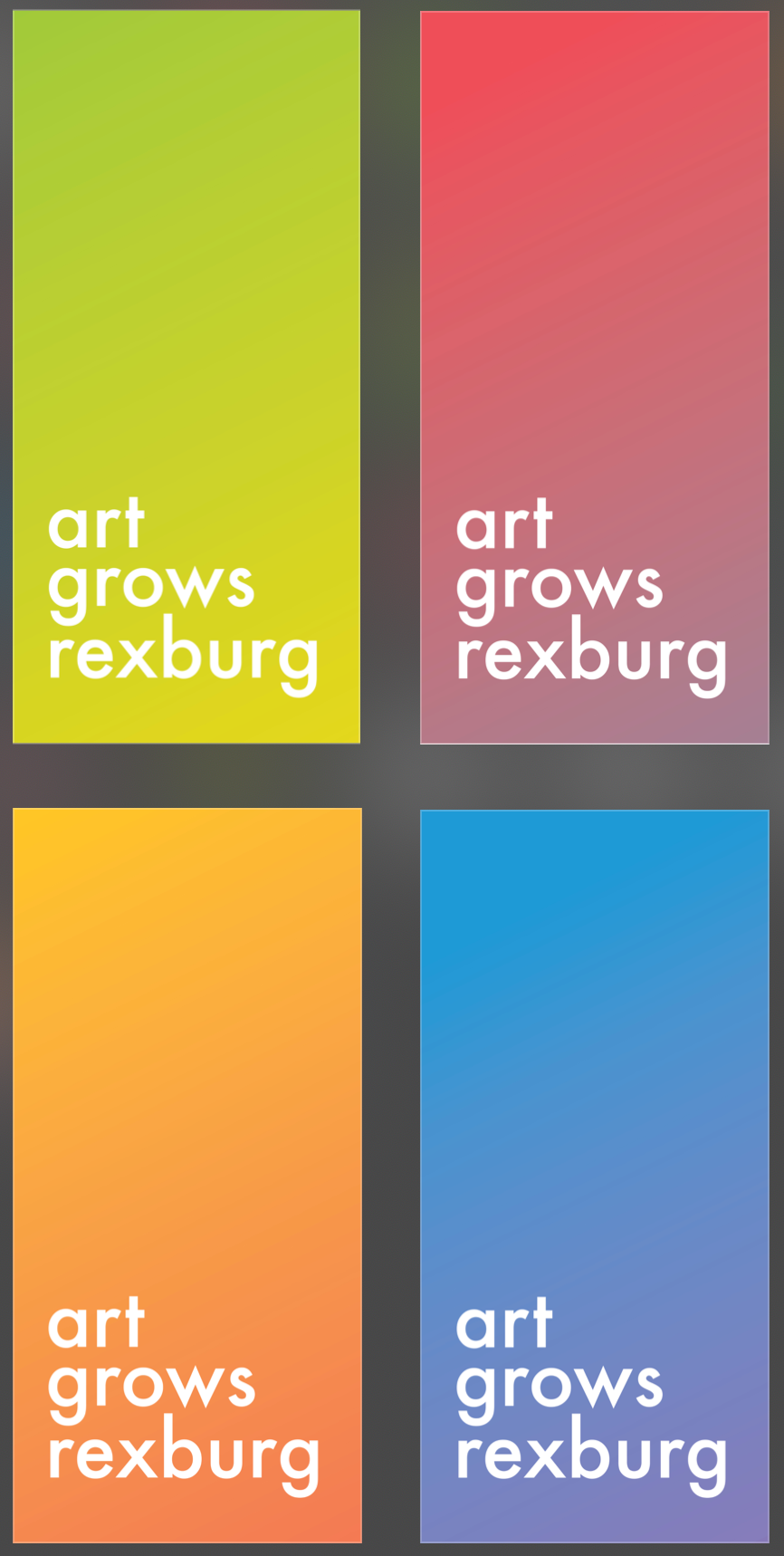
After sending these comps to the client I received some feedback (along with the sketches in the photo below on the left). Taking this into consideration I decided to push a sprout out of the seed and make a colorful set of digital compositions that could be applied seasonally (below and on the right).

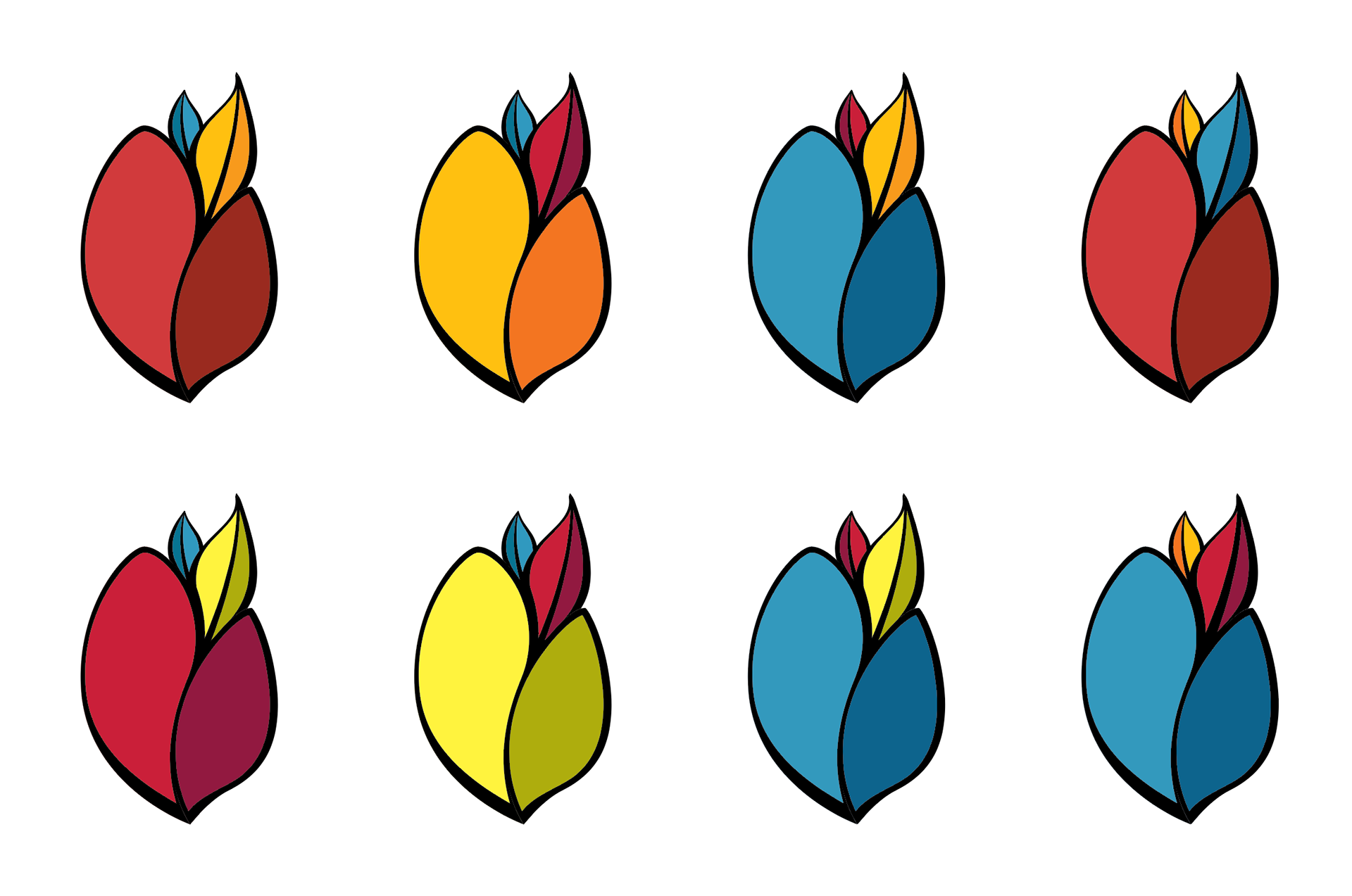
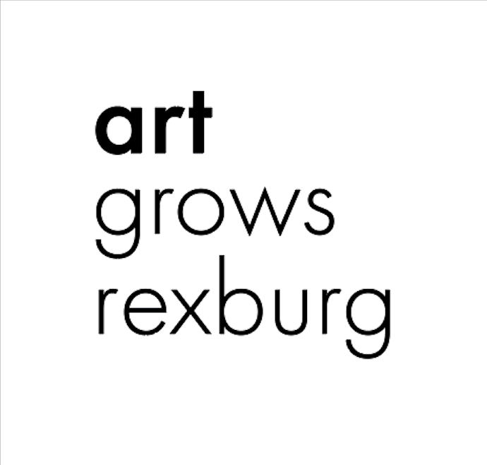
Upon further feedback I pushed the form of the seed further, again attempting to find a way to work the primary colors into the design without it becoming childish and comical. This was achieved by neutralizing the red, green and blue to maintain some substance in their representation.
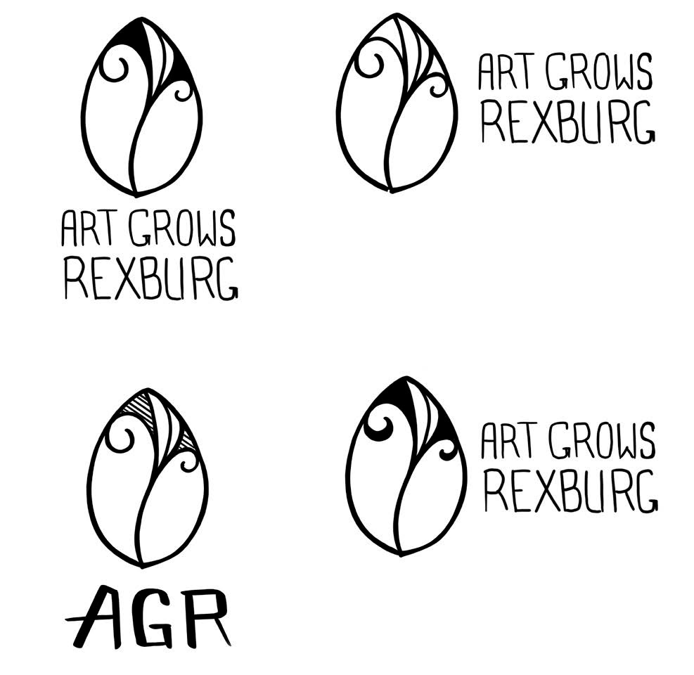
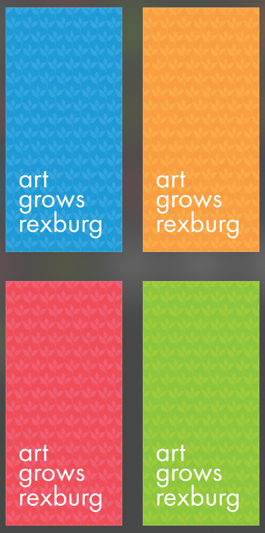
After the committee had fully gathered to review these compositions they responded with another design suggestion. This helped me understand that they highly valued the sprout shape in their original logo. I was pleased to see that they were willing to explore more modern and clean fonts.

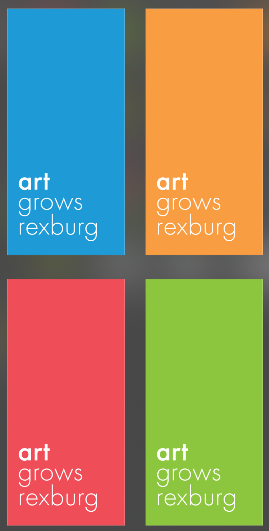
This began a series of compromises where I did my best to work toward their vision while still bringing an eye for quality and positive design to the table.
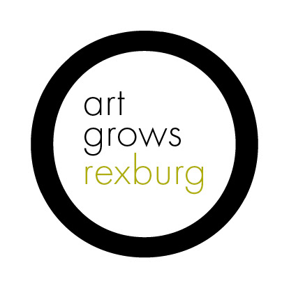


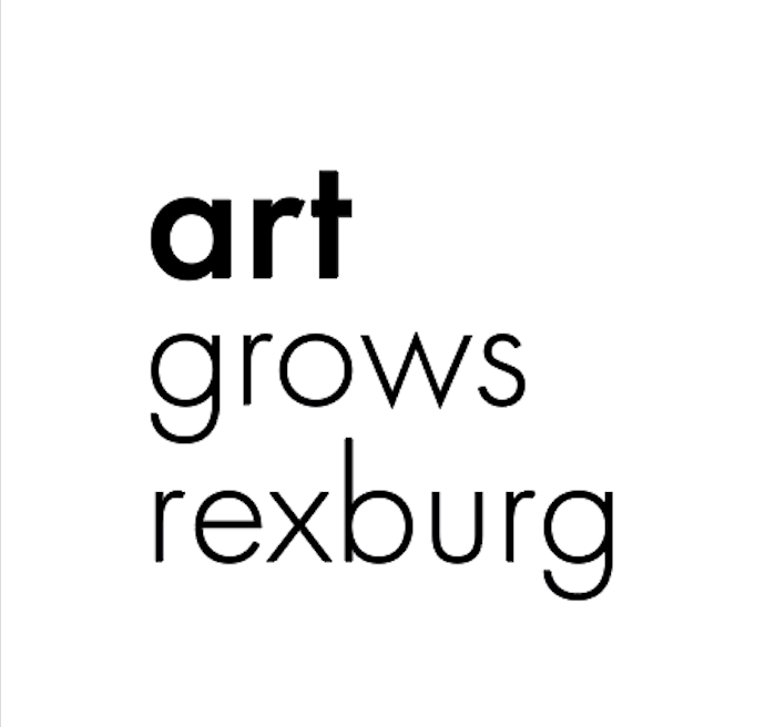
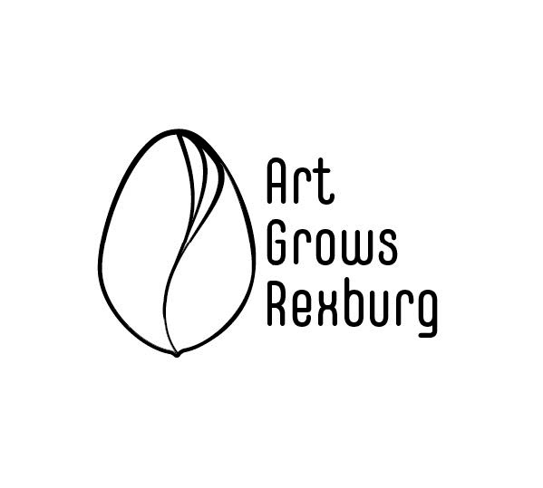
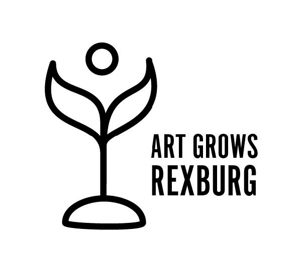
We also began to consider various layouts of the word mark. This all resulted in the agreement of the concept below. I was very pleased with the clean, professional, mature and artistic feel that it provided; Fortunately they agreed.

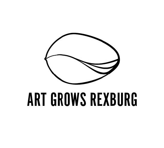
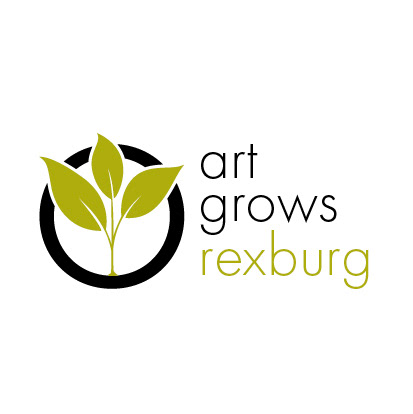
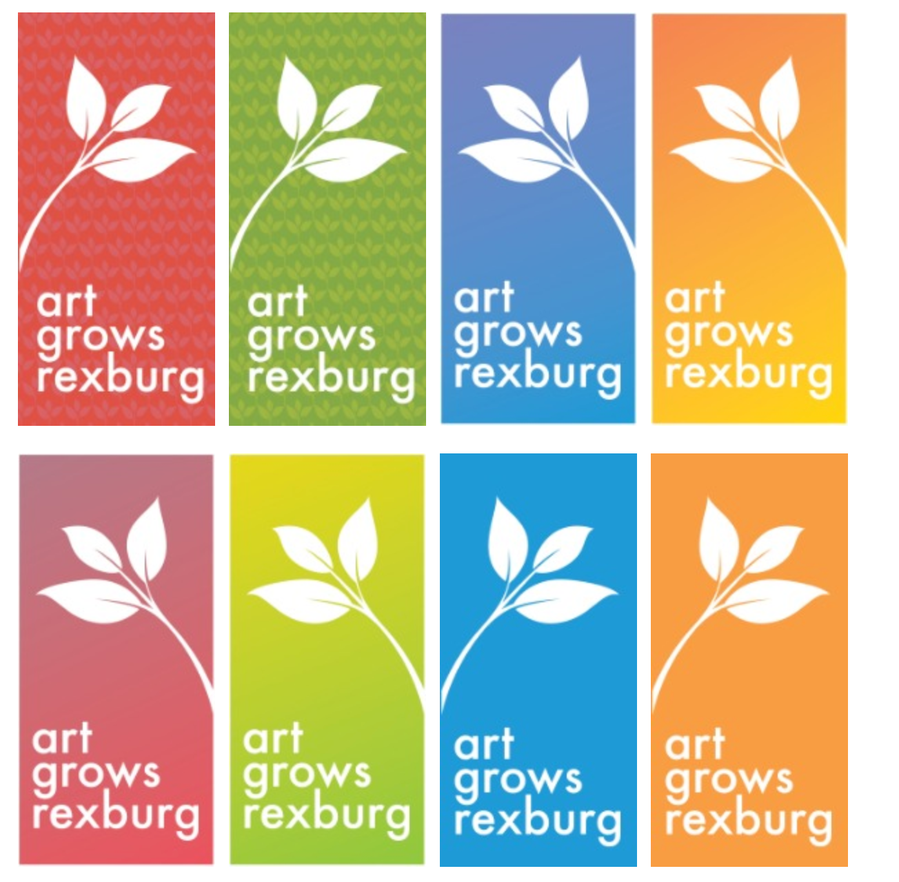
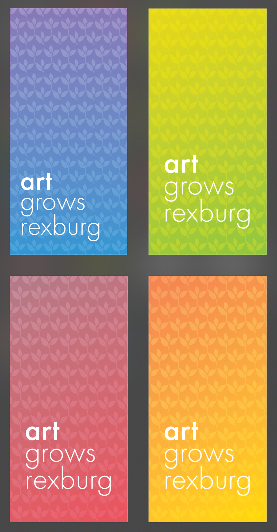
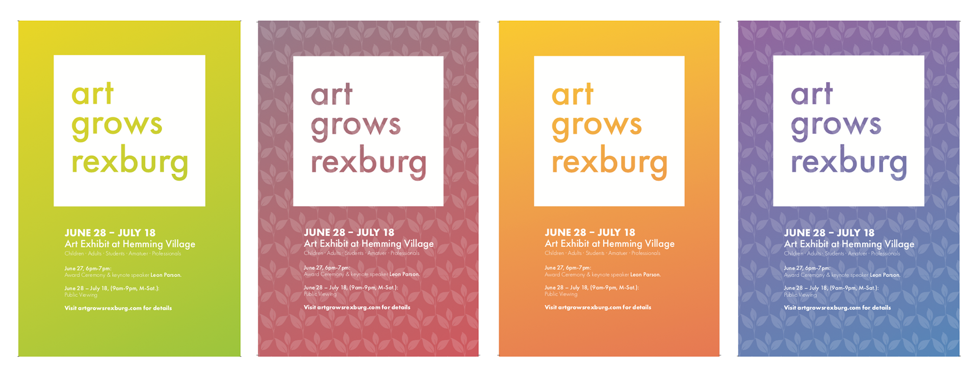
After agreeing upon this general idea I began working on a way to bring the colors back into the design to attract the younger audiences and represent some other the other company offerings such as children's summer camp, art contests, etc.
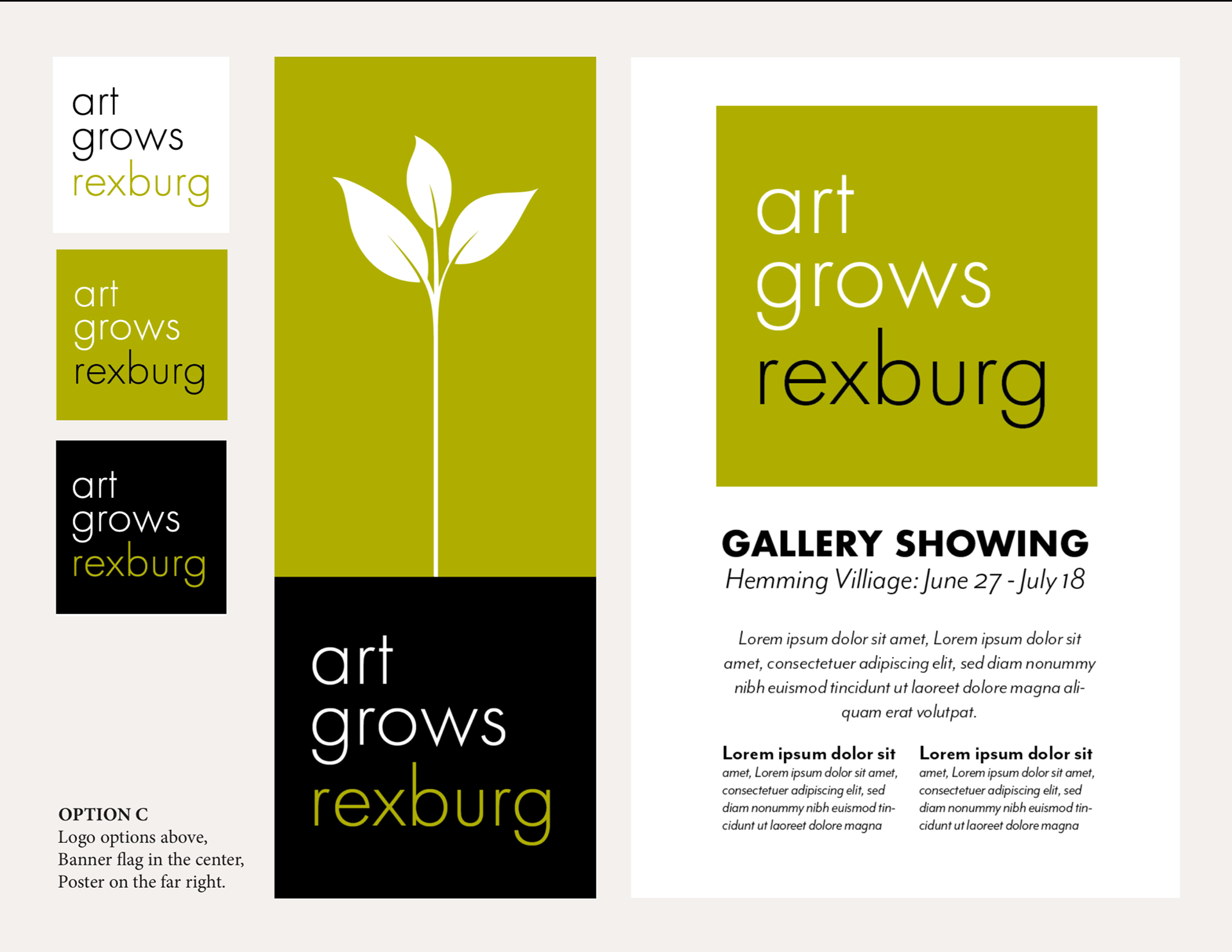
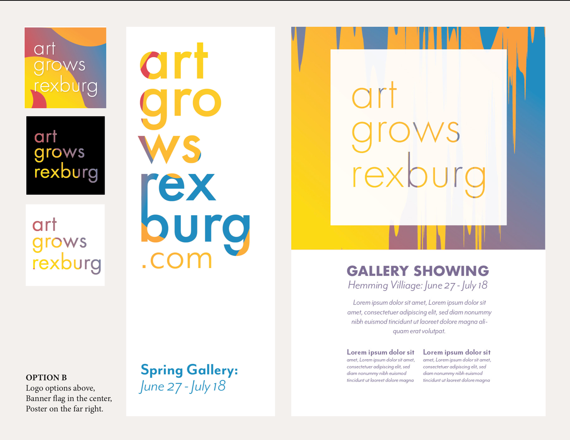
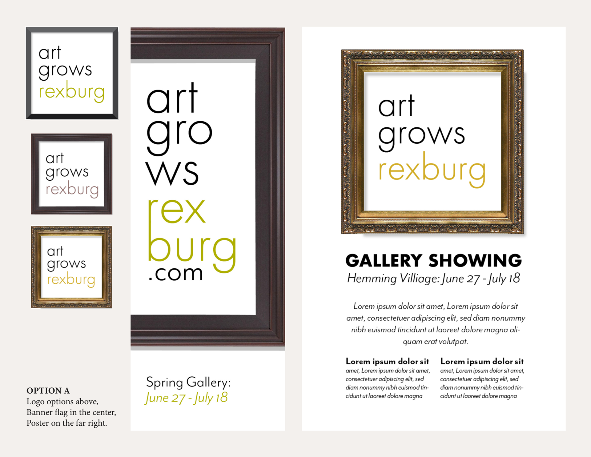
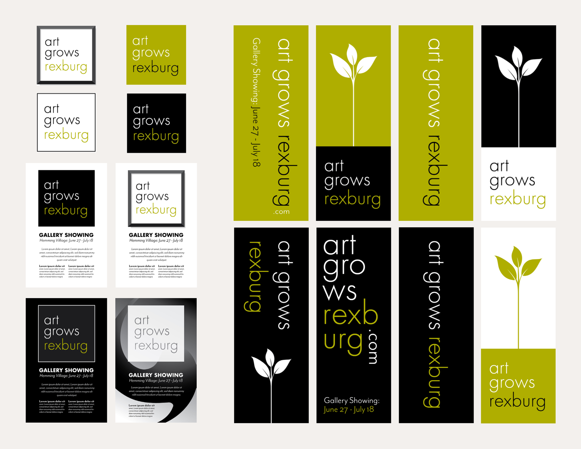
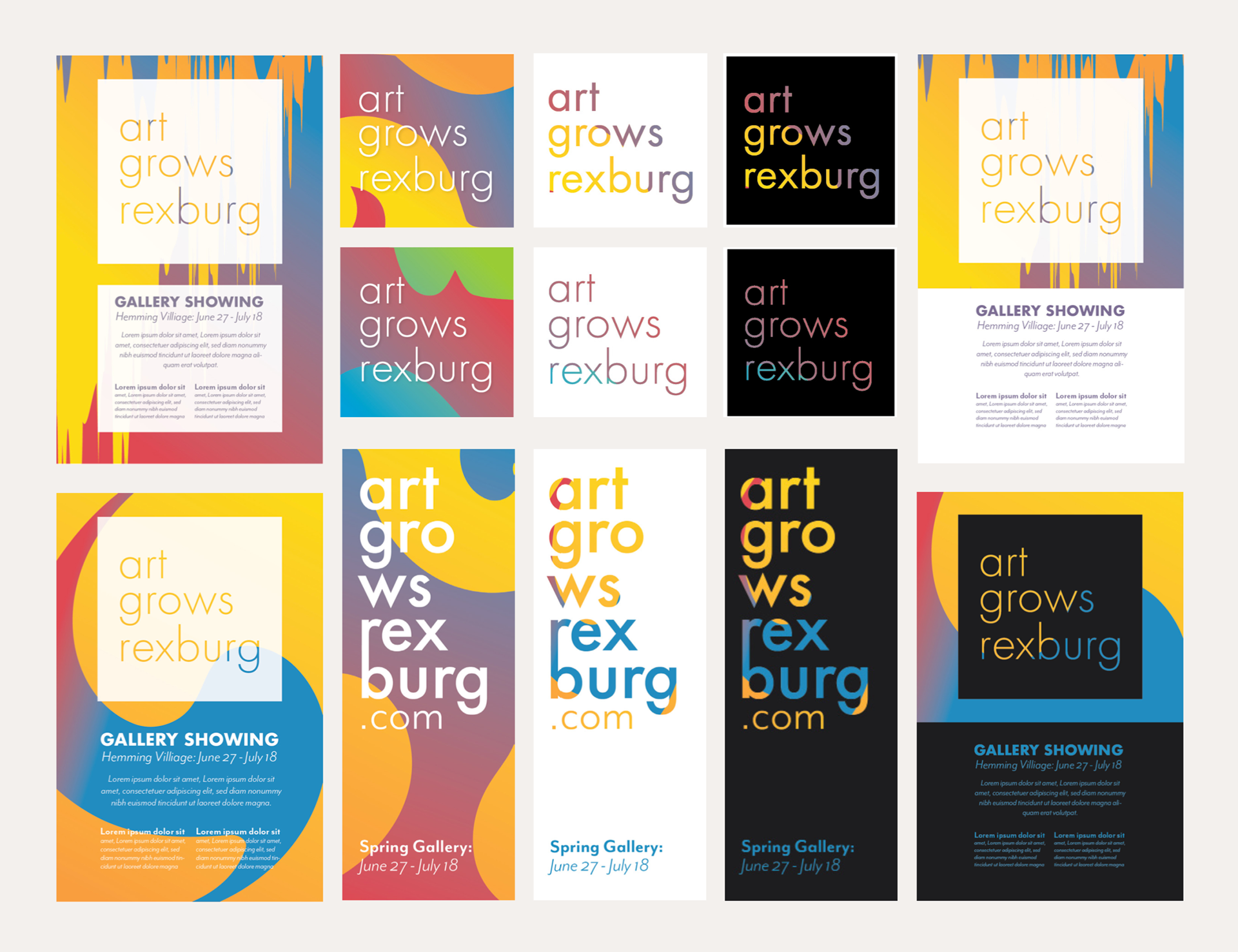
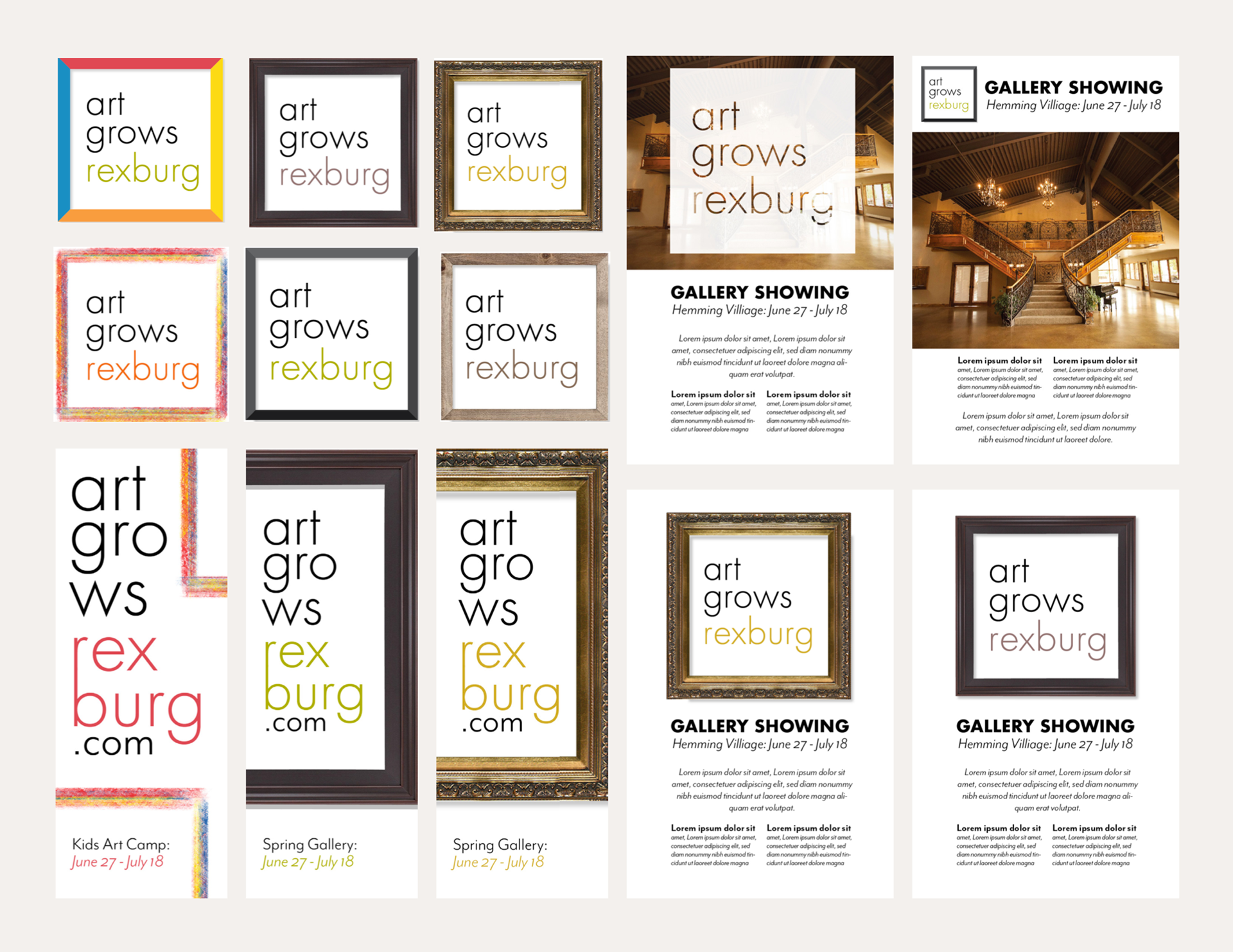
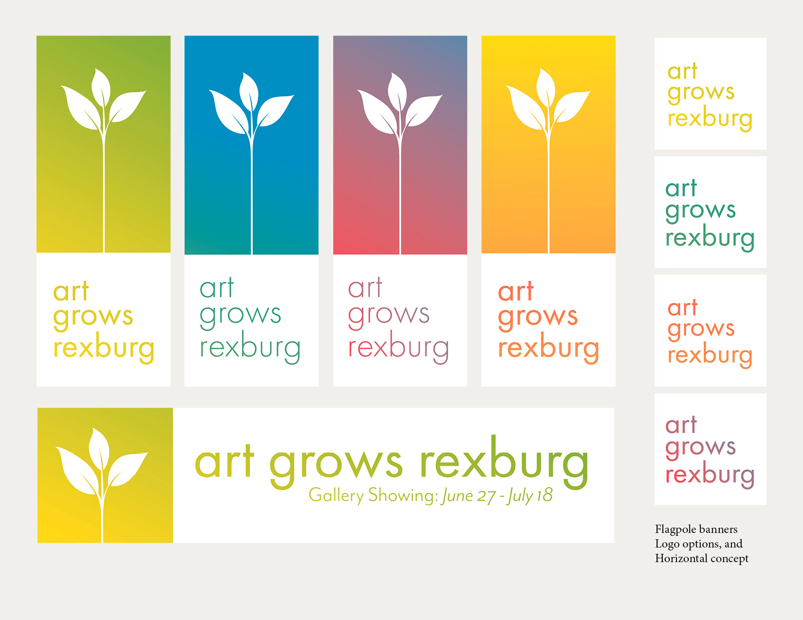
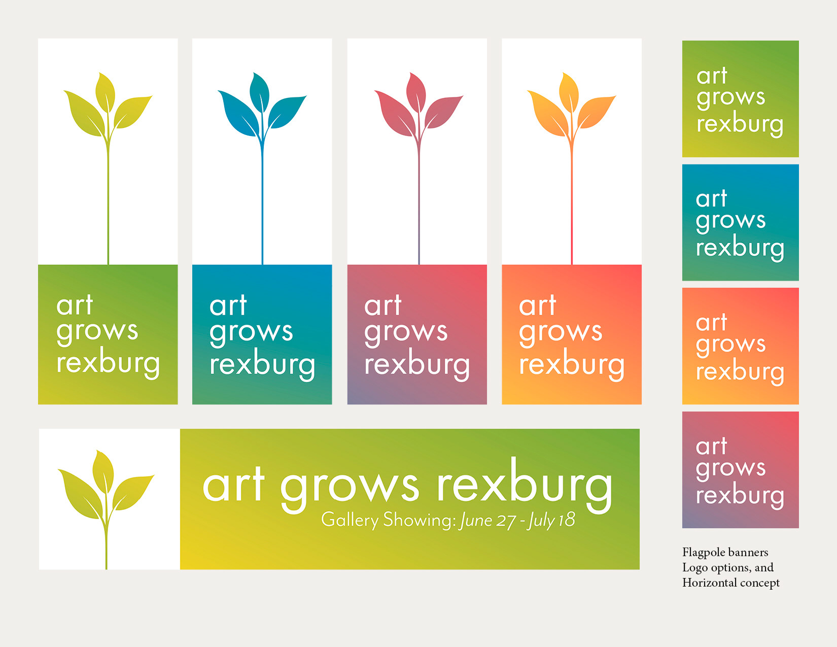
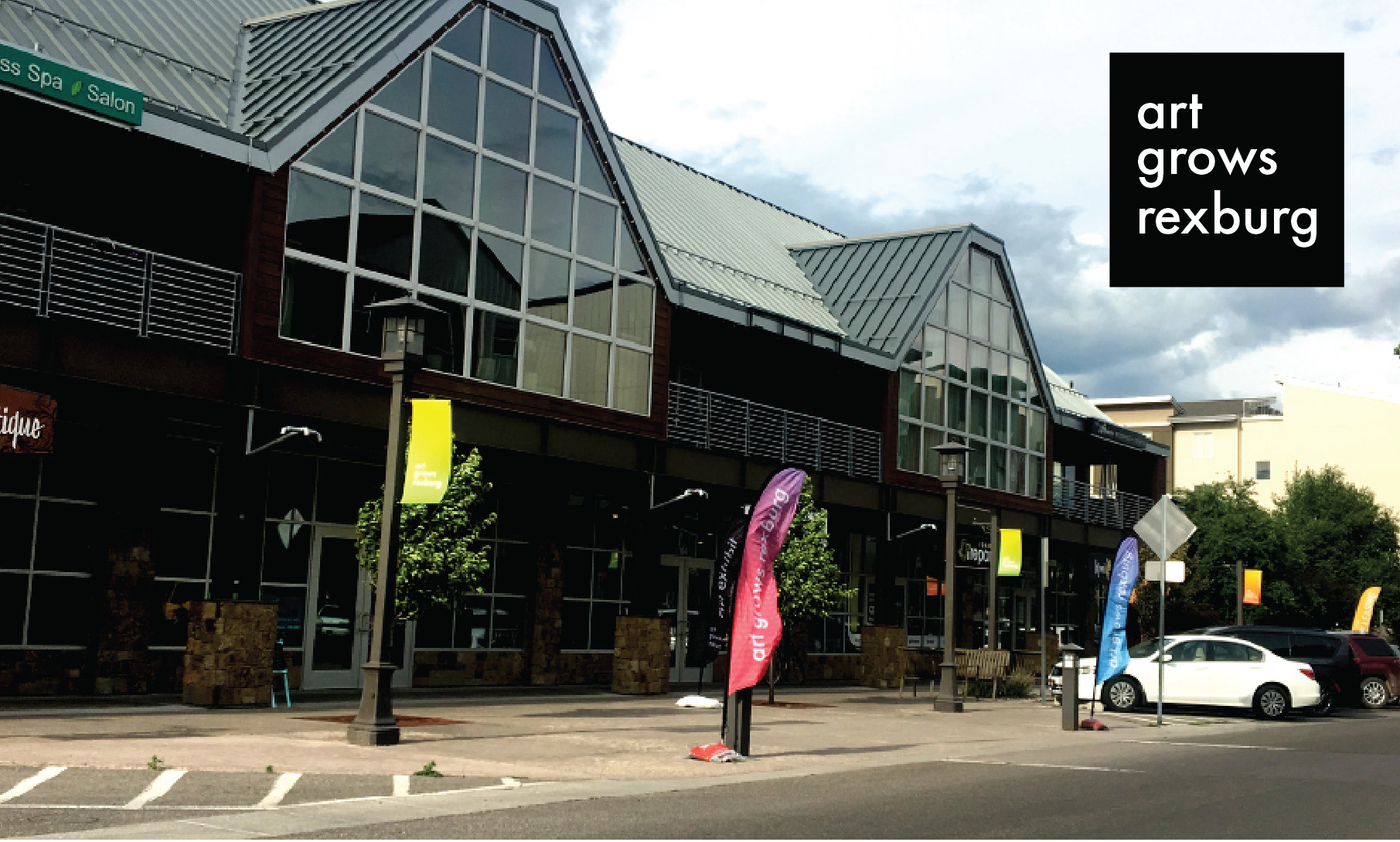
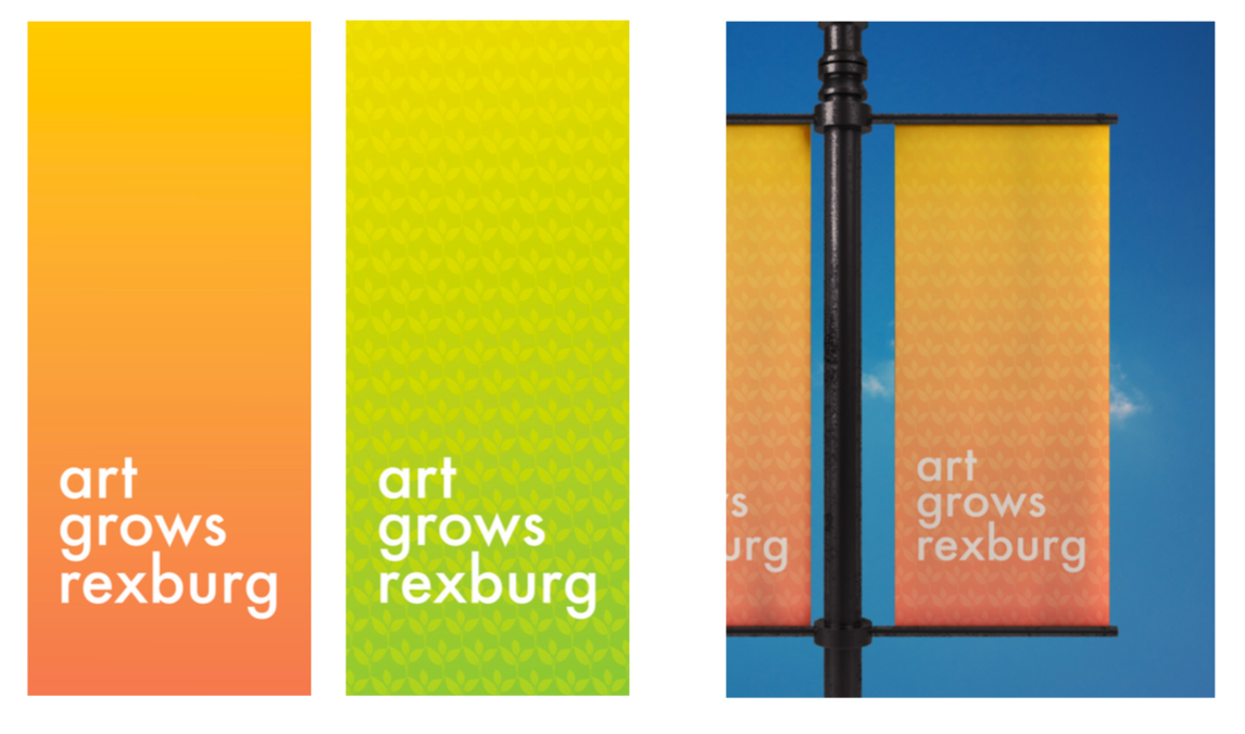
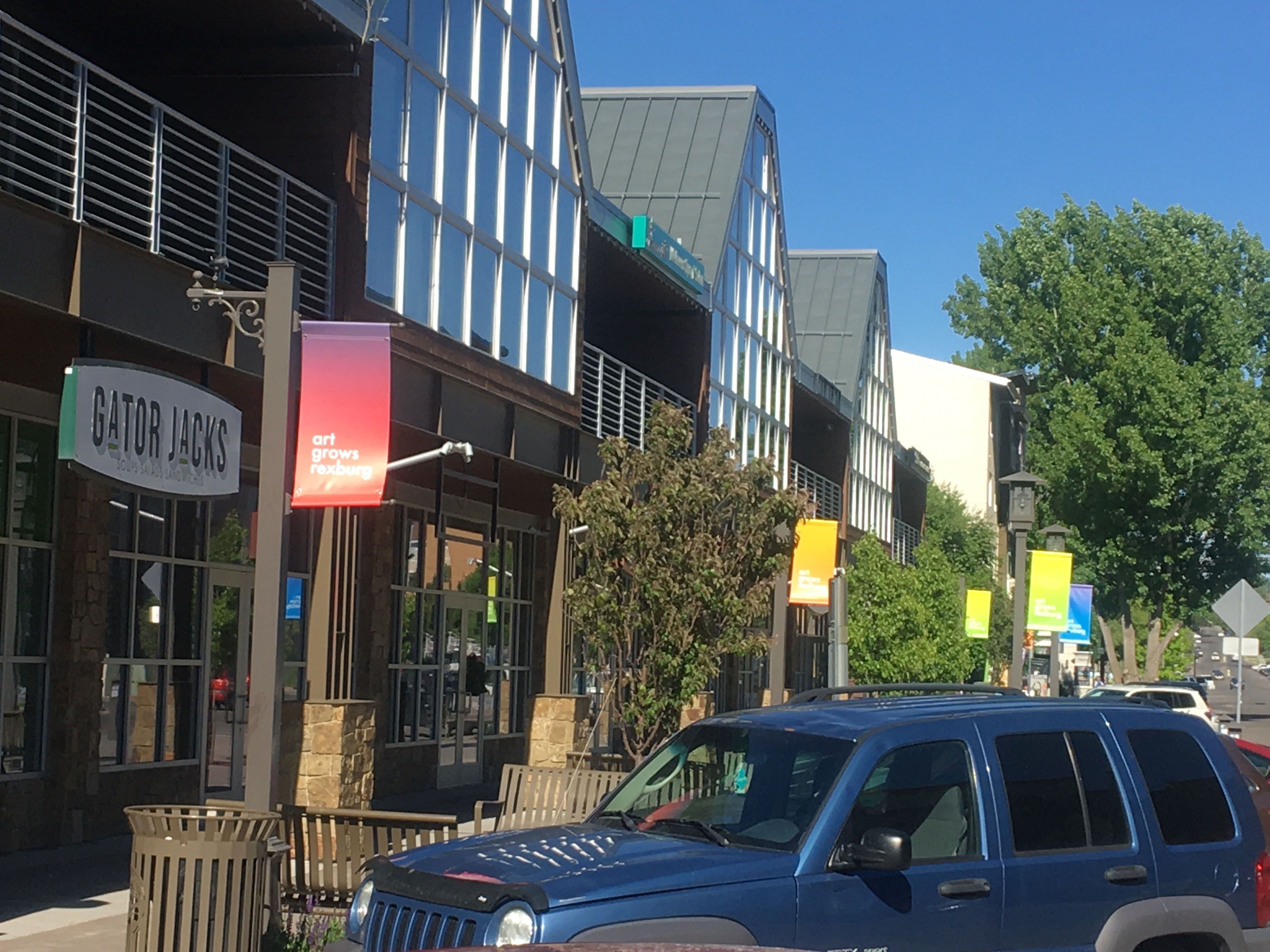
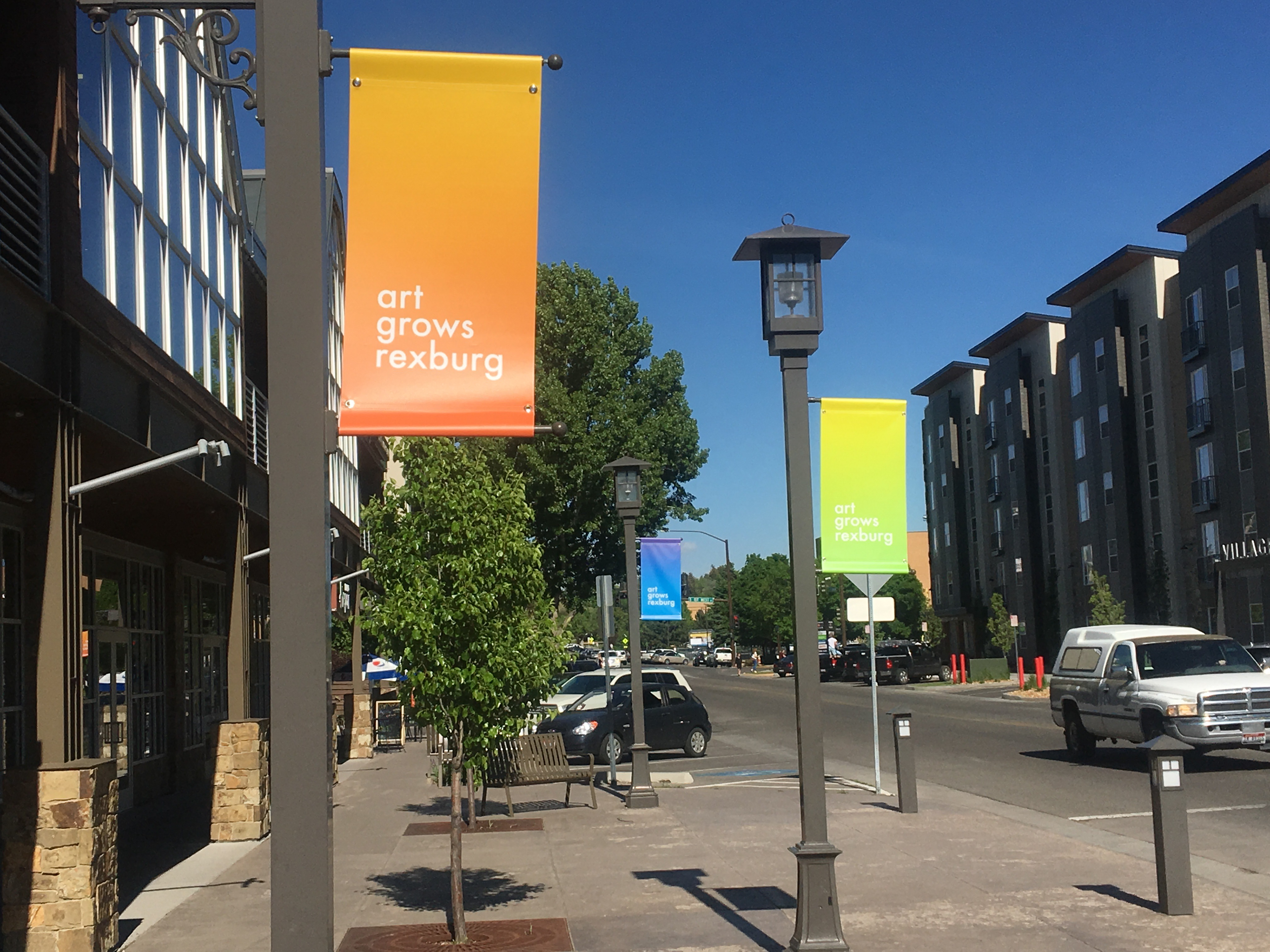
In the end we landed on something similar to the option above. It was at this point that I was notified that a primary use of the brand would be on streetlight banners. I was send a rough sketch of the layout, along with the clients idea for the design.
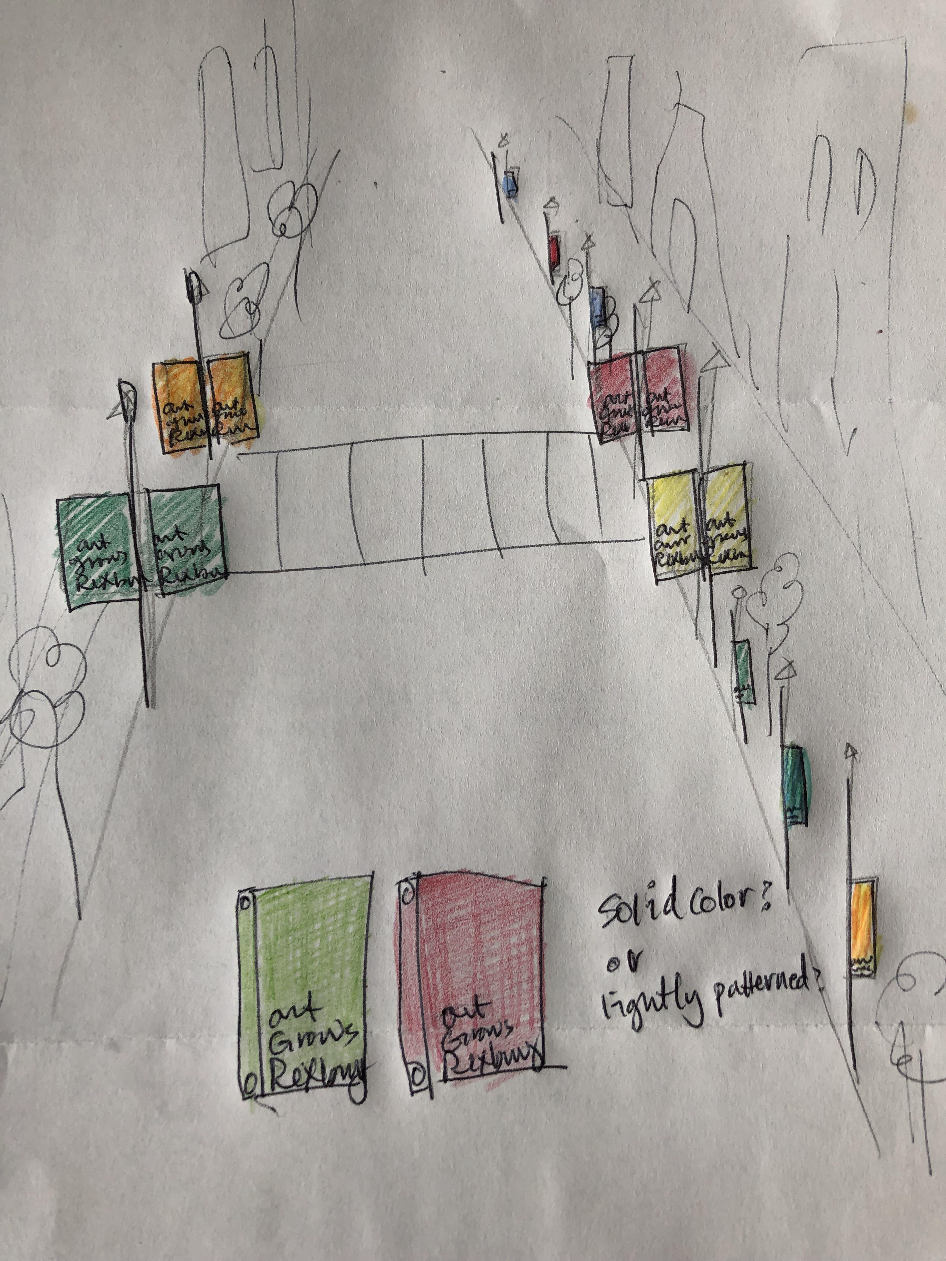
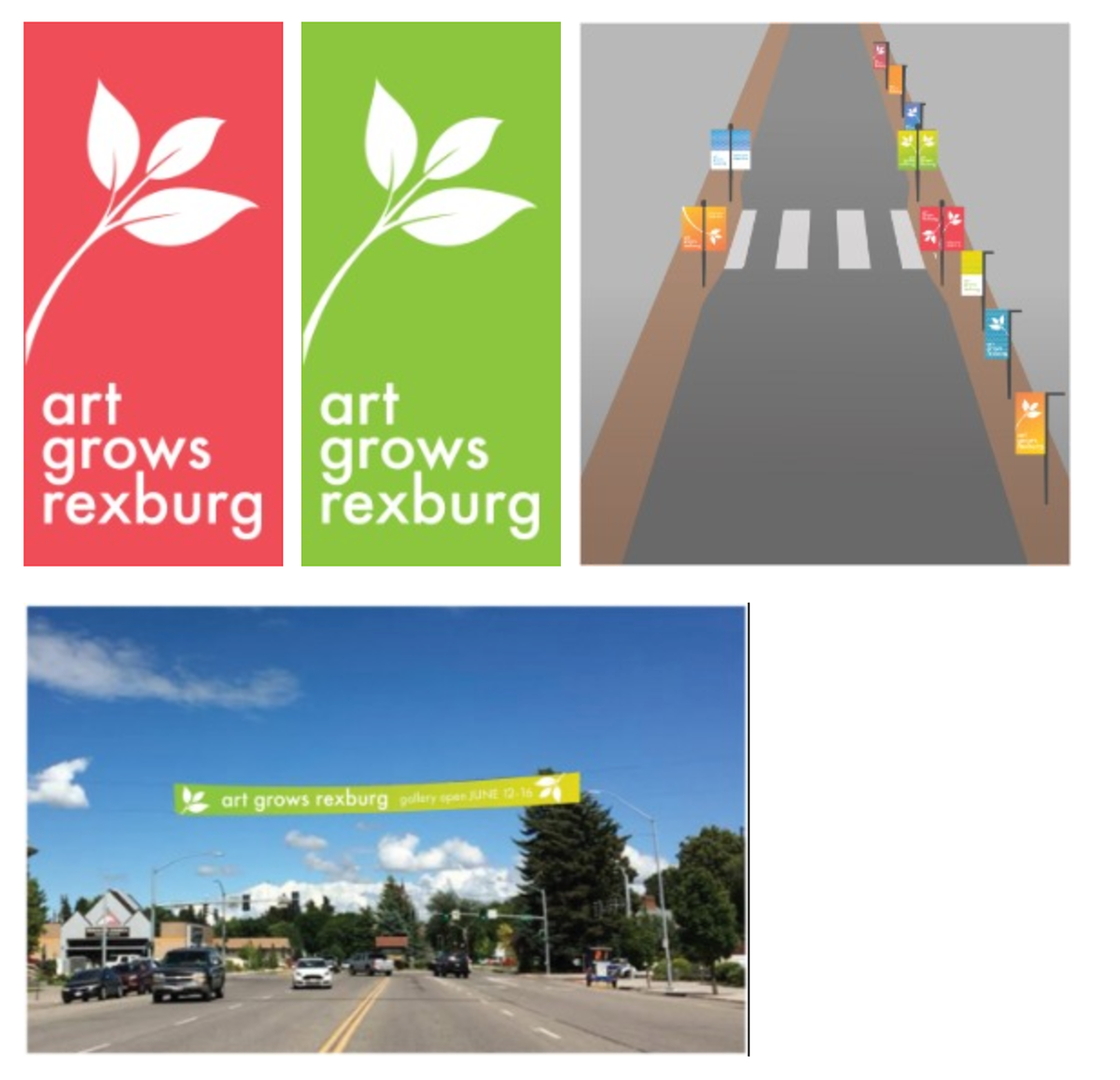
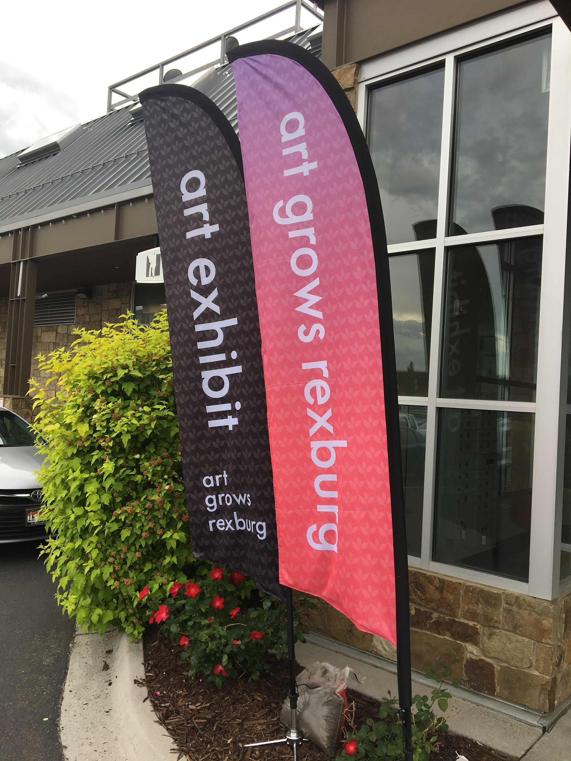
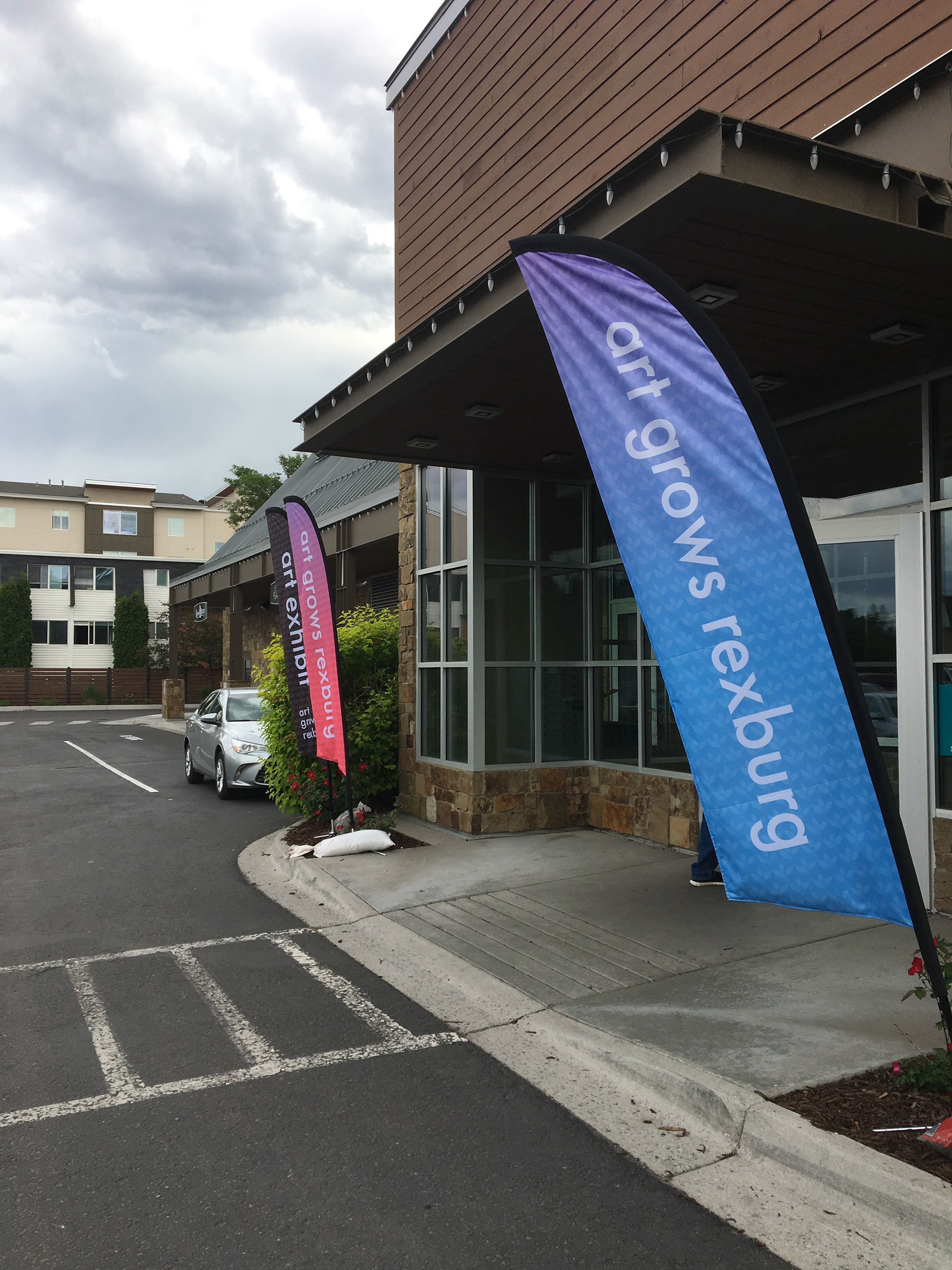
These ideas ultimately led to the final deliverable for the client, including designs for the streetlight flags, as well as sidewalk feather flags.

View the full Style Guide Here!
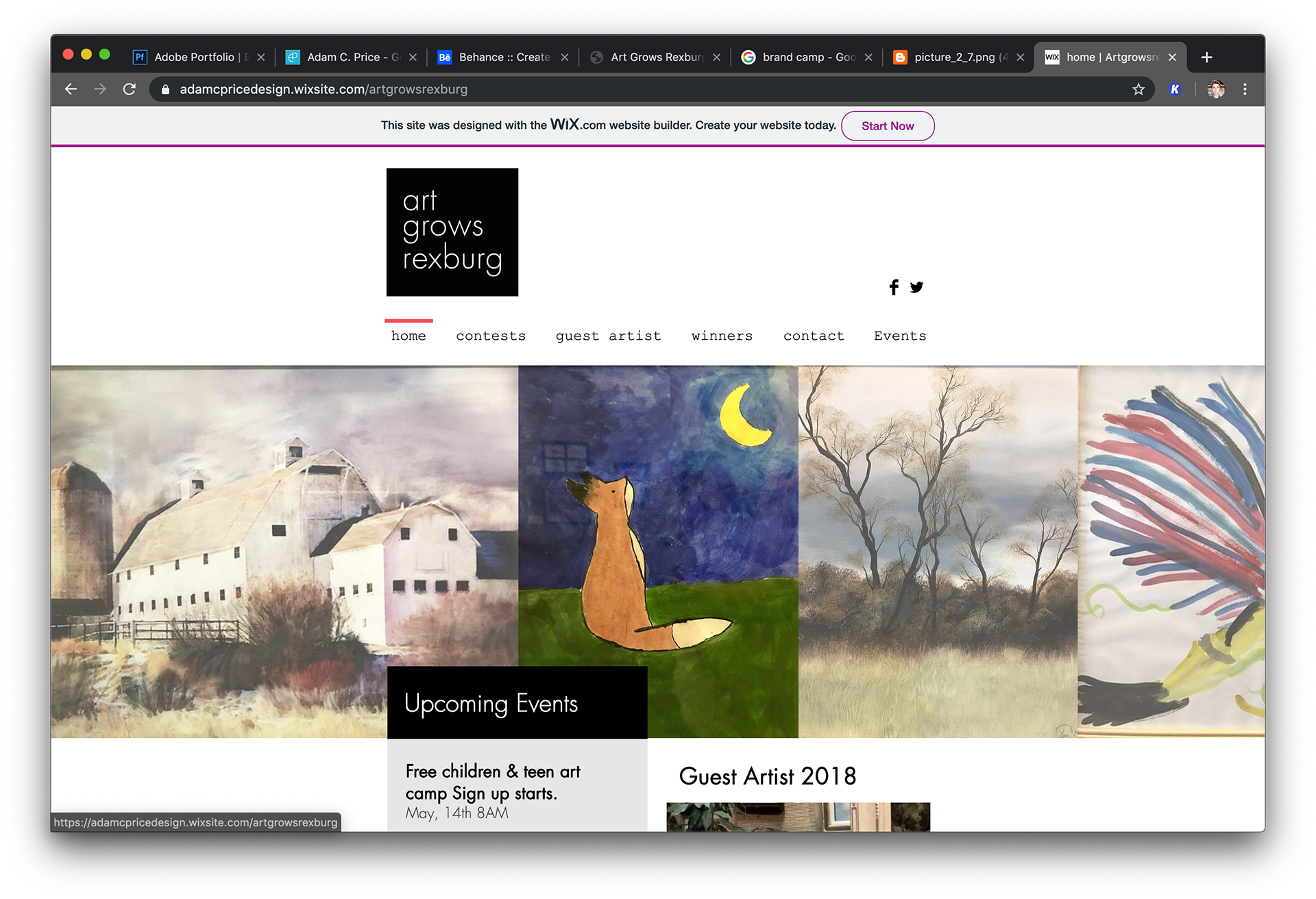
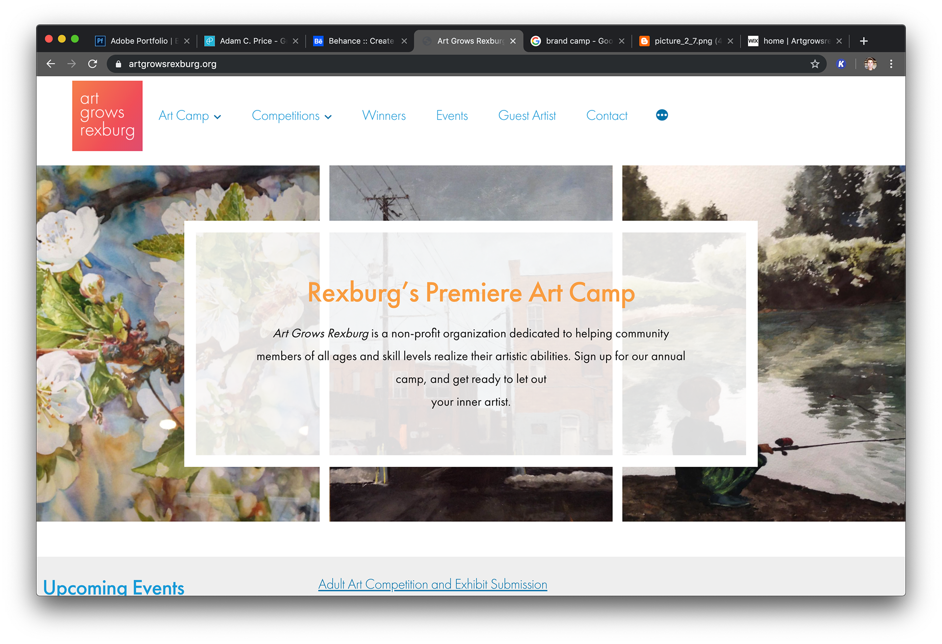
I also put together a mock website concept for the group (https://adamcpricedesign.wixsite.com/artgrowsrexburg -Left) with the various colors of logo on separate pages. Though they went a different direction (https://artgrowsrexburg.org/ - Right), I did enjoy the color-shifting of the logo that was coded into the top left corner of the final website.
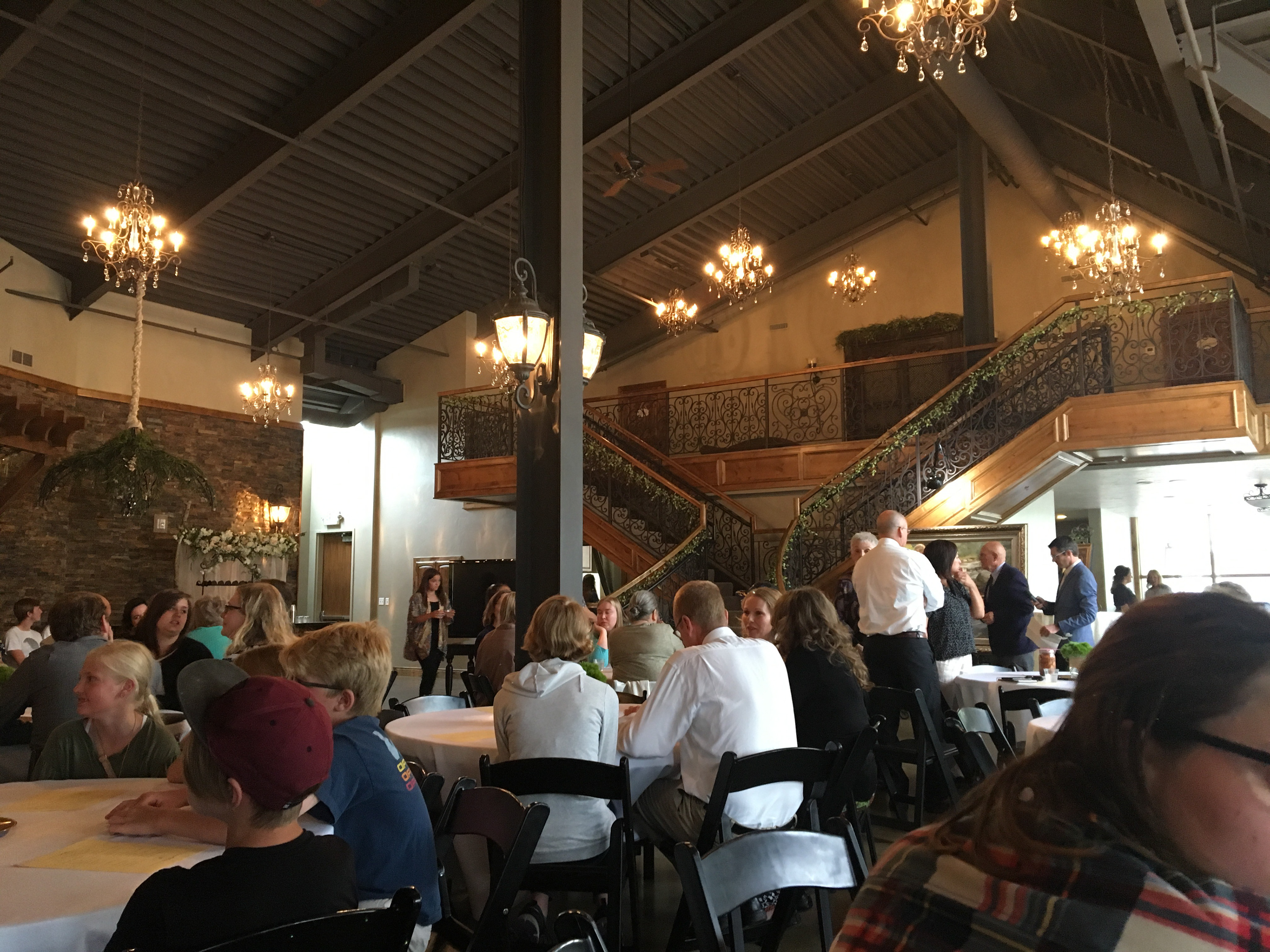
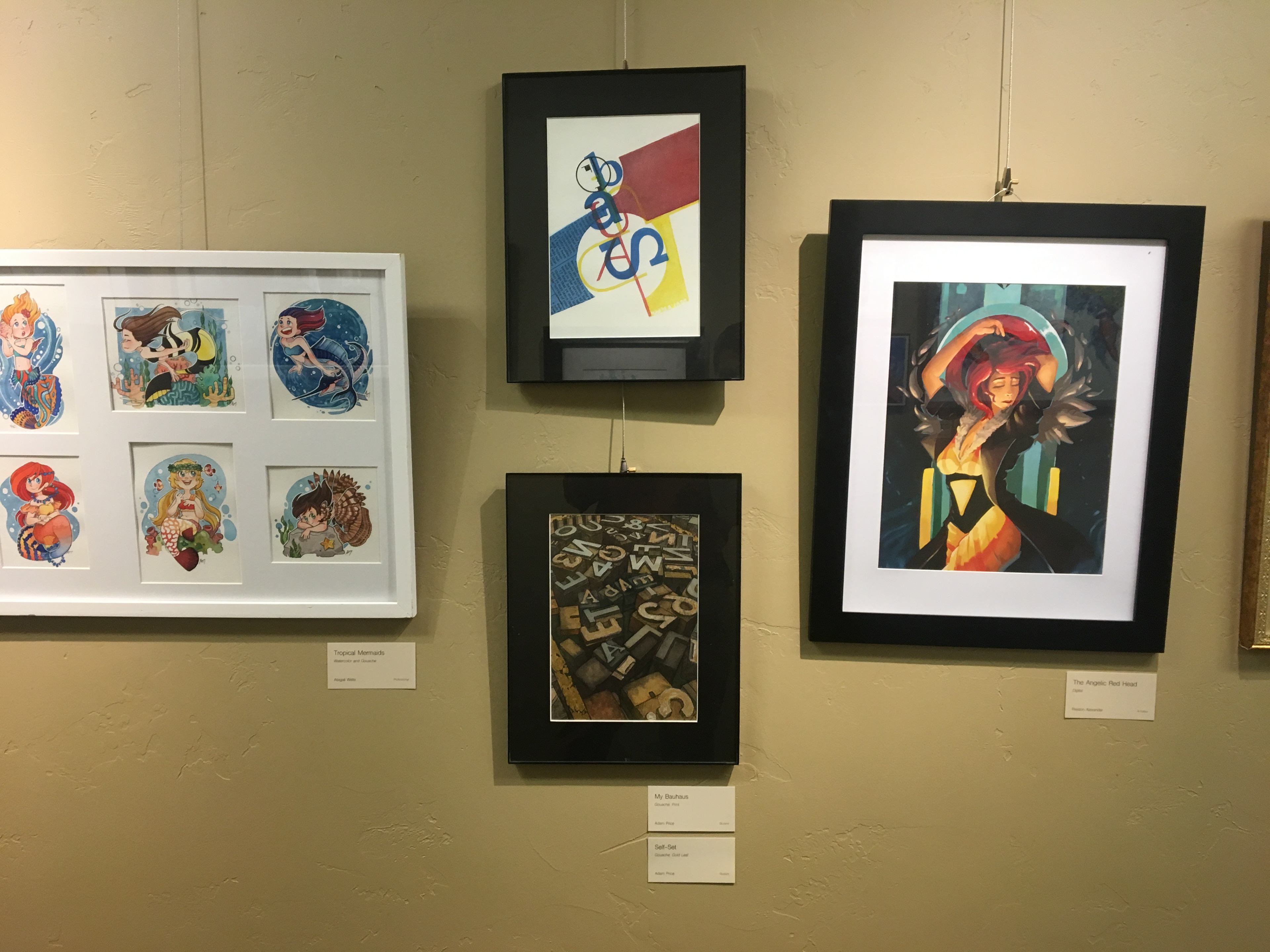
This was a wonderful opportunity, a great learning experience, and easily my largest freelance job to date. I also was able to have my work shown in the annual art show. The opening ceremony and award presentations were exceptional. It was wonderful to participate in this community event.