BYUI OUTLET 2017 - 20th Anniversary Edition
PROJECT DESCRIPTION
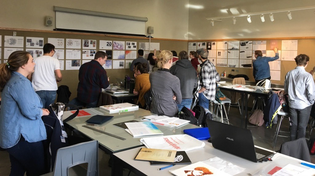
The class was divided into groups, and we were tasked with developing a theme for the upcoming BYUI Outlet publication in 8 weeks. Each group had to design 3 different covers, that would match with 1 editorial style. Each member of the class was also asked to choose from a selection of poems and stories that had been collected by the english department, for which we designed editorial spreads. These were presented with our group design on a self-appropriated schedule, with a given deadline.
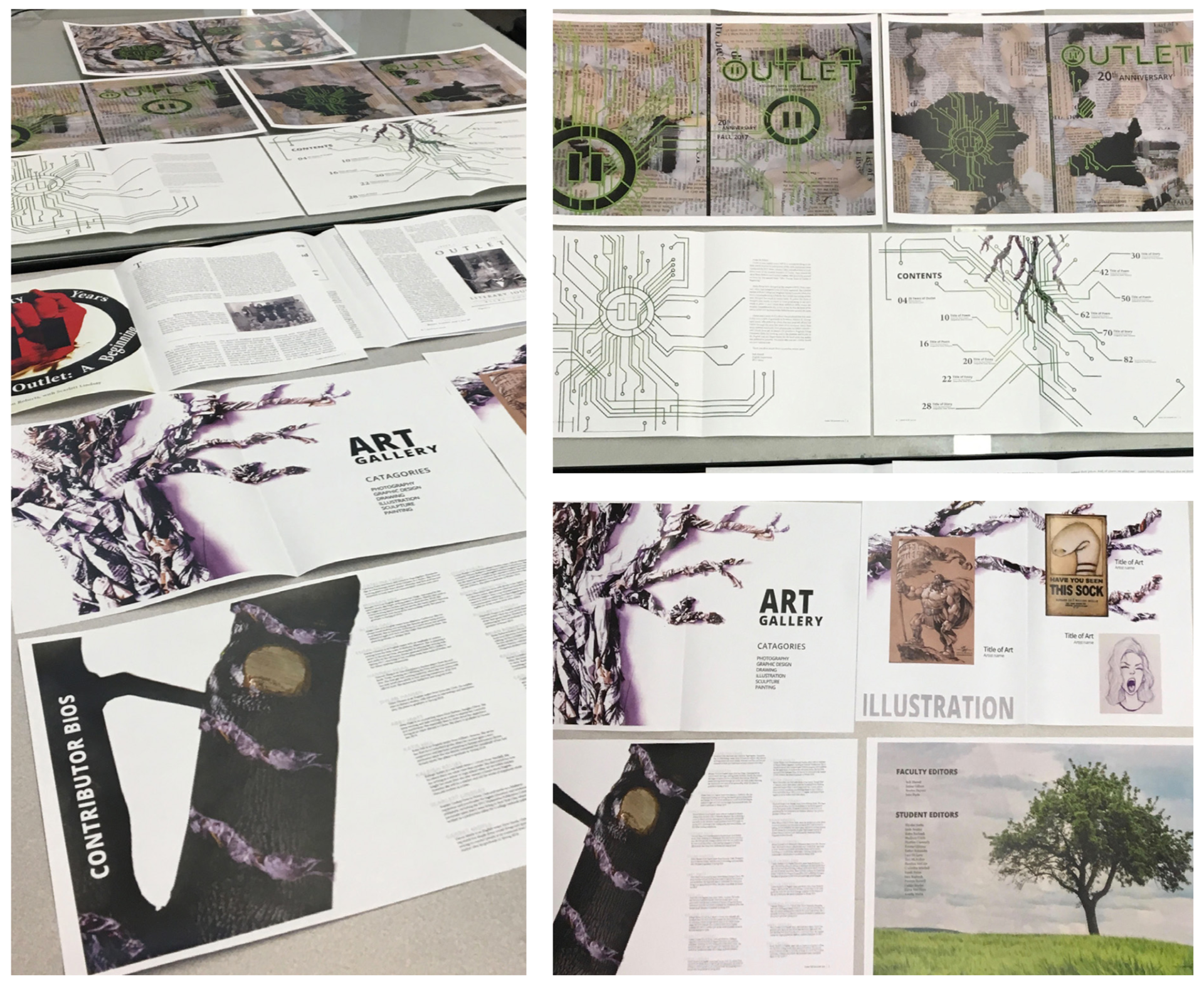
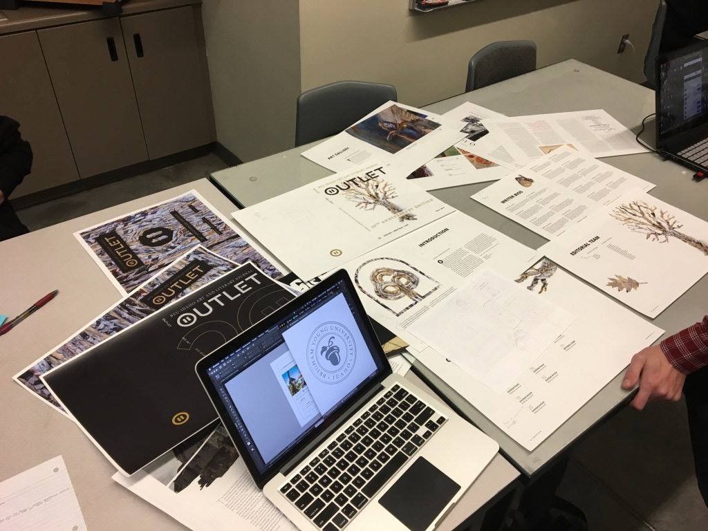
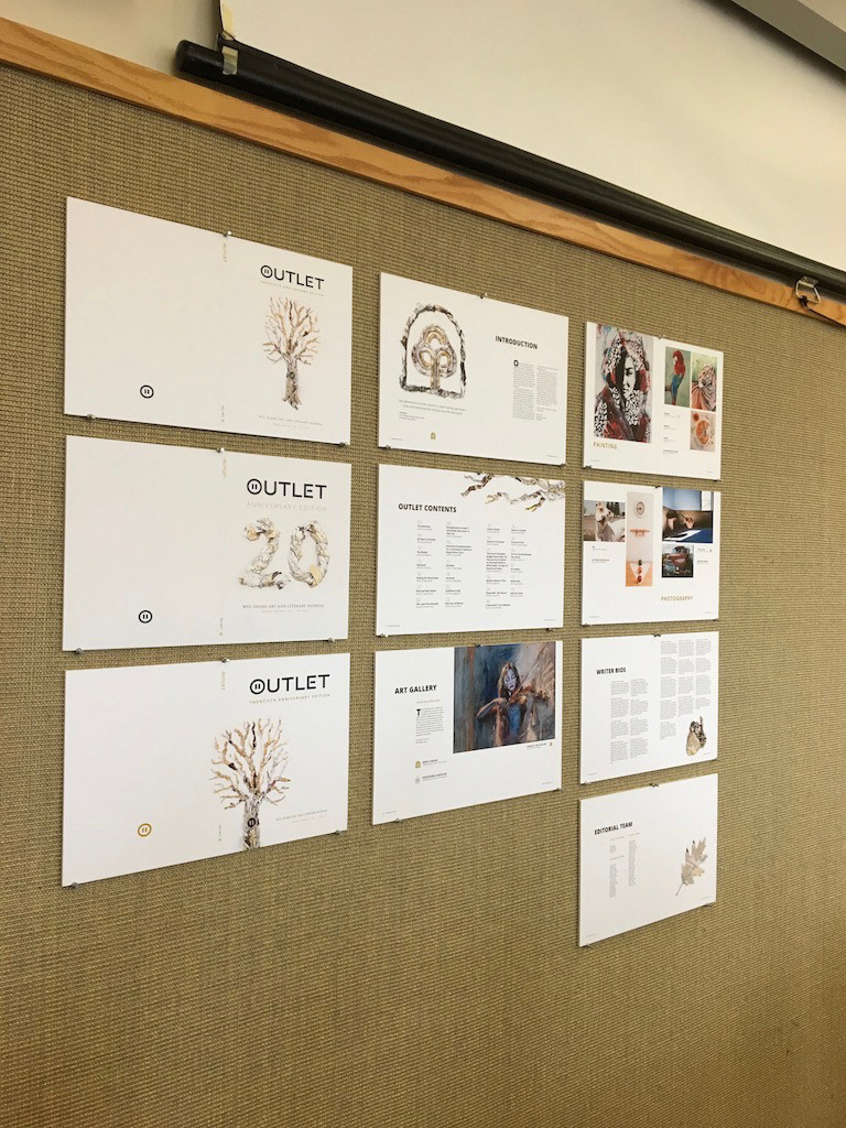
The group theme included the following:
· 3 creative cover options
· Front & Back Inside Covers
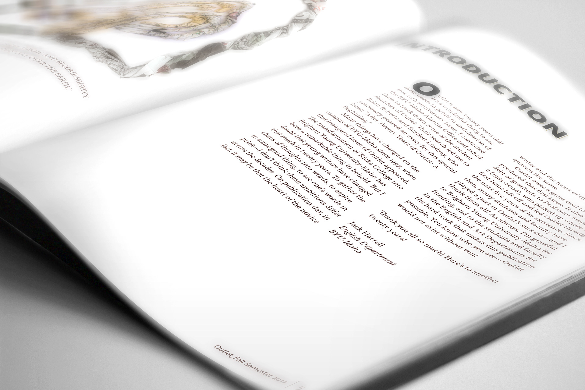
· From the Editor / Introduction Spread(s)
· Front & Back Inside Covers
· From the Editor / Introduction Spread(s)
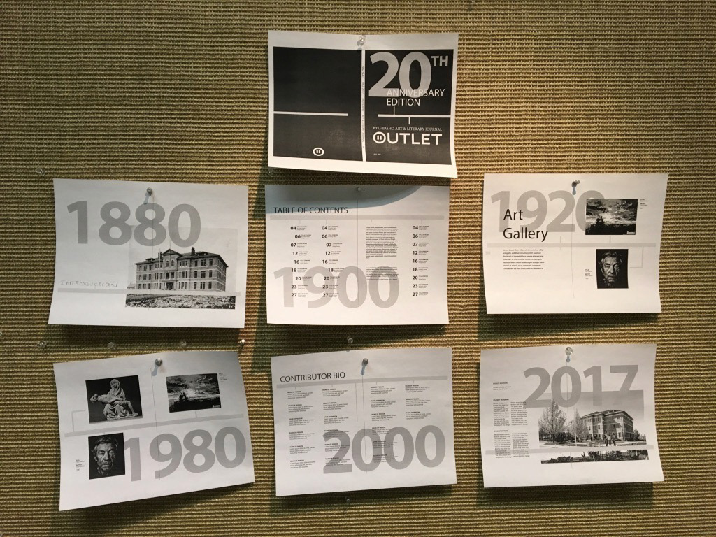
· 20 yrs of Outlet Aricle (1-2 spreads)
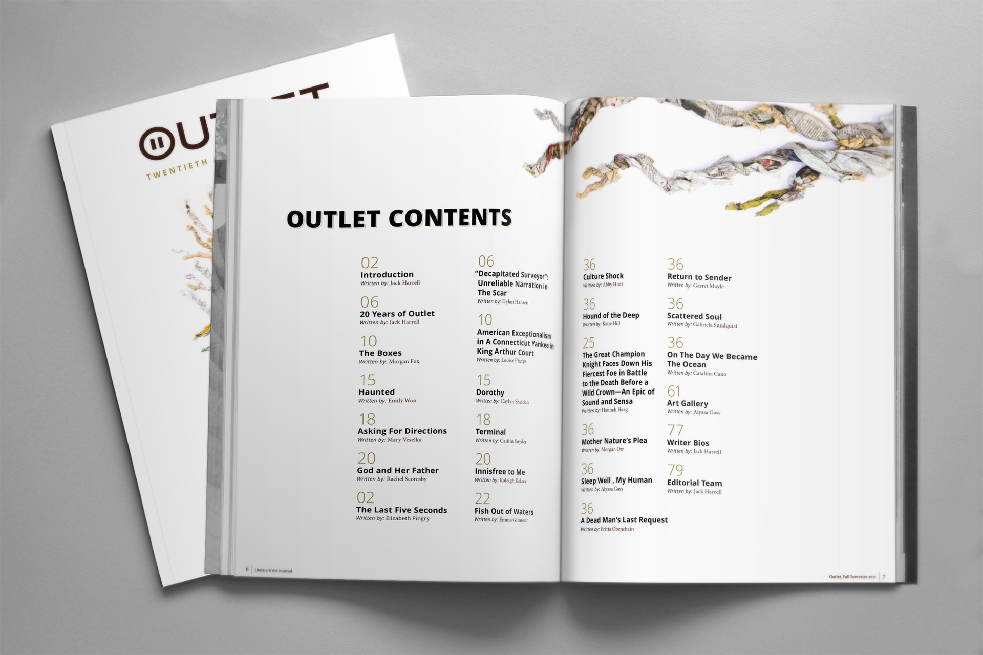
· Contents Spread
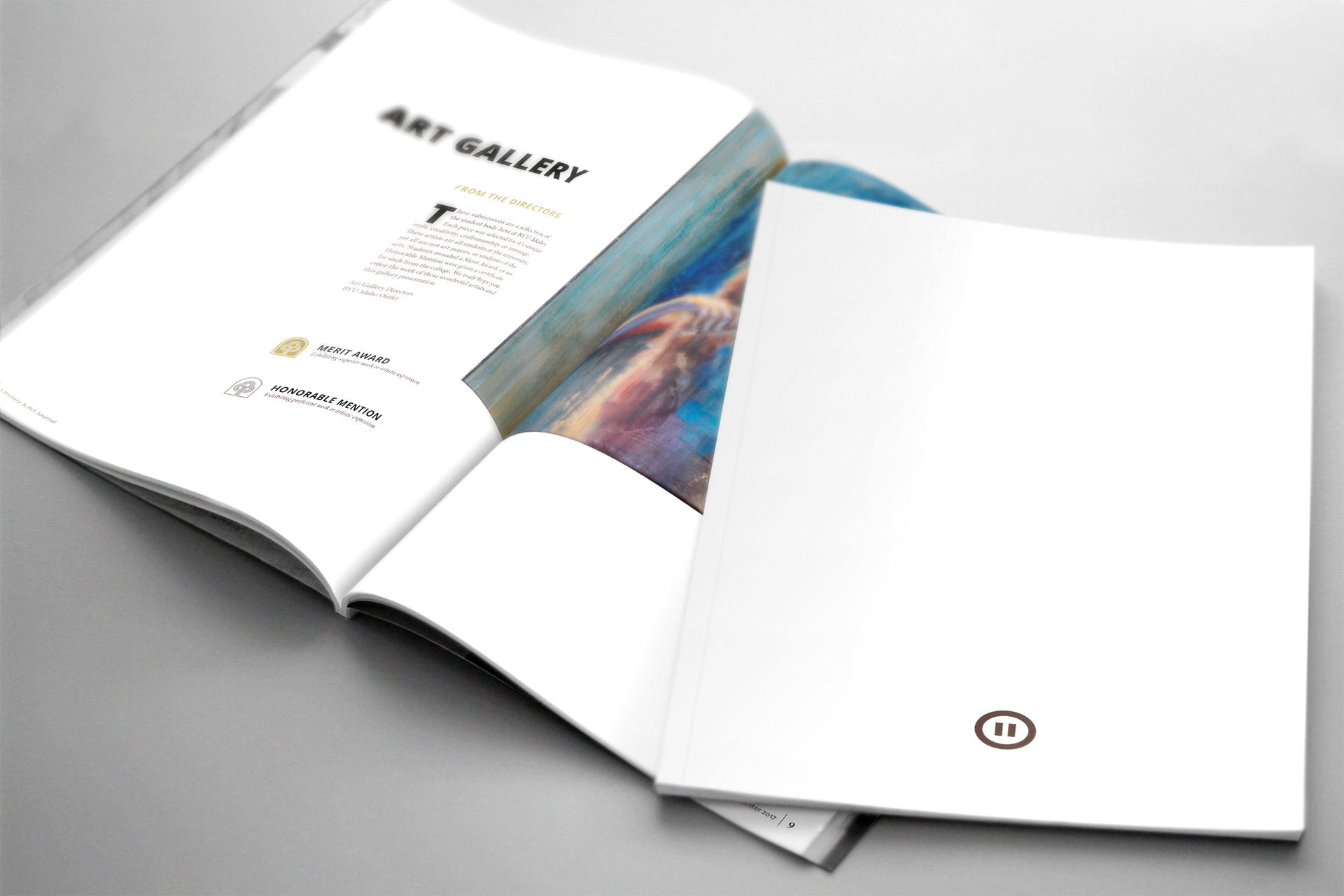
· Gallery Pages: Look & Feel (2 spreads)
· Contents Spread
· Gallery Pages: Look & Feel (2 spreads)
· Contributor Bio Spread
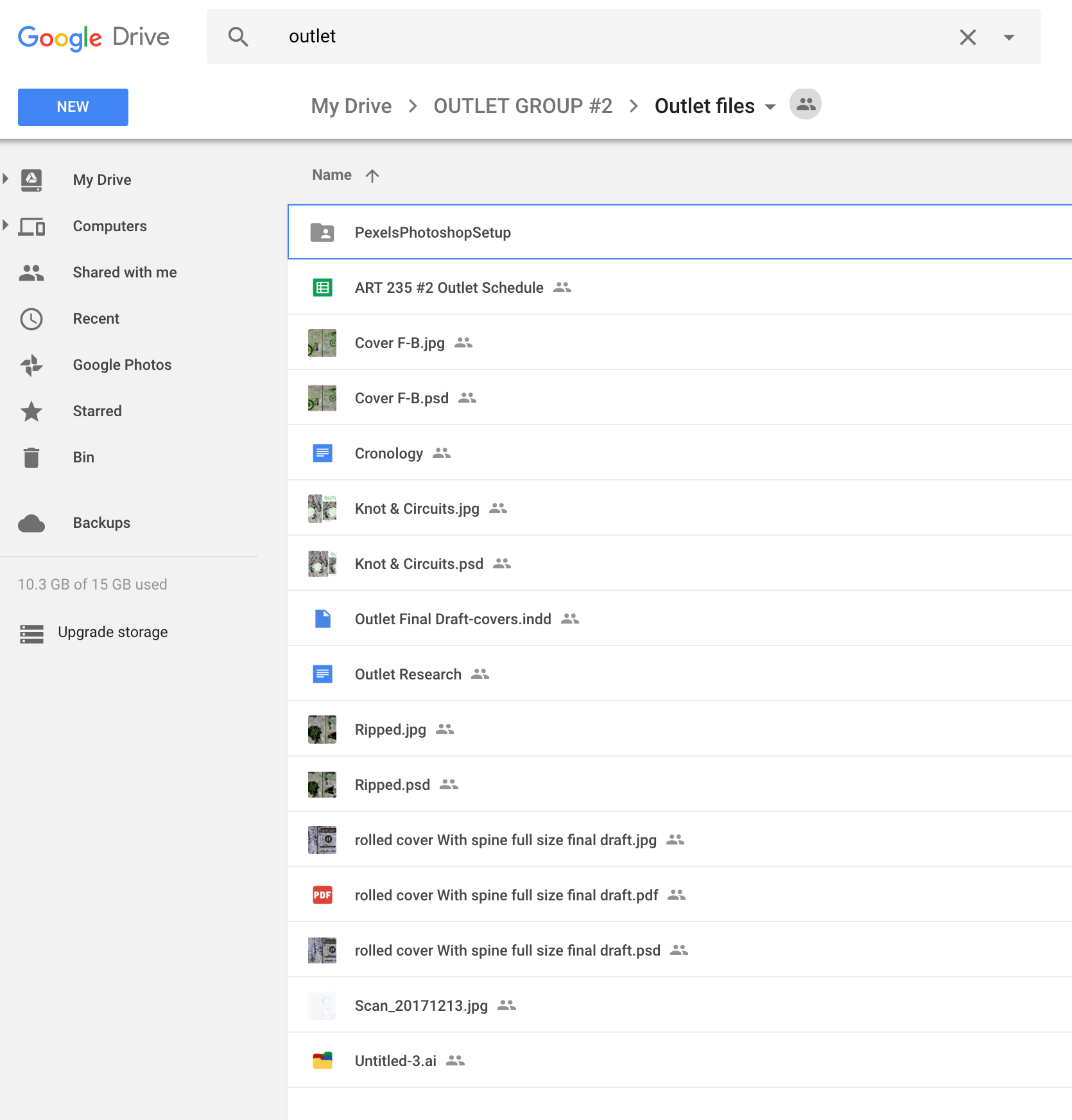
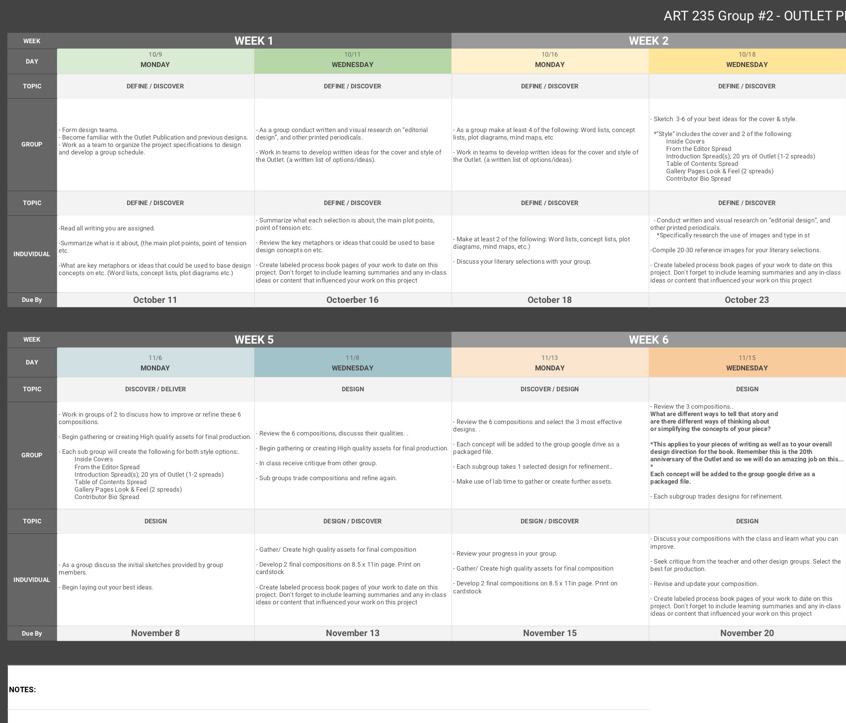
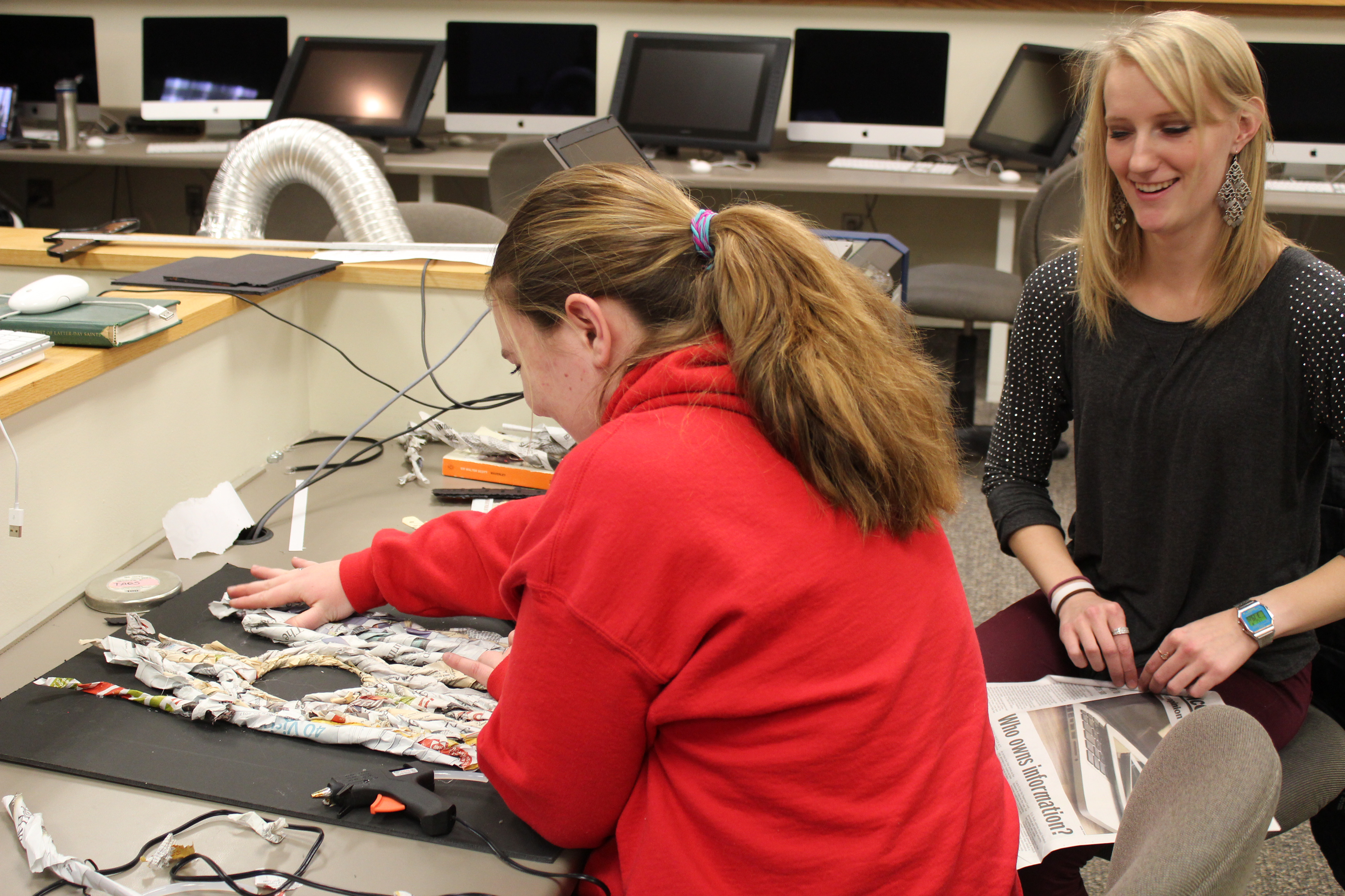
We designed and regulated our own schedule, using google drive for storage, and a facebook messaging group for regular communication.
DISCOVER
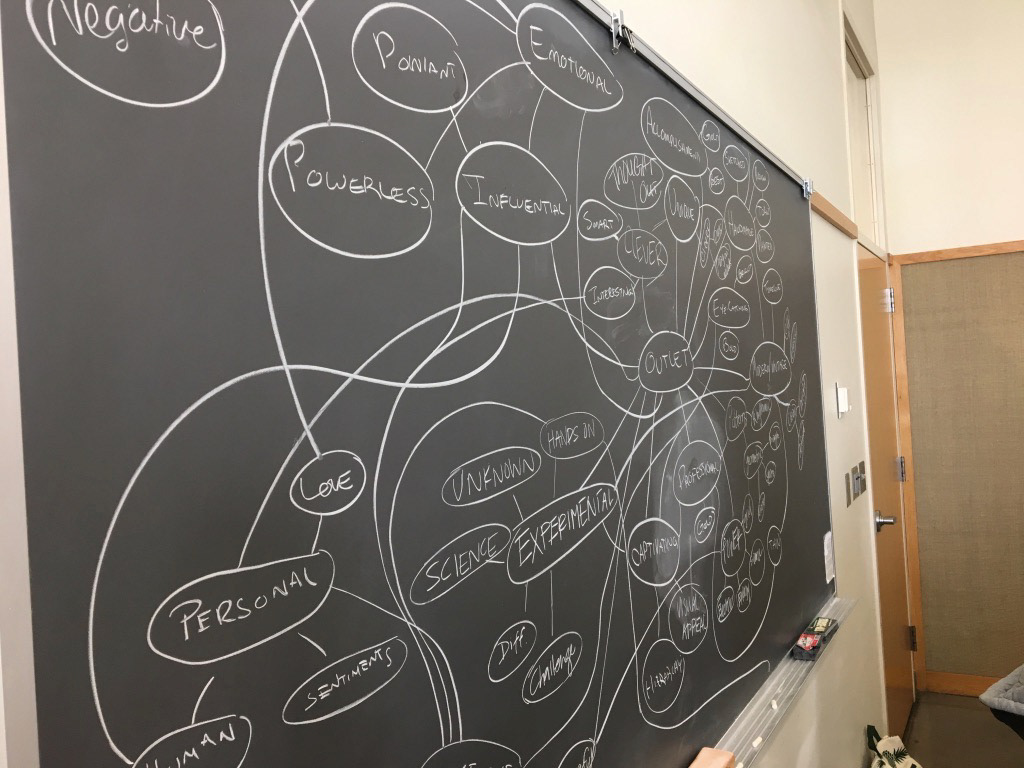
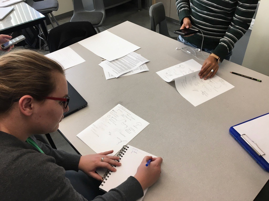
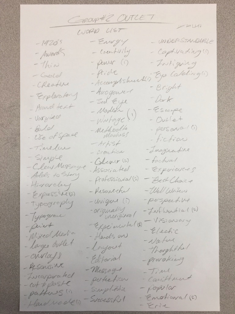
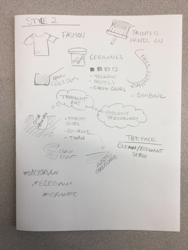
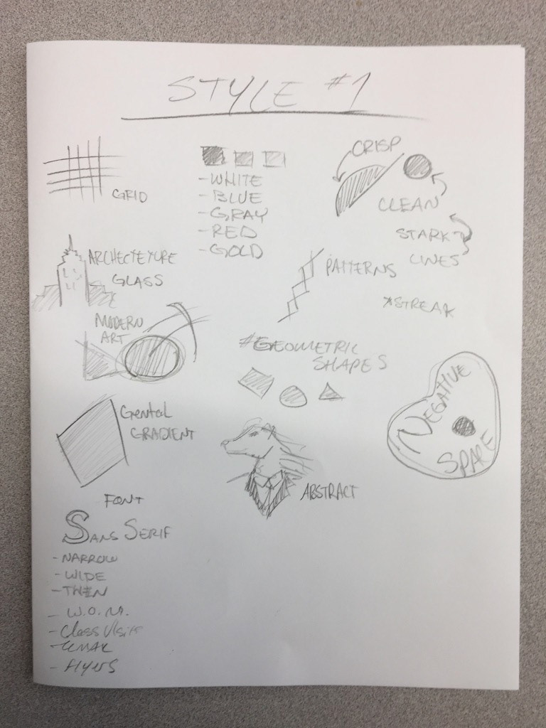
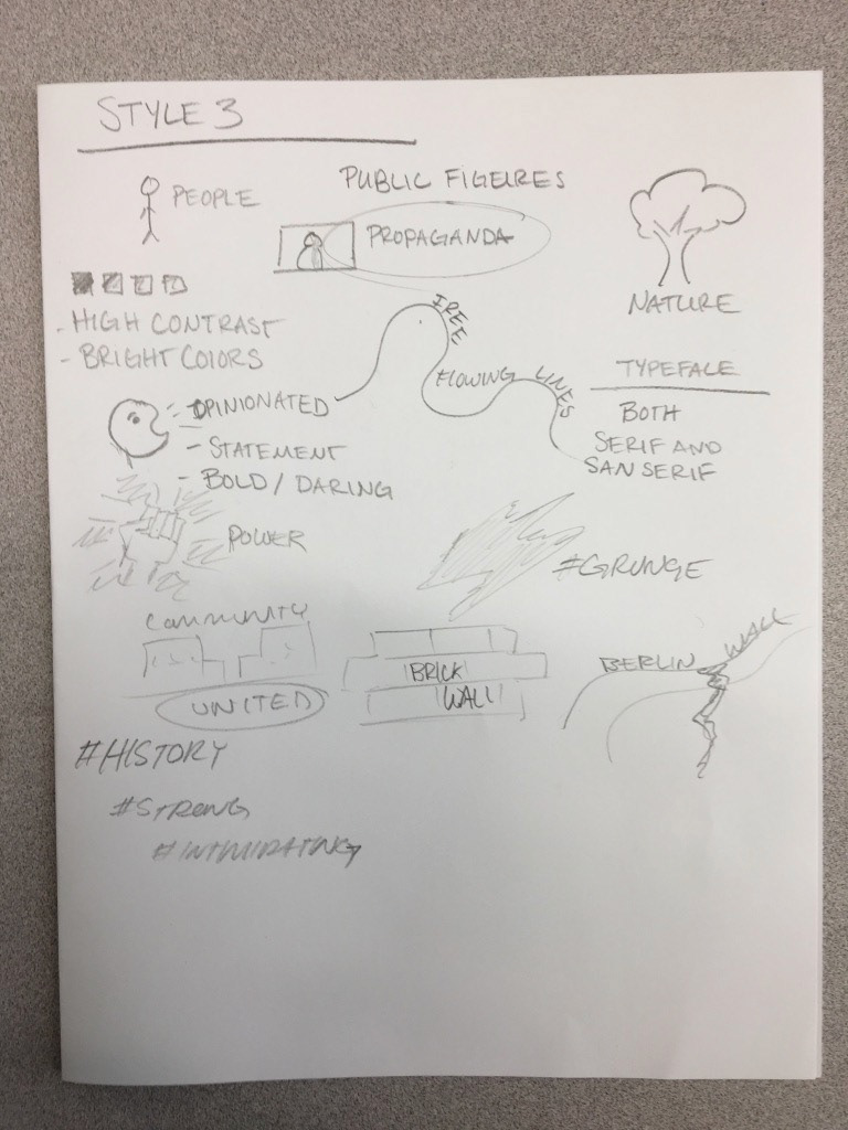
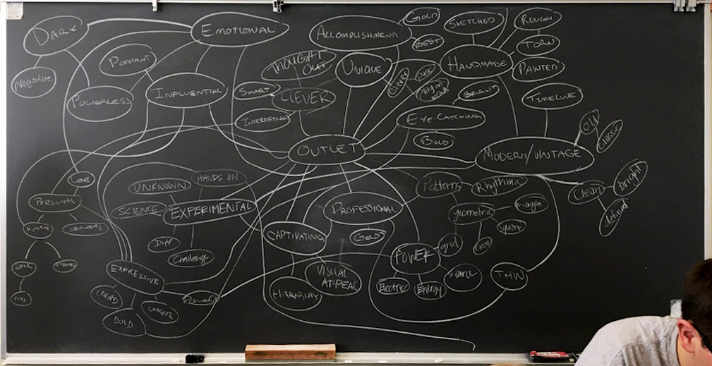
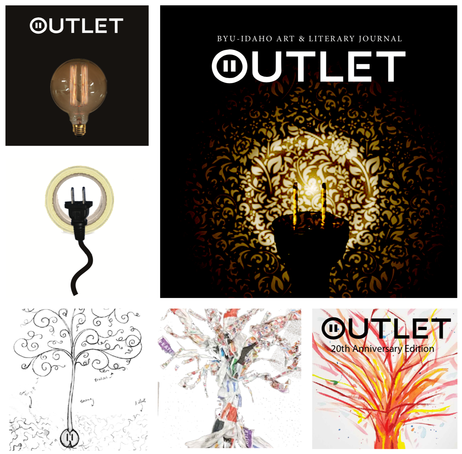
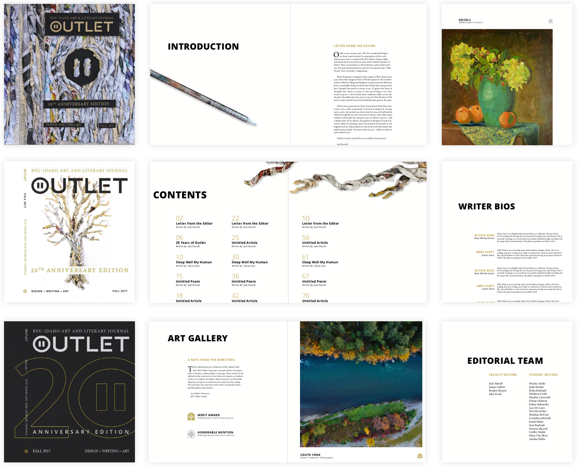
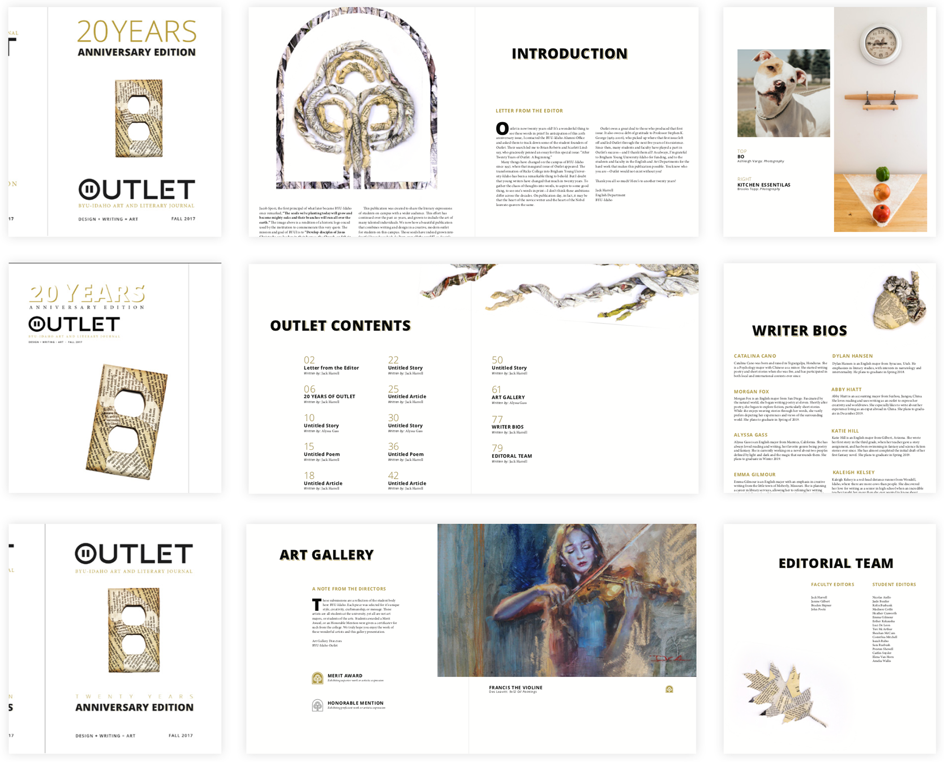
We started with some word maps and word lists. We decided to break into pairs and have each duo present a style, allowing us to choose from 3. We gathered our concepts into 3 styles. We ended up with A vintage/history style, A modern/grunge style, and a digital to natural style.
PROJECT DESCRIPTION
My partner and developed our first concept of our given style. Using a timeline as an emblem of the historical importance of this particular issue.
Define
EXPLORATION
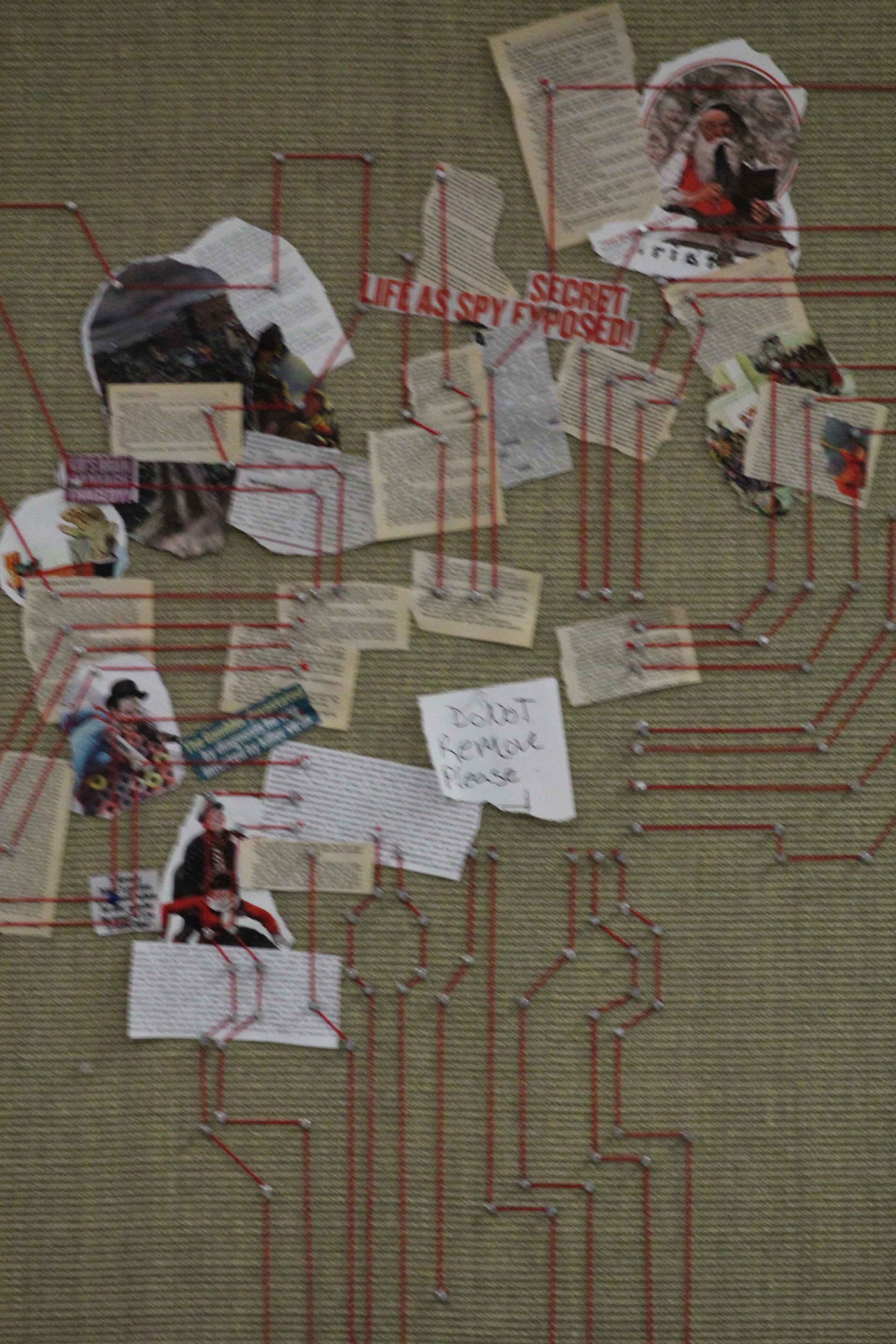
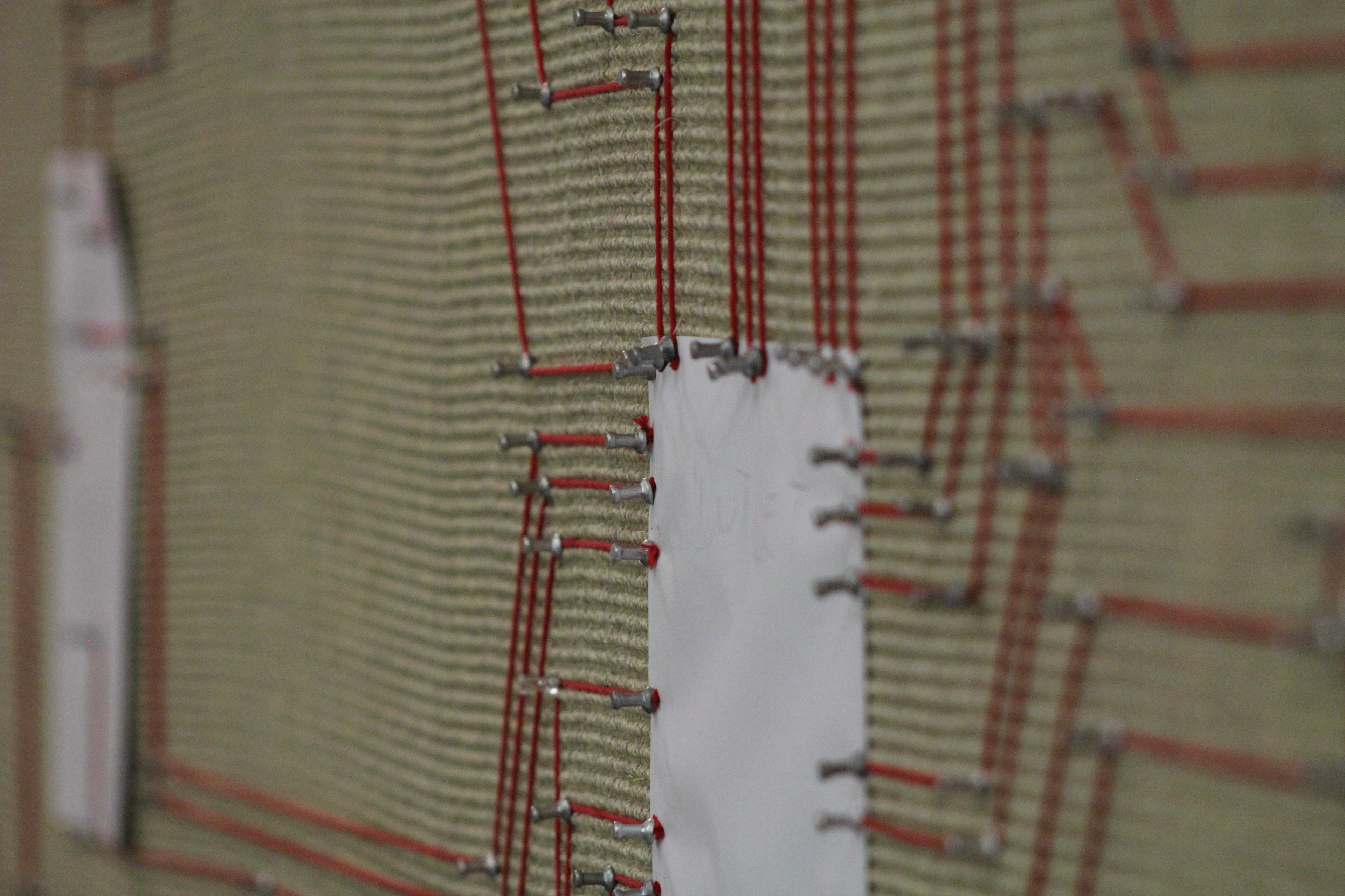
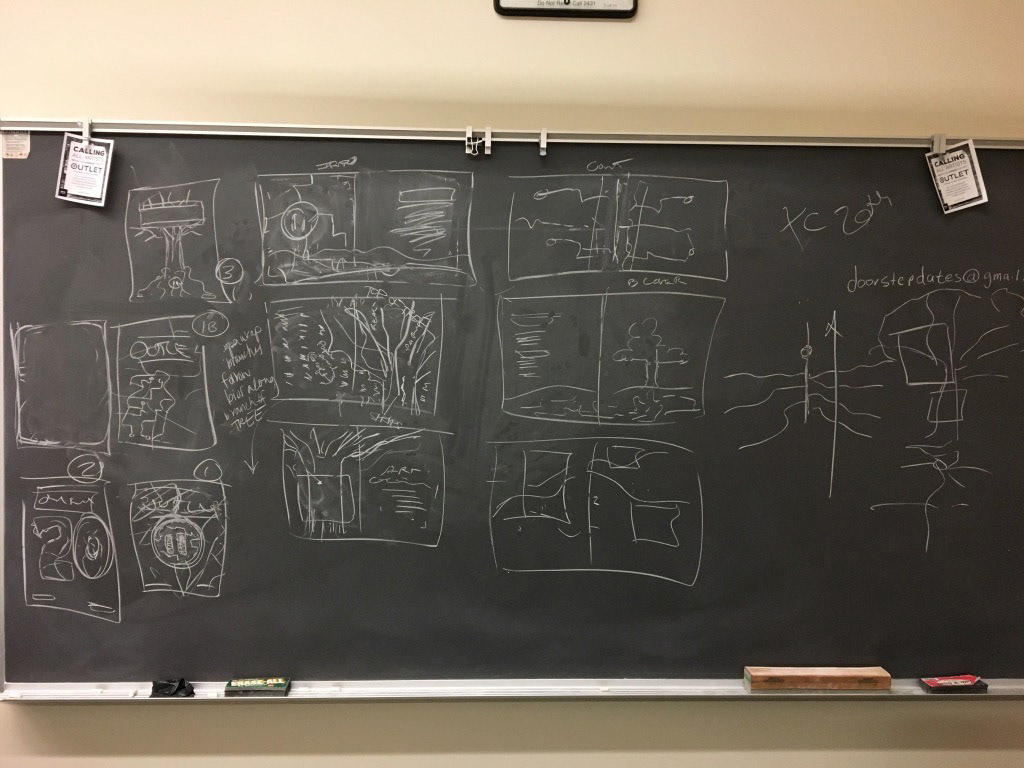
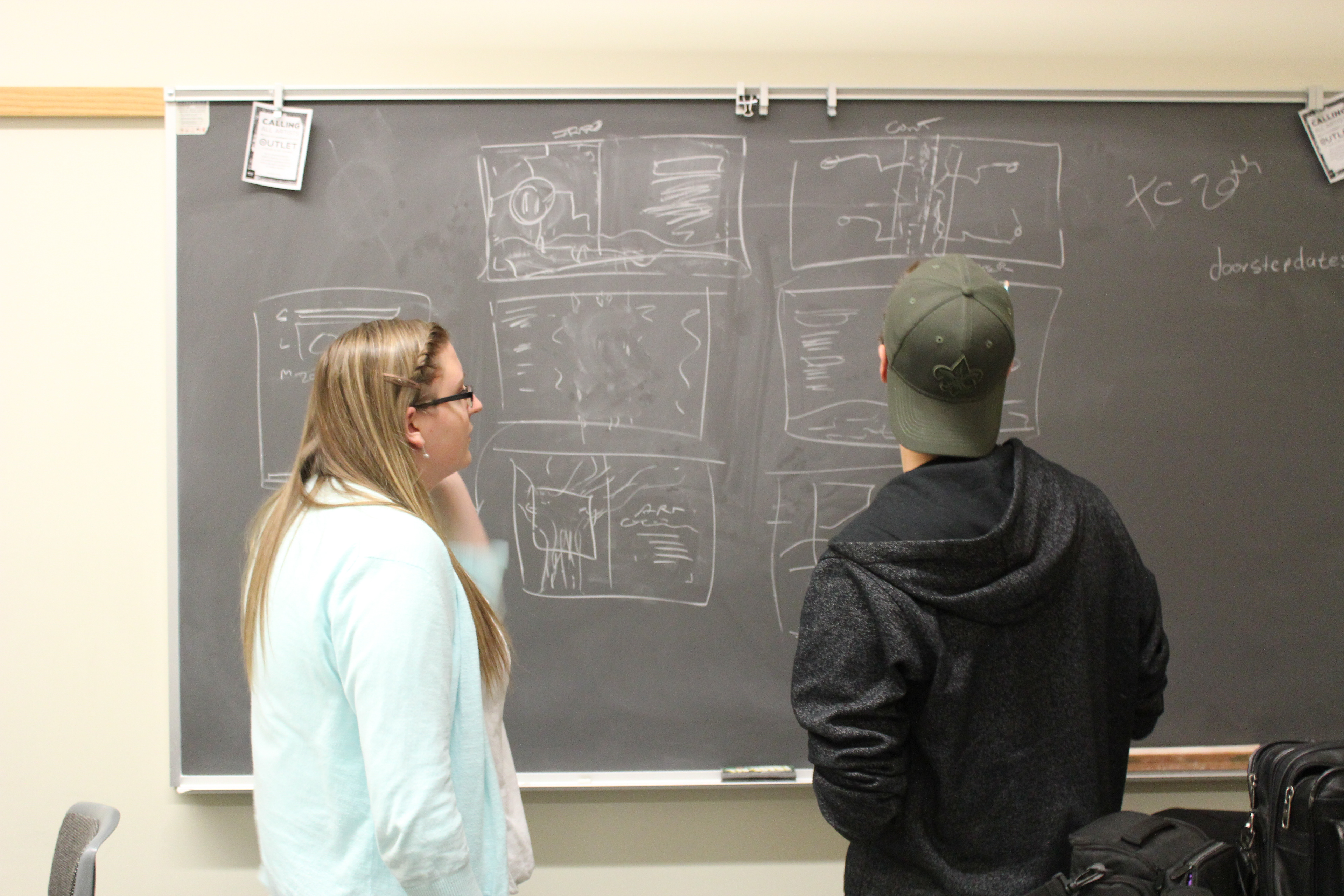
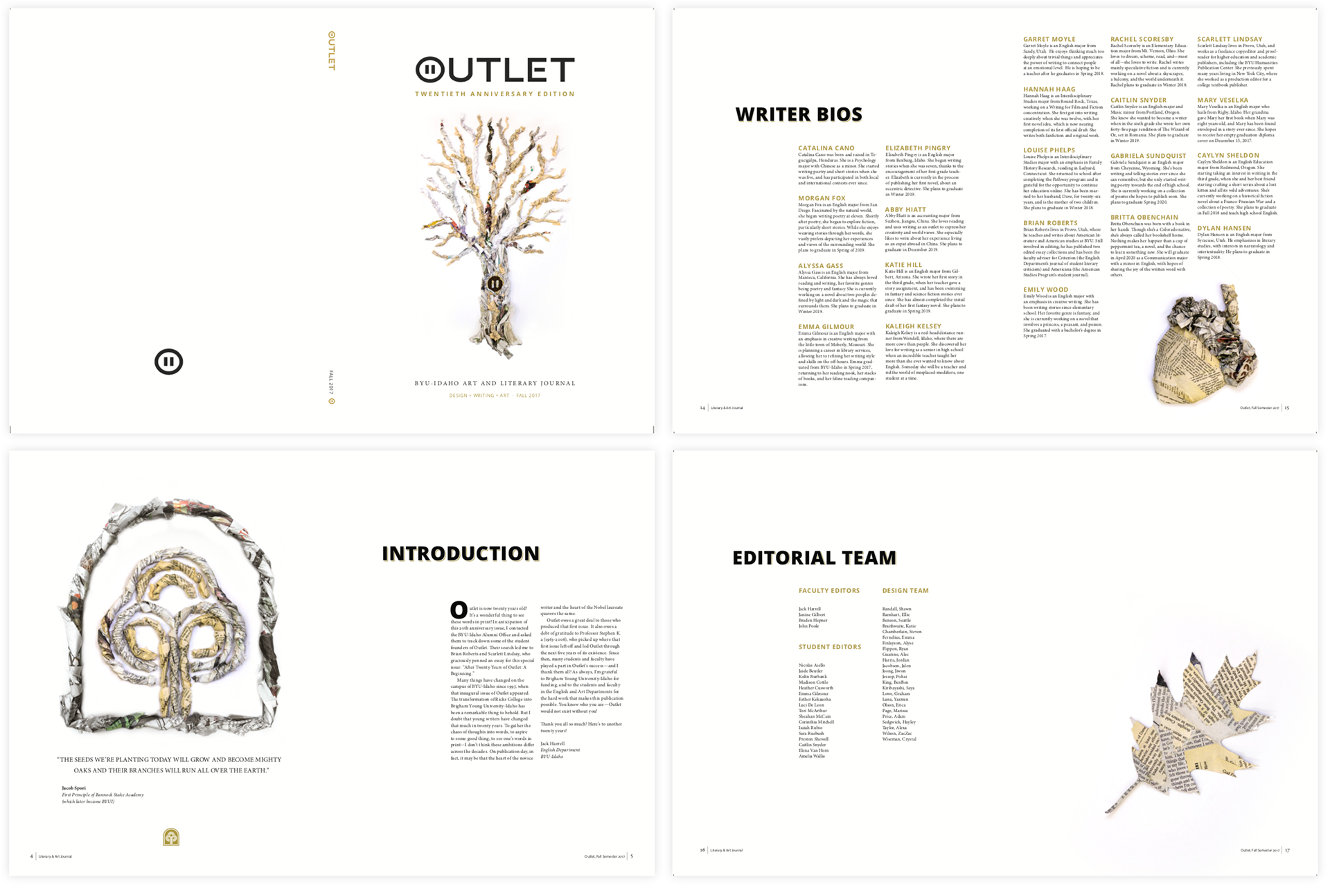
We presented all 3 concepts in class, and chose elements from each to bring together into one style. Each group member was responsible for a separate part of the style; Ben: Covers, Adam: Intro & Contents, Crystal: 20th Article, Katie: Art Gallery, Hayley: Contributor Bios. We compiled these spreads into one style that expressed a digital to natural concept. We were focused on how ideas can start like electronic signals, but grow in to temporal fruition.
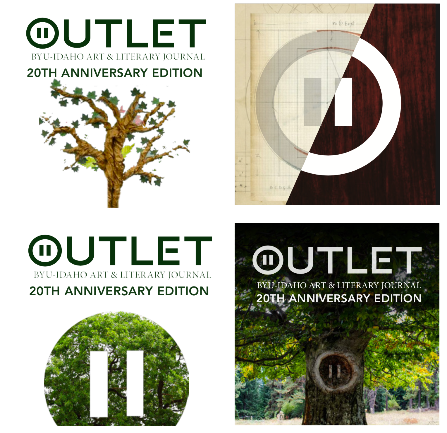
Though a few concept revisions, we rested more on an idea of creative growth and history. The first principal of BYUI, Jacob Spori once said:
"The seeds we're planting today will grow and become mighty oaks and their branches will run all over the earth."
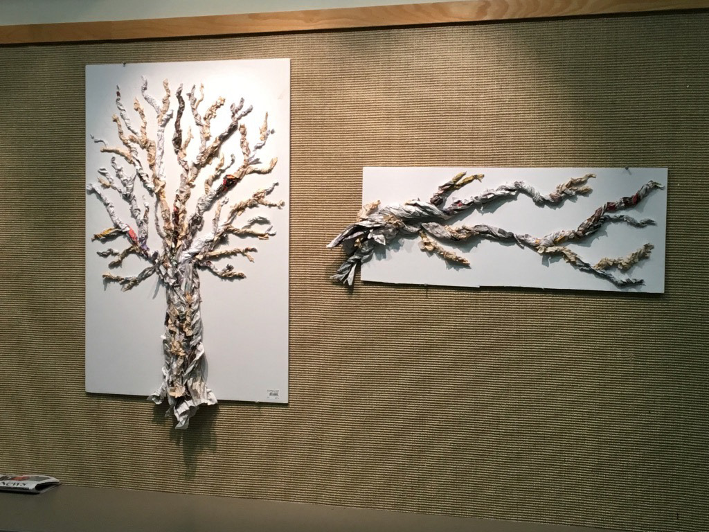
We followed this concept using an old school logo as a symbol in our style to help convey the way that both creators and creations start as a small seed, which sprout, branch and grow to develop the physical fruit of those artistic labors. We wanted to retain a sense of literary elegance, and implied historical significance with a gold and dark grey on white paired with used books and newspaper.
"The seeds we're planting today will grow and become mighty oaks and their branches will run all over the earth."
We followed this concept using an old school logo as a symbol in our style to help convey the way that both creators and creations start as a small seed, which sprout, branch and grow to develop the physical fruit of those artistic labors. We wanted to retain a sense of literary elegance, and implied historical significance with a gold and dark grey on white paired with used books and newspaper.
DESIGN
REFINING
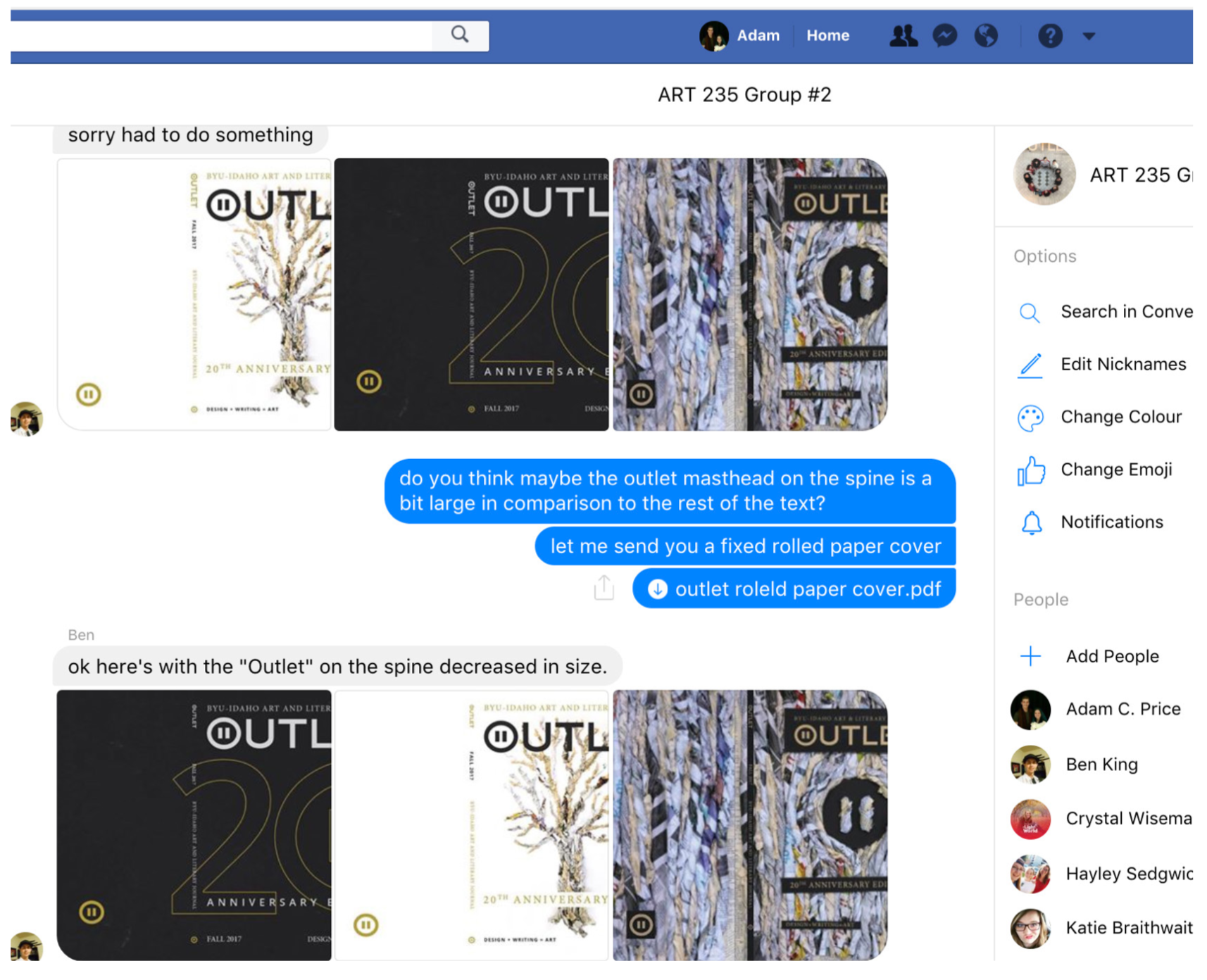
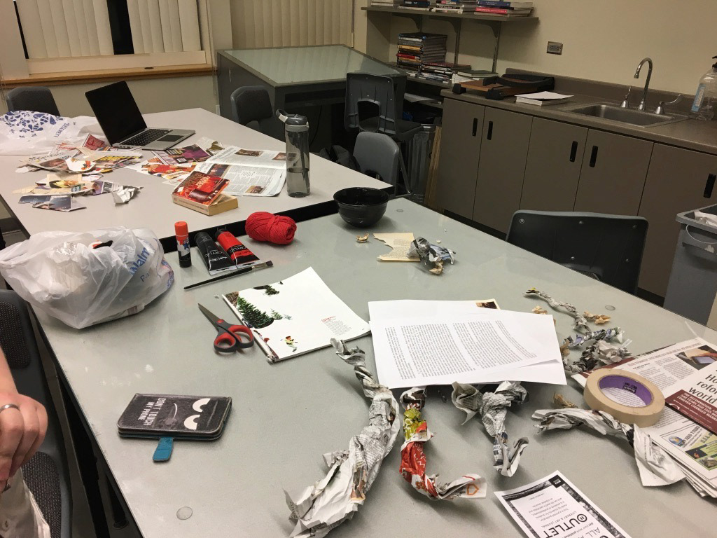
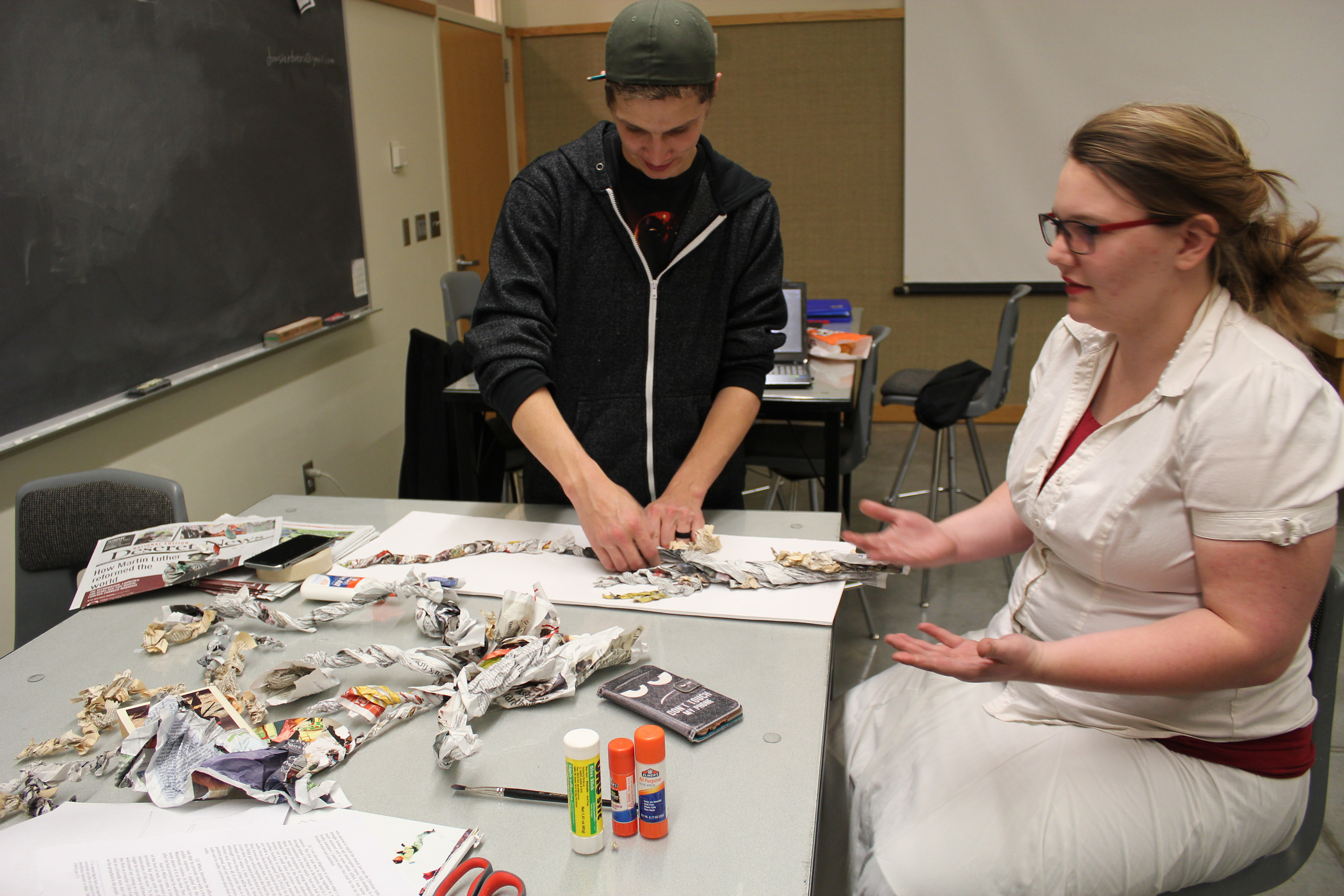
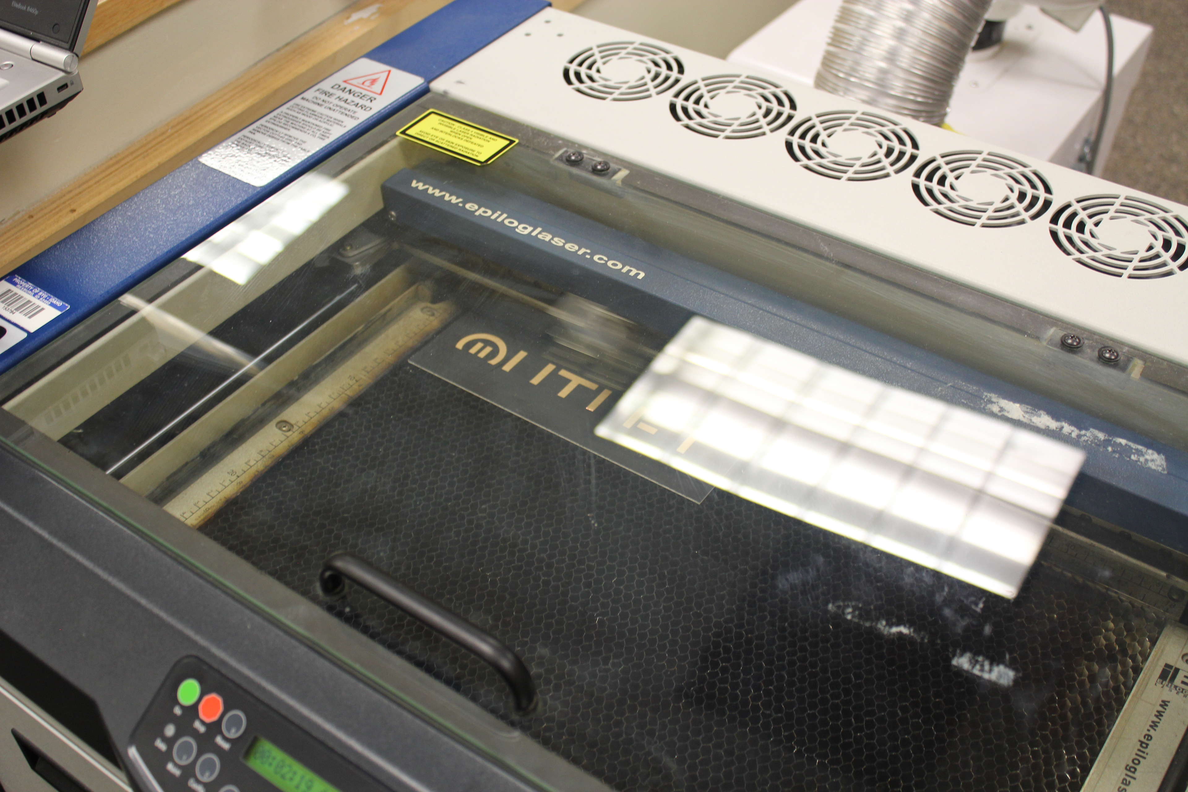
We took direct feedback and spend the week refining and honing our concept and our imagery. We decided to Focus more on our crumpled paper design, and use it more consistently throughout the publication. We also explored some different cover options, playing with actual outlet covers.
DELIVER
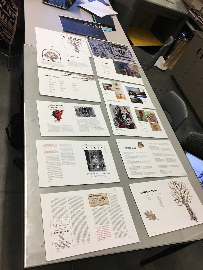
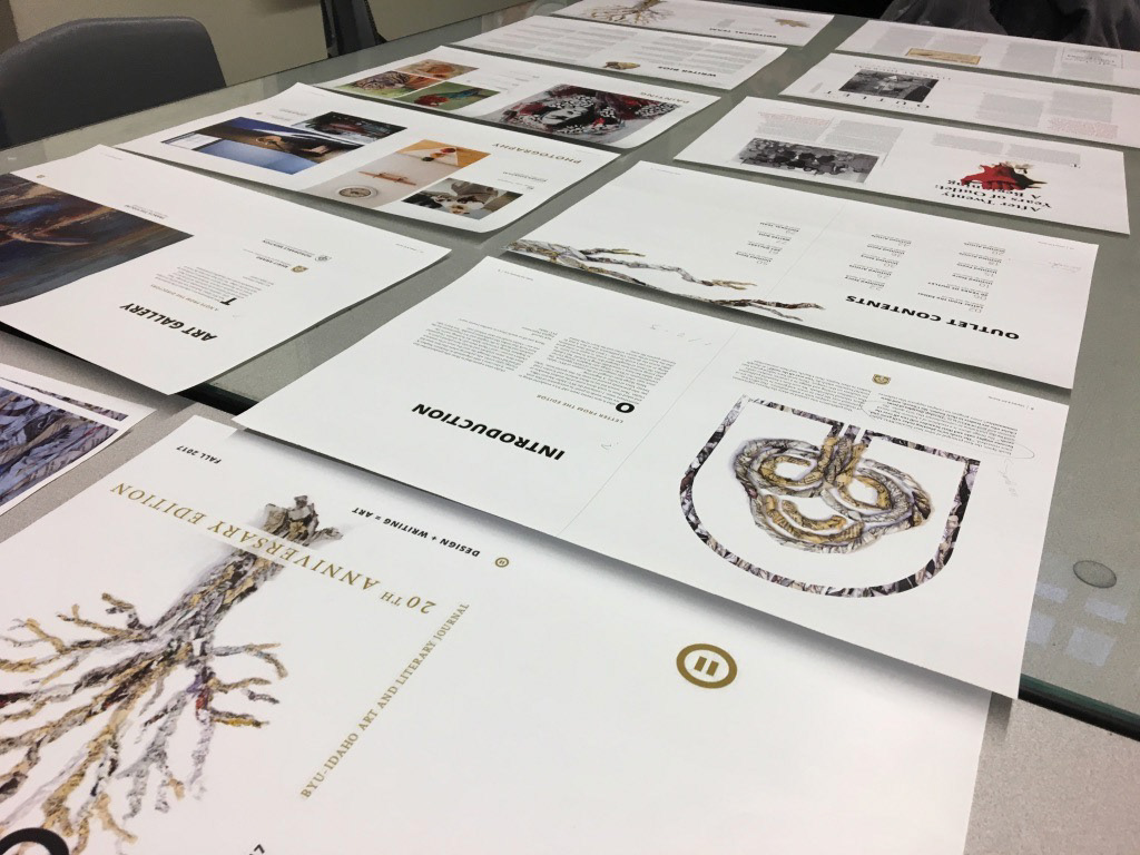
FINAL SUBMISSION / SELECTION
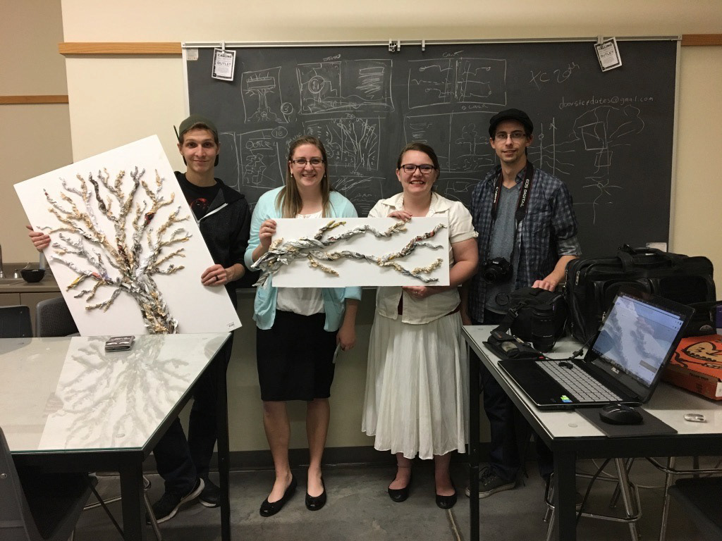
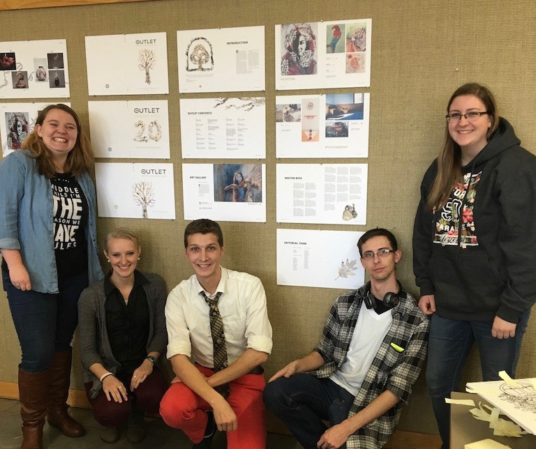
Each group brought their final submissions printed and mounted on foam core. The covers and styles were gathered, and the individual editorial spreads were likewise organized in groups. Each member of the class was given a sticky note to mark their vote for 1 cover, 1 style, and 1 version of each written submission.
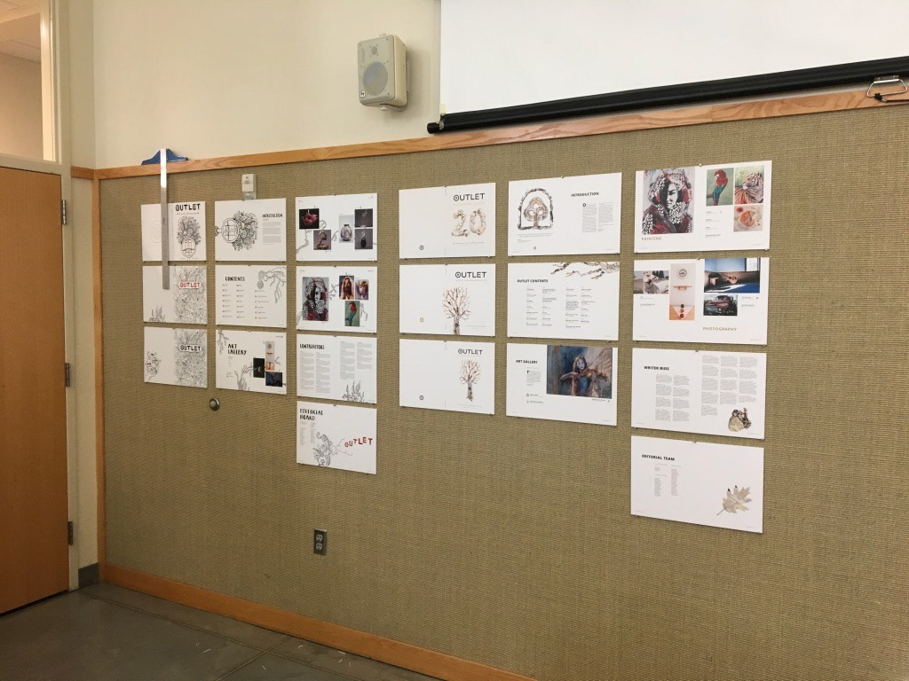
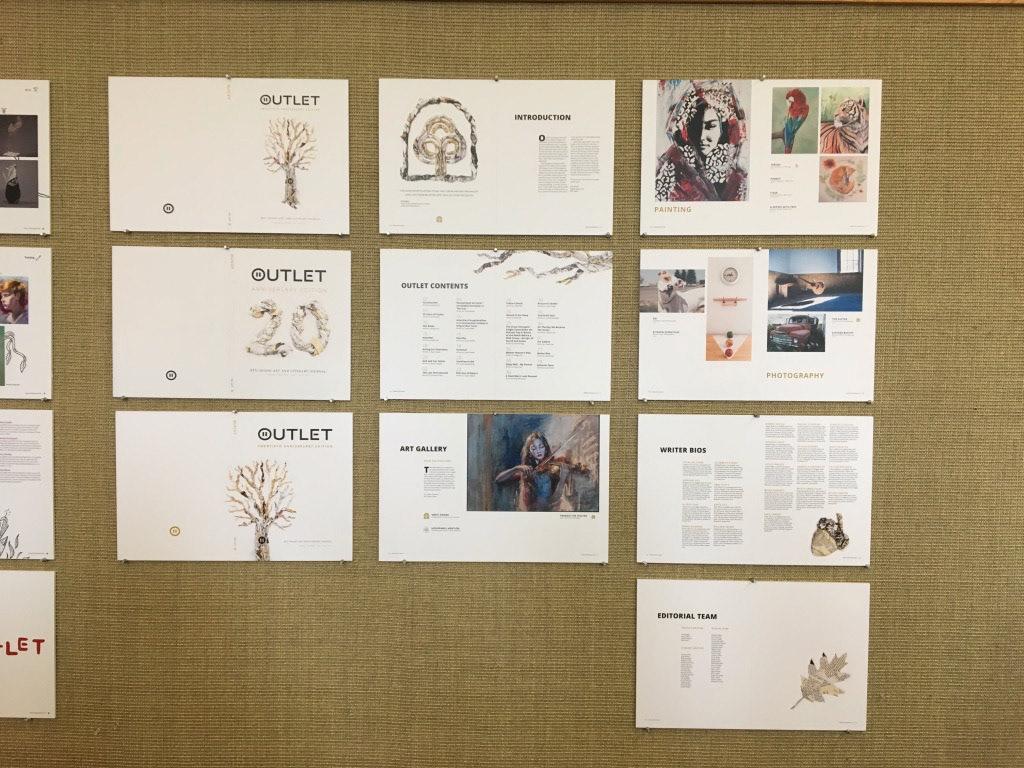
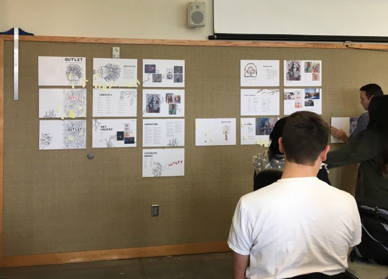
After the initial vote, our presentation tied with another group out of the 5 different styles. Each class member voted again between the top two styles; and the vote tied again with 7 votes for each style.
In the end our style was not chosen for the final publication. It as very well put together, with great attention to detail, and a creatively deep concept. As a group we were proud of our work, and grateful for the chance to learn and grow though this experience.